

As a category built on split-second decisions, drink branding has a lot more to do than look nice on a shelf. The best beverage branding turns packaging into memory, ritual into identity, and product design into something much bigger than the product itself. In drinks, people don’t just buy what tastes good. They buy what feels familiar, says something about them, and can be recognised instantly in a fridge, on a back bar, in a supermarket aisle, or across a crowded table. That’s why the greatest examples of beverage packaging design have such unusual staying power. They don’t just help sell a drink. They help define its place in the world.
That makes drinks one of the purest tests of what branding is actually for. In plenty of other categories, a brand can hide behind technical detail, product claims, or a longer, slower buying journey. Drinks don’t get that luxury. They compete visually, emotionally, and culturally, often in a matter of seconds. The bottle, can, label, colour, wordmark, silhouette, and serving ritual all have to pull their weight. At its best, beverage brand design doesn’t sit on top of the product like a layer of decorative wrapping. It becomes inseparable from the experience of drinking it.
There’s no shortage of competent work in the category, but only a small handful of brands really deserve “all-time” status. These aren’t just the most famous drinks brands, or the ones with the flashiest campaigns. They’re the ones that built assets strong enough to survive fashion, copycats, reformulations, market expansion, and that familiar corporate urge to “refresh” the life out of whatever made them memorable in the first place. The strongest brands in this space prove that the best beverage branding is rarely about novelty alone. It’s about owning something distinctive enough to be remembered, then reinforcing it for years without flattening it into irrelevance.
The most iconic examples tell a bigger story about branding itself: how memory gets built, how consistency becomes equity, how packaging becomes a strategic weapon, and how some brands manage to feel both timeless and completely alive. They also underline a truth a lot of companies still seem oddly reluctant to accept. Good branding isn’t the same as expensive branding, fashionable branding, or loud branding. It’s branding that can be recognised, recalled, and repeated.
A few industry voices make that point beautifully:-
Robert Volten, Managing Partner at Chuck Studios, picks Corona because its distinctiveness is so complete that the brand can be evoked by one tiny cue.
Bronwen Westrip, ECD at Denomination, points to the staying power of legacy brands that have strengthened over time without losing their DNA.
Simon Manchipp, Founder at SomeOne, goes straight for Guinness, describing it as “a liquid monument.”
Between them, they sketch out the real criteria for greatness in drinks branding: distinctiveness, confidence, consistency, and the ability to create a world bigger than the pack itself.
What Makes Drink Branding Successful?
Lonsdale
The simplest answer is distinctiveness, but that word gets used so casually it can start to lose all meaning. In drinks, distinctiveness isn’t abstract. It’s practical. It’s the shape of a bottle, the colour of a label, the sound of a name, the look of a pour, the icon on a glass, the ritual attached to serving. It’s the thing that lets someone recognise a brand before they’ve even consciously processed the logo.
That matters because drinks are bought under imperfect conditions. People are often choosing quickly, distracted, half-looking, surrounded by competitors making more or less the same promises. Successful drink branding reduces that effort. It gives the brain a shortcut. Coca-Cola remains one of the clearest examples. Its contour bottle was designed to make the product identifiable by shape alone, which is a very elegant way of turning packaging into a commercial moat.
Consistency is the second key ingredient, though not the stiff, joyless version that mistakes inertia for strength. Great brands evolve. They just do it in ways that reinforce recognition rather than weaken it. Guinness has retained the harp, the wordmark, and that unmistakable black-and-cream drama across generations. That’s what good consistency looks like. It protects memory while still allowing the brand to feel current.
Another ingredient is world-building. The best drinks brands aren’t just visually recognisable. They’re situationally recognisable. Corona isn’t just a beer. It’s lime, sunlight, beach, and ease. Guinness isn’t just stout. It’s patience, gravity, ritual, and a very particular kind of social theatre. Red Bull isn’t just caffeine. It’s motion, youth, speed, media, and edge. Branding becomes far stronger when people can recognise not just what the product looks like, but what kind of life it belongs to.
Packaging matters more here than it does in most categories. In very few sectors does the pack carry quite so much of the brand’s job. It has to signal quality, product type, mood, price point, and personality all at once, often at thumbnail size or from several feet away. That’s why beverage packaging design is never just a matter of taste. It’s part industrial design, part semiotics, part sales psychology.
Then there’s emotional posture. Drinks are often social props as much as consumables. A champagne bottle at a celebration means something different from a can of energy drink on a commute, a stout in a pub, or a sparkling water on a desk. Good branding understands that context. Great branding uses it.
The Best Drink Branding Examples of All Time
Guinness
Andrew Clare
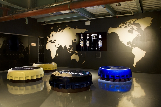
The first name that has to be taken seriously is Guinness. Simon Manchipp puts it with admirable bluntness: “It’s Guinness. Period. They designed a ritual. That stark, monastic black-and-white aesthetic is a masterclass in confidence. While every other lager brand is screaming with neon and frantic ‘refreshment’ cues, Guinness just sits there, patient and immovable, owning a color palette that shouldn’t work for drinks but somehow defines a nation. It’s a liquid monument.”
That gets to the heart of why Guinness is so powerful. It succeeds by refusing the expected visual language of mainstream drinks marketing. Where other brands lean into coldness, brightness, and speed, Guinness leans into depth, darkness, patience, and ceremony. The black pint and white head are among the most recognisable product appearances in the category, and the harp trademark ties the identity to Irish heritage with unusual force.
And it isn’t just the look of Guinness that matters. It’s the ritual. The pour, the settle, the expectation of waiting, the icon on the glass, the sense that the product isn’t simply bought but properly presented. That’s where Guinness moves beyond branding as surface treatment and becomes branding as behaviour. Plenty of brands talk about experience. Guinness built one people repeat.
Corona
Edd Fury
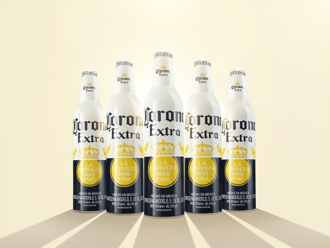
Robert Volten’s pick is Corona, and the reasoning is spot on: “Corona is my answer, and I say that with some hesitation because I’m a Heineken man. The reason I pick this brand is not because of a single brilliant campaign, but because of something far harder to achieve: a Distinctive Brand Asset so recognizable and famous that my mother knows it, when I reference the beer with a wedge of... lime. It’s so good, you don’t even need a logo to recognize a Corona.
“They also have a brand world that is clear, ownable, relatable and completely distinctive: the beach.
“Distinction, consistency, and time used to the fullest. This is the highest standard in drinks branding.”
There’s very little to add to that except agreement. Corona’s genius lies in how tightly its assets fit together. The clear bottle, pale beer, lime wedge, sunlit positioning, and beach-world cues all reinforce one another. It’s distinctive in appearance, yes, but also in atmosphere. You don’t just recognise the pack. You recognise the life around it.
Coca-Cola
AKQA
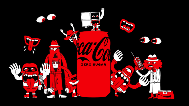
Coca-Cola belongs in any serious conversation about the best drinks branding because it solved one of the category’s central problems earlier and more elegantly than almost anyone else. Its contour bottle was created to distinguish the drink from imitators and became one of the most famous shapes in commercial history. That alone would be enough to earn it a place here.
What makes Coca-Cola especially formidable, though, isn’t just fame. It’s coherence. Script, red-and-white palette, contour bottle, curved graphic language, and decades of disciplined repetition have created an identity system that remains recognisable across formats, markets, and variants. It’s one of the clearest examples of what top beverage brands do well across product ranges: hold onto the core assets tightly enough that extensions still feel like the same brand, rather than cousins who’ve drifted apart.
Bronwen Westrip makes the point neatly when she says: “Legacy brands like Guinness, Angostura bitters, Budweiser, Absolut, Veuve Cliquot and Coca Cola are great examples of designs that have become great through consistency and strengthening over time - they have successfully adapted and retained relevance without losing their distinctiveness and by remaining true to their original DNA.”
That phrase, “original DNA”, is exactly right. Not because it sounds mystical, but because it names the real challenge. Too many brands evolve by stripping away memory in the name of simplification. The best ones evolve by intensifying what was always theirs.
Absolut
Take Absolut. Since its launch in New York in 1979, the brand has built itself around that apothecary-inspired bottle silhouette. The brilliance of Absolut isn’t just that the bottle is distinctive. It’s that the bottle became an endlessly flexible creative device. Collaborations, artist partnerships, campaigns, special editions: all of them could happen without the core identity dissolving. That’s not easy. Plenty of brands can create a strong pack once. Far fewer can create a visual object that keeps generating culture.
Veuve Clicquot
Veuve Clicquot is another reminder that a single asset, repeated with enough discipline, can become almost sacred. In a luxury category full of heritage cues, metallic detailing, serif typography, and old-world signalling, Veuve did something strategically very smart. It made colour the hero. The Yellow Label does an extraordinary amount of mnemonic work. The result is a champagne brand that can be recognised with absurd speed in environments where rival bottles often blur into one another.
Angostura
Angostura bitters is a slightly different kind of icon, but no less instructive for it. Its oversized label and unusual proportions have become some of the most recognisable cues in the bar world. It’s a useful reminder that not all branding greatness comes from immaculate polish. Sometimes what lasts is peculiarity. An eccentricity, repeated for long enough, becomes inseparable from authenticity.
Budweiser
Budweiser belongs on the list as a masterclass in broad-appeal asset branding. Its pack architecture has been sharpened over time around big, obvious, memorable cues like the bowtie. Budweiser’s brilliance isn’t subtle. It’s bold, heavily coded, and built for mass recognition. That’s the point. Mass-market branding doesn’t need to whisper to work. It needs to stick.
Energy Drink Branding: Why It Dominates Modern Brand Design
PepsiCo
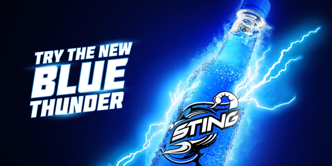
Why is energy drink branding more aggressive and instantly recognisable than so much other beverage branding? Because it had to be. Energy drinks entered crowded retail environments without the long cultural rituals or heritage equity that beer, wine, and spirits often enjoy. They had to communicate function and attitude fast. They couldn’t lean on centuries of reputation. They had to manufacture salience almost immediately.
Red Bull is the foundational example. Slim can, silver-and-blue verticality, opposing bulls, and a slogan that framed the product as activation rather than refreshment. Red Bull didn’t just sell an energy drink. It sold a worldview built around movement, performance, and possibility.
Monster took the same basic principle and pushed it in a darker, louder, more aggressive direction. Its claw-mark symbol, black can base, and acid-bright accents created a visual language much closer to gaming, motorsport, and alternative culture than to traditional soft drinks.
That’s why energy drink branding dominates so many modern design conversations. It showed the wider market that a drinks brand couldn’t rely on generic category cues and a bit of premium polish anymore. It needed sharpness. It needed a point of view. It needed assets that could be spotted instantly.
It also taught the rest of the industry that branding gets stronger when it builds a media universe around the product. Red Bull was never content being packaging plus advertising. It became an ecosystem of sport, stunts, events, and content. That move from product identity to cultural platform has influenced countless drinks brands since.
Key Elements of Successful Beverage Brand Design
Finn & Gray
So what makes drink branding memorable in a saturated market? Usually, it isn’t complexity. It’s compression.
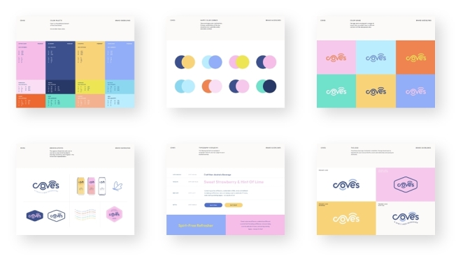
The strongest beverage brand design systems condense meaning into a small number of highly disciplined assets. A bottle shape. A signature colour. A label proportion. A symbol. A ritual. A graphic device. Something the consumer can retrieve almost automatically.
That’s one of the key differences between beverage brand design and general product branding. In many categories, brands can rely on longer attention spans, more informational copy, or more deliberate decisions. Drinks often work under the opposite conditions. Shelf choices are fast. The physical products can look very similar. Many of the functional claims are familiar. So branding has to do more of the persuasive heavy lifting at a glance.
The best drinks brands also maintain consistency across product lines by deciding, very clearly, what’s sacred and what’s flexible. Coca-Cola can introduce variants because the system is stronger than any one formula. Absolut can extend because the bottle remains the organising idea. Veuve Clicquot can diversify because the Yellow Label still does the memory work. That’s what top beverage brands understand: brand architecture isn’t housekeeping. It’s memory management.
The biggest mistakes companies make in drink branding are usually depressingly predictable. One is chasing design fashion at the expense of recognisability. Another is cluttering the pack hierarchy with too many messages, so nothing sticks. A third is borrowing category codes so obediently that the product vanishes into a wall of “quite nice” sameness. A fourth is treating packaging as late-stage decoration rather than a strategic asset. In drinks, that’s fatal. The packaging often is the brand.
There’s also a more subtle mistake: failing to connect the brand to behaviour. Great drinks branding rarely exists in the abstract. It knows where it’s consumed, who it’s consumed with, and what kind of moment it helps create. A brand that looks good but has no social or emotional position will always struggle against one that feels lived-in.
How Packaging Shapes Beverage Branding
Design Bridge and Partners
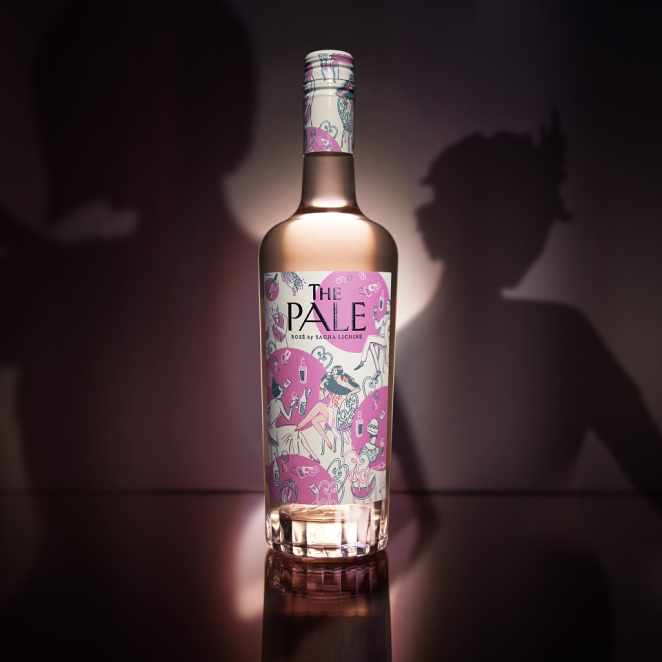
Packaging shapes drinks branding because it’s the thing people actually experience. Not the case study. Not the deck. Not the campaign film. The object.
That gives packaging a level of importance many branding conversations still underestimate. It has to work at multiple distances and in multiple contexts. It needs to be recognisable from afar, rewarding up close, ownable in the hand, and legible when flattened into e-commerce tiles or Instagram posts. It has to survive supermarkets, bars, festivals, fridges, and photographs.
The best examples all prove this in different ways. Coca-Cola shows the power of structural design. Absolut shows the power of silhouette. Veuve shows the power of colour territory. Angostura shows the power of eccentricity. Corona shows the power of transparency plus ritual. Guinness shows the power of product appearance itself.
This is also where Bronwen Westrip’s phrase “intelligent bravery” becomes especially useful. She says: “However newer designs that without decades to prove whether they’re strong enough to stand the test of time need to deliver something truly distinctive and desirable with bravery and intelligence (think Liquid Death).
“Working at one of the best drinks branding specialist globally, we have our own criteria for creating the future ‘hall of fame’. This is summed up by ‘Intelligent bravery’ - is the design intelligently breaking boundaries that progresses the category or the brand then beautifully executed. Examples of a couple we’re super proud of - not only highly awarded but have also provided rocketing commercial success for our brands have been Uovo and Gallus, but only time will tell if they are truly worthy of GOAT status...”
That distinction between bravery and intelligent bravery really matters. Plenty of drinks brands try to look disruptive. Far fewer manage to create a disruptive identity that still feels strategically grounded. Liquid Death is a good recent example because it broke aggressively from bottled-water category norms. It didn’t just try to look a bit different. It rejected the expected codes of the category outright.
That’s what great packaging often does. It doesn’t just reflect the product. It reframes the category around the brand.
What These Branding Examples Teach About Building Strong Brands
Sand Creative
Taken together, these brands point to a few bigger truths.
1. Strong brands are built through repetition, not sporadic brilliance. One excellent redesign isn’t enough. One famous campaign isn’t enough. What matters is the patient reinforcement of recognisable assets over time.
2. Memory usually matters more than novelty. The design industry often fetishises reinvention because it makes for better launch moments. Consumers don’t reward launch moments nearly as much as they reward confident familiarity.
3. The most successful drinks brands are behavioural as well as visual. Corona has the lime. Guinness has the pour. Coca-Cola has the contour. Red Bull has the ecosystem. Brands get stronger when they exist as habits and cues, not just graphics.
4. The best drinks branding often comes from resisting category conventions rather than obediently following them. Guinness doesn’t look like conventional refreshment. Liquid Death doesn’t look like conventional water. Red Bull didn’t look like a conventional soft drink. Difference, when it’s strategically disciplined, is usually the thing that gives a brand its life.
5. True brand strength sits in the combination of consistency and distinctiveness. Too much consistency without edge becomes wallpaper. Too much distinctiveness without repetition becomes a one-season stunt. The all-time greats manage both.
That’s why the best drink branding keeps resurfacing as a benchmark for the wider industry. It shows what happens when identity is treated as a long-term commercial asset rather than a launch-phase veneer. It shows how beverage branding and beverage packaging design can create not just recognition but attachment. And it proves that the best beverage branding is rarely the most complicated. It’s the branding that can be summoned from a fragment: a harp, a yellow label, a contour, a lime wedge, a black pint, a claw mark, a clear bottle in the sun.
In a saturated market, memorability isn’t a nice extra. It’s the whole game. The brands that win are the ones that understand that early, then keep proving it for decades.