

Packaging has a funny habit of being treated as the supporting act in stories where it was often the star all along. People talk about the product, the branding, the campaign, the founder myth, the big creative leap. Then the packaging gets mentioned somewhere near the end, as if it was simply the thing wrapped around the real idea. But the history of packaging and innovation tells a different story.
Again and again, the biggest commercial shifts have come from innovation in packaging design that changed how products were protected, shipped, recognised, trusted, opened, displayed and remembered. Long before the latest packaging design trends started talking about sustainability, QR codes and unboxing, the smartest creative packaging ideas were already changing the way entire industries worked.
Really innovative packaging isn’t just new but changes behaviour
That’s what makes packaging such a fascinating discipline. It sits in the middle of everything. It’s brand and logistics, design and engineering, psychology and regulation, commerce and culture. A truly great pack doesn’t just look good on a shelf. It can reduce spoilage, make self-service retail possible, improve safety, cut waste, speed up checkout, reshape a category or make a product feel iconic before anyone’s even used it.
The really innovative packaging isn’t just new. It changes behaviour. It makes something easier, clearer, safer, sharper or more desirable, and in doing so it changes the expectations around the product itself. That’s when packaging stops being decoration and starts becoming strategy.
What Innovation in Packaging Design Really Means
Mad River
There’s a temptation to think innovation in packaging design means novelty. A strange shape. A new material. A clever opening mechanism. A box that unfolds in a way that makes people on LinkedIn write the word “delightful” five times in one post. Sometimes that stuff matters. But real packaging innovation usually runs deeper than that. It changes a system, not just a silhouette.
Take the barcode. In visual terms, it’s hardly a masterpiece. But once standardised retail packaging became machine-readable, checkout sped up, stock control got smarter and the entire logic of modern retail changed with it. The barcode is something that fundamentally transformed the way we shop, and that’s not marketing fluff either. It’s a fair description of a packaging addition that rewired commerce.
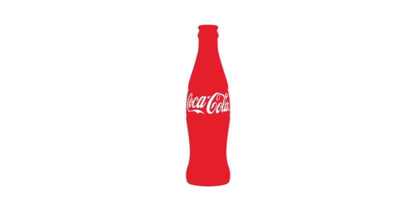
Or take the Coca-Cola contour bottle. It didn’t become iconic because somebody wanted a prettier bottle. It came from a commercial problem: imitation. Coca-Cola wanted a pack so distinctive it could be recognised by touch alone and identified even when shattered on the ground. That’s a brilliant brief. The answer turned packaging into brand protection, memory structure and cultural symbol all at once. It’s one of the cleanest examples of form doing work that many brands still try to force through messaging.
A packaging innovation becomes game-changing when it does more than decorate the product
That’s usually the test. A packaging innovation becomes game-changing when it does more than decorate the product. It alters behaviour for consumers, retailers, manufacturers or all three. It can change how something is stored, how it travels, how it’s opened, how long it lasts, how safe it is, how easy it is to identify, or how emotionally loaded it feels. In that sense, packaging innovation has never really been about embellishment. It’s been about leverage.
That’s also why the best packaging ideas tend to feel obvious in hindsight. Once the idea lands, it can look almost embarrassingly simple. Of course, the bottle should be recognisable in the dark. Of course, the pack should be easy to open. Of course, the product should survive shipping intact. Of course, the structure itself should reinforce the brand. But “of course” usually arrives after someone has done the hard thinking. That’s where the real work is.
For anyone working in the space now, that’s still the useful benchmark. Not “is it eye-catching?” but “what problem does it solve that ordinary branding can’t?” That’s where the most commercially serious work tends to begin.
Why Packaging Innovation Has Changed the Industry
Oscar Cauda
To understand how packaging design innovations changed product marketing, it helps to remember how much of modern commerce depends on packaging doing invisible work. Self-service retail depends on packs selling without a salesperson standing beside them. Large-scale distribution depends on packs surviving transport and stacking efficiently.
Pharmacy safety depends on packaging helping users dose correctly and keep products secure. E-commerce depends on packs surviving the journey while not making the customer feel like they’re entering combat with a box cutter.
This is why packaging and innovation have always been more closely tied than people admit. The pack is one of the few brand assets that has to perform under real physical pressure.
It has to protect the thing, explain the thing, sell the thing, survive transit, satisfy regulations, fit supply chains, support sustainability goals and still somehow make the product feel worth buying. That’s a ridiculous amount to ask of any single design object, which is perhaps why the best examples stand out so much when they get it right.
Packaging innovation changed the industry in two especially important ways
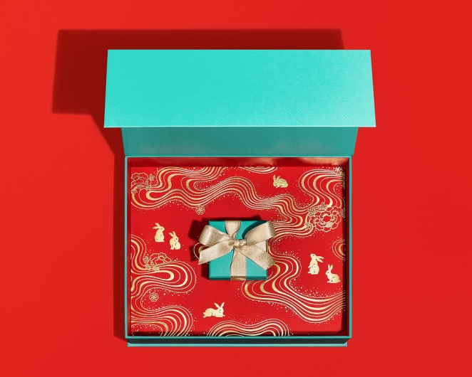
The first is that it turned packaging into a more explicit part of the brand promise. When a Tiffany Blue Box arrives, the emotional experience starts before the jewellery is even seen. Tiffany traces that distinctive blue back to Charles Lewis Tiffany’s choice of colour in 1845, long before “signature colour” became branding gospel. The box became ritual, and ritual became equity. The same basic principle shows up in different ways elsewhere too.
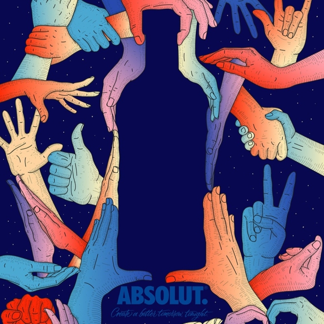
Absolut’s bottle didn’t just hold vodka; it became the centre of the brand’s visual world. Coca-Cola’s contour bottle didn’t just contain a drink; it became shorthand for the drink itself. Packaging, at its best, doesn’t support the message. It is the message.
The second is that packaging became a lever for operational advantage. Tetra Pak’s rectangular aseptic carton mattered because it wasn’t merely elegant. It was light, strong, easy to handle, distribution-friendly and designed to fit pallet standards. More importantly, it helped transform how long-life liquid foods could be stored and transported. That’s a whole supply-chain shift hiding inside a carton.
The same is true of the folding carton and corrugated box, which helped industrialise the movement of goods and made branded packaged products more scalable. Some of the most important packaging innovations in history aren’t glamorous. They’re infrastructural.
That’s why packaging design trends are never just a design story. They’re a commercial one. A change in pack format can affect breakage, display, shipping cost, waste, safety, convenience, recall procedures and brand perception all at once. That’s not styling. That’s leverage.
The Most Influential Packaging Design Innovations (With Real Examples)
Jackson Cleatus
Some packaging breakthroughs are so baked into daily life now that they barely look like innovations anymore. That’s usually a good sign. Once an idea has properly changed the game, it tends to stop looking radical and start looking normal.
The folding carton is one of those ideas. The Smithsonian’s Lemelson Center notes that the folding carton emerged in the late nineteenth century after Robert Gair realised machines could cut and crease paperboard at the same time. That production breakthrough made cartons faster, cheaper and more scalable to produce. It helped turn packaging into a serious industrial system rather than a fiddly handmade add-on.
In simple terms, it made branded packaged goods easier to make, easier to transport and easier to sell. That’s not a bad legacy for something now so ordinary most people barely notice it.
Then there’s the cardboard box, which might be the least glamorous revolutionary object in commerce. Its significance isn’t visual drama. It’s utility at scale. Corrugated and cardboard formats changed how goods moved, protected increasingly complex supply chains and later became the physical backbone of e-commerce. Whole empires of convenience have effectively been built on printed board and corrugated fibre. Which is not poetic, exactly, but it is true.
The Coca-Cola contour bottle remains one of the greatest examples of packaging structure becoming a commercial moat. Coca-Cola’s own recorded history makes clear that the brief was to create something distinctive enough to be recognised by touch and identifiable even when broken. That is wonderfully specific.
The result was not just a bottle but one of the most famous shapes in branding. It made the act of holding the product part of the brand experience, and it did it without needing to shout. If there’s a cleaner example of packaging pulling double duty as trademark and memory cue, it’s hard to think of one.
Tetra Pak’s aseptic carton changed an entirely different set of rules. The Tetra Brik Aseptic pack, launched in 1969 was light, strong, easy to handle and distribution friendly. It was also designed to fit neatly with international pallet standards. More importantly, aseptic technology allowed product and packaging to be sterilised separately and sealed under sterile conditions, helping transform the distribution of long-life liquid foods. That’s not just a clever carton. It’s a rethink of how food can travel.
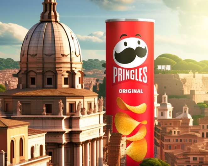
Pringles deserves a place in this conversation too. Not because it looked quirky, though it certainly did, but because it solved a whole collection of annoyingly familiar problems in one go. Pringles says Fredric Baur started working on the concept in the mid-1950s as an alternative to potato chips that were often greasy, stale and broken. The tubular can and stackable chip shape answered that mess with a kind of cheerful engineering logic.
The Pringles Can is a triumph of lateral engineering
Simon Manchipp, Founder at SomeOne, puts it better than most: “The Pringles Can. Everyone else was selling bags of air and broken dreams; Fredric Baur gave us a tennis ball tube for salty snacks. It’s a triumph of lateral engineering. It solved the shipping problem, the freshness problem, and the ‘crushed chip’ problem in one fell swoop. It turned a snack into a stackable geometric marvel. Branding through structural rigidity—genius.”
He’s right. The Pringles can feels slightly ridiculous and completely brilliant, which is often how good packaging innovation works. It turned protection into identity. It made structure memorable. And it proved that one of the smartest creative packaging ideas and most innovative packaging ideas of the modern supermarket era wasn’t decorative at all. It was brutally practical.
The pull-tab and later stay-tab can deserves credit for something less glamorous but equally important: convenience. Packaging lives or dies on those little moments of friction. If opening the thing is awkward, the design has already failed a basic human test. Ring-pulls made canned drinks easier to use and helped push the category further into everyday life. Convenience isn’t some minor consumer luxury in packaging. Quite often, it’s the whole battle.
Then came the barcode, quietly one of the most important additions ever made to a pack. It transformed the way we shop by connecting physical products to digital identity, speeding up checkout times and making stock systems far more intelligent. Plenty of packaging ideas improve one brand or one category. The barcode improved the entire retail machine around them.
Blister packs, meanwhile, transformed pharmaceuticals in a different way. FDA guidance notes that blister packs may improve patient adherence, reduce accidental exposure and help critical information remain with the medication throughout intended use. That’s the sort of packaging innovation that doesn’t need a glamorous case study because its value is obvious in the consequences. It made medicine easier to manage, safer to use and harder to misuse.
Child-resistant closures changed packaging’s role in the home just as decisively. The U.S. Consumer Product Safety Commission states that the Poison Prevention Packaging Act requires certain substances to be placed in packaging designed to be significantly difficult for children under five to open while still usable for adults. It’s one of the starkest examples of packaging design doing life-saving work. Sometimes the game being changed is not brand perception or category growth. Sometimes it’s whether a child gets hurt.
Amazon’s Frustration-Free Packaging belongs on the list for showing how packaging innovation changed again in the e-commerce era. When Amazon launched the initiative in 2008, the goal was to reduce “wrap rage”, make packages easier to open and use less packaging material. That sounds modest until you remember how often packaging becomes the first physical experience of an online brand. In e-commerce, the box is part of the service. If it’s wasteful, painful or absurdly hard to open, that’s not a packaging problem. It’s a customer experience problem. Amazon was smart enough to treat it that way.
And now we’re entering another shift with 2D codes and connected packaging. GS1 UK’s Sunrise 2027 work is built around the retail industry moving towards the ability to scan 2D barcodes at point of sale, while making clear that existing linear barcodes will coexist rather than disappear overnight. In practical terms, that means packaging is becoming more interactive, more traceable and more useful as a bridge between physical product and digital information. The package is becoming an interface, not just a label.
Case Studies: Brands That Redefined Packaging Design
Africa
Coca-Cola is the classic case because it solved a commercial problem with industrial design and then accidentally produced one of the most recognisable brand assets on Earth. The bottle worked on every level. It was distinctive, tactile, proprietary and culturally sticky. It did what all great packaging hopes to do but rarely manages at that scale: it made the product feel unmistakably itself. If anything, its success is a warning to brands that still think distinctiveness lives mainly in campaigns. Sometimes it lives in the thing your customer actually touches.
Tiffany & Co. is a different kind of masterclass. The Tiffany Blue Box didn’t change global logistics or invent a new material format, but it did something many brands would kill for: it turned the packaging into part of the emotional event. Tiffany’s own history traces the blue back to 1845, with the first Blue Book, and notes the role the Blue Box came to play in the house’s identity. That’s what happens when packaging becomes ritual rather than wrapper. The object arrives carrying promise before the product inside has had a chance to speak.
The Coca-Cola bottle was distinctive, tactile, proprietary and culturally sticky
Absolut shows what happens when packaging becomes the entire visual grammar of a brand. The bottle’s apothecary-inspired form looked unlike the usual category cues, and that difference became an asset rather than a liability. The Absolut Company’s own brand history makes clear how central the bottle became to its identity and advertising. In this case, the pack didn’t just support marketing. It gave marketing its leading character.
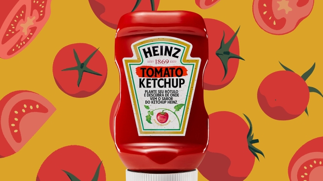
Heinz’s upside-down bottle is a smaller, funnier and in some ways more relatable story. It didn’t become famous because it was poetic. It became famous because ketchup is irritating when gravity is involved and people are very willing to love the thing that removes a daily annoyance. Kraft Heinz’s brand history points to making pouring easier as part of its product evolution, while more recent packaging reporting explains how the 2002 upside-down bottle used a silicone dome valve to solve the problem more elegantly. It’s a lovely reminder that consumer affection is often won not by grandeur but by reducing nonsense.
Tetra Pak perhaps offers the broadest industry lesson of all. The company’s own heritage material is very clear about what made the Tetra Brik Aseptic format matter: it was light, strong, easy to handle, distribution-friendly and aligned with pallet standards. That sounds technical because it is technical. But that technicality is precisely why it mattered. Packaging innovation often looks less like a glamorous ad and more like a system suddenly working better at scale.
Common Patterns Behind Successful Packaging Innovation
Feifei Ruan
Once you line up the examples, a few patterns show up pretty quickly.
First, the best packaging innovation starts with a real friction, not a mood board. Coca-Cola needed distinctiveness. Pringles needed to stop crisps arriving as oily rubble. Heinz needed to make dispensing less annoying. Amazon needed to reduce wrap rage. Child-resistant packaging needed to stop children getting into dangerous substances. Blister packs needed to help medication stay safer and easier to manage. The common factor is not visual novelty. It’s a problem worth solving.
Second, the best ideas solve more than one thing at once. Tetra Pak improved storage, transport and shelf life. The barcode improved checkout and inventory. The contour bottle improved recognition and brand defensibility. Pringles improved freshness, protection and distinctiveness. Compound value is usually what separates the genuinely game-changing from the merely interesting.
The best packaging innovations feel easier than what came before
Third, recognisability matters. Distinctive packaging does not just help a product look attractive. It helps memory do its job faster. The contour bottle, the Tiffany Blue Box and the Absolut bottle all became powerful because they were hard to confuse with anything else. In crowded categories, that’s not aesthetic icing. That’s commercial muscle.
Fourth, the best packaging innovations feel easier than what came before. Easier to identify. Easier to open. Easier to store. Easier to dose. Easier to ship. Easier to trust. The user may never describe those gains in the language of design, but they feel them all the same. And repeated feeling is what becomes habit.
Finally, great packaging tends to arrive when the surrounding system is ready for it. Folding cartons rose with industrial production. Barcodes rose with retail automation. Frustration-Free Packaging rose with e-commerce. 2D codes are rising with demands for traceability, richer product information and more connected consumer experiences. Timing doesn’t create innovation on its own, but it does help decide whether an idea stays clever or becomes consequential.
How Packaging Innovation Impacts Branding and Consumer Behavior
Creative 23
Packaging affects behaviour because it changes what people notice, trust, understand and tolerate. It can create anticipation, reassurance, frustration, delight, clarity or confusion. That’s a lot of power for an object some organisations still treat as the bit that happens after the “big idea”.
On the emotional side, packaging can make a product feel ceremonial or culturally loaded. Tiffany does that through ritual and symbolism. Absolut does it through distinctiveness and artistic adaptability. Coca-Cola does it through familiarity so deep the silhouette itself has become a brand language. In all three cases, the packaging carries meaning before the consumer has fully engaged with the product. It narrows the gap between recognition and desire.
On the practical side, packaging can quietly shape behaviour by reducing effort or risk. Blister packs can improve adherence. Child-resistant packaging can help reduce accidental poisonings. Easier-to-open e-commerce packaging can reduce frustration and waste. The upside-down Heinz bottle can make a small daily moment less messy. None of that sounds especially romantic, but it is exactly how products earn affection in the real world. Consumers don’t always fall in love with the brand promise. Quite often, they fall in love with the absence of hassle.
This is also where current packaging design trends become more interesting than the trend reports sometimes make them sound. Sustainability, traceability and connected packaging aren’t just fashionable talking points. They’re reflections of a broader shift in what people now expect packaging to do.
Packaging design has moved from containment to communication to participation
A pack is no longer judged only by protection and shelf impact. It’s also judged by whether it feels excessive, recyclable, useful, informative and in step with how consumers think brands ought to behave. 2D codes and QR formats point towards a future where the pack can carry much richer information, linking the physical object to authentication, recycling guidance, provenance and all sorts of post-purchase utility.
That’s the bigger answer to the question of how packaging innovation has evolved over time. It has moved from containment to communication to participation. Early breakthroughs industrialised transport and storage. Later ones improved recognition, convenience and safety. The newest wave is turning packaging into an interface between product, consumer and data. Different eras, same core principle: the pack matters most when it changes the experience around the product, not just the appearance of it.
For brands and creatives, that’s the useful lesson. Don’t begin with “how do we make this look more innovative?” Begin with “what tension in the product experience could packaging solve better than anything else?” That’s where innovation in packaging design gets serious. That’s where packaging and innovation stop sounding like conference-panel wallpaper and start becoming commercial advantage.
And that’s why the most enduring packaging design trends, the smartest creative packaging ideas and the genuinely innovative packaging that lasts all tend to share the same trait: they didn’t just improve the container. They changed the conditions around it.
Graham McGrath April 28th, around noon
The shape of a Pringles crisp is called a "hyperbolic paraboloid" - it's a piece of geometric genius.