

Projects with any serious duration (say a year deep) tend to gather all kinds of lint as they roll around departments, switch stakeholders or find new sponsors. In the process (or muddle), what might have started out - or rather, ended up - as a nice, clear and concise framing will have been subject to all kinds of pushing and pulling.
It’s likely that as the designer, you might well be the only person with any real connection to how it started. Your direct genealogical connection to the beginning means you’re likely in the rather important situation - as the ‘who' in possession of how the complex issues were quickly grasped. Likely as well, the few slides that did the original ‘ah-ha’ will be on your desktop.
If it is, and you’re facing down a fresh 196 page edition and wondering where your will to live is headed, I’d like to offer a means of reply.
The key to keeping the complicatedness away for me is GIFS. Gifs are great. I know they’re supposed to be internet-over-it but they’ve found a second life (ha ha) for me as a handy acronym when, for the twentyninteeth time, you need to remind everyone where they supposed to be going - so:
G - Goal
I - Information (just the key stuff)
F - Form (how it’s looking)
S - Story
Ok, sure, the order is interchangeable, but for client teams I’ve found it useful to start from the back, with the business objective. It’s also useful to check-in that things haven’t actually changed… or delayed-forward, as I heard the other day.
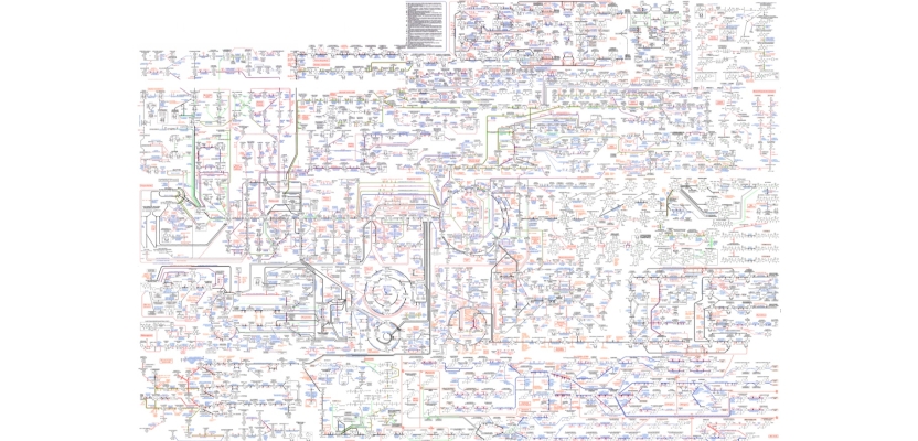
Keeping a project’s hopes (as well as the client team’s) alive is an often unspoken part of the designer’s job. The best way to steer the complicated away or at bay is with the thing we do best. Cut everything back to the essentials. And make GIFS. Otherwise you’ll end up having to work with something that resembles the header image - a map of the metabolic pathways that keep us alive.
Important to know that this stuff works, certainly. Exactly how it does, for most of us, not so much.