


If you want to understand what makes children’s book illustrations endure, you have to start by taking the form seriously. Too much lazy commentary still talks about children’s illustration as though it sits somewhere below “serious” art, as though simplicity means compromise, as though drawing for a child is somehow easier than drawing for an adult.
Anyone who’s spent even a little time with the best picture books knows that’s nonsense. Children are some of the toughest audiences in publishing. They can spot stiffness in a character, emptiness in a page and dishonesty in a visual world faster than most grown-ups. A child doesn’t care how prestigious the illustrator is. They care whether the image pulls them in and whether they want to turn the page.
That’s why the best childrens book illustrations work on two levels at once. They need immediate visual appeal, because younger readers are instinctive editors. They respond to rhythm, colour, shape, texture and emotional clarity before they respond to theory. At the same time, the work has to reward repeat viewing.
The best childrens book illustrations work on two levels at once
A picture book is rarely consumed once. It’s read again, then again, then dragged from one room to another, then requested at bedtime for the fiftieth time. Illustration has to hold up under that kind of scrutiny. Images help children grasp narrative, remember details and engage more deeply with the emotional arc of a story. Younger readers often respond well to clarity and strong visual cues, while older readers can happily move into denser, more layered scenes. That sits at the heart of why childrens illustration remains one of the most demanding and rewarding areas of visual storytelling.
The conversation has changed again in recent years because digital tools have widened the possibilities without changing the core brief. Whether a spread is painted in gouache, scratched into ink, built in collage or finished digitally, the real question is still the same. Does this artwork create a believable emotional world for a child? Does it give the story a pulse?
That’s what separates timeless childrens illustration from generic childrens drawing images that look pleasant in isolation but do nothing once they’re asked to carry narrative. The illustrators below prove the point in very different ways, and that difference matters. Children’s publishing has always needed range. One child needs wit, another needs warmth, another needs danger, another needs stillness. The strongest field gives them all of it.
Best Children’s Book Illustrations (Real Examples and Styles)

Laimutė Varkalaitė
The best children’s book illustrations don’t all look alike, and that’s exactly why the category remains so creatively alive. Some of the most memorable picture books are powered by an economy of line that feels almost casual until you realise how much character has been built with very little. Others are dense with detail, pattern and atmosphere, creating pages that feel like worlds you could step into. What matters isn’t the volume of visual information on the page. What matters is whether every mark belongs there.
A visually engaging picture book also understands age without patronising its audience. For very young readers, strong silhouettes, clean colour relationships and emotionally legible characters can do a huge amount of work. For readers moving into slightly older picture book territory, there’s room for more environmental storytelling, more visual jokes, more secondary narratives and more subtle shifts in mood.
What matters isn’t the volume of visual information but whether every mark belongs there
Children don’t outgrow visual sophistication. They grow into different kinds of it. That’s why a stark Dr. Seuss page, a deeply textured Jan Brett spread and a dreamlike Shaun Tan composition can all belong in the same wider conversation. They’re answering different needs, using different visual languages, while still respecting the intelligence of the child reader.
When people search for book illustrators or childrens book illustrations, they’re often hoping for a neat formula. There isn’t one. The real examples that last are the ones where style and story are inseparable. The illustration isn’t there to decorate the manuscript after the fact. It is the manuscript’s emotional architecture. It tells the child when to laugh, when to linger, when to feel safe, when to feel curious and when to feel the delicious edge of danger. Great children’s illustration does more than show what happened. It decides how the story feels in the body.
Types of Children’s Illustration Styles Used in Books

Sean Aikin
There’s a tendency in publishing conversations to reduce children’s illustration to surface categories. Cute. Whimsical. Classic. Bold. Painterly. Digital. They’re useful labels up to a point, but they don’t tell you enough. The more useful distinction is how an illustrator handles narrative space, character consistency and emotional temperature across a whole book.
Some styles are built around loose kinetic line and expressive movement. Some rely on controlled detail and pattern to create trust and immersion. Some feel theatrical, with each spread staged like a scene. Others feel cinematic, using pacing, cropping and silence as storytelling devices.
Simple illustration can be incredibly effective when the brief demands speed of recognition and strong emotional read. That’s one reason bold, reduced forms work so well for very young readers. At the other end, highly detailed imagery can slow the reading experience in all the right ways, encouraging the child to scan the page, notice background action and build a stronger relationship with the world of the book.
Neither approach is inherently better. A spare page can feel flat in the wrong hands, and a detailed page can feel busy in the wrong hands. The craft lies in matching the visual system to the story being told.
The best book illustrators create visual rules for a world and then keep faith with them
There’s also the question of consistency, which is where many weaker books fall apart. A good character design on one page means very little if the emotional logic, spatial proportions and visual tone drift over the next twenty.
Children notice that drift, even when they can’t articulate it. The best book illustrators create visual rules for a world and then keep faith with them. That doesn’t mean repetition. It means coherence. It means a child can trust the book’s universe enough to enter it fully.
Digital tools have made it easier to experiment with texture, revision and colour control, and that’s been a genuine gain for the field. What digital hasn’t done is remove the need for point of view. If anything, it’s made point of view more important because technical polish is easier to come by.
Today’s strongest children’s illustration often blends analogue warmth with digital precision, but the memorable work still comes from illustrators who understand pacing, psychology and the tiny decisions that make a character feel alive from spread to spread.
Top Book Illustrators Behind Iconic Children’s Books
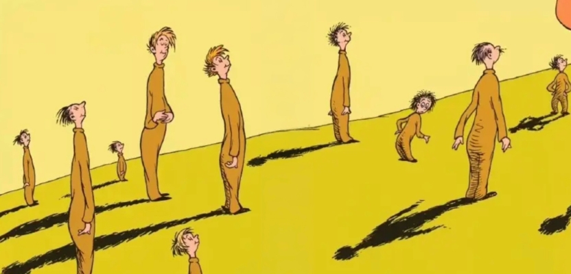
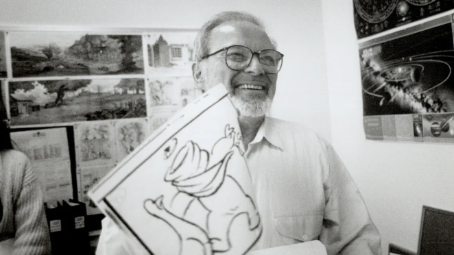
Dr. Seuss


Dr. Seuss remains one of the clearest examples of a visual universe that became its own kind of language. Theodor Seuss Geisel created a world where architecture bends, creatures wobble, hats tower, stripes misbehave and logic is always one delighted step away from collapse.
That visual elasticity is a huge part of why his books remain so durable. They don’t simply illustrate rhyme. They accelerate it. The line work pushes movement forward, and the exaggerated forms give children permission to imagine that ordinary rules have briefly gone off duty. That matters in children’s publishing because liberation is a core pleasure of the form.

What’s easy to miss is how controlled the Seussian world really is. For all the apparent chaos, the pages are built with absolute confidence. Shapes repeat, characters are instantly legible and compositions guide the eye with a clarity that keeps the reading experience buoyant rather than overwhelming.
That’s why his work still matters to conversations around childrens drawing images versus true narrative illustration. These are not just quirky pictures. They are engineered acts of visual storytelling, and they prove that absurdity works best when it’s built on discipline.
Maurice Sendak
Where the Wild Things Are deserves its own section because it changed the emotional weather of the picture book. Maurice Sendak didn’t give children a sanitised fantasy. He gave them a story where anger, rebellion, fear and longing could sit on the same page without apology.
The visual journey from bedroom to forest to sea to wild kingdom feels both intimate and mythic, and that duality is exactly why the book has lasted. The monsters are strange and massive, but they never feel random. They carry emotional weight. They feel like embodiments of childhood feeling rather than decorative fantasy.

The book also remains a masterclass in pacing through image. The expansion of the pictures as Max moves deeper into imagination is one of those choices that looks inevitable once you’ve seen it, which is usually the sign of a great one. The book trusts children with mood, with ambiguity and with intensity. It doesn’t shout. It broods. It lets white space and visual escalation do narrative work.
In an industry that still sometimes underestimates what children can process, Sendak’s achievement feels as fresh as ever. He understood that children don’t need everything softened for them. They need it made true.
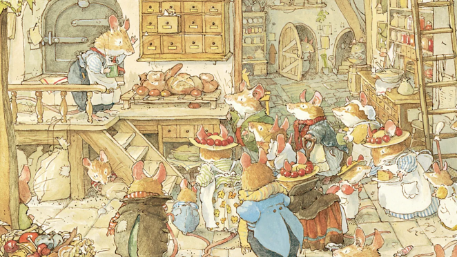
Beatrix Potter
Beatrix Potter brought a kind of observational precision to children’s illustration that still feels quietly radical. Her animals are anthropomorphic, of course, but they are never merely cute props. They carry the weight of close looking. You can feel the naturalist’s eye in the fur, the posture, the setting and the objects that surround them.
That’s one reason her work still lands so well. The fantasy feels rooted. Peter Rabbit may wear a jacket and get into trouble like a child, but he also remains convincingly rabbit enough to keep the world from tipping into sentimentality.

There’s also a restraint in Potter’s pages that contemporary illustrators can still learn from. She never seems desperate to impress the viewer. The line is delicate, the colour relationships are calm and the atmosphere is built through confidence rather than noise.
In a market that can sometimes mistake brightness for engagement, Potter reminds us that intimacy has enormous power. A child doesn’t always need the page to perform. Sometimes they need it to invite them closer.
Quentin Blake

Quentin Blake has spent decades proving that looseness can be a form of mastery. His line looks spontaneous because it’s alive, not because it’s careless. Few illustrators can suggest movement, comic timing and emotional warmth with such apparent ease. His drawings don’t sit still. They flicker, skip and lean into the joke.
That energy made him the perfect partner for stories that needed irreverence and velocity, but it also explains why his work has shaped the visual memory of childhood for generations. He gives children permission to feel that drawing can be playful without losing precision.

What’s especially impressive about Blake is his ability to keep exuberance human. The characters are heightened, but they’re never hollow. There’s always a sense that he’s interested in people first, caricature second.
That’s one reason his pages remain so emotionally available. They’re funny, yes, but they also carry tenderness, awkwardness and vulnerability. In a field crowded with overworked polish, Blake’s work is a powerful reminder that line with personality will always beat surface perfection.
Ernest Howard Shepard

Ernest Howard Shepard understood the emotional strength of understatement. His illustrations, especially in the worlds of Winnie-the-Pooh and The Wind in the Willows, are never trying to overpower the text. They create space around it, allowing tone to settle gradually.
The effect is remarkably durable. His drawings feel companionable. They don’t insist on themselves. They walk alongside the child reader and, in doing so, create one of the most comforting visual registers in children’s literature.

There’s a gentle intelligence in Shepard’s work that still feels instructive. He knew that charm doesn’t come from overstatement. It comes from observation, rhythm and trust. The environments hold memory, the figures hold character and the whole page moves with the quiet assurance of an illustrator who doesn’t need to raise his voice to be heard.
In children’s publishing, that kind of calm authority can be every bit as powerful as spectacle.
Peggy Fortnum

Peggy Fortnum’s Paddington illustrations are a lesson in what happens when character design is truly nailed. Paddington works because he is instantly recognisable and emotionally stable on the page.
The coat, the hat, the stance and the expression all combine to make a figure who feels both comic and sincere. That balance is harder to achieve than it looks. Too much sweetness and the character loses credibility. Too much irony and the affection evaporates. Fortnum gets the ratio exactly right.

There’s also a lovely modesty to the work. The drawings don’t fight for attention. They support a personality so strong that the reader fills in the rest with pleasure. That’s a useful distinction when thinking about childrens illustration as a storytelling discipline.
Not every book needs panoramic spectacle. Some need a character you believe in so completely that even the smallest gesture becomes narrative. Fortnum understood that instinctively, and that’s why the work still feels fresh.
John Tenniel

John Tenniel’s illustrations for Alice are among the great examples of an illustrator shaping the public imagination of a text so decisively that image and story become difficult to separate.
His version of Wonderland has bite. It’s intelligent, strange, slightly severe and entirely committed to the logic of dream. The characters are iconic because they never feel generic. They arrive fully formed, with psychological edge and a faint sense of threat sitting just beneath the wit.

What Tenniel also achieved was tonal balance. Wonderland can easily tip into meaningless whimsy if it isn’t handled with enough formal control. Tenniel gives it structure. The line is sharp, the staging is exact and the oddness has backbone. For children, that matters.
Nonsense only works when there’s enough order around it to make the disorder enjoyable. Tenniel’s illustrations understand that tension beautifully, and the result is work that remains visually authoritative well over a century later.
Axel Scheffler

Axel Scheffler is one of the clearest contemporary examples of warmth meeting precision. His best-known work has a softness that children trust immediately, but it also has superb structural clarity. Characters are readable from a distance, expressions land quickly and each page is built for narrative momentum.
There’s a generosity to his visual world. However mischievous or monstrous a creature may be, there’s usually a current of reassurance in the drawing that keeps the child reader engaged rather than alienated.

That emotional calibration is a huge part of his success. Scheffler understands that childrens book illustrations often need to hold opposites at once. A creature can be funny and intimidating. A setting can be unfamiliar but safe enough to explore. A page can be busy without becoming confusing. That’s real craft.
His work demonstrates how contemporary book illustrators can create commercially popular imagery without flattening it into generic cuteness.
Jan Brett

Jan Brett’s illustrations are built for immersion. She has a gift for making the page feel both decorative and deeply narrative, which is a rare combination. Pattern, costume, architecture and border design are never there simply to embellish. They’re part of the storytelling engine.
Children can read her spreads once for plot and then again for all the visual signals humming around the edge. That layered experience is one reason her books have such repeat-read power. They reward patience.

What’s especially striking is the sense of cultural and environmental specificity. Brett’s worlds feel researched and lovingly constructed, and that gives them authority. The detail never feels like fuss for fuss’s sake. It creates trust.
The child senses there is a real place here, a real system, a real atmosphere. In a time when so much mass-market illustration defaults to sameness, Brett’s work feels like a defence of richness.
Tony Ross

Tony Ross has always understood how much comic charge can sit inside line and exaggeration. His work doesn’t meander. It lands. Characters are expressive to the point of volatility, which is exactly what many children’s stories need.
A good Tony Ross image can communicate impatience, vanity, panic or stubbornness in a split second, and that speed is one of his great strengths as a storyteller. The humour is immediate, but it also has edge. He’s not afraid of the ridiculous, which is a gift in children’s publishing.

That edge matters because children respond to emotional honesty far more than adults sometimes expect. Ross’s characters are rarely polished ideals. They are difficult, dramatic, occasionally absurd and entirely recognisable.
That gives the work a bite that keeps it alive. He understands that visual comedy in children’s books isn’t about decorating the text with funny faces. It’s about turning behaviour into image.
Kat Merewether

Kat Merewether’s work brings a contemporary softness to the field without losing structure. There’s a tenderness in her character work that suits younger audiences beautifully, but it isn’t vague or sugary.
The forms are readable, the colour is supportive rather than overpowering and the emotional intent is clear. That clarity is crucial in childrens illustration because warmth needs shape. A comforting visual world only works when the reader knows where to look and what to feel.

What stands out in her broader contribution to children’s imagery is the sense of invitation. Her pictures often feel like open doors into play, imagination and emotional ease. That’s not a small thing.
In a crowded market, illustrators who can build trust quickly have a real advantage. Merewether’s work shows how gentleness, when handled with confidence, can be every bit as memorable as spectacle.
Ivan Bilibin

Ivan Bilibin remains a fascinating figure because his work shows what happens when folklore, graphic discipline and decorative intelligence collide.
His illustrations have a ceremonial quality to them. They feel deliberate, almost architectural, and yet they still carry wonder. The line is controlled, the composition is balanced and the ornamental detail gives the page a sense of cultural gravity that’s hard to fake. This is storytelling with visual lineage behind it.

For children, Bilibin’s importance lies in the way he demonstrates that fairy tale imagery can be beautiful without becoming vague. There is mystery in the work, but there is also structure. The visual world feels authored, not accidental.
That’s a powerful lesson for contemporary book illustrators. Fantasy doesn’t have to dissolve into blur. It can be highly designed and still feel magical.
Taro Gomi

Taro Gomi’s brilliance lies in clarity with attitude. His work often feels deceptively simple at first glance, but that simplicity is active rather than passive. Shapes are pared back, colour is bold and the pages move with enormous confidence.
There’s often a comic directness to the work that children respond to immediately. He understands that a child’s eye doesn’t need to be overloaded to be engaged. It needs to be respected.

That respect shows up in the way his books leave room for participation. The reader isn’t smothered by explanation. They’re invited in.
Gomi’s work has long been a reminder that childrens drawing images become children’s book illustration only when they create rhythm, surprise and relationship. His pages don’t just present pictures. They set up encounters.
Oliver Jeffers

Oliver Jeffers brought a distinct contemporary melancholy and wit into mainstream picture-book culture. His visual language feels accessible, but there’s usually something slightly off-centre in the best possible way.
The child reader gets warmth, humour and recognisable forms, while the adult reader can also feel the loneliness, philosophical play and emotional intelligence sitting beneath the surface. That breadth is part of his strength. He doesn’t flatten childhood into cheerfulness. He makes room for wonder and uncertainty together.

Jeffers is also a strong example of what happens when an illustrator’s wider art practice enriches their children’s work rather than distancing it from readers. Collage, space, scale and conceptual play all feed the page without making it feel academic.
The books remain readable, but never generic. In a category where sameness can creep in fast, Jeffers’ voice has been valuable because it proves commercial reach and artistic point of view don’t have to cancel each other out.
David Wiesner

David Wiesner has long understood the special power of visual narrative that doesn’t over-explain itself. His books often trust the reader to make connections through sequence, visual escalation and atmosphere, and that trust is one of the reasons they stay with people.
There’s a cinematic intelligence in the way he stages pages, but there’s also a dream logic that suits childhood beautifully. Strange events unfold with complete conviction, which makes the impossible feel oddly matter-of-fact.

What makes Wiesner so important in conversations about childrens book illustrations is that he proves visual storytelling can carry extraordinary narrative weight on its own. He doesn’t need pages of explanation to produce emotional movement. He uses image to create curiosity, suspense and revelation.
That’s not just illustration serving text. That’s illustration as narrative leadership.
Shaun Tan

Shaun Tan’s place in children’s illustration is unique because he expanded the emotional and thematic territory of the field without losing its essential openness. His images often deal with memory, migration, estrangement, fear and wonder through dreamlike worlds that feel both intimate and unsettling.
That can sound heavy on paper, but in practice the work is deeply humane. Children are often more willing than adults to enter symbolic space, and Tan understands that. He doesn’t simplify the world for younger readers. He gives them images rich enough to think inside.
He also represents a broader truth about modern childrens illustration. Depth doesn’t have to come at the expense of accessibility. Tan’s visual language is sophisticated, but it never feels like a closed door. It asks the reader to look harder, feel longer and accept ambiguity as part of the experience.
In an era where children are often underestimated by the market, that feels especially important.
Jill Barklem

Jill Barklem created one of the most lovingly realised small worlds in children’s publishing. The appeal of Brambly Hedge has never been just that it is charming.
Plenty of things are charming for five minutes. Barklem’s work endures because the world feels inhabited. The domestic detail, seasonal atmosphere and architectural care all combine to make the setting feel fully lived in. Children don’t just visit it. They believe in it.
That belief comes from an illustrator who understood scale emotionally as well as visually. Barklem miniaturises without trivialising. The world is small, but the feeling is expansive. That’s a difficult balance to strike. It takes tremendous discipline to make highly detailed work feel inviting rather than precious.
Barklem manages it, and the result is illustration that still feels like a home readers can return to.
Wanda Gág

Wanda Gág brought graphic boldness and narrative confidence to children’s books in a way that still feels modern. Her black-and-white work has weight, movement and conviction.
There’s nothing timid about it. The compositions are alive with rhythm, and the visual storytelling has a directness that keeps the page from feeling historical in the dusty sense. It still moves.

That’s the enduring strength of Gág’s contribution. She understood that children’s imagery can be stylised and forceful without losing warmth. Her work reminds us that softness is only one route into a child’s imagination. Strength, contrast and formal daring can be just as welcoming when they are grounded in story.
In conversations around the history of childrens illustration, Gág deserves more than respectful mention. She deserves active study.
Fred Marcellino

Fred Marcellino brought a draughtsman’s confidence and a designer’s instinct for silhouette to children’s illustration. His work often has theatrical flair, but it’s never empty flourish.
He knew how to create a page that announced itself immediately while still holding together as narrative. That combination is rare. Plenty of illustrators can create a striking single image. Fewer can build a visual identity that sustains a whole book.

There’s also a wonderful sense of personality in the best of Marcellino’s work. The line is assured, the composition is dramatic and the characters have presence. He understood that children’s books benefit from images with stagecraft, with entrances and exits, with timing and visual voice.
When people talk about top book illustrators, that ability to give a book its own theatrical weather is exactly the kind of craft that should be part of the conversation.
Children’s Illustration vs Simple Drawing Images

Kira Garfagnoli
This distinction matters, especially for brands, authors and self-publishers trying to commission work. A lot of people searching for childrens drawing images are really searching for childrens illustration, but the two are not interchangeable. A simple drawing image may be attractive as a standalone asset. It might work on a poster, a greeting card or a social post. Children’s book illustration has a different job. It must survive sequence. It must carry character continuity, emotional escalation and world-building across multiple pages.
That means the illustrator isn’t simply asking, “Does this picture look nice?” They’re asking, “Does this child look like the same child six spreads later?” “Can the reader track mood through the colour and pacing?” “Is this environment giving the story enough support?” “Will this page turn create anticipation?” Those are book questions, not just image questions. It’s why strong book illustrators are storytellers first, stylists second.
A beautifully rendered standalone image can still fail inside a book if it has no sense of sequence. By contrast, a simpler visual approach can absolutely thrive when it has narrative intelligence. That’s an important thing for commissioners to understand because the market is full of polished imagery that doesn’t know how to behave inside a story. The best childrens book illustrations aren’t judged one at a time. They’re judged by the experience they create collectively.
How Children’s Book Illustrations Influence Storytelling and Engagement

María Clara C.E
Illustration changes how a story is read, remembered and felt. That’s not a soft claim about atmosphere. It’s a practical truth about comprehension and engagement. When pictures and words work together properly, children are better able to track narrative, infer emotion and recall events. They also stay with the material longer because the page offers multiple entry points into the story. A child can return to an image before they can read all the words fluently, and that means illustration often acts as the first real bridge between storytelling and independent interpretation.
The best illustrators also know how to direct attention without making the process obvious. They use scale to show importance, colour to signal mood, composition to manage pace and repetition to create familiarity. This is where consistency becomes such a major issue. When a visual world is coherent, children settle into it quickly and engage more deeply. When it isn’t, something goes missing. The story may still function, but it won’t live in the reader in the same way.
There’s another dimension here too, and it’s one adults sometimes forget. Great children’s illustration gives children permission to feel complicated things safely. Fear can be held by humour. Sadness can be balanced by beauty. Mischief can be contained by rhythm. That’s one reason books like Where the Wild Things Are remain so important. They don’t just entertain children. They help them rehearse emotional states through image.
Modern Trends in Children’s Book Illustrations

Karine Makartichan
The strongest modern trend in children’s book illustration isn’t a single look. It’s range with confidence. We’re seeing illustrators combine analogue textures with digital finishing, use colour more strategically and build worlds that can speak to children and adults without pandering to either. There’s also been a broader acceptance of emotional complexity in picture books, which is healthy for the field. Work no longer needs to perform relentless cheerfulness to be considered child-friendly.
Digital tools have clearly expanded the practical toolkit. Artists can iterate faster, manage consistency more easily and test colour relationships with much greater flexibility. That’s opened the door to richer experimentation, especially for independent authors and smaller publishers. At the same time, it’s also made visual sameness a real risk. When a software-driven finish becomes the point rather than the vehicle, the work can flatten quickly. What still cuts through is authored style, not just technical cleanliness.
Another encouraging trend is that readers and commissioners are increasingly open to diverse visual registers. There’s more appetite now for the surreal, the textural, the culturally specific and the emotionally layered. That’s good news because children deserve more than one visual idea of childhood. They deserve a field wide enough to include tenderness, absurdity, darkness, exuberance, quiet and strangeness.
How to Choose the Right Children’s Illustration Style for a Book

Carolina Cancanilla - Alcázar
The first question isn’t “What style is popular?” It’s “What kind of reading experience should this book create?” If the story depends on immediate recognition, broad emotional cues and a very young audience, a cleaner and more reduced visual system may be the right choice. If the book invites lingering, re-reading and world exploration, greater detail might serve it better. Neither answer is fashionable by default. Both have to be earned by the story.
The second question is whether the illustrator can sustain a world, not just generate a sample. One great test image is never enough. Ask whether the character can hold expression across a whole narrative. Ask whether background treatment changes meaningfully without losing coherence. Ask whether the style has enough elasticity for joy, jeopardy, intimacy and momentum. The right childrens illustration style is the one that can survive the full emotional range of the manuscript.
Finally, choose point of view over trend. Trends pass through children’s publishing at the same speed they pass through every other creative industry. A distinctive illustrator with a real understanding of story will outlast a fashionable finish every time. That’s as true now as it was in the age of Tenniel, Potter, Sendak or Blake. Tools change. Markets shift. The need for authored visual storytelling doesn’t.
The Best Creativepool Community Children’s Illustrators
One of the strongest arguments for the health of childrens illustration right now is the range sitting inside the Creativepool community itself. If you’re commissioning, researching or simply looking for fresh visual voices, the platform’s broader search for children’s illustrators on Creativepool is worth spending time with because it surfaces the very thing the category needs most: variety. Creativepool’s own editorial direction is built around value-first, industry-relevant, long-form content that supports the community rather than flattening it into promotion, and that makes this kind of talent discovery far more useful than a simple directory dump.
Andrea Noca is a good example of an illustrator whose profile already signals range through project naming alone, with work including DIENTE DE LEON, Dali INFORGRAPHICS and BARCELONA CUSTOMER CONGRESS 2022. That combination suggests someone comfortable moving between expressive illustration and more information-led visual communication, which can be incredibly valuable in children’s publishing where clarity and imagination often need to coexist.

Andrea Noca- DIENTE DE LEON
Amanda Lima’s profile presents a warmer, more overtly story-led direction through pieces such as Adventures in Freelance Quarantine Cooking, Rabbits on the Moon and Welcome to the (indoor) Jungle, all of which hint at a playful narrative instinct.

Amanda Lima - Rabbits on the Moon
Izzi Pics also stands out immediately because projects like Claire and the Chatty Daisy, Hey Yeh! Cosmic Quest! picture book illustration and Little Dreamers place picture-book thinking front and centre.

Izabela Ciesinska - Little Dreamers
Niki Leonidou’s projects, including Linos Drakoulinos, Melody of Love and Little Red Ridding Hood, suggest an illustrator interested in classic storytelling with a lyrical streak.

Niki Leonidou - Melody of Love
Malane Newman brings a more overtly cartoon-driven energy to the mix, and that’s often a real strength in children’s work. Titles such as Cactus Pete Meetss Buster the Bully Children’s Book, The Amazing Nekudos Experience and Flying Me Crazy! Book Cover Illustration suggest a practitioner who understands accessible character-led storytelling.

Malane Newman - Cactus Pete Meetss Buster the Bully Children's Book
Henry Ezeokeke’s profile points to a similarly strong narrative impulse with projects like Mr Babs Hat goes haywire, Thunder and Lightning and ZAINAB HIDING, each of which sounds built around action, incident and expressive visual problem-solving.

Henry Ezeokeke - THE TREE TRUNK INN
Hazel Dawis offers a softer profile mix through projects like House Plants + Shiba, Portraits and Campfire friends, which hints at warmth and companionship, two qualities that can do a huge amount of work in picture books.

Hazel Dawis - Campfire friends
Emma Hildreth’s Just Dance and Odd Socks Greetings Card Range suggest movement, colour and character play, the kind of qualities that often transfer beautifully into younger audience publishing.

Emma Hildreth - Odd Socks Greetings Card Range
Andreea Balcan includes Happy Children’s Day, Raccoon Character Design and Friends, which feels very much in tune with the emotional openness that children’s illustration needs.

Balcan Ioana-Andreea - The Mouse House - Picture Book
Amir Abou Roumié’s positioning as a freelance illustrator working across online communications and social media points to a useful hybrid skill set, especially for projects that need characters to live across print and digital touchpoints.

Amir Abou Roumié - Modern Witchcraft | Poster
Cory Reid’s Aziza’s Secret Fiary Door and the Mermaid’s Treasure is the kind of title that immediately signals classic fantasy-adventure picture-book territory, and that instinct for story invitation matters.

Cory Reid - Aziza's Secret Fiary Door and the Mermaid's Treasure
Helen Panayi’s project mix, from Jason and the Golden Fleece to Underwater Colouring Page and Pig, suggests flexibility across mythology, activity-based illustration and character work.

Helen Panayi - Maki and Pip
Lexis B is especially easy to place in this conversation because the profile explicitly identifies work in children’s illustration alongside character design and cartooning, with projects titled Children’s illustration, Comic - Manga and Characters and props design.

Lexis B - Children's illustration
Elenor is another strong fit for this category, with Book Cover: Princess The Cat - Trylogy, Children’s Book Spread - The Mouse with Wings and Bear Garden all pointing toward an illustrator already thinking in terms of books and child-facing narrative worlds.

Elenor D.G. - Children's Book Spread
Rob Peters brings a more wildlife and cover-led sensibility through projects such as Koala Month 2022, Jaguar month and Game Maker picture book cover, which could be especially appealing for publishers looking for strong animal-based visual identities.

Rob Peters - PaPa and Christian's Great Adventure book
Rob Hooper’s profile positions him as a digital artist and includes praised project work such as a CHILDREN’S WARD MURAL, which immediately suggests scale, confidence and an ability to create child-friendly environments.

Rob Hooper - CHILDREN’S WARD MURAL
The larger point is the important one. Creativepool doesn’t offer a single house style of childrens illustration. It offers a field of different voices, which is what a healthy commissioning ecosystem should look like.
And that, really, is where the conversation should end. The best children’s book illustrations have never come from one dominant aesthetic. They come from illustrators who know what their stories need and have the skill to deliver it with honesty.
Sometimes that means the elastic anarchy of Dr. Seuss. Sometimes it means the emotional thundercloud of Sendak, the delicate observation of Potter, the electric looseness of Blake or the symbolic depth of Shaun Tan. Sometimes it means discovering an illustrator inside the Creativepool community whose profile already shows the seeds of something special.
The industry doesn’t need flatter visuals or safer books. It needs better ones.