
Seymourpowell, the global design company based in London, has created a bold new design for a new whisky brand called “The Class.” Produced by the Korean company HiteJinro, The Class is a new brand aimed at the country's emerging younger market and with a uniquem elegantly designed bottle and branding to match. The design seeks to fill a gap in the Korean Whisky bottle market by eschewing the traditional over-the-top, glamorous design, in favour of a simpler and more elegant approach. The unique design, with its sleek edges and almost perfume-bottle shape, is a move on the part of Seymourpowell to maintain the status and the masculinity of the drink without alienating the younger market.
The Class is a new brand aimed at the country's emerging younger market and with a unique, elegantly designed bottle and branding to match
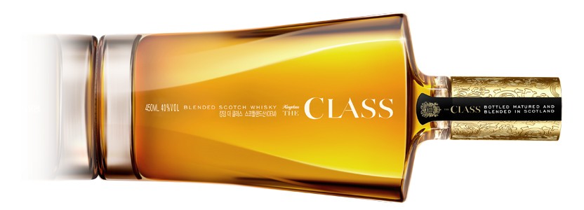
The main challenge with the project was to create a design of substance and structure, from scratch, without building off an existing product and according to the design agency this was achieved through “The holistic design of the bottle, graphics and branding.” The Class is a blended Scotch Whisky that's been designed to be mixed, and this is represented in the flowing lines, which converge together on the surface of the bottle. Perhaps the most striking element of the bottle's design, however, is the complete lack of a label. Instead, gold, vertical lettering has been applied through foil blocking, lending the design a minimalistic, modern bent that is highly visible without being off-putting.
The Class is a blended Scotch Whisky that's been designed to be mixed, and this is represented in the flowing lines, which converge together on the surface of the bottle
Neil Hirst, director of 3D Brand at Seymourpowell, says that the intention was to create “Something that would be distinct from the local competition while using a contemporary but familiar frame of reference.” He believes that the unique design of the bottle and the overall branding of the product “Reflects the aspirations of the target consumer, while retaining the familiar heritage and quality cues of the premium Scotch whisky.”
Perhaps the most striking element of the bottle's design is the complete lack of a label. Instead, gold, vertical lettering has been applied through foil blocking
JongSun Park, managing director of HiteJinro's wine and whisky division, meanwhile, feels that the launch of this new brand “Reflects the desire for a younger emotional product in the whisky market.” He adds that “The consumer age for whisky has dropped in the past few years,” and hopes that the elegant simplicity and premium design of the bottle will help attract these younger consumers. He believes that the new whisky “Will be a new trend in the Korean whisky market,” and also hopes it will “Encourage a new casual whisky drinking culture, replacing the old image of local whisky hostess bars.”
Official Seymourpowell Website
Benjamin Hiorns is a freelance writer and musician from Kidderminster in the UK who has just returned from a rather delightful 10 days in Turkey. Much whisky was consumed, most of it Scotch.