ad: Annual 2024 Now Open For Entries!
*

Rebrand Roundup: Tattoos, Music Festivals, Organic Tampons and other stories

Published by

Vbat – Foster's

**

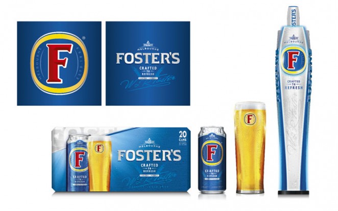
Ubiquitous lager brand Foster’s has been given a new packaging design and tweaked visual identity, which aims to give more precedence to its Australian history. The rebrand has been completed by Amsterdam-based branding consultancy Vbat, and includes a redrawn, serif “F” symbol, which now has slanted crosses and a thinner white outline. This sits within a redrawn gold roundel, which also has a thinner border. The branding retains the recognisable Foster’s “F,” which the agency now hopes will be more prominent to customers. The colour palette


This content is for members only

Click below to activate your Free Registration

Get Access

Already a member? Login here


Comments

More Leaders

*

Leaders

#Annual2024 – What the Judges want to see this year

After months spent sifting through some of the most creative work of the last year, Creativepool’s expert panel of judges are finally ready to pick the cream of the crop. This year’s expertly curated panel stands as our most diverse yet....

Posted by: Creativepool Editorial
*

Leaders

Are female board members more guilty of greenwashing?

With 72% of brands stating that one of their biggest fears is to be accused of greenwashing, Bec Peel looks at its impact on brands and how they can communicate sustainability issues with clarity. I’ve read a few reports recently on the...

Posted by: Continuous
*

Leaders

Regenerating London’s Commercial Quarter #BehindTheBrand

This week, we spoke to longtime Creativepool friend and SomeOne Founder Simon Manchipp, to discuss his agency’s visual identity for a bold new regenerative programme in London. What was the brief? Create a new comprehensive visual and verbal...

Posted by: Creativepool Editorial
ad: Annual 2024 Now Open For Entries!