*

Rebrand Roundup: Tattoos, Music Festivals, Organic Tampons and other stories

Published by

Vbat – Foster's

**

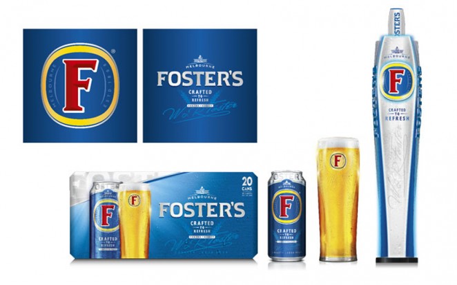
Ubiquitous lager brand Foster’s has been given a new packaging design and tweaked visual identity, which aims to give more precedence to its Australian history. The rebrand has been completed by Amsterdam-based branding consultancy Vbat, and includes a redrawn, serif “F” symbol, which now has slanted crosses and a thinner white outline. This sits within a redrawn gold roundel, which also has a thinner border. The branding retains the recognisable Foster’s “F,” which the agency now hopes will be more prominent to customers. The colour palette


This content is for members only

Click below to activate your Free Registration

Get Access

Already a member? Login here


Comments

More Leaders

*

Leaders

Navigating Growth and Change with Kimi Gilbert #GettingToKnow

In this insightful interview, we dive deep into the professional journey of Kimi Gilbert, a Managing Partner at Future Factory, a leading business development consultancy in London. With a career that spans over a decade at Future Factory, Kimi...

Posted by: Creativepool Editorial
ad: