*

Rebrand Roundup: Jersey, Whisky, the Roundhouse & More

Published by

Monotype – Transport for London**

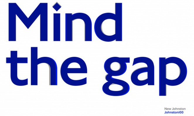
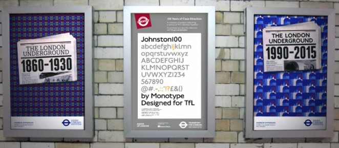
Monotype, the font and technology specialist, has updated the iconic Transport for London typeface to coincide with its centenary, featuring new hashtag, @ and ampersand signs. The new typeface, called “Johnston100,” comes a century after Edward Johnston’s original designs were introduced on London Underground, and almost 40 years after consultancy Banks & Miles brought in New Johnston, adding two new weights and accompanying italics for the full set. Johnston100, which aims to better reflect TfL’s role in the digital age, will be rolled out next


This content is for members only

Click below to activate your Free Registration

Get Access

Already a member? Login here


Comments

More Leaders

*

Leaders

Navigating Growth and Change with Kimi Gilbert #GettingToKnow

In this insightful interview, we dive deep into the professional journey of Kimi Gilbert, a Managing Partner at Future Factory, a leading business development consultancy in London. With a career that spans over a decade at Future Factory, Kimi...

Posted by: Creativepool Editorial
*

Leaders

#GettingToKnow Sibling Rivalry’s Bo Bishop

This week, we’re thrilled to sit down with Bo Bishop, Executive Director of Creative Strategy at Sibling Rivalry, whose approach to blending strategy with storytelling has made waves in the branding world. With a background in narrative fiction...

Posted by: Creativepool Editorial
ad: