ad: Annual 2024 Now Open For Entries!
*

Rebrand Roundup: From Kodak to Carluccio's

Published by

Work-Order – Kodak

***

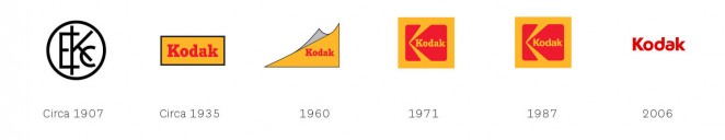
Kodak has redesigned its logo for the first time in a decade, opting to bring back a similar iteration of the iconic Kodak K first introduced in 1971. The New York-based studio Work-Order has designed the new identity, which features a graphic red K symbol set against a yellow background. But unlike the 1971 and 1987 iterations of the logo, which saw the word “Kodak” positioned horizontally within the red K, it is now written vertically within the new version. The new ident sees a marked change


This content is for members only

Click below to activate your Free Registration

Get Access

Already a member? Login here


Comments

More Leaders

*

Leaders

#Annual2024 – What the Judges want to see this year

After months spent sifting through some of the most creative work of the last year, Creativepool’s expert panel of judges are finally ready to pick the cream of the crop. This year’s expertly curated panel stands as our most diverse yet....

Posted by: Creativepool Editorial
*

Leaders

Are female board members more guilty of greenwashing?

With 72% of brands stating that one of their biggest fears is to be accused of greenwashing, Bec Peel looks at its impact on brands and how they can communicate sustainability issues with clarity. I’ve read a few reports recently on the...

Posted by: Continuous
*

Leaders

Regenerating London’s Commercial Quarter #BehindTheBrand

This week, we spoke to longtime Creativepool friend and SomeOne Founder Simon Manchipp, to discuss his agency’s visual identity for a bold new regenerative programme in London. What was the brief? Create a new comprehensive visual and verbal...

Posted by: Creativepool Editorial
ad: Annual 2024 Now Open For Entries!