*

Rebrand Roundup: From Kodak to Carluccio's

Published by

Work-Order – Kodak

***

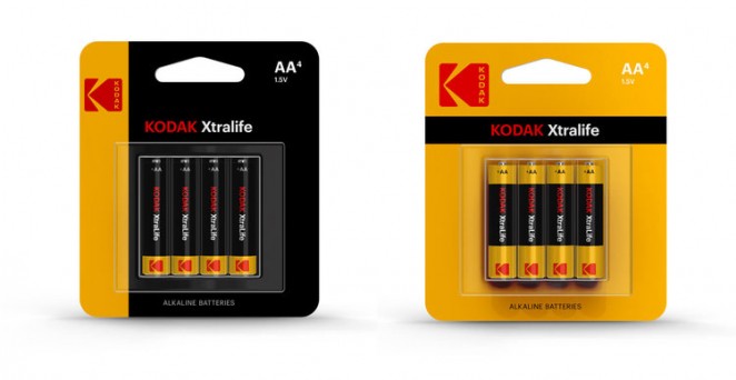
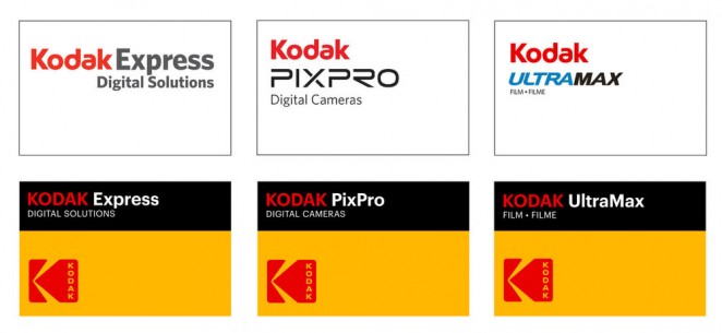
Kodak has redesigned its logo for the first time in a decade, opting to bring back a similar iteration of the iconic Kodak K first introduced in 1971. The New York-based studio Work-Order has designed the new identity, which features a graphic red K symbol set against a yellow background. But unlike the 1971 and 1987 iterations of the logo, which saw the word “Kodak” positioned horizontally within the red K, it is now written vertically within the new version. The new ident sees a marked change


This content is for members only

Click below to activate your Free Registration

Get Access

Already a member? Login here


Comments

More Leaders

*

Leaders

Navigating Growth and Change with Kimi Gilbert #GettingToKnow

In this insightful interview, we dive deep into the professional journey of Kimi Gilbert, a Managing Partner at Future Factory, a leading business development consultancy in London. With a career that spans over a decade at Future Factory, Kimi...

Posted by: Creativepool Editorial
*

Leaders

#GettingToKnow Sibling Rivalry’s Bo Bishop

This week, we’re thrilled to sit down with Bo Bishop, Executive Director of Creative Strategy at Sibling Rivalry, whose approach to blending strategy with storytelling has made waves in the branding world. With a background in narrative fiction...

Posted by: Creativepool Editorial
ad: