*

Rebrand Roundup: From KFC to Budweiser

Published by

Wolff Olins – Enel

*

*

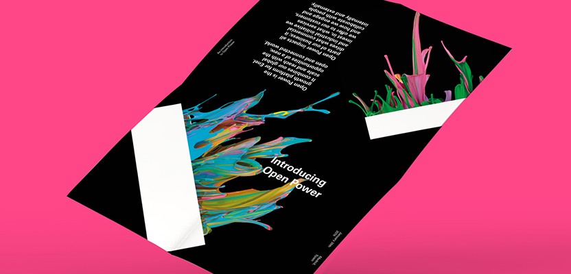
Wolff Olins has created a bold new brand identity for electricity and gas company Enel, which aims to mimic the idea of moving energy. To convey this message, each letter in the new logo includes a cursor that echoes a light bulb filament. When applied digitally, the cursor moves and evolves gradually to form words. The new visual identity, which is applied in various colours, replaces a blue, italicised sans-serif logotype with an orange tree icon. This new distinctive visual identity has been applied to


This content is for members only

Click below to activate your Free Registration

Get Access

Already a member? Login here


Comments

More Leaders

*

Leaders

Navigating Growth and Change with Kimi Gilbert #GettingToKnow

In this insightful interview, we dive deep into the professional journey of Kimi Gilbert, a Managing Partner at Future Factory, a leading business development consultancy in London. With a career that spans over a decade at Future Factory, Kimi...

Posted by: Creativepool Editorial
*

Leaders

#GettingToKnow Sibling Rivalry’s Bo Bishop

This week, we’re thrilled to sit down with Bo Bishop, Executive Director of Creative Strategy at Sibling Rivalry, whose approach to blending strategy with storytelling has made waves in the branding world. With a background in narrative fiction...

Posted by: Creativepool Editorial
ad: