ad: Annual 2024 Now Open For Entries!
*

Rebrand Roundup: From Kentucky to Outer Space

Published by

Beardwood & Co – Iron-Tek

**

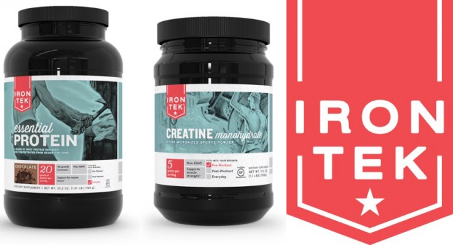
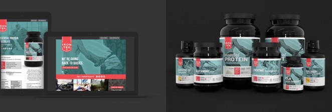
Beardwood & Co took inspiration from a classic American poster by Harold Von Schmidt for a packaging and ID rebrand of the Iron-Tek protein supplement range, in what its agency is referring to, rather boldly, as a “Fresh take on masculinity.” The branding uses the more classically masculine image of a muscular shirtless lumberjack cutting down a tree with a bandanna in his pocket, as well as other images of old-fashioned workers. The new look aims to close the disconnect between the garish, 1980s-looking meathead


This content is for members only

Click below to activate your Free Registration

Get Access

Already a member? Login here


Comments

More Leaders

*

Leaders

#Annual2024 – What the Judges want to see this year

After months spent sifting through some of the most creative work of the last year, Creativepool’s expert panel of judges are finally ready to pick the cream of the crop. This year’s expertly curated panel stands as our most diverse yet....

Posted by: Creativepool Editorial
ad: Annual 2024 Now Open For Entries!