
After Hewlett Packard announced its intention to split into two separate entities last October, the “Enterprise” arm was left without any real brand identity, and it's taken six months for the newly christened Hewlett Packard Enterprise to find itself, visually at least. The idea for the group was formed after HP decided to divide and conquer by letting one of the groups (HP Inc) focus on the company's bread and butter computer and printer business, and creating a new Enterprise group. This group will focus on corporate hardware and data storage, and HP claim it will “Define the next generation of technology infrastructure, software and services for the New Style of IT.” HP Inc, which will be led by Dion Weisler, is yet to unveil its own brand identity.
Hewlett Packard Enterprise CEO Meg Whitman unveiled a new logo for the company this week, six months after HP announced its intention to split into two companies
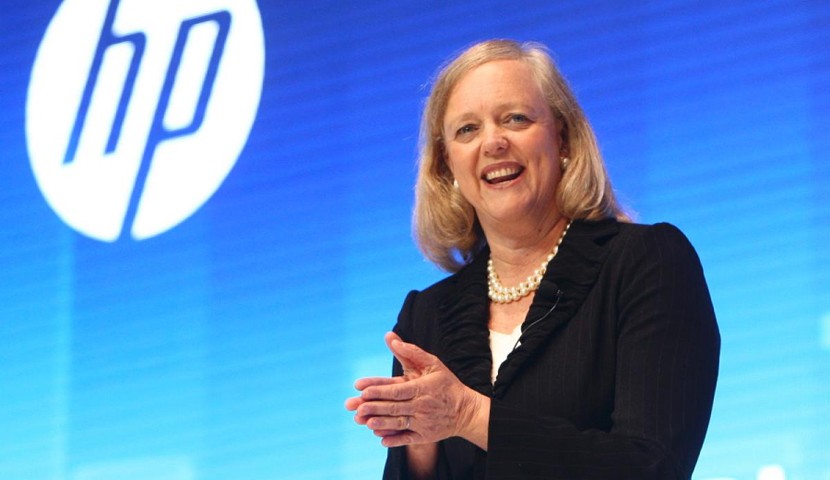
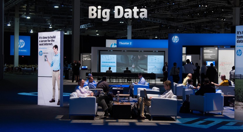
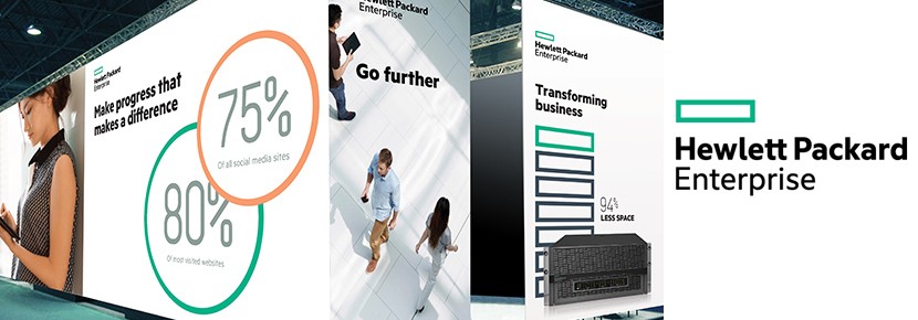
Behind-the-scenes design work at Hewlett Packard Enterprise has been going on since the planned split was announced, but this week president and chief executive Meg Whitman (the wealthiest woman in tech) finally unveiled something visible in the form of a new logo from the company's in-house design team. It's incredibly simple, some might argue a little dull, but Whitman admits that it's simple by design as it helps to underline what the company's business will be about; easy, simple and precise work, engineering and innovation. The company is made up of HP’s existing server, storage, networking and software service offerings with a focus on cloud, Big Data and mobile solutions.
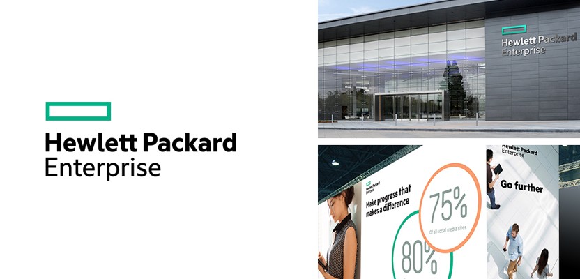
Whitman said the company is aiming for a “Singular and defining” brand identity that will “Stand out among customers”
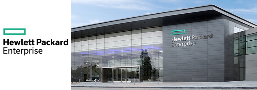
Whitman said the company is aiming for a “Singular and defining” brand identity that will “Stand out among customers.” The identity utilises a green rectangle above the Hewlett Packard Enterprise word-mark, which might look a little jarring, but was picked for that very reason, as Whitman feels it will help the company to stand apart not just from its sister company, but from the competition. She also explains that in the logo text, the two Ts connect for the first time in the company's history, a connection she feels is “Symbolic of the partnership” they intend to forge with their customers, partners and employees.
Hewlett Packard Enterprise is made up of HP’s existing server, storage, networking and software service offerings with a focus on cloud, Big Data and mobile solutions
She adds that to bring the (relatively) new company's ideals to life, they needed “A logo and a design system that would be singular and defining,” and a design that would express their “Renewed commitment to focus and simplicity.” She also feels that they needed a logo that would be “As transformative, flexible and agile” as the company is becoming. The design noticeably marks the return of the actual name Hewlett Packard to the company's branding, as until recently the HP logo simply used the lowercase initials.