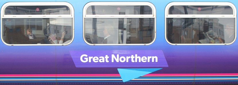
Govia Thameslink Railway (GTR), the biggest rail franchise in Britain, recently rolled out a new brand identity by SomeOne to bring the whole company in line with the recently rebranded South Eastern network. The train operating company, which also runs the Thameslink, Great Northern Services, as well as the Southern and Gatwick Express lines (which will both retain their existing identities), commissioned the rebranding in order to highlight its new direction and new connections, without forgetting it's older franchises.
Govia Thameslink Railway (GTR) recently rolled out a new brand identity by SomeOne

GTR operates around 22% of all passenger rail services in the UK, even though the brand itself has only been servicing the Thameslink and Great Northern lines for less than a year. Katy Taylor, group marketing director at GTR, believes that SomeOne succeeded in their goals. She said she found that the new look translated “Smoothly across the inherited estate of the previous franchise,” and that “The brand feels fresh and new,” demonstrating their commitment “To bringing new life to the Thameslink and Great Northern train lines.”
GTR operates around 22% of all passenger rail services in the UK
According to SomeOne executive creative director, Gary Holt, the idea behind bringing the design of the franchises together was to create a “Seamless journey” across the networks. The most obvious design features used in the rebranding is the “Helping hand” concept and the bold purple, pink, blue and white colour scheme. Holt said the colours had been chosen carefully to help link the Thameslink and Great Northern lines, and to fit in with the colour of previous branded stock, which will save “Considerable cost in having to repaint an entire fleet immediately.”
The most obvious design features used in the rebranding is the “Helping hand”
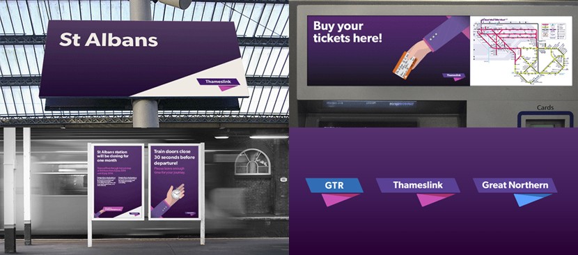
The “Helping hand” system, on the other hand (no pun intended), has been designed to aid communications for Southeastern Rail, with various sleeves and/or objects used to represent a different customer, staff member or action. It's clean, simple and immediately identifiable, and Holt also believes the hands act as a “Useful coherent branding element that can help travellers who cross networks.” He adds that, “Where previously they would simply be met by new and different identities, they are now met by a recognisable, useful helping hand, uniting what was previously separate.”