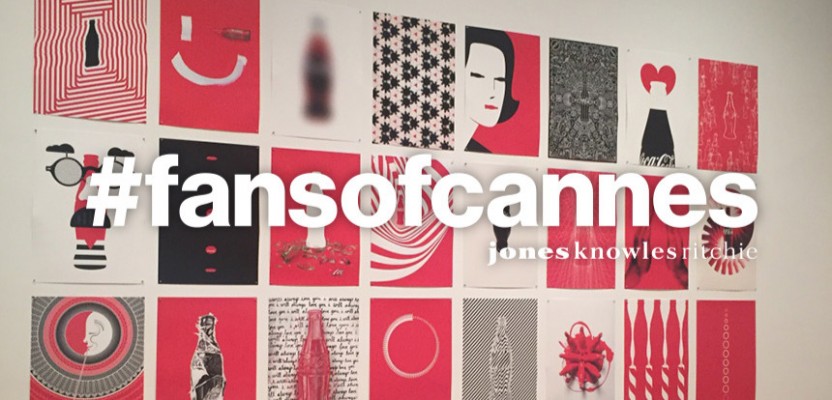
It’s not often that a brief is given to a broad set of industry creatives, each with their own distinct style and sense of expression, and for the output to be both artistically diverse, whilst sharing a striking consistency of spirit.
Yet that’s exactly what happened with Coca-Cola’s 100 years campaign which challenged artists, designers and illustrators around the world to recreate and reimagine vintage Coca-Cola bottle imagery and iconography using only three colours: Coke red, black and white. More than 130 artists from 15 countries responded with 250 plus pieces for the #MashupCoke project.
This celebration of the brand’s past reinterpreted for the future is just another example of the strength of Coca-Cola; a brand with such a powerful sense of self, that its charisma is not only ‘felt’ but actually understood to the point that it can be replicated time and again, with fresh consistency.
Surely this is the ultimate feat for any brand creator, and perhaps one of the best examples of branding in the modern age – collaborative, confident and charismatic.
By Rebecca Ford, Senior Brand Strategist, jkr London
Coca-Cola Icon Mashup (Cannes Lions Shortlist, 2015) Agency: Forpeople


