
Sibling Rivalry recently announced its new visual system reflecting two distinct sides of the company aligned under one holistic brand. Founded in New York in 2011, Sibling Rivalry is part brand studio and part production company. It delivers award-winning brand experiences for a client roster including HBO Max, BET, Google, and Audible. Sibling Rivalry’s holistic approach brings strategic thinking, story development, consideration of media and space, and multi-platform execution across the full lifecycle of the experience.
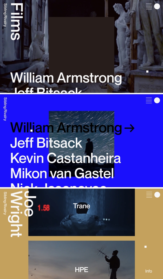
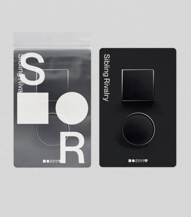
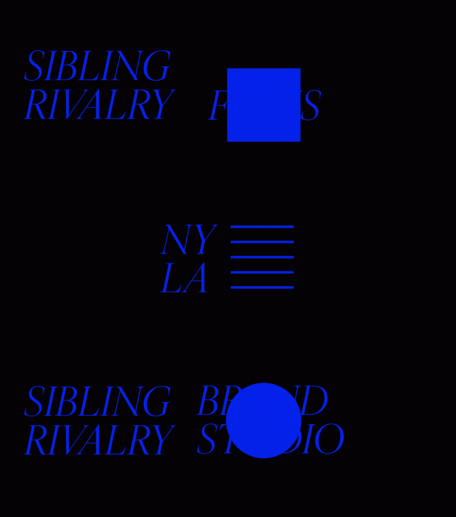
The new system brings the company’s two sides and skillsets together under one overarching look and feel, while allowing each side to retain its own distinct identity: the film production company is represented by a square, while a circle—alluding to a 360-degree working concept—depicts the brand studio. The site makes bold use of colour and content on the film side, with a greater emphasis on editorial for the brand studio.
To learn more and go behind the rebrand, we spoke to Joe Wright, Co-Founder and Chief Creative Officer, and Miro Sisma, Design Director, at Sibling Rivalry.
What was the brief for the rebrand? (Joe Wright)
As we evolve to meet the diverse needs of today’s industry, Sibling Rivalry needed a new brand that reflected our values as an inclusive, talent-driven company. It had to represent the diversity of skillsets and voices across the business, while also being a holistic brand that could live and breathe freely in its own right.
The rebrand was also about bringing the two sides of the company together. Rather than take an umbrella approach, we wanted to lean into the personalities of both our brand studio and production company, giving each their own identity under one brand.
How did the initial pitch/brainstorming phase go? (Joe Wright)
The first step was bringing the idea to our team and getting input from our staff. We wanted to invite as many creative opinions as possible—involve more Siblings—and refine this into the final outcome.
It was an open platform where our designers came together with ideas and concepts. We started with a bigger group and then distilled it down as we focused in on one approach.
Describe the purpose of the brand and its target audience (Miro Sisma)
Sibling Rivalry is part brand studio, part production company—with offices in New York and Los Angeles. We are proud to have partnered with clients including HBO Max, BET, Google, and Audible, applying a holistic approach through strategic thinking, story development, consideration of media and space, and multi-platform execution across the full lifecycle of the experience.
Our new visual system needed to reflect all parts of who we are, energizing our internal team whilst solidifying our identity to the industry and our clients.
What was your thinking behind the rebranding solution? (Miro Sisma)
It was about unifying our capabilities. The new system brings our company’s two distinct offerings together, creating a holistic system that allows each side to retain its own distinct identity.
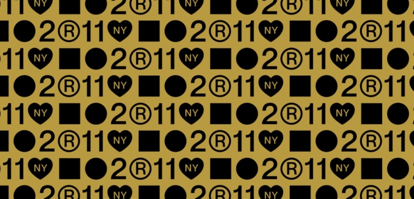
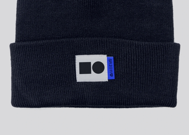
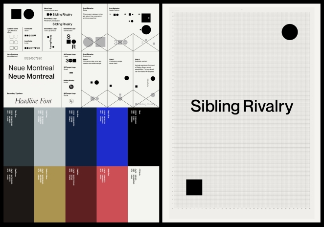
The film production company is represented by a square. This shape conveys a surface—more specifically an aspect ratio—inherent in the vernacular of film. A circle depicts the brand studio. This speaks to the studio’s comprehensive approach of building brands from the ground up; working on projects from ideation and naming to creative execution.
We also thought about how we could play off our name, Sibling Rivalry. There’s rivalry between our people but in a good way. We asked ourselves, ‘how can we communicate our diversity of opinions, and, visually the two different sides of the company?’ This is how we ended up with these two, simple shapes as the foundation of the identity system.
We questioned whether a square and a circle is ownable. But no one else is called Sibling Rivalry – these shapes have a deeper meaning for us. Each one is unique, but part of a family. So in this way, it makes a lot of sense. And when you combine this with what each shape stands for, it creates a strong system.
The modular elements can be combined with endless possibilities from reserved to playful, from literal to abstract—equipping our team with the tools and creative structure to fully and freely express themselves.
Did you learn anything new during the project? (Miro Sisma)
Designers are always learning, with every project and practice. This project emphasized the truth in the phrase ‘less is more’ and the power of simplicity. We also realized the brand is ever-evolving. When you look at it from a holistic viewpoint, at all the different iterations you can create, it takes on a whole range of personalities.
What was the biggest challenge? How did you overcome it? (Joe Wright)
As for any agency, it’s difficult to properly distill your offering. Everyone is trying to create this clarity of what exactly it is they can offer. Are you a design studio or brand consultancy? As we evolve, we have to constantly make it known to clients what we do, which is a complicated brief in itself.
It’s also harder doing projects for yourself than for your clients because you are naturally hypercritical: it’s a challenge to constantly look at the work with an outside perspective. Involving as many Siblings as possible throughout the ideation and design process helped to combat this.
What details are you most proud of and why? (Joe Wright)
What I really like is that once you understand the concept, the thoughtful approach behind it becomes visible. Yes, it’s simple, but it’s more academic than that. We’ve created a simple foundation that can be taken and used in a multitude of ways.
As you work more and more with the brand’s elements, you realize that the possibilities are almost endless. This is why it’s fundamentally an identity system, not a logo. The various ways the wordmark can be used in combination with the square and circle allow our creatives to express the brand in unique and interesting ways.
It’s almost as if you never see the same thing twice: it’s always changing, shifting. We work in a landscape where everything we do is in motion—not only our work and the design industry but the world. We all need to continually shift and evolve to stay relevant and keep up with the speed that culture is moving. Our new identity mirrors this constant state of flux.
What visual influences fuelled your solution? (Miro Sisma)
We were inspired a lot by minimalism and minimalist art—the works of artists Donald Judd, Ellsworth Kelly, and Sol LeWitt in particular—with a nod towards the modular geometrics of Bauhaus. We wanted something that wouldn’t date. If you think about great art, great design, it stands the test of time, bridging classic and contemporary.
What do you hope it achieves for the brand? (Joe Wright)
We wanted to design a system that our team could have ownership over. As a company founder, I hope it reflects and extends our values to inspire and encourage our team to evolve. The design system is an extension of these beliefs. We’re excited to see all the ways the team uses the brand to promote both the film production company and brand studio. We’re always evolving into something new, and so are our people.
What would you do differently if you could do it over again? (Miro Sisma)
Nothing and everything! :)
Credit list for the work?
Sibling Rivalry
- Joe Wright, Co-Founder/CCO
- Mikon van Gastel, Co-Founder/CEO
- Darren Foldes, Partner/Managing Director - Sibling Rivalry Films
- Joanna Fillie, Partner/Managing Director - Brand Studio
- Lauren Hartstone, Partner, Executive Creative Director
- Miroslav Sisma, Design Director
- Amber Park, Producer
- Pamela Olecki, Logo Designer
- Hoon Han, Animator
- Cassandra Delgado, Partnerships + Communications Director
- Becky Lau, Head of Strategy
- Alexandra Perpich, Associate Creative Director, Copy
- Wes Richardson, Animator
- Tevin Bloise, Junior Designer
Web Development
- Sean Herman, Herman Studio