
ad: Annual 2026 Shortlist Announced Soon
*

Rebrand Roundup: Tattoos, Music Festivals, Organic Tampons and other stories


Published

Vbat – Foster's

**

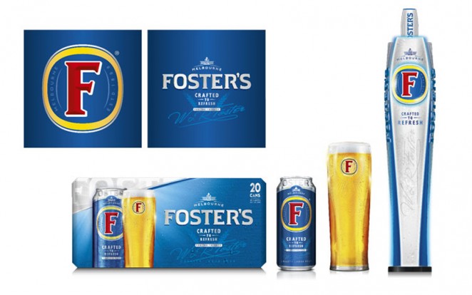
Ubiquitous lager brand Foster’s has been given a new packaging design and tweaked visual identity, which aims to give more precedence to its Australian history. The rebrand has been completed by Amsterdam-based branding consultancy Vbat, and includes a redrawn, serif “F” symbol, which now has slanted crosses and a thinner white outline. This sits within a redrawn gold roundel, which also has a thinner border. The branding retains the recognisable Foster’s “F,” which the agency now hopes will be more prominent to customers. The colour palette


 

This content is for members only

Click below to activate your Free Registration

Get Access

Already a member? Login here


Comments

More Leaders

*

Leaders

What Founders Lose By Not Building Brand

Let’s get this out of the way from the start: If you are building a company, you are building a brand. Each is the byproduct of the other. It cannot be otherwise. Most founders understand that investors expect a differentiated and compelling...

Posted by: Lysle Wickersham
ad: Annual 2026 Shortlist Announced Soon
ad: Hire Talent
ad:
ad: Hire Agencies