ad: Annual 2026 Shortlist Announced Soon
*

Rebrand Roundup: From the Premier League to Vietnam


Published

*Fable – Chen Nguyen

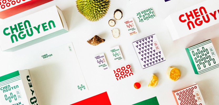
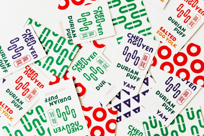
The Singapore-based consultancy Fable, has taken a simple design approach to a branding project for makers of Asian pastries, Chen Nguyen, which is distributed throughout Vietnam and China. Using elements inherent to the logotype, the letters “N” and “U” have been abstracted as basic shapes, and arranged in three ways to represent the three, flavours of pastry. So an oval shape represents durian fruit, a circle for salted egg, and a triangle for yam, with a mix of green, orange or purple accents also representing

 

This content is for members only

Click below to activate your Free Registration

Get Access

Already a member? Login here


Comments

More Leaders

*

Leaders

What Founders Lose By Not Building Brand

Let’s get this out of the way from the start: If you are building a company, you are building a brand. Each is the byproduct of the other. It cannot be otherwise. Most founders understand that investors expect a differentiated and compelling...

Posted by: Lysle Wickersham
ad: Annual 2026 Shortlist Announced Soon
ad: Hire Talent
ad: Hire Agencies
ad: