
I'm no statistician, but I can be fairly sure fewer people are watching movies at the cinema with every passing month. Netflix, Sky Movies, Film 4, downloads and DVDs are all conspiring to keep film buffs glued to the sofa and away from the big screen. That's before we factor in the fairly miserable, and wallet punishing experience of the glorified fast-food outlet that is the modern picture house. And we haven't even considered the chattering, phone-using, chomping and toilet-going punters with whom we are forced to share the auditorium.
Perhaps that's why our public transport, subways and hoardings are so populated with movie posters: spectacular displays, urging us to watch sequels of diminishing quality and largely unfunny frat-boy shenanigans. But, despite their prevalence, it's worth taking a closer look at those posters, because they contain some intriguing and quite puzzling elements.
Unfortunately, I'm not here to explain these conundrums, just to bring them to your attention. However, should you be in the possession of some little-known answers, please feel free to post them in the 'comments' section at the foot of this article.
'From The Producers Of ...'
This is a common Hollywood marketing gambit. By associating a new film with a previously successful title, the studio assumes they are more likely to lure you to the show. 'If you enjoyed some other flick, you'll love this one because the same producers were involved' - so runs the logic. Hang on, though. In movieland, producers aren't the creatives. Producers are largely responsible for the money, the facilities, the contracts and so on. They don't write the scripts, they don't cast the stars and they don't direct the action. So, can we believe every picture they 'produce' will be wonderful? As you've probably discovered, we cannot.
The Airbrush
We all know movie stars tend to be terribly vain. If you're prepared to share your face, in extreme close-up, with a few million viewers, I guess a bit of vanity doesn't do any harm. Nevertheless, when it comes to their glorious boat-races on the posters promoting their flicks, nothing less than 48 hours solid Photoshop work will do. Angelina Jolie is a good looking woman. Even if you grabbed an iPhone snap of her going past on an extremely fast bicycle, chances are she'd still be stupendously attractive. But a decent shot of Mrs. Pitt is deemed utterly insufficient for a poster. Before you paste those things to the side of a bus, you'll need to make sure she looks like a screenshot from an Adobe Creative Suite instruction manual. Why, exactly?
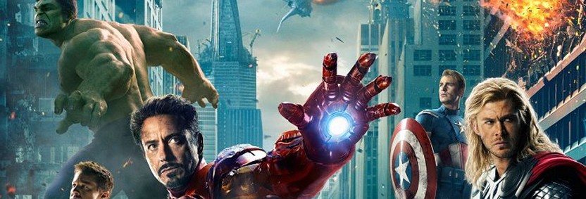
The Cast List
Now this one is a massive head-scratcher and always present in the marketing spreads for ensemble movies. There, in all their Photoshopped glory, are the supremely talented leads in some derivative blockbuster; lined up and stitched together in a suitably endearing pose. And above them, their names. Only, the name never corresponds with the figure below. Ever.
Of course, frequently, the order in which the starts are listed on posters is the result of furious argument and foot-stamping between fabulously wealthy LA agents. Sometimes, to quell rampant egos, it's all done alphabetically. But, once the pecking order has been established, why not create the visual line-up in the same sequence. Otherwise, there's a perilous possibility we'll take Nicole Kidman to be a large bloke with a beard. Which I don't think she is.
The Credits Font
Now look down. Just below all the whizz-bang graphics, and just above the release date, you'll see the credits. These don't include the caterers and carpenters, but may just stretch to the art director, or second unit director. And I use the word 'stretch' intentionally. Because, without fail, these details will be written in the most ludicrously vertical typeface. The characters deployed in this section would make most needles look broad and swollen. Presumably, this typography is designed to cram as much contractually necessary information into as small an area as possible. Unfortunately, it also has the effect of rendering the text completely illegible. Which, if you were in charge of 'special creature design' must be a bit of a disappointment.
Anyway, next time you're waiting for a train and gazing vacantly at a movie poster, see how many of these anomalies are present. And, if you can shed any light on these puzzles, I'd be delighted to hear from you.
Magnus Shaw is a blogger, consultant and copywriter


Owen Bailey November 15th, 2013, in the morning
I have never understood why the images of the actors and their names don't match up. What is that all about? It would make my day if someone had an answer to that one!