
Years ago, I wrote a piece for Creativepool suggesting the confused.com logo was a prime example of branding designed by a client. Looking for all the world like the worst clip-art available from the briefest Google image search, it featured a stick figure with wiggly lines for hair and a wiggly line for a mouth. Clearly intended to represent the word 'confused', it was chillingly shoddy and perplexingly cheap.
In my article, I guessed it would only be a few months before someone persuaded them to invest in something a bit more stylish and intelligent. I was right, but my timescale was out by a few years. In the meantime, the comparison site actually went in the other direction, turning that nasty cartoon into an animated character, which sang and danced across our screens for months on end. Usually to a re-worded version of The Village People's 'YMCA'. Grim.
Interestingly, my initial theory was also correct. All Confused's branding and marketing is conceived and developed in-house at their Cardiff office. Perhaps that's why it has taken so long to ditch the wiggly-haired lady and adopt a more sober emblem - something the company has recently done.
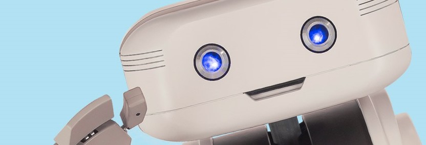
Alongside this swing from the ridiculous to the predictable (the new logo is as anonymous as the previous execution was infantile), the firm has launched a fresh TV campaign. The overly vigorous animated spectaculars have been replaced by a 'comedy' robot called Brian.
Setting aside my cynicism and sheer weariness at the tendency for campaigns to target adults with executions better designed for six year olds, I can't help wondering whether the brand is a bit ... er ... confused.
To move so determinedly and rapidly from bright colours, loud music and energetic movement, to a rather low-key, muted and ironic concept (Brian is hardly invigorating, resembling a spoof robot from 'The Fast Show'), makes me think Confused are unsure of their target audience. It's not that I don't like Brian - he's quite sweet. I'm just struggling to understand what he says about Confused. He's very clumsy and low-tech - a strange ambassador for a website which claims to be super simple and tremendously efficient. We also see Brian inadvertently annoying the people he approaches. Is this really a winning personification for the site? And, at a more basic level, does an audience which responds well to fast-moving cartoons also react positively to a gloomy, Marvin-like, machine?
While I was researching this piece, I took a trip over to Confused.com, expecting to find a homepage dominated by Brian and his calculating abilities. Surprisingly, he's hardly visible at all. There's a modest box about halfway down the screen, inviting us to apply for a quote - Brian is in the background. He crops up in a smaller box further down the page too. And that's it. The most prominent picture on Confused's front page is a boring, white car.
This smacks of a failure of confidence in the new brand style. If I felt my TV spots were genuinely appealing and compelling, I'd ensure my website reflected it in a big way. Confused seem less sure.
I wouldn't go as far as to say businesses should never do their own creative work (although I'd come close), but in this case I do believe Confused.com would benefit from the insight and expertise of an agency. That way, they'd avoid the hazard of producing ads that may appeal to their marketing folk, but are somewhat baffling to the consumer. In short, they'd avoid brand confusion.
Magnus Shaw is a copywriter, blogger and consultant


Magnus Shaw February 4th, 2014, around noon
Thank you, gents. Didn't realise Publicis were involved, Ben. Rather contradicts the claim on the Confused site.