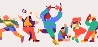

Brand expression agency Taxi Studio has collaborated with Mars Wrigley’s much-loved confectionery brand Celebrations to deliver one of the most significant rebrands in its 25-year history. The revitalised identity works to cement Celebrations as a treat choice for 365 days of the year – not just for Christmas.
From its initial launch in the 90s, Celebrations was a disruptor in the confectionery category and soon became a beloved household name. Seeing a tub of the chocolates in-store became almost synonymous with the arrival of Christmas. However, it struggled to retain relevancy in a market that was becoming increasingly crowded.
Overshadowed by its constituent brands, Taxi Studio saw the need to bring Celebrations into its own unique identity to drive more equity into the core of the brand. By modernising the brand and making it more progressive, Celebrations finds relevance with a younger, tech savvy audience who are increasingly engaging with brands in the digital world and want the excitement and diversity of product.
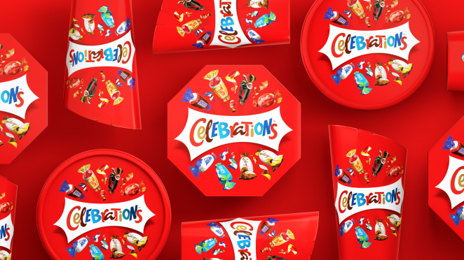
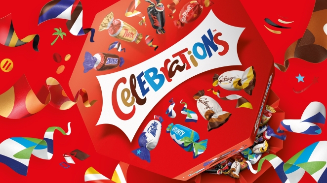
Taxi Studio distilled and amplified the design equities of the constituent brands, translating the familiarity of each iconic chocolate into a distinctive visual language to create Celebrations new look and feel.
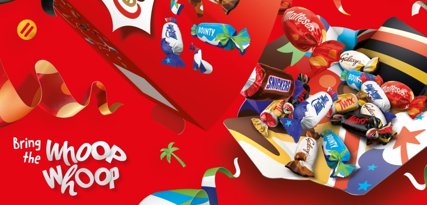
Bursting from the pack, there is a sense of dynamism and energy interspersed between iconised depictions of the wrappers to unify the disparate brands. Together, they create a more streamlined expression, with the Celebrations master brand mark as the central focal point.
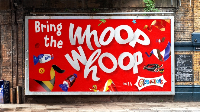
The new identity works to elevate Celebrations’ inviting and playful brand personality, re-engaging with consumers to help them share new moments and joy with others. It reappraises what ‘celebration’ actually means, to become the definitive chocolate brand to accommodate endless sharing and celebratory moments.
According to Ryan Wills, CEO and Founder at Taxi Studio, “Celebrations, by definition, is about being bold in marking a festivity or occasion, so this brand expression needs to communicate and evoke this feeling through every touch point.” We caught up with Ryan to learn more and go deeper behind the rebrand.
What was the brief for the rebrand?
Our brief was to reposition Celebrations in customers' minds as the confectionery brand to commemorate special moments all year round, invite a younger-tech savvy audience to the party, and drive equity into celebrations beyond the component brands.
Describe the purpose of the brand and its target audience
Celebrations, by definition, is about being bold in marking a festivity or occasion, so this brand expression needs to communicate and evoke this feeling through every touch point.
The interaction with the brand and box is an opportunity to remind consumers of the universality of festivities. It's not just about Christmas - it's about finding joy and celebration in mundane moments of togetherness and creating distinctive memory structures that reinforce these associations.
By modernising the Celebrations brand and making it more progressive, Celebrations finds relevance with a younger, tech-savvy audience who are increasingly engaging with brands in the digital world and want the excitement and diversity of product.
What was your thinking behind the rebranding solution?
We distilled and modernised the design equities of the constituent brands, translating the familiarity of each iconic chocolate into a distinctive visual language to create Celebration's new brand expression.
Bursting from the pack, there is a sense of dynamism and energy interspersed between iconised depictions of the wrappers to unify the disparate brands. Together, they create a more streamlined expression, with the Celebrations master brand mark as the central focal point.
The new identity elevates Celebrations' inviting and playful brand personality. By reappraising what 'celebration' actually means, Celebrations will become the definitive confectionery brand to accommodate endless sharing and celebratory moments.
Did you learn anything new during the project?
This was one of the projects we were working on when the UK went into lockdown in 2020. We had to adapt quickly to being thrust into working from home overnight, all whilst trying to maintain our collaborative culture and deliver work for our clients.
Our team were fantastic – demonstrating both resilience and flexibility. As a result, the spirit of the agency survived whilst everyone was working remotely, and it didn’t hinder our ability to produce beautiful work.
My most significant learning was just that – there are new and flexible ways of working which we’re practicing today at Taxi. Working together in the studio is an important aspect of the creative process. Still, there’s room for flexibility and adaptation of the ‘Monday to Friday at the office’ working model.
What was the biggest challenge? How did you overcome it?
The biggest challenge was evolving the constituent brands enough to produce new visual assets that would create a refined and modern look and feel for Celebrations. Each component brand has vast legacy, and we were essentially racing through the evolution of these brands.
It was a delicate balance to strike, ensuring that the assets drove equity back into the Celebrations Masterbrand whilst remaining distinctive and true to their origins.
We overcame this challenge by remaining true to the component brand’s heritage, while simplifying the visual footprint to ultimately drive equity into the celebrations master brand.
What kit/tools/software were used to create it?
The usual Adobe suite and Cinema 4D.
What details are you most proud of and why?
I’m most proud of the overall modernisation of the brand and the reduction of the visual noise of the old design, which hadn’t dated well. The modernised and simplified details are what make the new design.
What visual influences fueled your solution?
As designers, we’re influenced by everything, taking inspiration from within the design world and specific categories, but also from everyday life.
For this brand in particular, the component brands drove our visual influence for the brand rejuvenation.
What do you hope it achieves for the brand?
I hope that this rebrand forces reappraisal with consumers new and old, and drives consumption beyond the festive period – allowing Celebrations to become the brand of all celebrations – be that your child’s first goal at football or simply commemorating a great day at work.
What would you do differently if you could do it over again?
Honestly, nothing. We went through an extensive and positive process – from initially winning the pitch to working with a great client who understood the design process and empowered us to do our jobs whilst supporting and challenging where necessary.