
Branding agency Lantern recently created a new campaign and brand refresh for Digital Isle of Man, showcasing the island as a centre of digital innovation.
Brought on to bring the community lifestyle and natural landscape of the island to life, Lantern’s brand refresh highlights the unique ecosystem on the island and demonstrates the Isle of Man as the perfect place for the technology sector to flourish – a destination that is filled with, and welcomes, “open minds”.
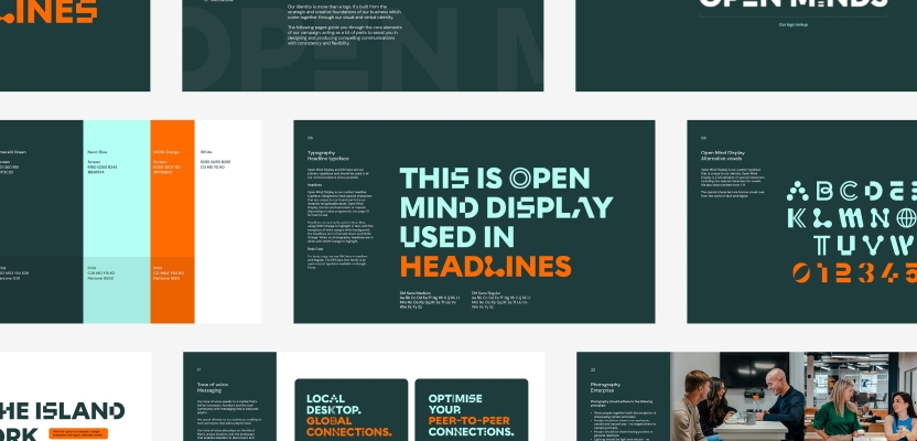
The appreciation of the technology sector is emphasised through the unique typeface designed by Lantern, in which every character of the alphabet has been created to reflect technology or collaboration.
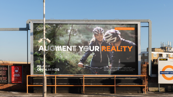
Used alongside neon blue and bright orange campaign colours, the design captures the personality of the island as one for design pioneers who “build the metaverse in the biosphere” by day and get on their paddleboards by night.
To learn more, we spoke to Lantern Director, Ryan Tym.
What was the brief for the rebrand?
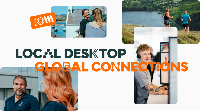
As well as being a haven for wildlife, the Isle of Man is home to a thriving hub for digital businesses, attracting talent from all over the world. We were appointed to define and amplify this strategic position, alongside a creative identity promoting the island as the perfect place for the technology sector to flourish.
How did the initial pitch/brainstorming phase go?
Digital Isle of Man reached out after seeing our place and destination branding work - approaching us to submit a proposal during the RFP phase. We presented a creative strategy based on ‘The Isle of Independent Minds’, this evolved into the ‘Isle of Open Minds’ to address concerns that ‘independent’ could feel isolating and not reflective enough of the close-knit, collaborative tech community on the island.
Describe the purpose of the brand and its target audience
A new campaign and strategic positioning statement for Digital Isle of Man was needed to attract talent and investment. Digital Isle of Man acts as a conduit between industry and government, helping to navigate doing business in the Isle of Man, with expert-led assistance every step of the way.
Digital Isle of Man strives to develop Isle of Man’s tech industry by continuously improving their offering and creating an environment that remains appealing to companies looking to establish as well as growing in a jurisdiction, offering a fantastic platform to secure B2B partners, investment, or financial services.
What was your thinking behind the rebranding solution?
Whilst digital businesses are diverse and varied, they are unified by a mindset of openness. Something that is also shared by the island itself. The Isle of Open Minds positions the Isle of Man as a place of innovation for digital businesses of all shapes and sizes. The campaign identity is set in the brand’s bespoke typeface showcasing the Isle of Man’s collaborative and supportive digital environment.
Brought on to bring the community lifestyle and natural landscape of the island to life, our brand refresh highlights the unique ecosystem on the island and demonstrates the Isle of Man as the perfect place for the technology sector to flourish – a destination that is filled with, and welcomes, “open minds”.
What was the biggest challenge? How did you overcome it?
The development of the typeface itself had a few challenges in terms of automating random character changes at appropriate intervals. It was then a technical challenge getting this to work across the different software, from InDesign to PowerPoint. However, by working with expert type designer Lewis MacDonald to execute it, we navigated the issue effectively.
What kit/tools/software were used to create it?
The bespoke characters were designed in Adobe Illustrator, based on the typeface Chromatica. Lewis then finalised this by turning the characters into an Open Typeface.
What visual influences fueled your solution?
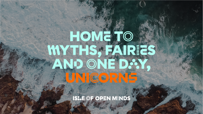
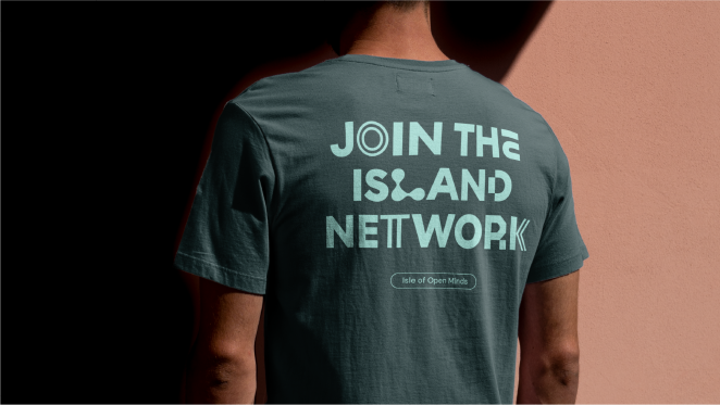
A custom typeface celebrates an appreciation of the technology sector, in which every character of the alphabet has been created to reflect technology or collaboration. For example, the “O” is seen as a power button and an “I” made up of three dots that look like a loading icon.
It’s a digitised twist on Visit Isle of Man’s typeface, which reflects the history and mythology of the island through runes. The campaign colours – neon blue and bright orange – are bold and vibrant, also inspired by the technology sector.
What do you hope it achieves for the brand?
There is hope that the campaign can challenge people’s perceptions of Isle of as an isolated island - repositioning the island as a hub for digital innovation, showcasing its’ close-knit tech community.
Credit list for the work?
- Ryan Tym, Director
- Henry Brown, Design Director
- Mollie Kendell, Designer
- Lewis MacDonald, Type Designer
- Gerard Ivall, Copywriter