
In the years of consumer excess that dominated most of the 20th Century, a premium brand had to be exclusive, ostentatious and downright unaffordable for the average man in the street. The premium label was the reserved for the luxury goods and the likes of Rolex, Jaguar and Dom Pérignon. These brands were owned by an exclusive club of the few who could afford them and a mere aspiration for those who couldn't.

Brands like Dom Perignon and Rolex have a quintessentially luxurious heritage.
Things have changed. In the age of the individual, premium products are no longer ostentatious items of desire but everyday luxuries that make consumers feel good. This can mean anything from pet food to deodorant to table salt. Want to take your brand to a premium place?
Here are the three major pathways to designing democratic desirability:
1. Simplicity
To give your brand a premium look and feel, it needs a certain sleekness, sophistication or the merest suggestion of chic. That means clean lines and minimalism in a category where the ‘everyday’ offerings are covered in busy graphics and bright colour. If you want to make a statement about your products superior quality, an understatement is the only one you need.

Though these pack designs are just concepts, they do a great job of showcasing premiumisation happening through pure simplicity.
2. Create Luxury Through Choice
An intuitive way of making consumers instantly connect a product with ‘premium-ness’ is to position it as part of a range. When premium products are all about personal choice, creating space in your portfolio for something special and a little set apart from your core offering can work wonders by inspiring consumers to treat themselves.
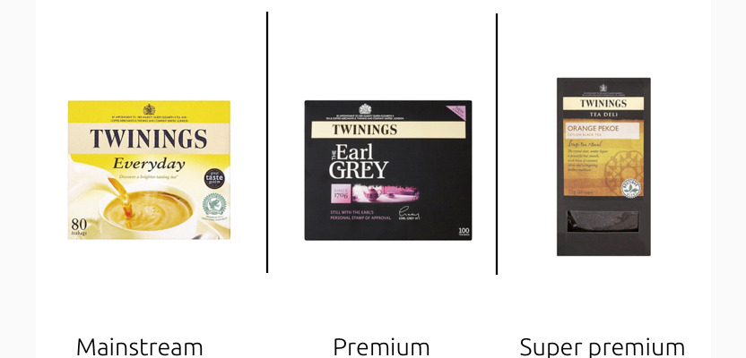
Twinings Earl Grey (middle of the range) is designed with premium cues and sits in the middle of the range. As a result the Tea Deli products at the summit of the range become super-premium in relative terms.

Johnnie Walker's whisky range is a great example of how changing colour, typography, bottle shape and graphics can heighten premium appeal gradually through severa tiers.
3. A Compelling Narrative
Stories are what make us human. Brands that connect you to a person, place, event or something bigger are always more likely to be perceived as premium because a personal connection is a rare commodity.

Warner Edwards is an Anglo-Welsh artisan gin with a unique brand story. The compelling tale is told through design on the pack. A weather vane represents several aspects of the brand story as it points west to east, from Wales to England, and from Warner to Edwards. Atop the vane, the Welsh dragon shares a glass with the English lion. This central lock-up is crowned with the brand motto “United in Spirit”, an entertaining wordplay encapsulating the rich brand story of Warner Edwards.