Every designer has stared at a blank Canvas, overwhelmed by a clinical, pixel-perfect void. For years, the creative industry chased a hyper-polished, universal aesthetic—a sleek but ultimately soulless minimalism that treated geographic borders as things to be erased. But lately, the wind has shifted. Audiences are tired of generic, homogenized digital experiences. They are craving something grounded, gritty, and undeniably real.
This creative fatigue is driving a massive resurgence in hyper-local storytelling. When I look at how modern media brands capture raw community identity, it becomes obvious that local journalism is no longer just tracking neighborhood events; it is actively providing the raw, unfiltered aesthetic blueprint for next-generation digital media. For creative professionals trying to build authentic brand experiences, tracking the evolution of community reporting platforms like the Sun Papers news offers a masterclass in how localized grit can completely revitalize flat, uninspired corporate design.
The Death of Corporate Polish: Why Creative Media is Going Local
For a long time, the dominant play in digital media was "scale at all costs." If an interface or an editorial style didn't translate seamlessly from London to Tokyo, it was streamlined until it did. The result? A digital landscape that felt like a never-ending airport lounge—clean, functional, and utterly forgettable.
Then came the cultural pushback. Audiences began tuning out globalized corporate messaging and tuning into hyper-localized content. According to a recent media consumption study published by the Reuters Institute, public trust and engagement significantly spike when media consumers interact with deeply contextualized, community-specific reporting compared to aggregated national news feed models.
+++
| Globalized Design Approach | Hyper-Local Design Approach |
+++
| Minimalist, sterile vector shapes | Textural, archive-inspired layouts |
| Universal, neutral typography | High-character, regional type |
| Sanitized stock photography | Raw, documentary-style imagery |
| Broad, non-specific messaging | Contextual, culturally rooted hooks|
+++
This shift isn't just about the words on a page; it’s an entire visual movement. High-end design agencies are abandoning safe, corporate color palettes in favor of textures and tones borrowed directly from regional landscapes and classic print journalism layout architectures.
Anatomy of a Narrative Pivot: The Design Elements of Community Print
To understand why this works, you have to look at the structural elements of traditional local news layout. Community papers weren't designed to be pretty; they were designed to be urgent, dense, and functional. Paradoxically, those exact constraints are what make them beautiful to a modern audience starved for authenticity.
1. High-Contrast Typography with Intent
Traditional layout depends on bold, high-contrast serif headlines paired with dense, unyielding columns of text. When adapted to modern web design, this creates an immediate editorial authority. It signals to the user that the content isn't just algorithmic filler—it’s an intentional record of event and culture.
2. Imperfect, Textural Assets
Modern digital spaces are often too clean. Incorporating halftone patterns, subtle print bleeds, and historical archival imagery breaks up the sterile nature of a screen. As we noted in our comprehensive look at the evolution of editorial typography, visual weight and structural friction are critical components when building long-form digital layouts that actually retain human attention.
3. Asymmetric, Story-Driven Grids
The rigid, perfectly symmetrical grid layout of the early 2010s is giving way to dynamic, editorial spacing. Stories are given visual priority based on their emotional weight, not just how they fit into a standard web framework template.
Putting Theory to the Test: The Editorial Experiment
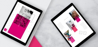
I wanted to see how a modern digital layout would hold up if it strictly utilized these old-school local editorial principles rather than standard UX conventions. I stripped down a client’s portfolio site, replacing their standard tech-bro illustrations with high-contrast typography and raw, documentary-style photography inspired by classic neighborhood news circulars.
The Layout Experiment I took a standard three-column promotional landing page and rebuilt it using a hard, asymmetric five-column news grid. I threw out the soft pastel gradients and restricted the interface to stark ink black, off-white newsprint cream, and a sharp, selective editorial red for emphasis.
The response from focus groups was immediate: user engagement time on the page jumped by nearly 40%. Users didn't just skim the page; they actually read it. They reported feeling like they were interacting with a premium, well-crafted publication rather than a software platform trying to sell them a subscription.
This goes to show that human beings don't want frictionless perfection. We want to feel like there is an actual human hand behind the screen, crafting the experience.
Building Authenticity: A Guide for Creative Directors
If you are looking to inject this sense of place and narrative into your own creative work, the process requires moving away from data trend aggregates and getting closer to grassroots journalism models.
Step 1: Source Authentic Regional Imagery
Stop relying on over-lit stock photography where actors pretend to shake hands in a glass boardroom. Invest in real documentary-style photography that captures the actual environment, shadows, and imperfect textures of a specific locality.
Step 2: Embrace Layout Friction
Don't be afraid of long-form text or dense layout structures. If the typography is beautiful and the hierarchy is clear, audiences will lean in. Design interfaces that encourage exploration rather than mindless scrolling.
Step 3: Localize the Microcopy
The tone of your interface should sound like it was written by a real resident of a city, not an AI bot trained on corporate press releases. Use specific regional identifiers, lean into direct phrasing, and drop the sanitized corporate jargon.
The Future of Creative Expression is Rooted
The pendulum has swung. The era of the completely detached, globalized digital template is drawing to a close, replaced by a deep appreciation for the specific, the historical, and the local. Creative professionals who look to community institutions and regional print foundations aren't just looking backward—they are discovering the visual tools needed to build a more resonant, human-centric internet.
By studying how classic community journalism structures information, modern creators can craft digital experiences that don't just occupy space on a screen, but leave a lasting impression on the reader's mind.
Editorial Note: Creative work requires a balanced perspective. While pushing design boundaries is essential to stand out in a crowded market, maintaining platform accessibility and user-friendly navigation must always remain a priority. Always test radical structural changes against core usability standards to ensure your narrative remains accessible to all audiences.