
Dan Mather is an independent silkscreen printer and graphic designer, he creates printworks borne of passion and precision; all of which stem from his motto: 'For the love of print'.
Hi Dan, first of all, how would you sum up your work?
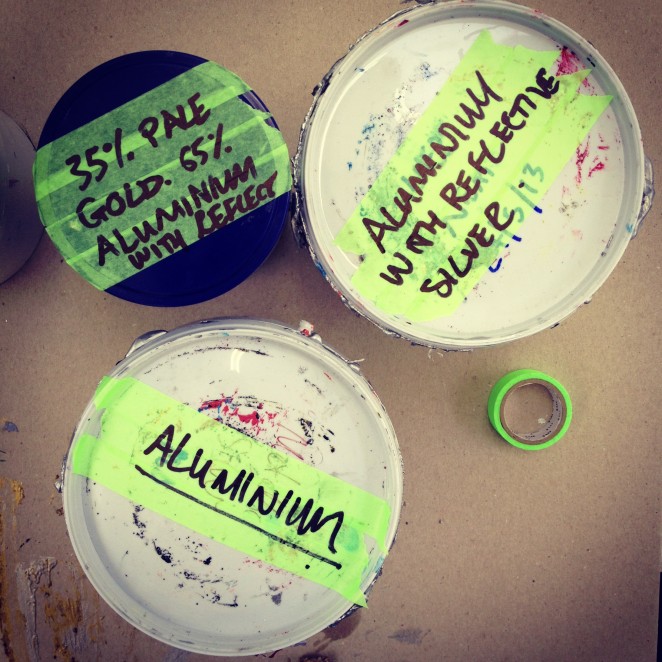
I collaborate closely with graphic designers and illustrators, and I specialise in water-based and hand-printed editioning. I’m a conscientious screen printer and take great care in producing the best print possible, at all costs. I work by myself from a shared print studio and do it for the love of print!
It’s been a privilege to work with people like Apple, Bicycling Magazine, Design Museum, Dixon Baxi, Fontsmith, Made Thought, Premier League and Rapha among others. I always look forward to establishing new relationships with people and the projects they bring.
What would you be doing if you weren't screen printing?
I’d probably still be working in graphic design. I like to keep my foot in the water, freelancing in-house now and again, and I like to work amongst other creatives in a studio environment on occasion.
Tell us, how do you keep your ideas fresh?
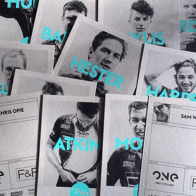
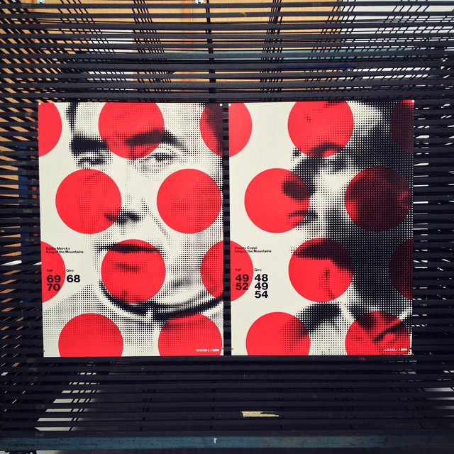
Most of my personal work has a strong cycling theme to it and many of my ideas come from watching races, reading articles and listening to interviews; picking up on metaphors and idioms I like the sound of. I love the world of cycling as viewed from behind the bike, and I try to create work that references cycling, but isn’t explicitly about bikes.
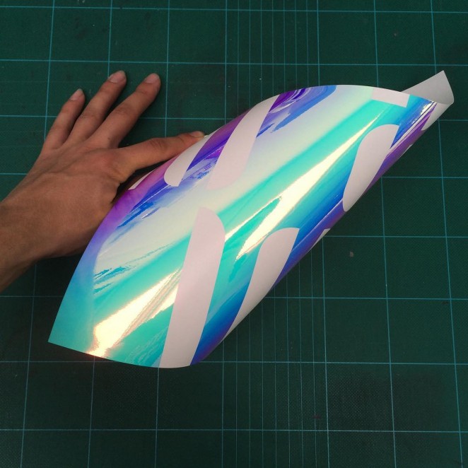
From a print perspective, I think working in the medium of screenprint helps a lot with how an idea visually develops. Physically printing and observing how a particular print method looks in the actuality of ink on paper, contributes heavily to any design process I undertake.
What are you currently working on?
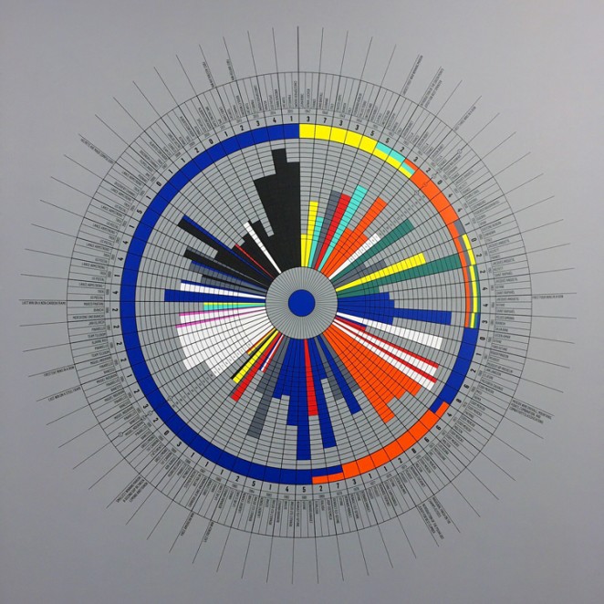
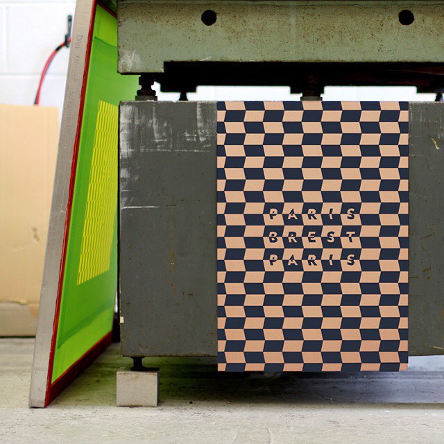
Lots! The majority of it is print work. I’ve just completed a new edition for Massif Central which pushed the limit on stroke weight and point size, resulting in a 0.176mm line and 4pt type in metallic gold. I’m so proud of that. Next up is a two-colour poster of a very well known logo that I can’t say anymore about at the moment, but you’ll see it in a few weeks. After that is poster for Look Mum No Hands! which promises to be very eye-popping. Then some experimental screenprints using ink that reacts to daylight for another client, that’ll be a very exciting poster.
I’m also working with Wimbledon College of Art on a project for their Degree Show, and in-between commercial projects I’m finding the time to complete Printed Mather. Printed Mather will be a limited edition, unique collection of A6 crops exemplifying different inks, papers and print techniques achievable through water-based screenprint. Collated from crops of posters I’ve spent the past five years printing, I couldn’t think of a better way to demonstrate my work than to let the screenprint speak for itself. Follow me on Instagram for updates!
What’s the best type of brief?
A considered one. I find working with the client is the best way to create a brief. The client has a rough idea of what they want, but sitting down with them and going through every aspect will deliver more than they could have imagined.

Finally, what are your top five favourite or most visited websites?
Believe it or not I don’t really follow any websites. I look at Instagram daily and find that a much nicer way of seeing what people are up to. Companies like G.F Smith, Arjowiggins, Progress Packaging, Creative Review, Eye Magazine and Dezeen are firm favourites.