

For any brand, identity is everything and while a part of that identity is always going to be decided by the public, a great deal of it is cultivated by a branding team who set out to guide the opinions of the population.
However, not all rebranding efforts yield the desired results. In fact, some incredibly popular brands have experienced spectacular rebranding failures that offer valuable lessons, so history is not doomed to repeat itself.
Let's explore some historic rebrand fails and understand what we can learn from them.
Tropicana: The $35 Million Packaging Debacle
In 2009, Tropicana, a well-known orange juice brand, decided to redesign its packaging. The familiar image of an orange with a straw was replaced with a minimalist design featuring a glass of juice and a vertical logo. While the intention was to modernize the brand, the new packaging was met with widespread criticism. Consumers found it bland and unrecognizable, leading to a 20% drop in sales within two months. Tropicana quickly reverted to its original design, but not before suffering a $30 million loss.
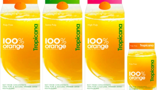
Lessons Learned: Emotional connections with brand elements are powerful. Drastic changes can alienate loyal customers. A thorough market analysis and consumer feedback are crucial before making significant design changes.
Gap: A Short-Lived Logo
In 2010, clothing retailer Gap attempted to update its classic blue box logo to a more contemporary design. The new logo featured a simple, Helvetica font with a small blue square, which many consumers felt was generic and uninspiring. The backlash on social media was immediate and intense, forcing Gap to revert to its original logo within six days.

Lessons Learned: A strong brand identity should be preserved, not discarded. Listening to customer feedback is essential, and changes should align with brand values and customer expectations.
British Petroleum (BP): Misaligned Values
BP's rebranding in 2000 aimed to highlight the company's commitment to environmental sustainability. They introduced a new logo featuring a green and yellow "Helios" symbol. However, the new brand identity was seen as hypocritical, especially in light of BP's ongoing oil drilling activities. The logo's credibility took a further hit following the disastrous Deepwater Horizon oil spill in 2010, which severely damaged BP's reputation.
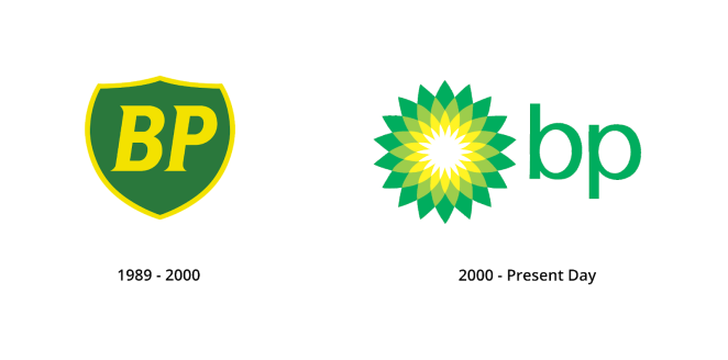
Lessons Learned: Rebranding efforts must be authentic and align with the company's actions and values. Inconsistent messaging can lead to public distrust and backlash.
Leeds United: Ignoring Tradition
In 2018, Leeds United, a historic English football club, unveiled a new emblem to mark their centenary. The new logo featured a stylized "Leeds Salute," but omitted traditional elements like the white rose and the club's initials. Fans reacted negatively, feeling that the new design lacked historical significance and emotional resonance. Over 77,000 fans signed a petition against the new logo, prompting the club to revert to their original emblem.

Lessons Learned: For institutions with deep-rooted traditions, preserving historical and emotional elements in branding is crucial. Engaging with the community and stakeholders is essential to avoid backlash.
Syfy: Lost in Translation
In 2009, the Sci-Fi Channel rebranded itself as Syfy to modernize its image and appeal to a broader audience. However, the new name was problematic in several languages, including Polish, where "Syfy" sounded similar to an offensive term. The rebranding also failed to resonate with long-time fans of the channel. Despite the criticism, Syfy retained the new name and logo, leading to ongoing ridicule and confusion.

Lessons Learned: Global brands must consider cultural and linguistic implications when rebranding. Extensive research and testing can help avoid unintended negative connotations.
Final Thoughts
Rebranding can be a powerful tool for refreshing a company's image and staying relevant. However, these historic rebranding failures highlight the importance of understanding and respecting the emotional connections consumers have with a brand.
Before engaging in any rebranding efforts, brands and their agencies alike must conduct thorough research, engage with their audience, and ensure that any changes align with their core values and mission. By learning from these mistakes, they can avoid some of the costly blunders detailed above and successfully navigate the often complex and deceptively delicate process of rebranding.
Header image by James Birks