


In an age where products jostle for attention on both the shelf and social media, packaging has had to evolve far beyond mere protection. It can be storytelling, experience or even performance art. From upcycling waste into new containers to turning a cardboard box into a movie projector, designers have reimagined the humble package in wildly inventive ways.
Below are some of the most creative and impactful packaging examples of our time, each illustrating how a well-designed package can amplify a product’s appeal through the stratosphere.
Pizza Hut’s “Blockbuster Box” Projector
For a Double Pizza meal deal in Hong Kong, Ogilvy Hong Kong and Pizza Hut teamed with designer Andy Reynolds to turn a pizza box into an event. The “Blockbuster Box” is a pizza box with a removable lens: when you pull out a specially crafted lens and stick your phone in place, the box becomes a movie projector.
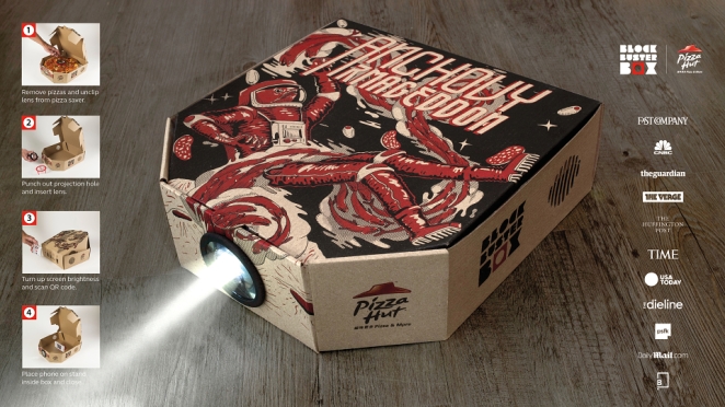
In practice, the pizza arrives in a seemingly ordinary box, but customers can assemble the box and lens to project a film onto the wall while snacking. The idea was born from the idea that “pizza and movies bring people together” – turning what you’d normally toss into “something you wanted to keep”. This playful design not only won a 2016 Pentaward but also demonstrated how packaging can extend a brand experience beyond the meal itself.
Notpla’s Seaweed-based Packaging
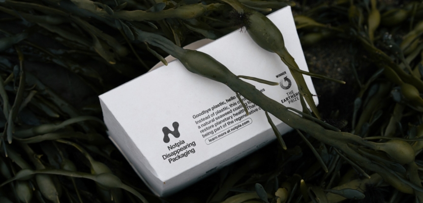
Sustainability pioneers are also pushing packaging innovation. London startup Notpla (short for “not plastic”) created food containers and sachets with a 100% natural seaweed coating. Unlike conventional containers made with petroleum-based liners, Notpla’s packaging can be home-composted and “disappears without a trace just like a fruit peel”.
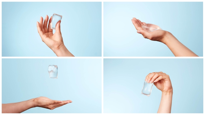
In their own words, “Notpla believes packaging shouldn’t outlive your lunch,” and their biodegradable materials break down just like the fruit peel example. For example, Notpla’s edible water pods (Ooho) and cutlery (made from materials like seaweed and wheat) have gained notice worldwide. By harnessing fast-growing seaweed as a base, Notpla demonstrates a radical rethink: packaging that returns harmlessly to the earth, closing the loop on disposable food containers.
Carlo Ratti’s “Feel the Peel” Orange Juicer
Carlo Ratti Associati's “Feel the Peel” is an avant-garde orange juice bar that literally turns waste into the drinking vessel. In this machine, oranges are shown off in a transparent hopper. After they’re squeezed, the spent peels are dried, ground, and mixed with a binder (like polylactic acid) to 3D-print a bespoke cup for that very juice. It’s a circular design, with the prototype machine using orange peels to create bioplastic, shaping bespoke cups to hold the juice made from the cups’ own innards. In other words, the fruit becomes both juice and packaging.
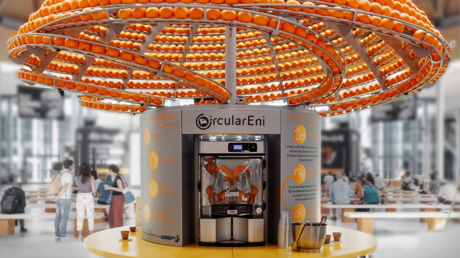
This playful experiment, commissioned by energy company ENI, teaches an important lesson about circular economy in packaging: the “waste” peel is upcycled on-the-spot, so you literally drink from a cup grown from orange rinds. This inventive setup (complete with pinball-style presentation of oranges) highlights how visionary design can make sustainability tangible and fun.
Mondelez/Cadbury “Made to Share” Chocolate Packs
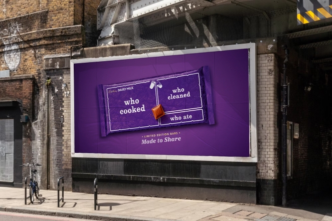
Not all innovation is technological – some come from brilliantly simple ideas. In 2025 Cadbury Dairy Milk launched “Made to Share,” a limited-edition chocolate bar packaging designed with VCCP that literaly visualises the idea of sharing. The standard bar has 36 little chunks, and the special packs are subdivided in ways that mirror real-life groups (families, roommates, coworkers). According to the D&AD awards, Cadbury “redesigned their bars of Dairy Milk to be shared proportionately, rewarding the generous ones amongst us with the largest share.”
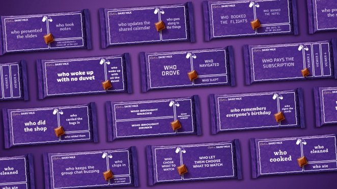
Each pack’s graphics and break points were inspired by scenarios like a bunch of mates sharing sweets. The result is a clever piece of packaging design: by explicitly marking the chocolate for “sharehouse” or “colleagues,” the pack itself reinforces Cadbury’s message of generosity. It’s a subtle yet powerful use of packaging as communication – literally embedding the social message into the product’s form. We liked it so much we gave it a GOLD award at this year's Creativepool Annual Awards!
Audiovox “EarBudeez” Earbud Packaging
Sometimes innovation is purely about delight. In 2009 designer JDA Inc. created EarBudeez for Audiovox — a series of earphone packages that double as cartoon faces. Each box is given a personality by positioning the two earbuds as eyes and drawing simple facial expressions around them. Customers treat earbuds as fashion accessories, so JDA developed the EarBudeez series as personalities with the earbuds as eyes in different positions to convey attitudes and emotions. In other words, picking between “Serious Jake” or “Giggly Jill” is like choosing a character in a video game.
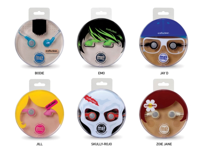
These eye-catching boxes won a Gold Pentaward for creative packaging. The impact: shoppers see not just a tech gadget, but a playful character. It turns a standard electronics box into a collector’s novelty – appealing to “customers of all ages who want to express themselves with a unique product”.
PepsiCo x China’s People’s Daily “Everyday Heroes” Cans
Packaging can also carry stories. During the COVID-19 pandemic, PepsiCo partnered with China’s People's Daily New Media on a “Everyday Heroes” campaign. They launched limited-edition Pepsi cans printed to look like newspaper pages, honoring frontline workers. Each can’s design mimics newspaper layout and includes inspiring Chinese headlines and quotes (for example “White-Clad Warriors Brave the Front” and “Fearless of Sacrifice, Charging to the Front”) from real People’s Daily reports.
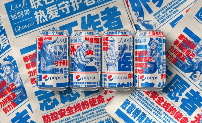
The glossy cans effectively became commemorative posters celebrating doctors, nurses and volunteers. PepsiCo’s design team noted that this project was “born out of gratitude, empathy and appreciation”. By putting newsprint and tributes right on the can, Pepsi turned everyday packaging into a heartfelt salute. It exemplifies how a brand can use its package as a medium to convey cultural respect and social messaging, not just brand logos. It's also another design we awarded with a Gold back at the 2021 Creative Annual Awards!
Shangri-La Constellation Mooncake Boxes
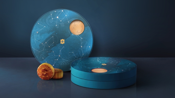
Luxury hotel chain Shangri-La and Design Bridge Asia crafted an elaborate packaging solution for their 2019 Mid-Autumn Festival mooncakes. Called the Constellation Collection, the gift boxes embraced astrology and interactivity. Each set came in two designs. The “Specialty” box has a rotating lid – as the user turns it each day, it follows the moon’s cycle, unlocking a different hidden mooncake and astrological riddle for the 8 nights leading up to the full moon (a bit like an advent calendar).
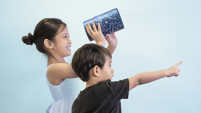
Even more whimsically, the “Kids” version is a cylindrical box that doubles as a stargazing telescope. Children can peek through this cardboard tube to view illuminated constellations printed on the inside, “learning their names as they move from one to the next”. In short, the packaging itself becomes a toy and an educational tool. This project shows how high-end packaging can become part of a cultural ritual – infusing gift-giving with interactive fun and tradition. No wonder it swept multiple design awards.
Backbone Branding’s “Riceman” Rice Packaging
Bringing humanity to commodity packaging, Georgian agency Backbone Branding designed Riceman (a premium rice brand) with a novel approach. They wanted to “pay tribute to the anonymous humans in charge of the hard work in the rice fields”. So, the bags are printed with minimalist line drawings of farmers’ faces displaying various emotions (pride, satisfaction, empathy, tiredness). When lined up on a shelf, the series of faces spans a “wide spectrum of human feelings…as if those farmers were having an expressive conversational scene with one another”.
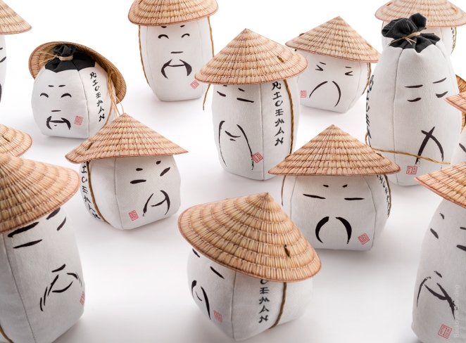
To reinforce the link between brand and farmer, even the name “Riceman” was chosen to immortalize the workers behind the rice. Functionally, the designers used sturdy woven sackcloth for the pouch and crowned it with a cone-shaped lid resembling a farmer’s Asian hat – which ingeniously hides measuring cup lines on the inside. The end result is packaging that combines sustainability (recycled fabrics), folklore and clear typography. Riceman proves that even a humble bag of rice can tell a story of people and place through its design.
Unilever’s Degree “Inclusive” Deodorant
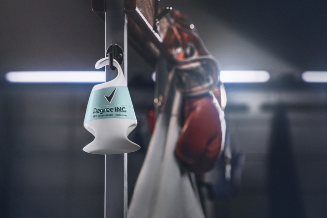
Inclusivity is a growing theme in product design. Unilever’s deodorant brand Degree (known as Rexona in some markets) launched Degree Inclusive – billed as “the world’s first deodorant designed for people with disabilities.” The packaging was redesigned from the ground up. For example, the roll-on container has a hooked grip so it can be held one-handed, and magnetic “click” closures replace twisting caps. A larger applicator ball covers more skin per swipe, and even the label includes Braille instructions.
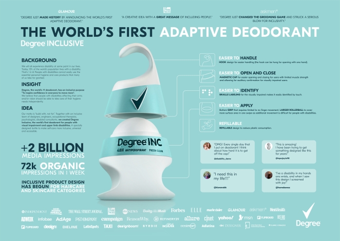
This empathetic redesign ensures that people with limited vision or manual dexterity can open and use the product independently. In short, every aspect of the pack was engineered to lower barriers – a reminder that inclusive packaging can broaden a brand’s reach and purpose.
Nikita Konkin’s “Good Hair Day” Pasta
Designers even play with puns and imagery in food packaging. A favourite example is Good Hair Day Pasta, a concept by designer Nikita Konkin. The tag line may be about pasta quality, but the form tells a joke: each box is cut and printed to look like a swoosh of hair. One version, for fettuccine, shows “voluminous swirls of billowy fettuccini standing in for epic hair”. In other words, the pasta strands themselves are the model’s hair. A neutral background and simple logo let the “hair” (and its natural colour) pop.

This whimsical packaging won design awards and has even been sold in Italy. Good Hair Day Pasta highlights how packaging graphics and die-cuts can create a visual pun: the product inside literally becomes the illustration on the box.
Ecovative’s Mushroom Packaging
Finally, we look at packaging grown from fungi. Mushroom Packaging (from Ecovative Design) uses mycelium (the root structure of mushrooms) to create custom packing forms. In this approach, agricultural waste (like hemp) is combined with mushroom spores and allowed to grow in a mold for about a week. The result is a tough, foam-like material that cushions shipped goods. Crucially, this packaging is home-compostable, so after use you can safely bury it in soil. Ecovative boasts it offers “a sustainable and home-compostable alternative to the plastic foam that is clogging landfills and waterways,” effectively “reducing plastic pollution with the power of mushrooms”.

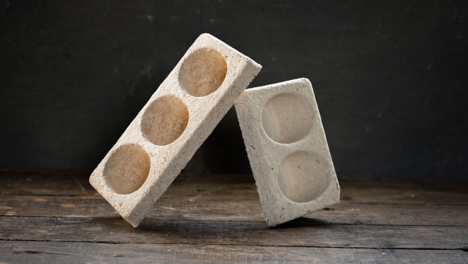
In other words, you’re not buying another styrofoam cup, you’re buying a little mushroom pillow for your product. Brands like Dell and IKEA have trialed Mushroom Packaging for fragile items. By literally growing packaging instead of molding plastic, this innovation addresses environmental concerns head-on.
Soy Mamelle's Soy Milk Udders
In the late 2000s, Russian agency KIAN re-imagined how to communicate soy milk’s milk-like qualities with a packaging concept that could barely be more literal: Soy Mamelle’s bottle is shaped like a cow’s udder. The brief: show that plant-based milk can match the nutritional credentials of cow’s milk. The result: a squeezable, three-legged bottle (in PET or glass) that leans on the shelf, capped at the top like a conventional drink container—but unmistakably udder-shaped. According to KIAN, the form “gives the idea that milk from a vegetable source is identical to that from a cow.”
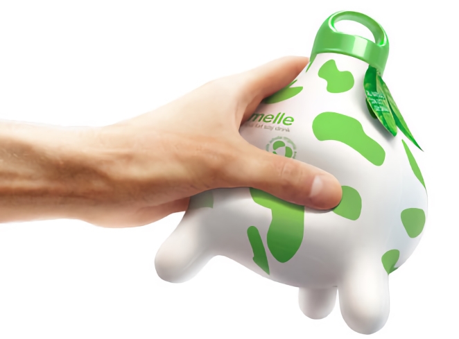
In essence, Soy Mamelle’s packaging is a reminder that innovation doesn’t require high-tech materials or complex manufacturing. Sometimes the simplest leap (“what if the bottle looked like this?”) is enough to turn a commodity into a memorable experience.
Apple
Last, but certainly not least, it wouldn’t be a round-up of innovative packaging worth a pinch of salt without the Californian tech giants. Apple’s 21st-century reinvention set a new golden standard when it came to elegant minimalism. It’s a standard still being copied and referenced today and not just in the tech world either.
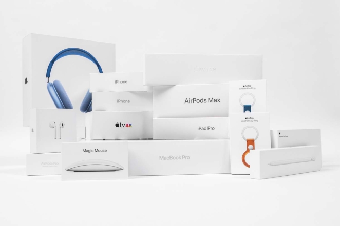
Apple’s packaging philosophy, crystallised under the influence of its late co-founder Steve Jobs, is rooted in what one commentator calls the “clean lines, whiter-than-white elegance and direct, no-fuss ultra-minimalism.” From the moment you pick up an iPhone or MacBook box, the design signals: this is premium, this is intentional, and every detail has been considered.
Why Apple’s packaging stands out
- Minimal aesthetic, maximum impact. The product box often features a single photographic image or subtle embossing, devoid of clutter and heavy copy. The visual absence itself becomes part of the brand’s signature.
- Experiential unboxing. Apple doesn’t treat packaging as a throw-away container. The box-lid fit, the feel of the card stock, the peel of the interior – all carefully calibrated to create anticipation and delight. As one observer notes, “Opening an Apple product is an experience in itself.”
- Engineering efficiency meets sustainability. Beyond aesthetics, Apple has re-engineered its packaging to reduce waste and environmental impact: shrinking box sizes, moving to fibre-based materials, eliminating plastics.
- Brand communicate through packaging. Instead of shouting brand values through text or graphics, Apple’s packaging whispers them through precision, restraint and material choice. One blog summarises: “when it comes to packaging innovation, few companies have achieved the level of refinement and brand alignment as Apple.”
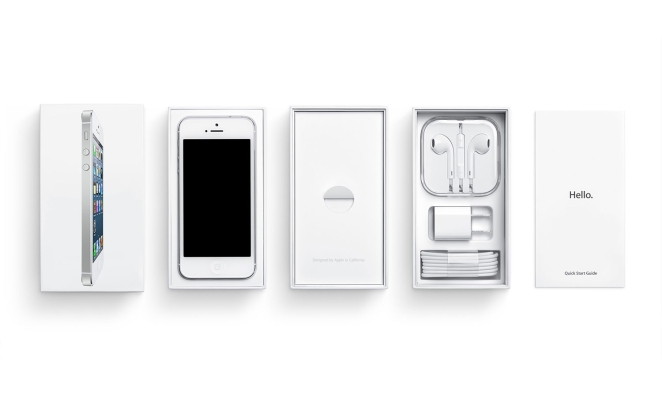
Apple’s approach transcends technology: it has become a reference point for any brand keen to elevate packaging from protective function to brand-defining moment.
- The minimalist language is now widespread in luxury goods, premium electronics, and even unexpected categories such as food and personal care.
- The unboxing ritual (once a footnote in packaging design) is now a strategic element of consumer experience (and social media amplification).
- The ecological optimisation of box size and material is widely emulated across FMCG as regulatory and consumer pressures increase.
In short, Apple’s packaging isn’t just about being elegant: it’s about aligning form, function, emotion and sustainability in a single crafted object. Which is precisely why no survey of standout packaging in the 21st century would feel complete without it.
Bringing Your Next Packaging Vision to Life with Creativepool
Wunderman Thompson Argentina
If these innovative packaging designs prove anything, it’s that when creativity meets craftsmanship, the result isn’t just a container—it’s culture. Whether it’s a biodegradable seaweed pouch, a 3D-printed cup grown from orange peel, or an inclusive deodorant designed for everybody (and every body), the right designer can turn form into function and sustainability into storytelling. And that’s exactly where Creativepool comes in.
Whether you’re looking for a packaging designer, a structural engineer, a 3D visualiser, or a branding studio, you’ll find them here. Creativepool is home to thousands of designers, makers and material innovators. These are the people who shape how products are experienced before they’re even opened.
Hiring a Packaging Designer Through Creativepool
Design Bridge and Partners
There are three simple ways to connect with the sharpest minds in packaging and product design for your next launch or rebrand:
1. Search and Contact
If you already know what you need (perhaps a luxury box designer, a sustainable materials expert or a visual storyteller specialising in FMCG packaging) dive straight into Creativepool’s talent network. Browse portfolios, case studies and credentials with intuitive filters. Creativepool’s ranking system helps you discover award-winning creatives and agencies at every scale, from boutique studios to global leaders.
2. Post a Studiogig
Need a creative partner quickly? Post a Studiogig. It’s the fastest way to reach freelancers and studios who understand brand expression through materials, finishes and tactile experiences. Your brief goes directly to relevant members of the community, with responses delivered straight to your inbox.
3. Post a Job
If you’re expanding your internal design team (maybe hiring a packaging technologist, a print production manager or a sustainability lead) post a job listing. Creativepool promotes every role across its active design community and job board, connecting you with candidates who can elevate both aesthetics and impact. You stay in full control. No recruiters, just direct access to the people who can bring your product vision to life.
Hiring a Design Studio Through Creativepool
Progress Packaging
If your project calls for a full-service partner (whether you’re reimagining your brand identity, developing eco-friendly retail packaging or creating a premium unboxing experience) Creativepool makes it easy to find and collaborate with the right design studio.
Find a Studio
Explore agency reels, portfolios and case studies. Filter by sector, service or design style to find studios that match your product’s audience and ethos. You can also discover Creativepool’s Top 10 packaging and branding agencies.
Post a Brief
Prefer to see proposals? Simply post your creative brief with objectives and budget. Studios that align with your brand’s vision will respond with tailored concepts and timelines.
Need Help?
VCCP
Creativepool’s team of experienced industry specialists is here to support you. Whether you’re commissioning a circular packaging prototype, planning a global rebrand rollout, or launching a sustainable product line, we’ll help you connect with the people who can make it happen.
Chat with us live when posting your gig, or reach out through the Creativepool contact page.