
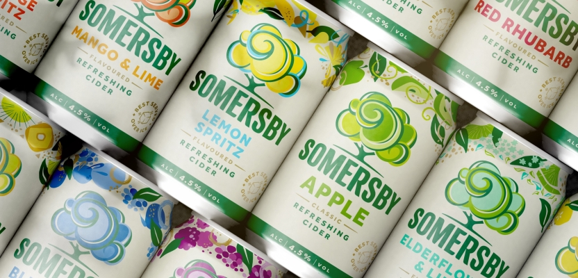

In a bold leap forward, Somersby has reimagined its iconic identity to stay ahead in a fiercely competitive market. Spearheading this transformative journey are Rob Skelly, Creative Director, and Wander Bruijel, Chief Strategy Officer at Born Ugly, who have blended visionary design with a refreshing sensory experience.
From rethinking visual codes to crafting a flexible brand system that resonates with a dynamic, youthful audience, this interview unpacks the creative process, the challenges overcome, and the innovative strategies that have redefined what it means to be refreshingly iconic in today’s ever-evolving marketplace.
What was the brief for the rebrand?
We had previously redefined the codes of the cider category for Somersby in 2018 and it was clear that we needed to do that again. The brand had undergone rapid growth since, and was becoming a victim of its own success as it expanded into new markets with demand for different innovations. The competition was catching up with new flavours and propositions, so now was the time for Somersby to reinvent itself.
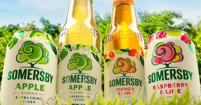
The key challenge was to improve Somersby’s iconicity to improve stand out and make navigating the brand easier. How we could we make the brand pop while also ensuring its relevance and maintaining the story we wanted to tell the marketplace?
Essentially, we needed to make Somersby recognisable in the blink of an eye.
How did the initial pitch/brainstorming phase go?
The initial pitch and brainstorming phase felt like a natural continuation since we’d already been part of Somersby’s original refresh. This time, the focus was on looking ahead. What could the next 10 years look like for the brand?
It was a really collaborative process that kicked off about two and a half years ago. Alongside the client, we worked to define the challenge and shape the brief. The wider team dug into what was happening in the market, exploring how we could interpret semiotic codes in a fresh and distinctive way as well as considering what secondary brand assets we needed to give local markets flexibility while keeping everything globally aligned.
Describe the purpose of the brand and its target audience
The project was all about creating global alignment and understanding. We did lots of research into the lead markets to truly understand the different audience needs and varying maturities of markets.
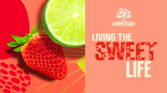
As it tends to attract a younger crowd, Somersby’s audience is constantly refreshing itself, so we focused on tapping into a refreshed mindset to ensure we stayed the drink of choice for those already connected to the brand. At its core, Somersby has always been about refreshing people’s optimism. We needed to reinterpret that purpose for today’s consumer.
What was the biggest challenge? How did you overcome it?
The biggest challenge was creating a brand identity system that could manage Somersby’s diverse and growing portfolio.
To tackle this, we headed into the world to see the brand in the real environment. One key market was the Polish market – the brand’s most mature market, but also, its most chaotic, with intense interest in new flavours and propositions. The experience demonstrated that we needed a portfolio approach and a flexible design system that could help consumers navigate all the noise while still making Somersby stand out.
What details are you most proud of and why?
What we’re most proud of is the role we’ve played as brand guardians for Somersby. We’ve navigated the complexities of their portfolio and brand architecture while seamlessly integrating it into their communications.
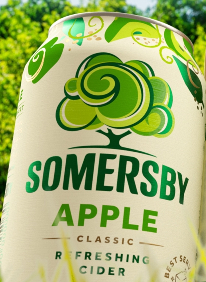
Beyond that, we designed not only the brand’s visual world, but also its sensory world, designing what the brand smells, tastes, and feels like. We even went so far as designing the Somersby garden. It’s been incredibly rewarding to see how everything has come together to create a cohesive, standout brand identity.
What visual influences fuelled your solution?
The visual influences were driven by the idea of refreshing perspectives. We tapped into the core of the Somersby brand, being refreshingly optimistic.
The goal was to make the brand feel like something to look up to, both literally and figuratively. We evolved the tree, which was overburdened as a key brand asset, inspired by circular dapples of natural light pouring through the trees and gave the design an upward perspective.
Changes to the wordmark helped to reinforce that sense of positivity and upward movement. When it came to expressing the fruit, we wanted to bring in a sense of surprise and discovery, much like looking up and noticing the little optimistic quirks in the world around you, especially in contrast to how many of us are often walking with our heads glued to our phones.
We also wanted the brand’s assets to capture the whole flavour experience, so we created different expressions for each type, whether sweet, zesty, or tangy, adding depth to the sensory experience.
How do you ensure consistency in brand messaging and visual identity across various channels and touchpoints?
Ensuring consistency in Somersby’s brand messaging and visual identity across channels and touchpoints was key given how complex the brand portfolio is.
We focused on driving both the brand’s consistency and iconicity while also creating a system that could flex across the entire portfolio and tell the brand story through multiple channels.
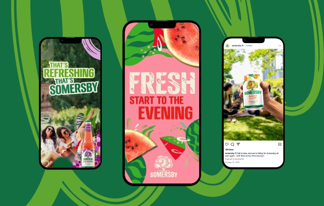
To do this, we developed a clear design system that anchored the brand’s fixed elements, making sure we knew which brand assets had to remain consistent and which ones could be flexed as storytelling tools.
A big part of this was identifying the core offering, where we firmly anchored the design system. From there, we could have more flexibility as we moved into different propositions and pillars of the strategy. This gave us the freedom to adapt the visual brand language in ways that helped tell the Somersby story effectively across touchpoints.
What role did consumer research or market analysis play in shaping the direction of the rebrand?
Consumer research and market analysis played a huge role throughout the process.
We needed to understand the dynamics of different markets, from mature ones like Poland, which are noisy and competitive, to emerging markets like those in Asia.
We used our usual four lenses discovery approach to deep dive into the brand itself, what was happening in the consumer world, the competitive set across markets and the broader global trends impacting consumers.
This helped guide the global identity refresh’s direction, ensuring we made informed decisions that resonated with different audiences.
Can you share any behind-the-scenes anecdotes or memorable moments from the rebranding project?
There were definitely a couple of moments that stood out from the project. Going to Poland and witnessing the reality of that retail environment was eye-opening as it brought home the reality of the challenge that Somersby faced.
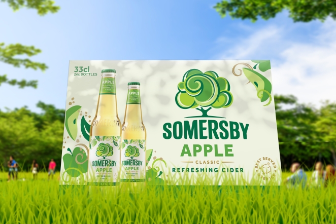
In terms of some more personal memories, Carlsberg was an incredibly generous client. We spent times taking electric boats throughout the canals of Copenhagen, immersing ourselves in Somersby whilst soaking up the rays of the sun.
Credit list for the work?
Wander Bruijel – Chief Strategy Officer
Rob Skelly – Creative Director
Rachael Edwards – Design Director