



In today’s fast-scrolling job market, a creative digital portfolio must do more than simply show your best work. It has to explain that work, grab attention in seconds, and prove you can solve real problems. In practice, hiring managers want portfolios that are crystal-clear, context-rich and thoughtful: they look for clean navigation, well-defined roles, engaging case-study stories, and evidence of process and impact.
Recruiters don’t want long case studies; they want clarity. A strong portfolio explains what the project is, why you created it, and what impact it demonstrates. In other words, top portfolios act like a strong handshake that’s brief but convincing and compelling.
How to Create a Standout Portfolio
Vladislav Lavv
To cut through the noise, focus on what actually stops someone scrolling. That means:-
- Structuring your site so projects are easy to find.
- Leading each piece with a punchy one-line role or project title.
- Tlling each story with clear context (challenge→approach→result).
- Showing measurable outcomes and explaining how your work made a difference.
- Keeping the whole thing polished with no typos and a logical layout.
- Ending with an obvious “what next?” So easy contact info or a call-to-action .
I’ll break down these key signals one by one and also explain why the right side projects (especially those targeted to your desired industry) can become some of the most persuasive “experience” on the page.
What Should a Good Portfolio Consist of?
Clear Structure and Defined Roles
Juliette Mothe
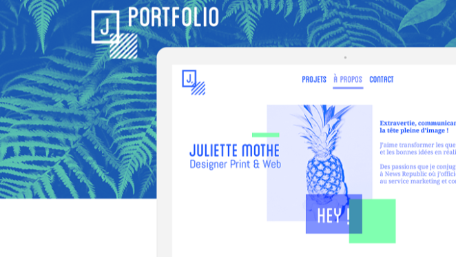
Before a recruiter reads a word, they’ll take in the structure of your portfolio. A clean, intuitive navigation is essential. Your homepage or main menu should immediately orient visitors to what you do best and this can be done by keeping menus simple and obvious, with quick links to, for example, About, Portfolio, and Contact
The homepage might include 2–3 featured projects or a one-line value proposition (“Graphic Designer specializing in fintech apps,” for instance) so hiring managers grasp your focus at a glance. In short, treat the portfolio itself like a design project: the layout, typography and hierarchy should all make sense.
No one will click through a messy, confusing site so use open space, consistent styling and predictable menus. There is a time and a place for complication and invention and your portfolio is not it.
It also helps to open each case study with a concise role or title line. Think of it as a headline for that project: “UX Redesign for a Healthcare App” or “Brand Identity for Eco Startup,” for example.
Try starrting each piece with a “simple, one-line project role” before diving into the story. This one-sentence summary instantly signals relevance and saves precious seconds. In practice, naming your role clearly (e.g. “Lead Designer for Mobile Campaign” or “Concept Branding for Non-Profit”) sets expectations immediately. It makes your contributions unmistakable, especially in team projects. Remember: recruiters often spend only a minute or two on that first scan, so don’t make them guess who did what. State it up front.
- Easy navigation: Use a simple menu or page structure. For example, group work by category or medium (e.g. “Branding,” “UX/UI,” “Illustration”) so visitors can click right to the relevant section. Each section title should be unambiguous and visible.
- Homepage clarity: Start with your name, title, and a one-line value statement. Feature a few key projects or a short portfolio preview. This gives a snapshot of your best work up front.
- Project titles/roles: Begin each case study with a brief tag like “Product Redesign – Fitness App” to communicate the context instantly. This solves problems like people skimming just the headlines and still understanding the gist.
With navigation and roles nailed, visitors can easily browse. From there, it’s on to the stories behind each piece.
Compelling Case-Study Storytelling
Eugene Borodulin
Instead of just an image gallery, each project in your portfolio should read like a mini case study. That means giving context and narrative, not just visuals. Employers complain about “vague portfolios” that list pictures without explanation, because such portfolios leave “room for doubt about your role or impact”.
The “Problem → Approach → Outcome” structure is a popular way to frame a case study
To stand out, pair every project image or mockup with a short written context: What was the brief or challenge? Why did you take the approach you did? How did you solve the problem? For example, always include a brief summary stating the objective (e.g. “Revamp the onboarding flow of a fintech app to boost sign-ups”), your specific role (“led UX design, user interviews, and prototyping”) and the outcome (perhaps an increase in engagement or another result).
The classic “Problem → Approach → Outcome” structure is another popular and compelling way to frame a case study.
For instance:
- Problem (Challenge): What user need or business goal prompted the project? E.g. “The company needed a faster way to onboard users.”
- Approach (Solution): What steps did you take? Mention research, sketches, or key design decisions. E.g. “I conducted five user interviews, then designed three wireframe concepts.”
- Outcome: What was the result or learning? Cite any measurable impact or product result. E.g. “The final design reduced completion time by 40%, and analytics show a 20% higher signup rate.”
Presenting your work this way hooks the reader: it quickly tells them the story without wading through dense text. It also answers the implicit question recruiters have: “What value did this person add?” A tightly written case study (even a couple of short paragraphs) proves you understand the “why” behind the images.
This storytelling approach also brings out the “thinking” in your work. Frame the challenge and how you approached it and focus on the process, not on the final product” In practice, that means mentioning your rationale (“I tested variant A because we saw drop-offs in user tests”) rather than just showcasing polished screens.
Wherever possible, show the journey. Include a sentence or two about inspiration or constraints (budget, timeline, technology) to explain your decisions. This transparency builds trust. After all, raw results or polished mockups alone don’t prove anything but a clear narrative of how you solved something does.
Showing Your Thinking: Process and Iterations

Zara Picken
A truly memorable portfolio doesn’t hide the process but actively highlights it. Hiring managers love seeing how you got from point A to point B. Sprinkle your case studies with sketches, wireframes, prototypes or iteration snapshots. Rather than just the final screens, include at least one screenshot or photo of your work-in-progress for each major project stage. This could be a whiteboard sketch, an early wireframe, a style exploration or even a brief captioned storyboard.
The best designers make their thinking visible by sharing sketches, inspiration and process, helping the viewer understand how the final outcome was reached. This approach demystifies the work.
For example, show that before the slick UI you’re proud of, you experimented with different layouts (perhaps pictured as small thumbnails) or user flows. Embed a quote from your team or a quick test result if available. Simply observing an end product isn’t compelling; visual storytelling of the journey is what stands out.
Visual storytelling of the journey is what stands out
Graphical elements help break up text as well. Use diagrams, flowcharts or annotated images to underscore key points. But keep it relevant and concise. The portfol.io blog suggests adding visual cues (arrows, highlights) that point to your decision points.
For example, if you chose a new iconography or color scheme, show the rough drafts and final palette side-by-side. The goal is to convey “this is why I picked this over that.” Recruiters often reject portfolios that are just final screenshots but if you inject yourself into your UX portfolio by showing yourself in your portfolio, it’ll stand out.
In real life, tangibility counts too bringing printouts or mock-ups to an interview can make a lasting impression. In short, don’t hide your thinking. Sprinkle process shots and notes throughout so reviewers can see how you arrive at solutions.
Highlight Results and Impact
Milan Zaveri
Ultimately, employers are looking for proof that you can deliver results rather than just pretty pictures. Whenever possible, quantify or describe the impact of your work. For example, if a redesign boosted user sign-ups, cite the percentage or conversion rate. If you ran a campaign, share the engagement or revenue it generated.
Even qualitative outcomes (like “positive user feedback” or “adoption in 3 pilot regions”) count. As one Creativepool article puts it, recruiters want “impact-driven achievements, metrics, client outcomes, [and] awards or creative milestones”.
Don’t bury these results in fine print. Highlight them in your write-up or even create a “Results” section at the end of each case. A simple “Outcome” subtitle can make sure hiring managers notice the bottom line. Always frame projects as successes or learning experiences.
For instance: “Our redesign increased click-through by 30% over three months,” or “the campaign concept earned a client pitch and was adopted with minor tweaks.” If you lack hard data (e.g. a personal project), you can use rough numbers or a clear statement of what would hypothetically improve (e.g. “anticipated a 10% reduction in drop-off by restructuring this page.”) This kind of transparency shows you think like a business person, not just an artist.
Add business details or a metric wherever you can. Even a sentence like “This approach solved the client’s retention problem, as evidenced by a 15% longer session time” demonstrates accountability. Remember, as a recruiter reads your portfolio, strong results are proof you have already solved problems, making you a safer bet than someone who only shows processes.
Professional Polish and Clear Next Steps
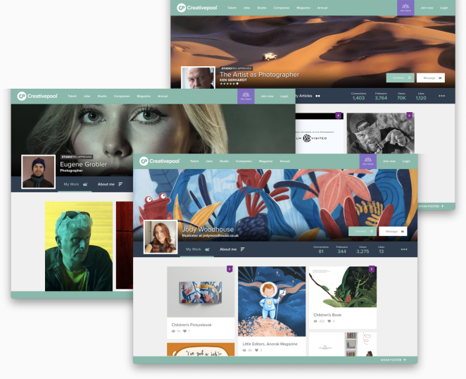
Every detail of your portfolio counts. Before you hit “publish,” double-check for any typos, broken links or inconsistent formatting. Typos and sloppy design elements can kill credibility. Likewise, ensure colour choices, fonts and spacing are consistent across the site. A mismatched style or unexpected shift can make your portfolio feel disjointed. In short, err on the side of clean and simple design.
Importantly, always include a next step. Conclude each page or case study with a clear call-to-action. This could be a link saying “View full case study” (to a PDF or website), or simply a prompt to contact you. Make sure your name and contact details (email, LinkedIn, etc.) are visible on every page or very easy to find.
Also, always make it as easy as possible to hire you by clearly showing your name and contact details. A simple footer with your email and phone, or a dedicated Contact page with a form, removes all friction from the hiring process.
Keep in mind that any professional profile you have should align. A dated LinkedIn profile alongside a modern Creativepool portfolio can send mixed signals. Update all platforms with the same headline, summary and recent work so recruiters get a cohesive view of who you are. In practice this means syncing your skills, job titles, and even profile photo across sites.
On Creativepool specifically, use all available fields: list your key skills and specialties, add tags for your industry and tools, and curate your projects. The more complete and targeted your profile is, the more likely agencies are to find you during searches.
In short, think of the portfolio itself as a deliverable: deliver quality, deliver context, and deliver a path forward. Like a well-structured proposal or website, it should guide the reader from introduction to conclusion with zero guesswork.
Leverage Side Projects and Targeted Relevance
Deepak Jolly
One of the stealthiest portfolio boosters is a well-chosen side project. These can quietly become your best experience. For instance, if you want to break into gaming, a UX redesign of a game app (even a hobby project) sends a strong signal.
Side projects show initiative, problem-solving and niche alignment, which are all desirable qualities that make you stand out. In fact, good old fashioned initiative is one of the top signals recruiters look for.
When you include side projects, still apply the same case-study rigor: explain why you did it, what challenges you faced, and what the outcome was. The key is relevance. An agency will be impressed if they see you’ve already done groundwork on problems similar to theirs.
Frame side projects around business outcomes. For example, “This project shows I can simplify onboarding flows for fintech apps,” or “This campaign concept proves I understand Gen Z culture”.
In practice, create a “Projects” or “Side Projects” section on your site or resume. List only a few well-chosen examples (say 2 to 4) each with a snappy headline and brief result. Even if the projects are speculative or self-initiated, treat them like client work in your presentation.
Top Tip: give them a one-liner title and a short result to tell recruiters “here is something real I built.”
In short, let your portfolio be a bridge between your past and where you want to go. Highlight any personal or volunteer projects that align with your target roles. They prove you’re motivated and have the creative horsepower even outside of paid gigs. As one expert puts it: when presented with clarity and intention, your side projects become some of the most persuasive signals in your portfolio.
Polish and Promote Your Profile
A standout digital portfolio is equal parts content and presentation. It’s not just about showing final images, but about proving how you think, solve problems and respond to a brief. Once you’ve applied all of the above your work should really speak for itself.
Remember to polish your online presence too. Update your Creativepool profile with these insights: tag your skills, add descriptions to your projects, and use keywords that match your ideal roles. That way, the agencies who scroll through Creativepool will find the very signal words you’ve built into your standout portfolio.
Putting these signals into practice takes time, but it pays off. Recruiters spend only seconds on a first scan, so make every word and image count. Tell a clear story, back it up with evidence, and close the loop with easy contact information. Do that, and your portfolio will do the heavy lifting to get you noticed and hired.

Laura Cibilich (above), founder of RUN Aotearoa, sums up these principles quite succinctly:-
“A standout portfolio isn’t just a gallery of finished work, it’s proof of how you think, solve problems, and respond to a brief.
As an agency founder, the strongest portfolios I see include real-world experience balanced with self-initiated work that shows initiative and passion. The best designers also make their thinking visible by sharing sketches, inspiration and process, helping the viewer understand how the final outcome was reached.
Professionalism matters too. Always include a short written context for each project – the brief, any challenges, what inspired the approach and how you solved the brief. Don’t forget that your portfolio is a design in itself, so pay attention to detail to create a well-designed, thoughtful and polished portfolio.
And if you’re meeting with potential employers, bringing physical print samples can make a lasting impression, showing craft, production knowledge, and how your design performs in the real world. Finally, make it easy to hire you by clearly showing your name and contact details.”
How to Create a Standout Portfolio That Gets You Hired
Rob Jackson
A portfolio that gets interviews isn’t the one with the most work but the one that does the most work on your behalf.
Because here’s the uncomfortable truth: employers and agencies aren’t “browsing” your portfolio on the sofa over a cup of tea. They’re speed-scanning between meetings, comparing you to five other tabs, and looking for any excuse to move on.
So, the goal isn’t to impress them with volume. It’s to remove doubt. Make it instantly obvious what the work is, what you did, why you did it that way, and what changed because you were involved. That’s the difference between a digital portfolio that looks nice and one that feels hireable.
A portfolio that gets interviews isn’t the one with the most work but the one that does the most work on your behalf
If there’s one final rule to tape above your monitor, it’s this: show the outcome, but narrate the thinking. Use clean structure so nobody gets lost. Use short, sharp context so nobody has to guess. Use process and iterations to prove your brain wasn’t on autopilot. And whenever you can, pin a result to it (a metric, a milestone, a before/after, a learned insight) because impact is the language employers speak when they’re trying to justify a hire.
Then do the boring bit, ruthlessly: proofread, fix broken links, tighten titles, and strip out anything that’s there “just because” you once did it. End every case study with a clear next step (email, booking link, “Let’s talk”), and make sure your Creativepool profile mirrors the story you’re telling. This mean projects properly written up, skills and tags aligned with the roles you want, and your best work pushed to the top. Your portfolio wins the click; your profile helps you get found again.
Do that, and you’re no longer asking hiring managers to imagine your value. You’re demonstrating it clearly, quickly, and without them lifting a finger