


The new bakery on your high street has spent a small fortune on its sign. You can tell because the lettering is made of brass, the brass is mounted on dark green tiles, and the designer’s photograph of it looks terrific. What you can’t tell, as you walk towards it on a wet Tuesday, is whether the place sells bread or bathroom fittings. By the time you’re close enough to work it out, you’ve passed the door. The designer, who had the considerable advantage of knowing what the sign said, was delighted with it.
That gap between the approval image and the pavement is where signage design gets interesting. A sign has to work while people are moving, talking, looking for a particular door or wondering whether they’ve got time for coffee before their train. In a hospital, a legible sign can spare someone the embarrassment of asking for directions a third time. At an exhibition, a stand can do a day’s worth of business with people who first noticed it over somebody else’s shoulder. And a shop sign can make a building that’s been there for decades feel like somewhere you might actually want to go.
Eye-catching signage earns that first glance and gives people something they can use immediately. It might be a name, a reason to stop or the reassuring discovery that the lift really is down this rather unpromising corridor. The most interesting design decisions happen when you know which of those reactions you’re after. Here’s how to make them, from the first walk around the site to the day you find out whether anyone can read what you’ve made. If you’re still gathering references, start with Creativepool’s best signage examples.
1. Start with the person who needs the sign

Doko Studio
Ask what somebody should be able to do after seeing the sign. “Make the shop more visible” is an understandable ambition. “Help people coming from the station recognise the bakery before they reach the crossing” gives you a route to walk, a distance to measure and a moment to design for. It might reveal that the shop already has a perfectly good fascia and that the useful addition is a projecting sign people can see as they approach along the pavement. That’s a much better discovery to make before anyone prices up new brass letters.
Spend time on site with someone who knows how it operates. Reception staff can tell you which doorway visitors mistake for the entrance. At a trade show, the people who worked last year’s stand will remember when the aisle got busy and which side everyone approached from. Talk to first-time visitors too. Staff can become so practised at navigating a place that they forget what the experience was like before they knew the shortcut past the lifts. Record the routes, the things that already catch the eye and the places where people slow down or turn back.
In wayfinding and signage design, the same building can contain people with very different questions. At a museum, someone arriving for a workshop wants to know which room it’s in. A parent who’s just wrestled a pushchair through the door might want the toilets. A tourist with an hour to spare may be looking for the permanent collection. A single directory can help all three once they have somewhere to stop and read. The entrance and the first junction still deserve their own clear instructions. Give each proposed sign a one-sentence brief that says who it’s for, where they’ll be and what they need to do next. If two unrelated jobs keep turning up in that sentence, you’ve probably found a second sign.
2. Give each sign one message people can take in

Masha Kulichkova
How much information should you include on a business sign? Start with what someone needs at that exact point. On a shopfront it’s usually the name, plus a short description if the name alone gives people little to go on. An unfamiliar brand called Fieldwork could be a florist, a coffee roaster or a consultancy that charges by the half-day. A plain descriptor does a useful job there. Opening hours, an offer and the details of how to book can live on the door or window, where people have already slowed down enough to read them.
Try writing the line you would say to a stranger who asked you the same question. “Ticket collection” comes out of the mouth rather more readily than “Pre-booked admissions fulfilment”. “Lift to Level 2” tells somebody what will happen if they follow the arrow. If a phrase has made its way from an operations spreadsheet into a sign, ask whether anyone outside the organisation would use it. Use the same destination names on confirmation emails, event programmes and physical signs. The small pleasure of finding “Hall B” exactly where the ticket said it would be is worth more than an extra chance to call it the Innovation Pavilion.
The pressure to include more often comes from perfectly reasonable people. The sponsor wants visibility, operations wants the opening hours and marketing has a strapline it’s rather fond of. Give them a place in the system according to when the reader needs them. At an exhibition, for example, the hall identifier can help visitors choose the right aisle, the stand headline can explain the offer and a panel inside can carry detail and sponsor credits. Try the shortest version of the copy in a rough layout first. You’ll have a much better discussion about whether anything’s missing once you can see what the space buys you.
3. Choose a format that suits the location and the message

ByVolume
When someone asks for outdoor signage design ideas, start by looking at how the building is approached. A fascia runs across the face of a shop and is useful to someone across the road. A projecting blade sign is easier to pick up along the same side of the street. A freestanding sign can identify an entrance set back from the pavement, if there’s a suitable spot to put it. A window graphic can catch someone at close range and give them a reason to come in. If you need both discovery and persuasion, give them surfaces suited to the two different reading distances.
Exhibition signage design brings the same problem indoors, with the added complication that half the people around you are trying to solve it at the same time. A high-level identifier, where the venue allows one, can help people spot a stand from an aisle. The stand’s main panel has room to say what the exhibitor does. A close-up panel can explain how a product works while someone waits for the demo. If the whole design depends on the biggest piece of text being readable from the far end of a crowded hall, check where the ceiling banners and the neighbouring stands are going before you sign it off.
Digital signage design earns its keep when the information changes often enough to justify a screen. Think of room allocations at a conference, service updates at a station or a lunch menu that changes during the day. Give each screen a layout that can accommodate a long session title, an unexpected change and a member of staff in a hurry. Keep essential directions visible throughout any content loop, either in a fixed part of the screen or on a nearby static sign. Find out who will update the display and what it shows if the feed fails. If the answer is a spinning wheel and an apology, you’ve still got a bit of design to do.
4. Make the sign readable before people reach it

WMP Creative
Start with the distance at which someone needs the information, then work back to the letter size. A visitor who reads “Reception” after walking past the corridor has read the sign perfectly. They’ve still missed their turn. Mark the point where you want that decision to happen and check how far it is from the proposed sign. Record the angle as well. Ten metres head-on across a lobby is a very different proposition from ten metres along a wall where the lettering is viewed almost edge-on.
Measure actual letter height on the artwork. A font size in points tells you very little about what gets fabricated, and two typefaces set at the same nominal size can give you quite different visible letters. Check the width of the complete line as well as the height. A short word may look generous in the prototype, only for the longest destination on the site to force the production team to squeeze every letter together. Use a full-size paper test of the smallest critical line, especially where you’re working around a shallow fascia or a narrow wall. Tape it up, step back and have somebody read it cold.
This is also where you find out whether the design can accommodate more than one reading distance. A hotel guest approaching from across a courtyard may just need the building name. At the door they can read check-in times and instructions for late arrivals. A visitor standing still in front of a map can deal with a level of detail a person moving through a station concourse simply can’t. Size the important words to suit the earliest useful sightline and use the space people have at the next stopping point for the rest. If a closer reading position is part of the plan, make sure people can actually get to it without blocking the route or leaning across a planter.
5. Choose lettering for the words it has to carry

Lee Stuart Shepherd
A typeface can look wonderfully distinctive when you set a six-letter brand name in it and run out of goodwill the moment it has to spell “Accessibility enquiries”. Try real destination names, room numbers, floor labels and opening hours as soon as you start choosing type. Check characters that can get confused at a glance, such as zero and capital O, or a capital I, a lower-case l and the numeral 1. That detail matters in places where being one room out means you’ve gone to the wrong appointment. If you’ll need accents, translations or another writing system, check support before you build the whole visual identity around the font.
For directions, a well-drawn sans serif with distinct letter shapes and an open interior to letters such as ‘a’ and ‘e’ is a useful place to start. Try ordinary mixed case for longer labels. The variation in letter shapes gives readers more to work with at a glance. Give the lettering enough weight to survive distance, reflected light and the production process, then space it so whole words can be read comfortably. Closely packed bold type can lose definition, especially when light bleeds around backlit letters. Thin strokes that look lovely at 200 per cent zoom have a similarly disappointing way of disappearing.
A bit of personality still goes a long way. A hand-painted name over a pub door or a chunky custom wordmark on a music venue can do more for the place than the most immaculate system font in the world. Give expressive lettering the space and scale it needs, and use a companion typeface for things people have to read quickly. When you send both to the fabricator, ask to see the finest strokes and tightest gaps at the proposed production size. A sample cut from the real material will tell you more about the type than another round of debate about whether it feels “premium”.
6. Use contrast people can see in the actual space

Minale Tattersfield
What makes a sign stand out in a busy environment? Often it’s a clear shape and a colour or tone that the surroundings have left available. You need the letters to stand out against the sign face and the sign itself to be easy to pick out against the wall, shopfront or concourse behind it. The two checks catch different problems. White lettering on a navy panel can be easy to read while the panel itself disappears against a row of dark shopfronts. Photograph the setting at the time people are likely to see the sign and look for a tonal difference before you start testing brighter colours.
Try a greyscale preview to flag combinations that are close in lightness, then check the real samples on site. A luminous-looking brand colour in a digital presentation can turn unexpectedly modest on uncoated stock or a powder-coated panel. Glossy finishes may pick up a bright reflection at precisely the angle your visitors approach from. For essential information, pair any colour coding with words, symbols or numbers. “Blue route” is much more useful when it also says where it goes. On a screen, check contrast throughout the entire animation, particularly where text sits over moving pictures.
When London hosted the Olympics in 2012, visitors needed to spot the signs for the Games among directions they already used for the bus, train and Tube. Minale Tattersfield chose magenta for pedestrian routes between venues and transport points. The hue was distinct from the colours already used for individual transport modes. If you’re designing for a busy site, take stock of what a colour already tells people there before you give it a new meaning. You can see how that decision played out in the London 2012 Olympic wayfinding scheme.
7. Use visual hierarchy to guide the next decision

Wiedemann Lampe
A corridor sign that gives reception, meeting rooms, toilets, deliveries and the finance department equal billing asks visitors to read the whole thing before they can find their answer. In wayfinding sign design, the information at each point should be shaped by the decision people are about to make. Group destinations that share a direction, keep arrows close to the words they belong to and arrange groups consistently across the site. Give the most important destination enough space to be found quickly, particularly if there’s a crowd or the sign has to be read on the move.
Try drawing the journey in three moments. First comes orientation, where people work out where they are and what’s nearby. Then comes a decision at a junction. Finally comes confirmation, where they find the room number or get a little reassurance that they’re still going the right way. Follow one route in both directions. You may discover that a visitor can find the gallery from reception but has to improvise the way back. If there’s a step-free route, follow that from start to finish too. A beautifully obvious lift sign loses its usefulness if the only sign to the lift disappears when the visitor comes out on another floor.
A site with gardens, sports facilities and a museum presents a particular problem. People need to find what they came for and still have the chance to discover something they didn’t know was there. A good entrance directory can make that invitation. Along the route, a simpler sign can get back to the business of pointing towards the café. For an example of how a distinctive yellow and a system of icons can help visitors make sense of a large site, see Wiedemann Lampe’s wayfinding for Gunnersbury Park & Museum.
8. Use graphics that help people recognise, remember or navigate

Marta Wasilewska
A strong image can explain what a business does from across an aisle. A bicycle workshop can put a recognisable wheel in a window graphic. A food stand can show the dish it actually serves. An exhibition about a designer’s work can pick one striking object to carry the entrance image and let the detail emerge inside. Give the picture a specific role. If its job is to catch an eye at a distance, it needs a recognisable silhouette or a clear subject. If its job is to explain a process, position it somewhere people can pause long enough to look.
Icons have a similar job, with much less room for interpretation. For familiar facilities, use widely understood pictograms and pair them with plain text where it helps. Avoid inventing a suite of clever symbols for basic destinations, especially when visitors are unfamiliar with the space. Try asking someone what they think an icon means before you show them the words underneath. If a drawing of a cup could reasonably point to a café, drinking water or a very small trophy room, the answer is useful evidence about what to put next to it. Decorative illustration has more freedom on arrival panels and exhibition graphics, where it can build atmosphere around the information.
A graphic can establish where something belongs without requiring the headline, date and arrows to wear the same treatment everywhere. Build a small kit of recognisable shapes, image crops or borders, then let the directional signs use the quietest version that still feels like part of the event. See how a single framing device gives posters, tickets, badges and wayfinding a family resemblance in Marta Wasilewska’s FRAME exhibition identity.
9. Carry your brand through the whole journey

Pernod Ricard
People encounter a brand in bits and pieces. They see the café’s name on a projecting sign, then the queue instructions in the window and the collection point inside. They may visit a shop in a different town and look for the same cues. If those signs have been commissioned independently over several years, the shop can feel as though three different businesses have agreed to share the rent. Choose a few things to keep consistent, such as the tone of the instructions, the position of arrows and a distinctive colour that remains legible in the materials you use.
Make a sign family and decide what it looks like in practice. Your arrival signs can carry a bigger expression of the identity. A directory has to handle multiple destinations comfortably. A small room identifier may need room for raised characters and a consistent place where visitors can find it. Think about the details that connect them. A common typeface, the same grid or a recognisable edge profile might do more work than reproducing the full logo on each panel. If you’re deciding which elements of a wider visual system deserve that kind of repetition, see Creativepool’s guide to building a brand identity.
Give the people who’ll live with the signs something usable. A short guide with examples of a permanent panel, a temporary notice and a digital update can prevent a good system from falling apart six months in. Include working templates and rules for where new messages go. A library closing a floor for maintenance should be able to put up a coherent diversion that afternoon. A venue changing the name of a room should be able to update that panel without reopening the whole brand project. Put somebody in charge of the vocabulary and templates. Their most useful design decision may be to remove an old instruction once the temporary one has done its job.
10. Walk the sightlines and check the lighting

La Cuevita Publico
Take the mock-up to the site and walk past it in both directions. Cross the road. Approach from the car park. Sit down and look again from the height of a seated visitor. Look for door swings, delivery vans, queues, neighbouring signs, temporary displays and anything that grows leaves in spring. A sign hung from the ceiling can remain visible over a queue, while a smaller panel beside a doorway can provide the close-range information you need once you arrive. Where people come from more than one direction, work out what each approach reveals and at what point.
Then go back at a different time. One of the more common signage mistakes is approving the location and finish under the most forgiving lighting the site gets all day. The shadow of a canopy can swallow a sign face by lunchtime. At night, a lit interior behind window lettering can make the lettering difficult to pick out. An illuminated sign can have a pleasing glow in one setting and look like an emergency at the end of the street in another. Ask for an evening trial or a sample if illumination is central to the idea. For a digital display, see how it handles direct sun, darker conditions and a steep viewing angle.
Treat placement as part of the message. At a shared office, a sign that says “Visitors” beside a pair of identical doors has given people a reason to hesitate. Put it where the relationship is obvious, perhaps directly alongside the correct entry panel. On a large site, stand at the junction and ask whether the arrow could plausibly point down two different paths. A small move in either direction may do more than redesigning the panel. If the design involves projecting hardware, exterior lighting or access equipment, bring the fabricator and site manager into that conversation while there’s still time to change where things go.
11. Specify durable materials and build in accessibility
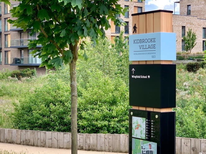
Air Design Limited
Work out how the sign will be used, cleaned and updated before choosing its finish. A coated aluminium panel can be a practical starting point for exposed locations. A replaceable insert can make sense in a directory where tenants change. A printed graphic on reusable frames can suit an exhibition that needs to pack down and travel. Ask to see samples of the proposed surface and how lettering will be applied, and talk through exposure to sun, rain, regular cleaning and knocks. On a multi-sign job, get design, survey, fabrication and fitting costs itemised. That gives you a better basis for comparing quotes and lets you see what it will cost to replace a single panel down the line.
How do you make signage accessible to people with visual impairments? Start with large, clear lettering, a strong tonal difference between text and background and a finish and position that limit glare. Make detailed signs easy to approach. Depending on the building and the function of the sign, provide raised lettering or Braille where appropriate and agree a consistent, reachable place for tactile information. Build in another way to get important information where the setting calls for it, such as an audible announcement or accessible directions people can consult before arrival. For guidance on type, contrast, positioning and tactile signs in pedestrian and public transport environments, see the Department for Transport’s Inclusive Mobility guidance.
Involve blind and partially sighted people in a walk-through while the designs are still easy to change. Ask where they expected to find information, whether they could get close to it and what happened between one sign and the next. Include people who experience the environment from different heights and angles. Check that the signs on a step-free route lead to a usable entrance and carry on beyond it. A real route can expose a problem the sign schedule hides, such as an accessible map placed at the other side of a busy reception queue. Give the team time to act on those findings before it releases the full production order.
12. Test what people do before you make the whole set

James Burton
You can learn a lot with a paper printout, a roll of tape and a handful of people who haven’t been to the site before. Give them a real task. Ask them to find the workshop, pick up a ticket or tell you what the shop sells as they walk past. Keep quiet while they try it. Note the first place they look, the word they misread and the point at which they stop for help. Ask what they remember after they’ve passed the sign. Someone who can describe the illustration in detail and can’t tell you which stall sold the coffee has given you better feedback than a roomful of people saying it looks great.
Test a second version against the problem you saw. If visitors miss a turn, try moving the sign upstream before you make the letters bigger. If a shop’s name is visible but nobody can work out what it sells, try a short descriptor and see what changes. If a screen cycles to the right information after everyone has moved on, try a static panel or a persistent line of text. Before approving the full run, check the production proof at the intended scale, verify the destinations and arrows against the latest floor plan and agree who will check the signs in place after fitting.
Once the signs are up, measure something related to their purpose. At a venue, ask reception to tally the most common requests for directions over comparable periods before and after the change. At a trade show, ask visitors where they first spotted the stand. For a shopfront, compare how often passers-by stop or come in at similar times of day, with some allowance for weather, events and promotions. The numbers are a way to see where people are getting stuck and what deserves another look.
Then go back to that stretch of wet pavement. Watch somebody approach who has no stake in the brass lettering and has never seen the design presentation. They spot the bakery before the crossing, work out what it sells and go in. The sign will probably be the last thing they mention when they tell a friend where they bought the bread. For a piece of eye-catching signage, that’s a rather satisfying day’s work.
How to hire a signage designer on Creativepool

Simon Manchipp
Ask a signage designer to show you a previous job from where a visitor would first encounter it. For a shopfront, that might be across the road. For a wayfinding scheme, it’s the first junction where someone has to choose which way to go. Ask what changed after the first site visit. A story about a pillar that hid the only useful arrow will tell you a fair bit about how that designer works.
Try searching for ‘signage design’, ‘wayfinding’ or ‘environmental graphic design’ on Creativepool’s Talent page. Use the location filter if you need someone who can visit the site, or switch to Project search to find work similar to yours and see who made it. Once you’ve found a few promising portfolios, get in touch through the designers’ profiles to check their availability.
For a one-off commission, you can post a free studiogig and receive applications from vetted freelancers. If you need someone in-house to manage signage across several shops, venues or exhibitions, you can advertise a permanent role.
Give everyone on your shortlist the same brief. Include site photos, a floor plan if you have one, your budget and the date the signs need to go up. Say if you already have a fabricator and ask who’ll handle the site survey, production artwork and proofs. Above all, describe what’s happening on the ground. ‘People keep asking the café staff how to get back to the car park’ is a perfectly good first line for a wayfinding brief. It gives a designer somewhere to stand and something to solve.