


Of all the creative arts, graphic design has perhaps the most unique and rich history of innovation and rebellion, with certain creations upending the status quo and leaving an indelible mark on art and visual culture.
From pioneering maps and movements to bold brand identities, these graphic designs have changed how we think and feel about art and design.
Today, as part of our ongoing “Best Of” month series picking out the best of the best of the creative world, we’ll explore some iconic designs that transformed the creative landscape forever, with insights from industry leaders on why they mattered.
Along the way, we’ll also see how the spirit of revolution in design continues to inspire today’s graphic designers.
What Makes a Design Revolutionary?
Not every popular style or logo is truly revolutionary. True game-changing designs often feel shocking or wrong at first, before time proves their genius. As Simon Manchipp (Founding Partner at branding agency SomeOne) puts it:
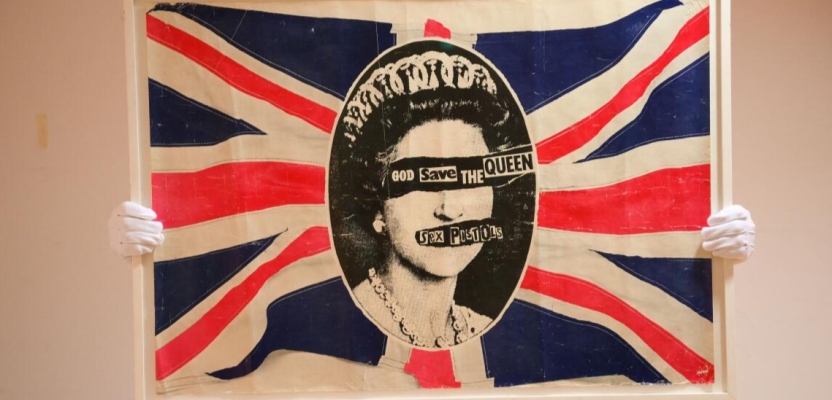
“Harry Beck’s 1933 Tube map didn’t show you where things were. It showed you how to think about where things were. That’s not decoration. That’s revolution. He lied about geography to tell the truth about movement. Brutalism did the same with concrete — refusing to apologise for being concrete. Jamie Reid’s Sex Pistols ransom notes? Type as weapon. Photocopied sneers that still echo. Way before a Brat summer.
What doesn’t belong here? Minimalism as a lifestyle accessory. Flat design. All those oat-milk startups with ‘clean’ sans serif identities. That’s not revolution. That’s Stockholm syndrome from a decade of Apple keynotes. Design that actually changes art forever is supposed to look wrong before it looks right. Bauhaus was ‘degenerate.’ Swiss typography was ‘inhuman.’ Punk was ‘ugly.’ Which means the next forever-shift is probably festering right now on someone’s bedroom floor.”
Manchipp’s passionate take reminds us that revolutionary design breaks with convention and redefines aesthetics or communication. The Bauhaus style was once condemned as “degenerate” by the Nazis; Swiss Style typography was initially seen by some as cold and mechanical; punk graphics were called ugly and unprofessional. Yet these approaches ended up transforming visual art across the world.
Below, we look at several graphic designs (from specific works to entire movements) that altered the trajectory of art and design.
The London Tube Map: A New Way to See
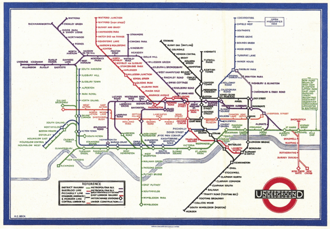
One early revolution in information design came in 1933 with Harry Beck’s London Underground Tube Map. Before Beck, transit maps tried to mimic real geography, becoming cluttered and confusing. Beck’s insight was radical: to simplify. He drew the subway lines like an electrical circuit diagram – color-coded, evenly spaced, and only using vertical, horizontal, or 45° lines. This diagrammatic map ignored exact distances and geography, instead showing travelers an intelligible system of connections.
Originally, Beck’s design was considered too radical by transit officials and was rejected. But a trial print proved the public loved it. The result was “an instantly clear and comprehensible chart” that not only became an essential guide to London, but a template for transit maps worldwide. Nearly every modern subway map – from New York to Tokyo – owes a debt to Beck’s invention of the diagrammatic transit map. His 1933 design is now regarded as a design classic that changed how people visualize complex information.
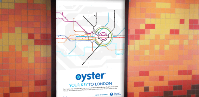
Beck’s map taught designers that clarity and concept can trump literal accuracy. By “lying” about geography to tell a deeper truth about movement (as Manchipp noted), Beck opened the door for information design to be creative and user-centric. It’s a perfect example of design innovation that at first looked “wrong” but proved undeniably right.
The Bauhaus Movement: When Modernism was "Degenerate"
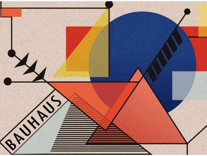
In the 1920s, the Bauhaus school in Germany turned art and design on its head. Bauhaus designers like Walter Gropius, Paul Klee, and Laszlo Moholy-Nagy pushed a philosophy of form follows function and unity between art and industry. They embraced minimalist geometry, clean typography, and functional aesthetics. This was a sharp break from the ornate, decorative styles that preceded it.
At the time, these modern ideas were so shocking that the Nazi regime shuttered the Bauhaus in 1933, branding its abstract, internationalist art as “degenerate”. Yet what was once dismissed as deviant became the very foundation of modern design. Bauhaus design was revolutionary for its day, completely turning the way the world looked at design on its head. By integrating fine arts with crafts and technology, Bauhaus established that design could be both artistic and industrial, beautiful and functional. Nearly 100 years later, the Bauhaus movement remains a highly influential force – its DNA visible in everything from modern architecture and furniture to graphic layouts and typefaces.
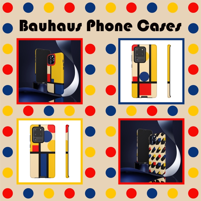
Key Bauhaus graphic works, such as Herbert Bayer’s universal typeface (a sans-serif alphabet) and minimal poster designs, introduced principles of simplicity and readability that still guide designers. The movement showed that stripping design to its essentials can yield a new, timeless beauty. Today’s minimalist brandingand user-interface designs trace back to Bauhaus ideas (even if not all minimalism counts as “revolution” per Manchipp’s critique). The Bauhaus’ once-“degenerate” style is now taught as a cornerstone of design education worldwide.
Swiss Typography: The Cult of Clarity
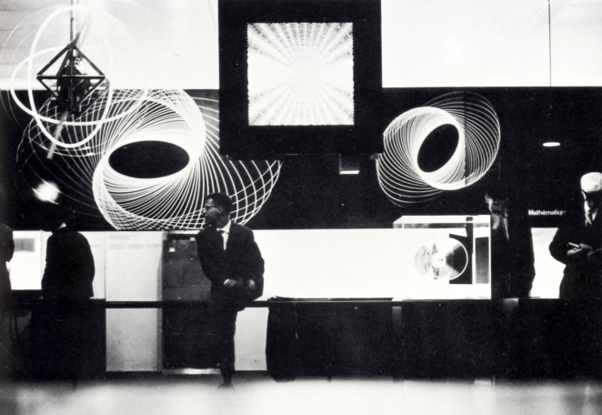
Building on Bauhaus ideals, the mid-20th century saw the rise of the Swiss Style (International Typographic Style) – a graphic design movement centered in Switzerland that perfected the art of clarity. Swiss designers like Josef Müller-Brockmann and Armin Hofmann pioneered the use of mathematical grids, sans-serif type (like Helvetica), and asymmetrical layouts to create order and legibility in design. They treated typography as a serious, objective tool for communication rather than personal expression.
When first introduced, this stark approach struck some as too impersonal – even “inhuman” in its machine-like precision. Yet the influence of Swiss Style became impossible to ignore. It shaped modern graphic design in the 20th century, introducing foundational principles of clarity, order, and legibility. From corporate logos to public signage, the world adopted Swiss principles because they just work – a clean Swiss grid makes information easier to navigate, and a neutral font lets content speak without distraction.
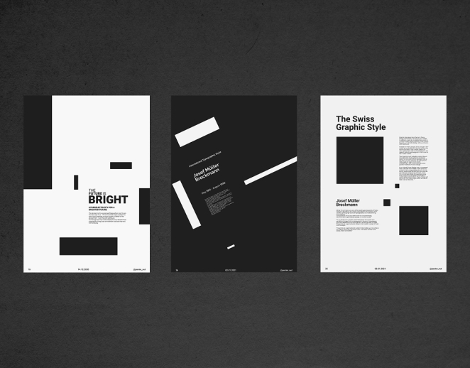
Think of your daily life: the readability of subway signs (often in Helvetica), the clean layouts of websites and magazines, or the simplicity of a modern corporate logo – much of that is thanks to the Swiss Style revolution. By the late 1960s, even mega-brands like Coca-Cola were drawing from the Swiss “less is more” philosophy in rethinking their identities (as we’ll see next). What was once derided as overly sterile became the default language of global visual communication.
The Swiss Style’s longevity shows how a once-radical idea can become classic. Its “timeless principles (like clean grids and minimal type) still shape how we design today”. Every designer who has learned about aligning to a baseline grid or choosing a sans-serif for clarity is inheriting the Swiss legacy. In short, this movement permanently changed the art of typography and layout, proving that simplicity and structure can be profoundly beautiful.
Punk: The Ugly and the Unforgettable
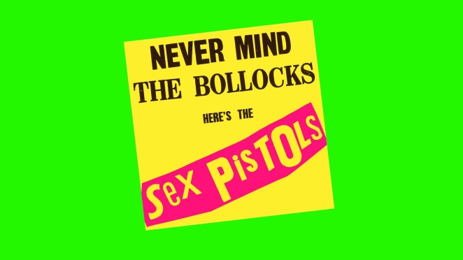
By the late 1970s, reactionary forces were brewing against the very notions of order and polish in design. Nowhere was this more explosive than in the punk rock movement, where graphic design became a weapon of rebellion. At the forefront was artist Jamie Reid, whose cut-and-paste collage artwork for the Sex Pistols defined punk’s look.
Reid’s most famous piece, the 1977 “God Save The Queen” single cover, is arguably the most iconic punk image of all time. It features a defaced portrait of Queen Elizabeth II with her eyes and mouth obscured by ransom-note lettering – a direct affront to authority and propriety. The image, released during the Queen’s Silver Jubilee, was so provocative it was banned by the BBC, yet it became a cultural legend. Reid followed up with neon day-glo album covers like “Never Mind the Bollocks” and other ransom-letter graphics that broke every rule of good design – intentionally so.
Why did this “ugliness” change art forever? Punk graphics tore apart the idea that design must be pretty or corporate. Reid’s work showed that raw, messy, and confrontational visuals could better express a cultural moment than any slick ad agency design. The ransom-note typography, DIY collage, and fluorescent colors created a visual vocabulary for rebellion that has since been absorbed into mainstream design and art. What was once the anti-design of a subculture is now exhibited in museums like the MoMA and the V&A as important art.
Punk’s graphic style paved the way for later design waves: the grunge typography of the 1990s (think David Carson’s Ray Gun magazine) and today’s resurgence of Brutalist and “anti-design” aesthetics on the web. It proved that shock value can carry a powerful message, and that “looking wrong” is sometimes exactly what a design needs to wake people up. In the words of Manchipp, punk design was ugly – and that was its genius. It permanently expanded the palette of what’s acceptable in graphic art, reminding creators that breaking the rules can itself be an art form.
Brutalism's Raw and Unapologetic Edges
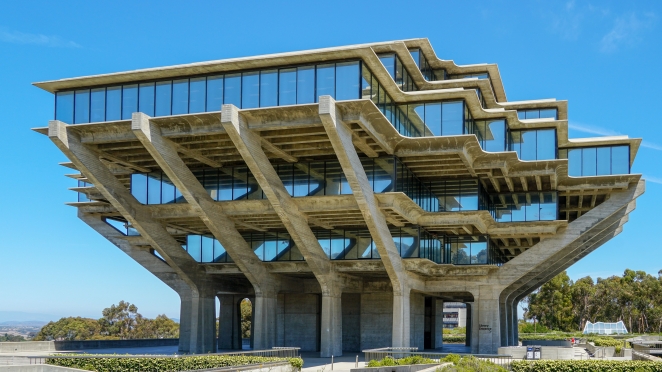
In architecture, Brutalism (popular in the 1950s–70s) was about raw concrete and honesty of materials – buildings that were blocky, unadorned, even intimidating. Designers in recent years have channeled that spirit into graphic and web design. Brutalist-inspired graphic design strips away polish and ornament, embracing a look that can appear clunky, bare-bones, or “wrong” by conventional standards.
Why emulate Brutalism? Because it’s a reaction against the artificial slickness that can make all design look the same. Brutalist design, whether in print or on websites, intentionally looks raw and unadorned – sometimes resembling early 90s web pages or photocopied zines. This approach refuses to “apologize” for being what it is, much like Brutalist buildings proudly display rough concrete. In digital design, brutalism might mean using default system fonts, bare HTML layouts, clashing colors, or chaotic compositions. Proponents praise it for its honesty and daring: it’s design stripped naked.
In the context of graphic design history, Brutalism’s resurgence (and its extreme cousin, anti-design) is an important counter-trend. It shows designers once again pushing against the grain – the same way Bauhaus rebels pushed against ornament, and punk pushed against slickness. As Manchipp noted, “Brutalism did the same with concrete — refusing to apologise for being concrete.” In other words, owning the raw substanceof the medium can itself be revolutionary.
While Brutalist design isn’t everyone’s cup of tea (and can be taken to unusable extremes), its influence is evident. Major brands and creatives toy with lo-fi graphics and “ugly” layouts to stand out in a sea of perfect minimalism. The pendulum of design keeps swinging between polished and raw; Brutalism’s current vogue reminds us that there’s always an appetite for the bold and unorthodox. By challenging our aesthetic comfort zones, Brutalist design carries forward the legacy of earlier groundbreaking movements – keeping designers on their toes and audiences guessing.
Coca-Cola: When Branding and Art Collide
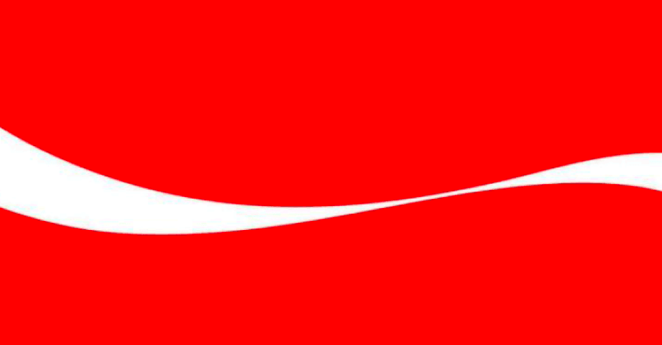
So far, we’ve looked at maps, movements, and music. Our next example comes from the world of branding, and it illustrates how a commercial design can also change the art of graphic design. The case in point: Coca-Cola’s evolution of its visual identity, particularly the introduction of the famous Dynamic Ribbon device in the late 1960s.
Coca-Cola has had its scripted logo since the 19th century, but by the 1960s the company sought a more unified, modern brand system as it expanded globally. The design firm Lippincott & Margulies (now Lippincott) was tasked with this overhaul, dubbed Project Arden. Instead of starting from scratch, designer Walter Margulies and his team looked to Coke’s strongest icon – the contour of its curvy bottle – and abstracted from it a new graphic element: the white “Ribbon” wave that flows under the Coca-Cola logo.
Debuting around 1969, the Dynamic Ribbon Device was a stroke of genius. It gave Coca-Cola a flexible symbol that could appear on any packaging, advertisement, or merchandise and be instantly recognizable, even without the full logo.
This idea – that part of a package or a fragment of a logo could carry a brand – was revolutionary in design. It extended Coke’s visual identity beyond just a wordmark, turning graphic design into a strategic asset for brand recognition.

The “Arden Square” system Lippincott created (a red square containing the script logo, the ribbon, and even standardized type like Helvetica) became “one of the most influential branding assets of all time”. It set a template that many other brands followed: think of Nike’s Swoosh (recognizable without the word “Nike”) or McDonald’s golden arches – the concept of using a singular graphic element as an icon of the brand took off after Coke’s success.
To understand why Coca-Cola’s Ribbon changed art and design, consider what senior brand expert Rodney Abbot (Senior Partner at Lippincott) says about it:
“The evolution of the Coca-Cola design system fundamentally changed the landscape of graphic design. It all started with one deceptively simple idea: that Coke should be instantly recognizable — even if what you see is just a fragment of the bottle. This packaging principle was limited to the design of the bottle for many years until the late 1960s, when the designers at Lippincott & Margulies (now Lippincott) took this concept further by introducing the ‘Ribbon,’ a visual element abstracted from the contour of the bottle and complementary to the Coca-Cola logo. This flexible visual device harmonized packaging and marketing while embodying the brand’s spirit.
What makes this innovation so profound is how it extended Coke’s distinction and intellectual property. This approach to branding — where a singular, iconic element is reinterpreted to reinforce uniqueness and strengthen the trademark — was revolutionary. It set a new standard for brand identity worldwide, demonstrating that a commitment to revealing the essential character of the brand, carried out with deep respect for its heritage, can elevate a brand into a living symbol of culture and art. In essence, the modernization of the Coca-Cola brand identity redefined art in branding forever.”
In short, Coke’s 1960s brand redesign showed the world that graphic design for brands could rise to the level of culture and art. A well-designed logo system isn’t just a marketing tool – it can become a beloved symbol imbued with meaning (the Coca-Cola ribbon is recognized across languages and nations).
The project also underscored the importance of brand consistency: thanks to that 1960s design language, Coke’s visual identity has stayed remarkably consistent for over half a century, proving the power of a strong design idea. Every time a company today thinks about flexible logos, dynamic branding, or preserving brand heritage in a modern way, there’s a bit of the Coca-Cola Ribbon philosophy at work.
Art Deco’s Geometric Glamour
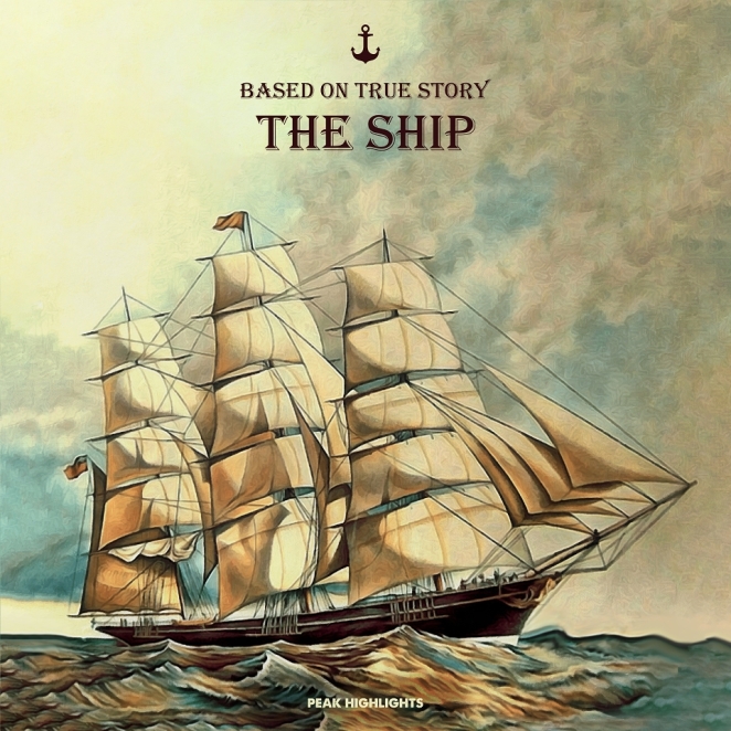
Hany Farouk
When the world emerged from World War I, it craved optimism and Art Deco delivered it in gold, chrome and geometry. In the 1920s and ’30s, it transformed graphic design into a statement of modern luxury. Sleek poster art, travel ads and magazine covers projected confidence through bold lines, symmetry, and metallic opulence.
Designers like A.M. Cassandre turned motion into art. His legendary Normandie poster (1935), depicting the ocean liner as a gleaming triangular monolith, captured the era’s faith in technology and progress. Cassandre’s dynamic compositions and custom typefaces like Bifur and Peignot defined an entire generation of visual sophistication — and laid the groundwork for modern typographic systems.
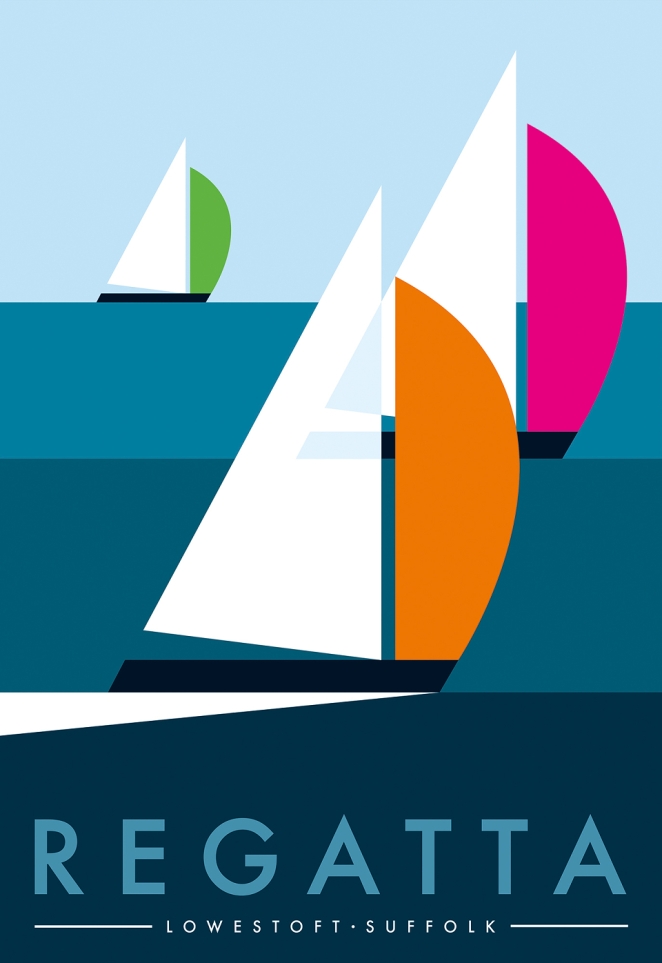
Art Deco’s geometric precision and stylised glamour influenced everything from packaging to cinema posters. Even today, luxury brands and editorial designers borrow its motifs to convey timeless elegance. Whenever a design channels symmetry, gold foil and bold type to express confidence, it’s echoing Art Deco’s enduring truth: modern can be beautiful, and beauty can be modern.
Pop Art and the Power of the Everyday
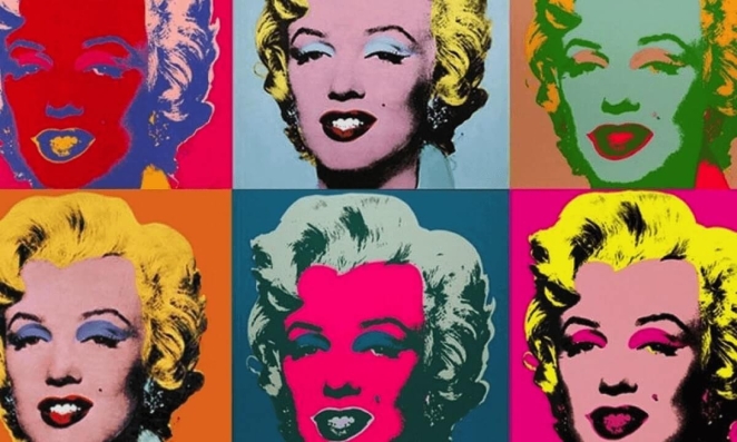
If Art Deco elevated luxury, Pop Art did the same for the ordinary. Emerging in the late 1950s, Pop Art blurred the lines between advertising, mass production and fine art — and in doing so, changed graphic design forever.
Andy Warhol’s Campbell’s Soup Cans turned supermarket packaging into cultural icons, proving that branding could be as powerful as painting. His Marilyn Diptych, repeating a publicity shot in bright, flat colours, borrowed the language of printing and advertising to explore fame, repetition, and identity. Warhol didn’t just imitate graphic design — he weaponised it, showing how repetition and colour could manipulate emotion and desire.
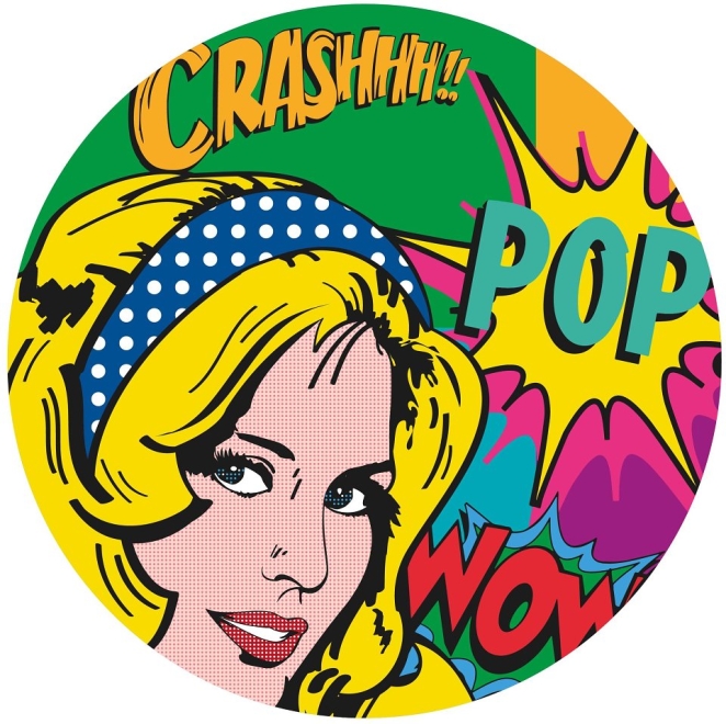
Meanwhile, Roy Lichtenstein took comic strips and magnified them onto gallery walls. His hand-painted Ben-Day dots, thick outlines and melodramatic captions reimagined mass-produced art as something worthy of contemplation. It was ironic, playful, and bold — a direct challenge to both art snobbery and design conservatism.
Pop Art’s legacy runs deep. Every vibrant poster, ironic ad campaign or retro-inspired brand owes something to Warhol and Lichtenstein. Their work taught designers that commercial imagery could be art, and that familiarity — when twisted with colour, humour and confidence — could be revolutionary. From Nike and Spotify campaigns to modern editorial layouts, Pop Art’s DNA is everywhere. It reminds us that design doesn’t need to whisper sophistication; sometimes, it’s most powerful when it shouts in full colour.
When "Wrong" Becomes "Revolutionary"
Every movement here began with discomfort. The common thread? Courage. Each designer challenged convention — and in doing so, shifted how art and communication intersect. The next design revolution might already be forming in someone’s sketchbook or code repository. It might look strange. It might even look wrong. But that’s the point. Every great design that changed art forever began with a designer who dared to see differently.
Find the Next Iconic Designer on Creativepool
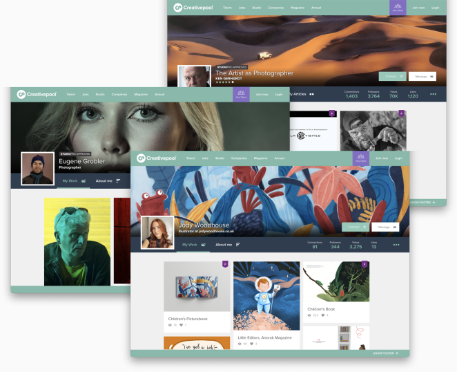
If you’re looking to ride the wave of design innovation, consider connecting with the community that lives and breathes creative change. On Creativepool, you can find and collaborate with the world’s best graphic designers and graphic design agencies, many of whom draw inspiration from these iconic milestones in design history. Whether you need a cutting-edge rebrand or a fresh creative perspective, you’ll find the talent ready to shape the future of design – perhaps even to change art forever, once again.