


A great website is more than a collection of codes and colours. It’s a living, evolving interface between idea and audience and a space where storytelling, utility and aesthetic intersect in real time. At least, that’s the ideal. The best websites shape how we engage with the digital world, raise the bar for user experience and redefine the creative potential of the internet itself.
At its core, website design is a uniquely multidimensional art form. It draws on graphic design, motion, architecture, psychology, typography, animation, and increasingly, performance and sound. Unlike a static poster or product package, a website must adapt and respond, intuitively guiding users, surprising them and making them feel something.
What makes a site truly great is when it’s more than the sum of its parts. The flow of interaction. The elegance of invisible UX. The storytelling baked into transitions, micro-interactions, scroll behaviours. The best sites feel as if they’re anticipating you whether you’re shopping, learning, laughing or working. That’s not accidental. That’s the result of thoughtful, layered design and a collaboration between visual creatives, strategists, developers, UX architects, writers and, in many cases, entire web design agencies.
Creatively, websites are also mirrors of their time. Flash-heavy art sites from the early 2000s feel vastly different from today’s ultra-minimal mobile-first builds but each tells us something about the tools, aesthetics and cultural touchpoints of its era. A pixel-packed homepage from 2005 might seem chaotic now, but in its day, it was a performance in HTML and GIFs. Conversely, today’s clean grids and ambient animations reflect an era of accessibility and speed.
And yet, despite trends and tech shifts, some principles endure. The best websites are ones that serve a clear purpose and do so with ingenuity. They take risks, invent new patterns and elevate content. Often, they even become reference points for the entire industry. These are the sites that creatives bookmark, developers dissect, and users return to again and again not just to navigate, but to experience.
So, in this article, I’ll be celebrating those icons by celebrating the websites that defined moments, broke moulds and set new standards. Some were built by lone designers, others by world-class agencies. Some were engineered to go viral. Others quietly shaped the fabric of the web.
But all of them, in their own way, represent the best of what happens when creative ambition meets digital execution.
Info.cern.ch (1991) – The First Website
In 1991, Tim Berners-Lee launched the world’s very first website at CERN. Fittingly, this bare-bones page was dedicated to explaining the World Wide Web project itself. There were no images, no fancy layouts – just green text on a black background describing how hypertext worked and who was involved.

Its simplicity was striking, but it opened the door to everything that followed. Amazingly, you can still visit a faithful recreation of that first page at info.cern.ch, preserved as a monument to the web’s birth. This unstyled page may look “ugly” by today’s standards, but it set the foundation for the internet by demonstrating the power of universally accessible information.
GeoCities (1994) – The DIY Web Goes Mainstream
Long before social networks were even a thing, GeoCities was where millions gathered digitally to learn HTML by trial, error and glitter GIFs. Organised into “neighbourhoods” (Hollywood, SiliconValley, etc.), it framed the early web as a place you lived, not just visited, and normalised personal publishing at scale. Its rise, Yahoo! acquisition, and eventual shutdown left such a cultural imprint that archivists later dubbed its rescued detritus a “digital Pompeii.”
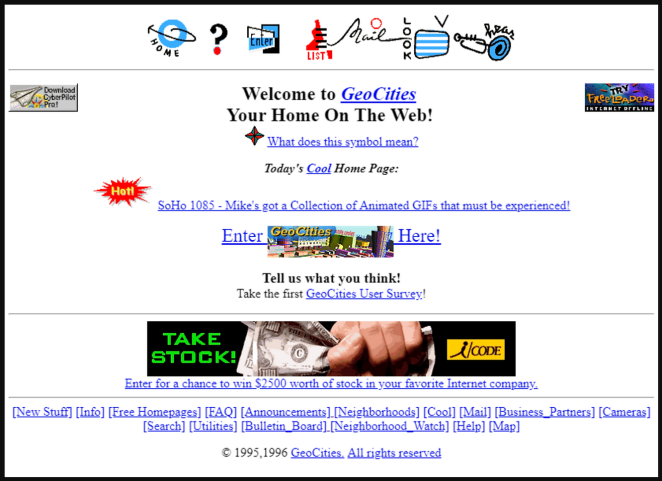
GeoCities hard-wired vernacular web tropes: page counters, guestbooks, web rings, tiling backgrounds and marquee text—low-fi components that nonetheless taught information hierarchy, navigation, and community signposting. The neighbourhood metaphor was a proto-IA pattern; web rings were an early discovery mechanism; and the sheer permissiveness of the canvas primed a generation to experiment with layout and colour outside professional constraints.
eBay (1995) – Reputation-Driven Marketplace Design
eBay transformed peer-to-peer trading into a mainstream behaviour and made trust a core UI element via seller feedback and transparent histories. “Buy It Now” (added in late 2000) fused the theatre of auction with instant purchase convenience, accelerating a host of now-standard ecommerce conventions and pushing interface design toward clarity, urgency, and confidence.
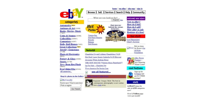
eBay’s listing pages evolved as micro-storefronts: image slots, item specifics, bid states, time remaining, and reputation badges combined into a compact decision engine. The site taught shoppers to parse noisy, user-generated imagery by augmenting it with structured metadata and trust signals—an early lesson in balancing free-form content with rigid UI scaffolding to reduce risk perception at checkout.
Craigslist (1995) – The Power of Anti-Design
Craigslist’s spartan index of blue links is design by subtraction: ruthless hierarchy, speed, and consistency. That stubborn minimalism made the site a global default for local classifieds and proved that when the job-to-be-done is obvious—find a flat, list a sofa—formality and ornament can be liabilities.

The creative trick is refusal: no branding fireworks, no gradients, just a predictable information model—category > list > detail—rendered in lightweight HTML. It’s a case study in task-first UX where scannability (uniform link styling, terse headlines, dense lists) and ultra-fast loads shape behaviour more than visual flair ever could.
Razorfish “Blue Dot” (1995) – First Animated Website
In 1995, digital agency Razorfish made internet history with a bouncing blue dot. Their website, which was nicknamed “The Blue Dot,” used Netscape Navigator’s new server-push GIF capability to create the first-ever animated homepage, an innovation so novel it often crashed browsers.

This playful moving dot captivated visitors and signaled that websites could be dynamic and interactive, not just static text. The Blue Dot helped establish Razorfish as a pioneer of web design and showed the world that the web could be a medium for creativity and motion, even in its early days.
Hotmail (1996) – Webmail for the Masses
Launched as “HoTMaiL” (a nod to HTML) and acquired by Microsoft in 1997, Hotmail mainstreamed the idea that your tools live in a browser. Free accounts, simple login, and an instantly familiar inbox made email a ubiquitous, commuter-PC-to-library-terminal habit—and framed the web app era that followed.

Hotmail’s genius was familiarity: folder lists, message tables, and toolbar actions mirrored desktop clients, then steadily layered Ajax interactions—drag-and-drop filing, inline actions—without breaking the mental model. It’s an early masterclass in progressive enhancement: evolve the UI’s responsiveness while preserving affordances users already trust.
Google (1998) – The Search Engine that Changed Everything
It’s hard to imagine life before Google. When Google’s clean, minimalistic site first appeared in 1998, it was a breath of fresh air compared to cluttered portals of the time. Google’s brilliantly simple homepage (just a logo, a search bar, and two buttons) underscored its mission to make the web’s information easily searchable.
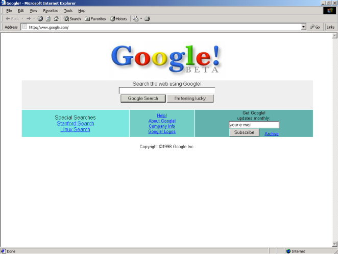
Over the years, that simplicity endured even as Google grew into a tech giant. Today, Google.com is the most visited website on the planet, processing billions of search queries each day. With around 97 billion monthly visits in 2025, it continues to attract more traffic than any other site. Google’s impact on the web is unparalleled: it not only set the standard for elegant, user-focused design, but it fundamentally changed how we find information online.
Amazon (1999) – One-Click and Frictionless Checkout
Amazon compressed the path from intent to order with its 1-Click system (patented in 1999), reframing conversion as a design problem: remove steps, collapse decisions, and make identity/payment state persistent. The pattern rippled across retail UX and even licensed into other ecosystems.
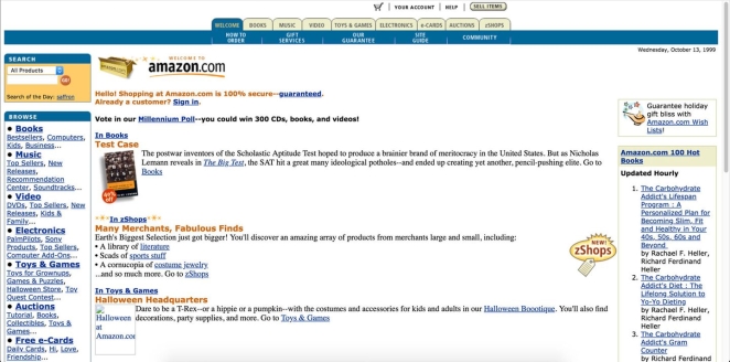
Creatively, Amazon’s product pages iterated toward an evidence-stack: primary image gallery, social proof (ratings/reviews), scarcity cues, and clean CTA zoning around the buy box. The checkout’s micro-interactions—default addresses, saved payments, instant confirmation—turn anxiety into momentum, proving that typography, spacing and state management can be as persuasive as copy.
Requiem for a Dream (2000) – A Flash Web Experience
By 2000, the film Requiem for a Dream showed that movie websites could be art in their own right. Its official site was among the first to fully harness Adobe Flash for a cinematic web experience. Far more than a simple promotional page, the Requiem site pulled visitors into an interactive descent that mirrored the movie’s themes of addiction and disintegration.

As users navigated deeper, the interface itself began to glitch and unravel, eventually collapsing and “ejecting” the user at the end. This creatively disturbing journey was a “cinematic gem” on the web, proving that a website could evoke emotion and storytelling just like a film. It set a precedent for Flash as a tool for immersive, experimental design in the early 2000s.
Wikipedia (2001) – Content First, Collaboration Always
Wikipedia’s impact is as much design as governance: a calm, typographic canvas scaled to millions of articles under clear editorial norms (NPOV, verifiability). Its navigational patterns—infoboxes, categories, references—make reading and contributing feel natural at planetary scale.

The creative language is spartan but intentional: infoboxes summarise, leads frame context, citation scaffolding builds trust, and accessibility guidance enforces readable, link-sensible pages. It’s interface as policy, where templates and layout conventions encode community values, demonstrating how design systems can sustain collaborative quality over time.
WordPress (2003) – Themes, Plugins and the Blog Template
Forked from b2/cafelog in 2003, WordPress separated content (posts/pages) from presentation (themes) and functionality (plugins), democratising publishing for individuals and brands alike. That architecture seeded today’s template-driven, no-code culture.

Creatively, the theme layer encouraged coherent typography, rhythm and layout across entire sites; plugins modularised complex behaviours (SEO, commerce, membership) into installable UI capabilities. Over time, the block editor pushed composition further—treating content as design primitives—so non-designers could craft grid-clean, responsive pages that still respect semantic structure.
The Pirate Bay (2003) – Search, Lists and Defiant Minimalism
TPB’s UX distilled a contentious activity to bare essentials: a search field, a categorical browse, and sortable tables. Its switch to magnet links reduced server burden and made the interface even leaner (click, launch client, done) cementing “get me the file, fast” as an interaction mantra.
Aesthetically, the starkness is the point: a logo, a ship, a tagline (“the galaxy’s most resilient BitTorrent site”), and an information-dense table that privileges metadata (seeders/leechers, size, age) over visuals. It’s utility theatre (performing speed and inevitability) while telegraphing a rebellious brand posture through minimal graphic cues.
MySpace (2003) – Mass Customisation (and Chaos)
Arguably the precursor to Facebook, only with a greater emphasis on customisation, MySpace handed the paintbrush to users: profile HTML/CSS hacks, autoplay music, glitter backdrops, and the notorious “Top 8.” It hard-wired identity performance into page design and taught a generation the basics of front-end modding—often by copy-pasting code snippets.
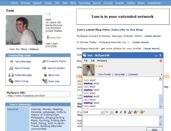
Creatively, it proved that permissive theming drives engagement and social drama. The cost—clashing palettes, broken layouts—was a UX lesson: expressive freedom without guardrails can erode readability and performance. But the pattern (user-authored skinning, embedded media, social modules) became a seed for later, more curated personalisation across the social web.
CSS Zen Garden (2003) – CSS Design Revolution
When CSS Zen Garden launched in 2003, it revolutionized how designers approached the web. Created by Dave Shea, this site was a simple HTML page styled purely with CSS, and designers around the world were invited to submit their own styles for it. The result was a gallery of hundreds of stunningly diverse designs – all using the exact same HTML content, with only CSS and images changing the appearance.
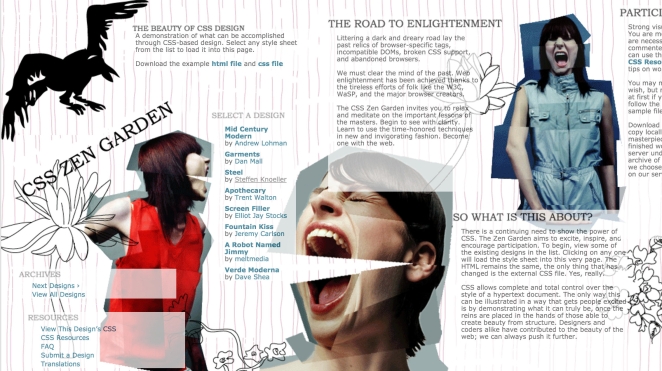
CSS Zen Garden brilliantly demonstrated the separation of content and presentation: you could completely transform a webpage’s look and layout without altering its HTML at all. From zen-like minimalism to elaborate illustration, the designs showed off CSS’s newfound power in the era of modern browsers. This project inspired a generation of web designers to embrace CSS-based layouts and creative styling, pushing visual web design forward by leaps and bounds.
Google Maps (2005) – The Birth of the “Slippy Map”
Google Maps made dragging, panning and zooming feel instantaneous by popularising Ajax in a mass-market app. It reset expectations for responsiveness and inspired a wave of mashups and APIs as developers treated the browser like a real-time canvas, not a sequence of pages.

Design-wise, it’s interaction choreography: grab-and-go panning, tile loading that anticipates motion, subtle hover states and markers that layer meaning without clutter. Later route-dragging and way-point editing showed how direct-manipulation UI reduces cognitive load—users edit the map itself instead of forms, a principle now common across web apps.
YouTube (2005) – The Thumbnail Grid that Ate TV
YouTube standardised the video web: a search-and-thumbnail grid, a frictionless embedded player, and “related” rails that made discovery feel endless. Its player updates in 2007 added slick in-player menus and quick access to embed code/URLs, cementing the share-anywhere model.
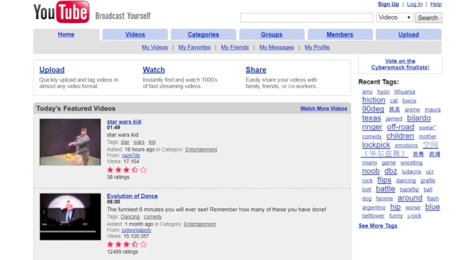
Creatively, the UI elevated thumbnails as poster art: bold faces, tight crops, legible text, high contrast—visual signals engineered for instant comprehension. The watch page’s recommendation column and later feed logic became attention-shaping design patterns copied everywhere, while iterative player chrome (controls, overlays) balanced function with unobtrusive polish.
The Million Dollar Homepage (2005) – Viral Internet Phenomenon
Not all influential sites are polished – some are just brilliantly quirky. Case in point: The Million Dollar Homepage, a one-of-a-kind internet phenomenon from 2005. Conceived by 21-year-old student Alex Tew as a way to pay for college, the site was a single blank grid of 1,000,000 pixels that he sold off at $1 per pixel as advertising space. The concept was so odd and audacious that it quickly went viral, drawing in businesses and individuals eager to “own a piece of internet history.”
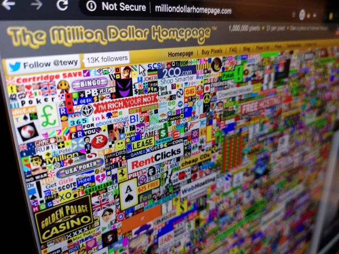
In a matter of weeks, Tew’s page became a chaotic digital quilt of tiny ads and logos, and by January 2006 he had sold every last pixel – netting about $1,037,100 in the process. The Million Dollar Homepage turned into a media sensation and proved that simple ideas (and a bit of internet novelty) can make a huge impact. Today, it remains online exactly as it was, a brightly colored time capsule of mid-2000s web culture where dozens of garish ads jostle for attention. It’s a little piece of web history that still makes people marvel and smile at the wild west days of the internet.
Facebook (2006/2009) – The Feed as the Interface
Facebook might no longer be the bell of the ball, but it remains perhaps the most influential of all social media websites. News Feeds (2006) reframed a website as a living stream of stories; the Like button (2009) made micro-feedback the atomic unit of interaction. Together, they defined the modern social web’s grammar: infinite scroll, ranking, and ambient participation at scale.
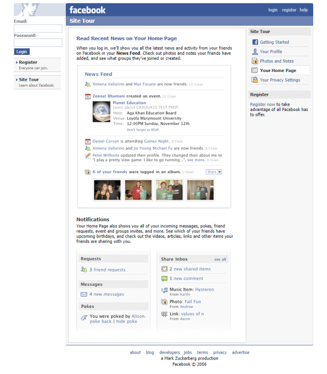
From a design lens, the feed introduced uniform “story” components (avatar, actor, verb, object, affordances) composable and rankable. Like’s tiny glyph became a behavioural lever and analytics input, flowing into sorting algorithms that tuned the interface to observed preference. It’s systematic UI (card patterns, subtle time stamps, inline actions) optimised for skim-and-respond speed.
Kickstarter (2009) – Crowdfunding as Interface
Kickstarter made pledge-based funding a mainstream behaviour by standardising the project page as a persuasion flow: hero video, narrative, tiered rewards, deadline and a big “Back this project” CTA, all anchored by a real-time progress bar and social proof. From day one (launched 28 April 2009), its layout taught creators to present scope, risk and updates in scannable modules, while teaching backers to read credibility from signals like comments and creator activity.

Creatively, the magic was less visual gloss than interaction grammar: timeboxes created urgency; tier cards framed value; updates/comments kept the page “alive.” Founder retrospectives and platform histories underline how the page architecture shaped modern crowdfunding rhetoric—and even academic work analyses how reward structure, price and time windows affect outcomes, which is really a study in interface incentives.
Pinterest (2010) – The Masonry Grid Era
Pinterest popularised the asymmetric “masonry” wall—an endlessly scrolling inspiration feed optimised for quick visual scanning rather than rigid rows. That look spawned a thousand clones, to the point where “Pinterest layout” became shorthand for staggered cards that close vertical gaps.
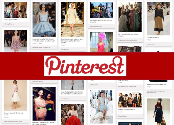
Technically, the aesthetic rode on David DeSandro’s Masonry library, which stacked items by available vertical space; the approach influenced CSS Working Group proposals and countless dev guides. Designers got serendipity and pace; engineers got a recipe (JS or modern CSS) for dense, image-led discovery surfaces across commerce and publishing.
The Boston Globe (2011) – Responsive at Newspaper Scale
BostonGlobe.com was the first major news site to fully commit to responsive web design, shipping a single codebase that elegantly adapted type, images and layout across phones, tablets and desktops.

Design firms Upstatement and Filament Group helped finesse adaptive images and typographic rhythm so articles remained readable at any width. The result normalised media queries and fluid grids in editorial design—and set a template every publisher would eventually follow.
Medium (2012) – The Clean Reading Template
Medium made long form feel modern again via generous whitespace, calm typography, roomy line heights and a reading view that banished chrome. It also invented social reading patterns (inline highlights, notes, and later “claps”) that blurred the line between audience and author.
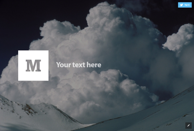
Medium’s highlight-and-respond is a seminal micro-interaction: it embeds conversation into paragraphs instead of relegating it to the bottom, changing how people annotate and share ideas. The minimal palette pushed an entire generation of newsroom features and brand blogs toward “calm design”.
GOV.UK (2012) – Service Design Wins “Design of the Year”
GOV.UK showed that task-first, accessible service pages can be award-winning design, unifying hundreds of departmental sites into one system and winning the Design Museum’s overall “Design of the Year” in 2013.

Its enduring influence is a publicly documented design system: patterns, content style, interaction rules and an explicit set of “Government Design Principles” teams can reuse. It reframed “good” as simpler, clearer, faster and measured by user outcomes rather than ornament.
Product Hunt (2013) – The Daily Launchpad
Born as a 2013 email list, Product Hunt turned launches into a ritualised feed: cards, upvotes, maker comments and a daily leaderboard. It became the place to debut, shaping how founders package landing pages and one-line value props.
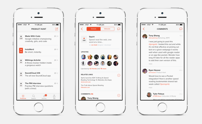
The UI’s constraints—short pitch, crisp visuals, time-boxed competition—create momentum and signal quality. Internal dashboards and community lore reinforce the loop: ship early, iterate in public, surface feedback, climb the board. It’s discovery UX engineered for FOMO.
Slack (2013) – Workplace UI with Personality
Slack made channel-based chat the operating system of work, then layered in reactions and threads—two micro-patterns that reduced noise while preserving context. The team’s design write-ups show years of iteration before “Threads” shipped in 2017.

Creatively, emoji reactions act as metadata (vote, acknowledge, escalate) and compress what would be dozens of “+1” messages; threads keep the main flow scannable. Slack’s own posts explain how these tiny affordances change team behaviour—design as social protocol.
Figma (2016) – Browser-Native, Multiplayer Design
Figma proved heavyweight creative software could be web-native and real-time: multiple cursors, comments, and prototyping in one canvas. That “Google Docs for design” moment reset collaboration expectations across the entire productivity stack.

Under the hood, Figma’s team documented the multiplayer tech (operational transformation) that keeps edits in sync; more recently, it’s even wiring its platform to AI/agents—evidence that “design in the browser” is now a platform layer.
Johns Hopkins COVID-19 Dashboard (2020) – Real-Time Civics
JHU/CSSE’s dashboard became the world’s most cited pandemic interface: a clean choropleth/map + counters + drilldowns, fed by mixed automated and manual data pipelines. It set the tone for sober, actionable crisis dashboards.

The published methodology details the curation, cleaning and publishing workflows—design decisions (colour, layer order, interaction) are all in service of clarity and trust. Governments and newsrooms copied the model wholesale.
ChatGPT (2022) – Chat as the New UI
It might have only launched on the 30th of November 2022, but it’s already almost impossible to imagine the internet without it. Besides introducing the wider world to the possibilities of generative AI, ChatGPT also subtly revolutionised how we interact with the web by design. It normalised the threaded conversation as a primary interface for search, writing and coding: iterative prompts, inline edits and context carry-over. It effectively put “dialogue with a system” at the centre of mainstream computing again, in many ways bringing us full circle.
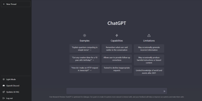
Subsequent interface updates shifted toward side-by-side editing and document-style workflows, reinforcing that the chat window is now a workspace, not a mere text box—patterns already echoing across productivity and creative tools.
Lusion (2023) – Cutting-Edge WebGL Experience
When it comes to pushing web technology to its limits, Lusion’s studio website is in a league of its own. Launched in 2023, the site is a jaw-dropping showcase of real-time 3D graphics and interactive storytelling. Lusion (a UK-based creative studio) essentially turned their homepage into a WebGL-powered playground – complete with floating abstract shapes, immersive transitions, and an astronaut shattering through your screen as you scroll. This site isn’t just for show either; it nabbed top industry honors, being named Website of the Year 2023 by the CSS Design Awards and even winning a Webby Award for its mobile design excellence.

Lusion’s team used the project to “push the boundaries of web technology and storytelling,” building a site that reflects their technical expertise and bold imagination. Despite all the visual fireworks, the site is smooth and surprisingly intuitive to navigate – a testament to the studio’s skill in performance optimization. Lusion’s creation proves that in 2023, a website can truly be a living, breathing art piece. It blows people’s minds (as their motto suggests) and sets a new benchmark for interactive web design.
INFINITI by Nissan (2024) – Immersive Luxury Online
The luxury automotive world has also seen its share of stunning web experiences. In 2024, INFINITI (the premium vehicle brand of Nissan) unveiled a new global website that redefines what a car site can be. Created by Critical Mass, the INFINITI site was built to “convey the luxury of INFINITI vehicles and the Japanese-inspired hospitality of the brand” in digital form. The result is an immersive journey that makes browsing cars feel indulgent. High-end visuals abound: full-bleed videos of sedans gliding through cityscapes, interactive 3D car models you can rotate, and silky-smooth page transitions that emulate the feeling of a luxury ride. Every interaction and motion on the site was obsessively refined to “make every single interaction feel truly luxurious,” from the way menus slide out to the elegant hover effects on buttons.

One groundbreaking feature is “Aimi,” an AI-powered digital assistant – essentially a lifelike virtual concierge who can answer questions about INFINITI models in real time. This 24/7 digital brand ambassador adds a personalized touch, guiding users through complex tech specs or comparisons with a friendly face. By combining rich storytelling, sensory visuals (including sound design), and cutting-edge tech like AI, the INFINITI site delivers an online experience as premium as sitting in the leather seat of an actual INFINITI car. It’s no surprise this project won awards (including a Creativepool Annual honor in 2024) and set a new standard for the auto industry’s websites. It shows that with the right creativity, even a car website can make you go “wow” and feel the brand’s luxury ethos through the screen.
Bringing Your Next Website to Life with Creativepool
If these websites spanning from the web’s inception to the cutting edge of today prove anything, it’s that when imagination meets execution, the result is culture-shaping design. Whether it’s interactive storytelling, groundbreaking UX, or seamless e-commerce journeys, the right digital talent can turn a layout into an experience, a page into a platform, and a platform into a legacy.
That’s exactly where Creativepool comes in. Whether you’re searching for a UX designer who understands behavioural flow, a full-stack developer who can bring your CMS to life, or a digital studio capable of launching a game-changing site from scratch, you’ll find them here. Creativepool is home to thousands of web designers, developers, creative directors, UX/UI specialists, digital agencies and tech studios. These are the people who turn ideas into interfaces and bring bold visions online, one click at a time.

Credit - Ben The Illustrator
Hiring an Individual Through Creativepool
There are three simple ways to connect with the best digital and web talent for your next website, campaign or experience:
1. Search and Contact
If you already know what you’re looking for — maybe a UI designer for a mobile-first platform, or a developer who specialises in interactive microsites — dive directly into the Creativepool talent network. Browse portfolios, code samples and case studies using smart filters. Creativepool’s ranking system helps you identify top professionals across disciplines, from boutique freelancers to globally acclaimed studio leads. Once you’ve found your fit, message them directly to start the conversation. You can also browse our Top 25 creative professionals in each category to see who’s setting the standard.
2. Post a Studiogig
Need a specialist fast? Post a Studiogig. It’s the fastest way to connect with freelancers and collaborators who understand the demands of digital experiences — from rapid prototyping and landing page design to complex CMS builds and immersive storytelling. Your brief is instantly distributed across the most relevant members in the Creativepool community, with responses delivered straight to your inbox.
3. Post a Job
If you’re building out an internal digital or product team (perhaps hiring a lead UX architect, junior developer or digital product owner) you can post a job directly. Creativepool reviews and promotes all listings, notifies qualified candidates, and hosts your role on a Jobs Board visited daily by top-tier creatives and engineers. You stay in control of the process (no recruiters, no middlemen) just a direct line to the talent who can build your next great platform.

Credit - Ben The Illustrator
Hiring a Digital Studio Through Creativepool
If your brief calls for a full-service digital campaign, e-commerce platform or brand website, Creativepool makes it easy to discover, shortlist and connect with specialist studios.
Find a Studio
Use the studio search tool to explore digital portfolios, client sectors and development expertise. Filter by platform, technology stack or visual style, and discover studios behind some of the most compelling and award-winning websites in the industry. You can also explore our Top 10 creative agencies by speciality.
Post a Brief
Prefer proposals? Simply post your brief with your budget, goals and timeline. Studios that align with your objectives will respond with tailored proposals and creative solutions, helping you make confident, informed decisions.
Need Help?
Creativepool’s team of ex-industry experts is here to help you shape and scope your digital ambitions. Whether you’re producing a portfolio microsite, commissioning a complex ecommerce relaunch, or developing a fully bespoke web experience, we’ll help define your needs and connect you with the right talent fast. Chat with us live when posting your gig, or reach out via our contact page.
Because at Creativepool, we believe the next era-defining website is already being imagined, it just needs the right creative collaboration to bring it online.