

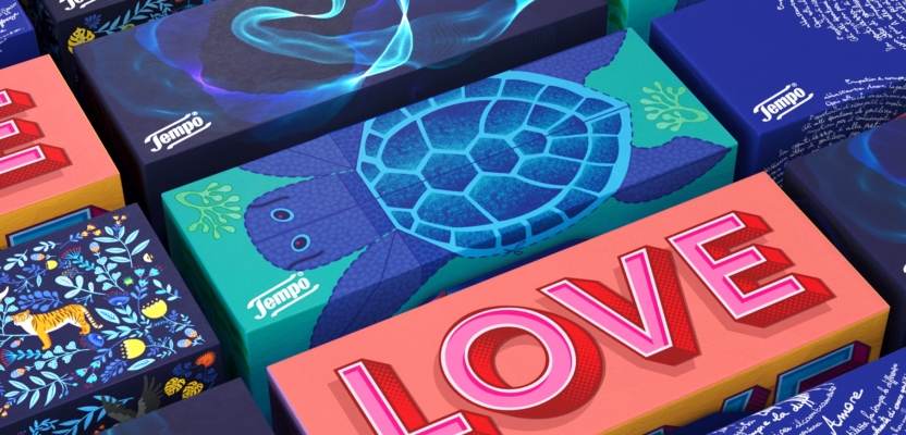

A fingerprint formed by handwritten phrases, an EEG of the brain’s response to kindness, and a turtle designed by renowned illustrator Rebecca Sutherland all feature in striking new packaging for Essity-owned tissue brand Tempo in Italy, created by WMH&I.
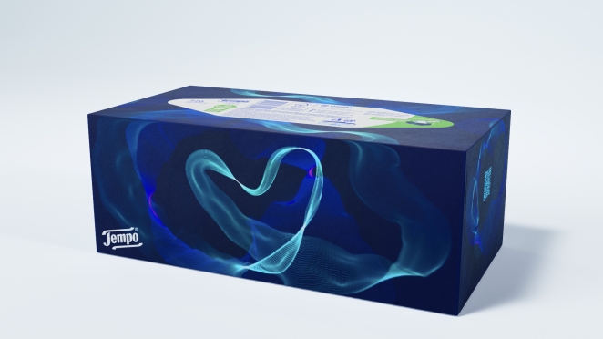
For the design inspired by kindness to self, WMH&I took real-life EEGs recording people’s reactions to witnessing acts of kindness, artfully adjusting it to create a heart-shaped motif blending science with aesthetics.
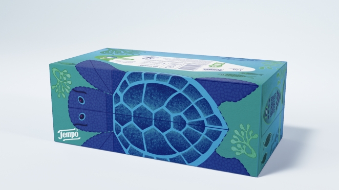
Award-winning illustrator Rebecca Sutherland, whose work has appeared on Royal Mail stamps and for brands including Waitrose and Virgin Atlantic, is behind the design linked to kindness to the planet. It features the Mediterranean loggerhead sea turtle, a globally threatened marine species, which can be cut out and turned into a 3D model once the tissues have been used.
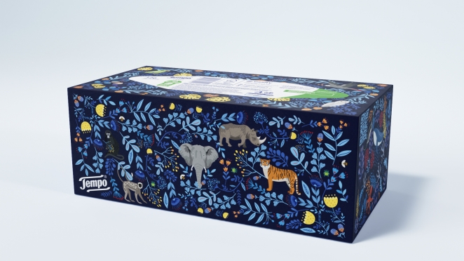
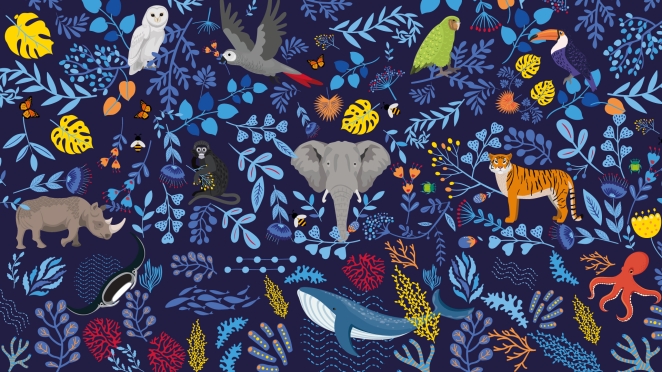
Two further designs depict other endangered species and striking typography, with WMH&I also creating a series of animated videos and website assets to go with the new packaging, including a film showing how to make a model from the loggerhead sea turtle. These are linked to QR codes on the packaging.
To learn more, we spoke to the team at WMH&I about the power of packaging as a tool.
What was the brief for the rebrand?
Packaging is an immensely powerful communication tool. It possesses the ability to generate value, deepen brand meaning, cultivate loyalty, and entice new audiences. Tempo recognised the opportunity to leverage its box packaging to evoke curiosity, desire, and establish a novel and captivating connection with consumers.
How did the initial pitch/brainstorming phase go?
The brief from Essity’s Italian team grew out of an earlier Tempo rebranding effort by WMH&I, which began in 2022 and saw WMH&I come up with a design playbook to be used by local Tempo teams across the world, laying out the guiding principles behind developing Tempo pack designs while inspiring them to think beyond the usual imagery.
This was driven by Essity’s desire to strengthen the presence of Tempo on supermarket shelves amid a worldwide trend for budget, own-brand tissue boxes to be given eye-catching designs.
Describe the purpose of the brand and its target audience
TEMPO is Europe’s leading tissue brand. Its purpose is centered around the idea that TEMPO and its products help wipe away negativity by instigating kindness - to ourselves, to others and to the planet.
The new designs are driven by TEMPO's three brand pillars of Kind to Self, Kind to Others and Kind to Planet, with the aim of deepening the connection between the brand and consumers.
What was your thinking behind the rebranding solution?
We defined a packaging design strategy on three key objectives. A pack design should be:
- Meaningful by being connected to the brand's purpose.
- Ownable by using the brand's distinctive visual brand assets.
- Considered regarding the pack as a complete 3D element and go beyond a generic pattern that is simply applied across all sides.
Did you learn anything new during the project?
We collaborated with Myndplay and delved into the visualisation of brain data. The EEG Neurofeedback headset allows brainwaves to go beyond the lab and the screen into the real and virtual world.
The MyndBand uses 3 dry sensors on the forehead to measure brainwave activity, this is then transmitted via Bluetooth to a computer, tablet or phone allowing a user to see their brain activity, focus, relaxation, and mindfulness states in real-time.
What was the biggest challenge? How did you overcome it?
To strike the balance between a striking and disruptive design that is still unmistakably TEMPO. Balancing the brand’s visual assets with illustrators’ own styles and getting a wide range of different designs working well together.
What kit/tools/software were used to create it?
Beside using the usual Adobe CS suite, we also worked in Cinema 4D and proprietary software and hardward from Myndplay.
What details are you most proud of any why?
As mentioned previously, the design inspired by kindness to self, we collaborated with Myndplay, a neurofeedback technology company to capture real-life EEGs recording people’s reactions to witnessing acts of kindness, artfully adjusting it to create a heart-shaped motif blending science with aesthetics.
What visual influences fueled your solution?
We set out to create a range of pack designs that would look and feel very different from each other. The typographic fingerprint design reflects each human being’s uniqueness, with a closer look revealing that the whorls are formed by handwritten phrases like “There is no small act of kindness” and “Empathy begins with understanding that we all struggle”. It connects to the pillar of kindness to others.

Other designs depict endangered species to help understanding of the environment and of the need for being kind to the planet. Award-winning illustrator Rebecca Sutherland, whose work has appeared on Royal Mail stamps and for brands including Waitrose and Virgin Atlantic, is behind the design linked to kindness to the planet.
It features the Mediterranean loggerhead sea turtle, a globally threatened marine species, which can be cut out and turned into a 3D model once the tissues have been used.
What do you hope it achieves for the brand?
At the heart of the Tempo brand is its purpose of bringing kindness to the moments that make us human. We tasked ourselves with the challenge of translating this ethos into packaging that would amplify its significance at the point of purchase, fostering customer loyalty while also appealing to new audiences. Our aspiration is that these packages continue to fly off the shelves, resonating with the hearts and minds of Italian consumers.
What would you do differently if you could do it over again?
Alongside the pack design, we created a series of videos and website assets for additional consumer education.
These assets are linked to QR codes on the packaging. In the future, there will be an even greater opportunity to create content that can further enhance the packaging experience. This is especially the case with tissue boxes, which often reside in people’s homes for extended periods.
Credit list for the work?
Creative Director Mark Nichols
Designer Rachel Dain
Business Director Emmanuelle Hilson
Strategy Director Wybe Magermans
Postproduction Jason Budgen, Val McCrum
Illustration Rebecca Sutherland, Rachel Dain
Neurofeedback Technology Myndplay