Wang Liying
Graphic Designer
ABOUT
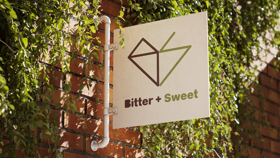
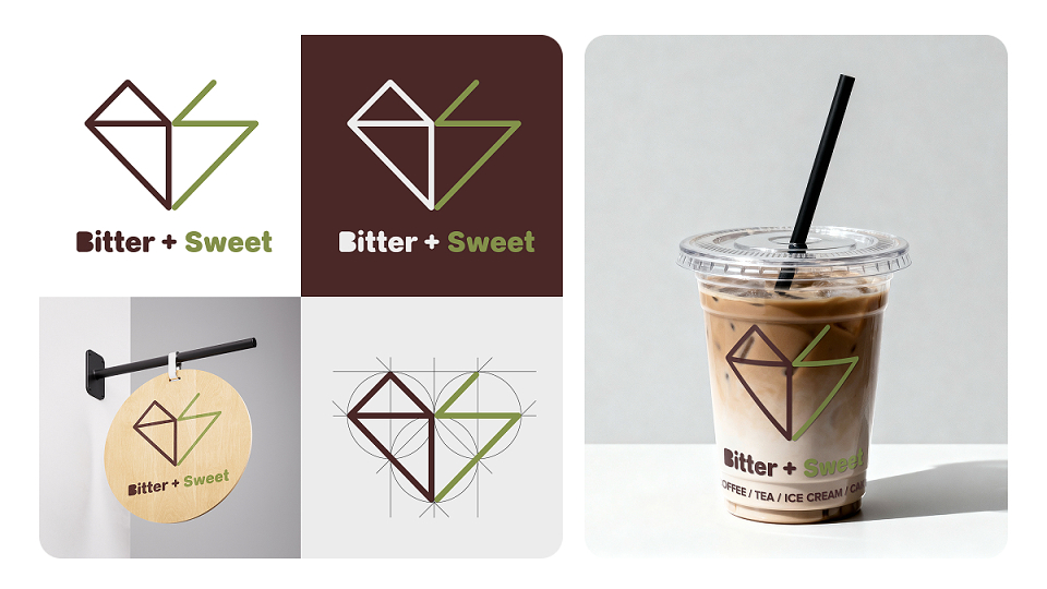
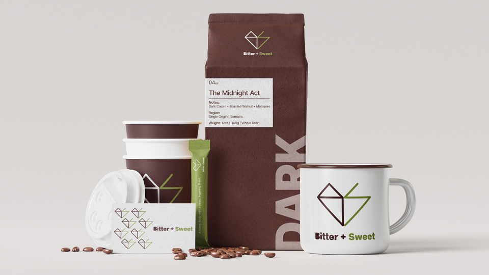
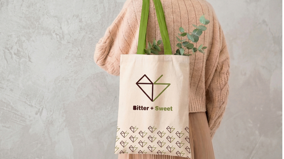
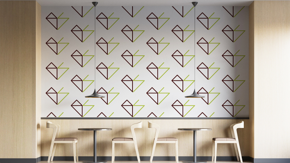
This project was inspired by the intrinsic duality of the coffee experience: the balance between strength and softness. The motive was to create a symbol conveying both technical precision and human warmth. Research into geometry and minimalist monograms led to a heart shape constructed from the letters 'B' and 'S'. The goal was to reward observant customers with a hidden narrative, moving beyond traditional coffee tropes toward a sophisticated, modern craft aesthetic.
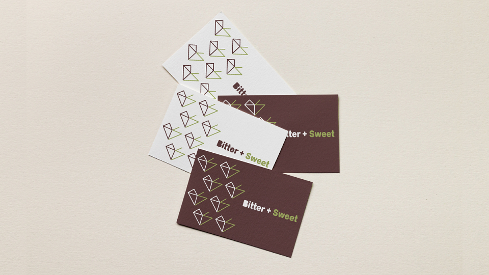
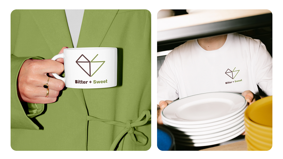
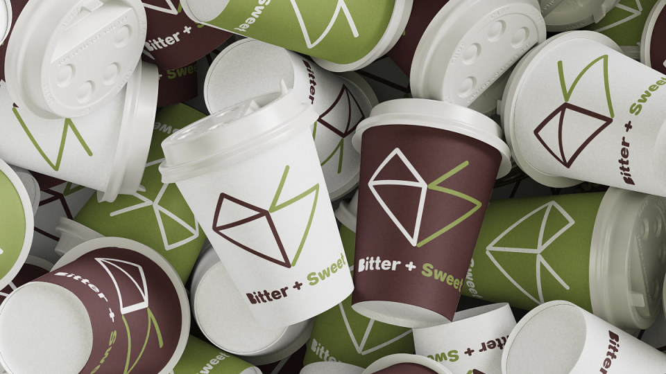
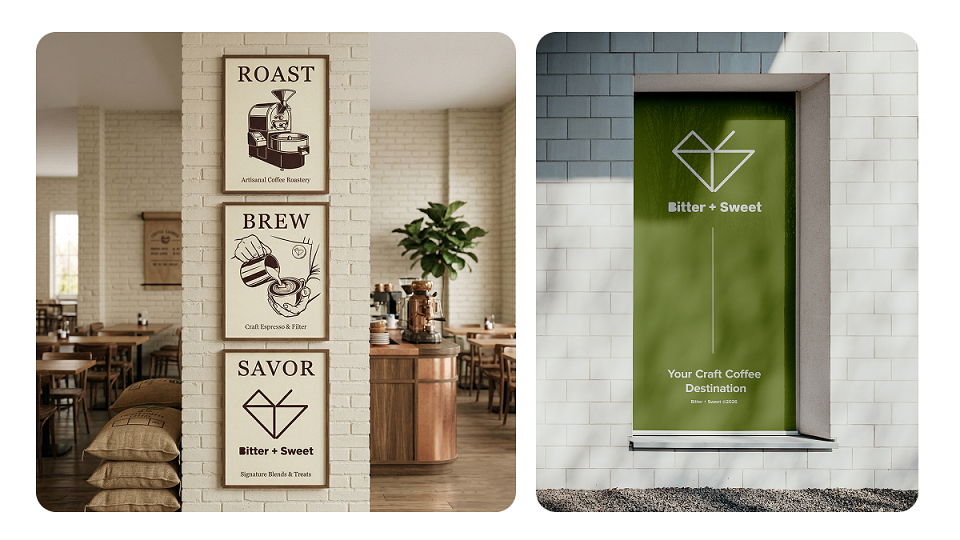
This identity is built to ensure pixel-perfect translation across digital screens and physical print. The logo is delivered in scalable vector formats and high-resolution raster files. Brand guidelines define minimum sizing and clear space rules to guarantee legibility on applications ranging from small paper espresso cups to large storefront window decals and embroidered employee uniforms.
AWARDS
A' Design Award 2026
MUSE Creative Award 2026
MADEIT CREDITS
-

Wang LiyingGraphic Designer
Annual 2026 ShortlistBitter + SweetGraphic
Project featured: on 24th April 2026