

2025 has been a landmark year in brand identity design, bringing forth some truly exceptional visual identities. From global rebrands to indie passion projects, designers pushed the boundaries of brand design this year to create striking logos, packaging, and visual systems.
If you’re looking for brand identity inspiration 2025 or creative brand identity ideas 2025, this roundup highlights over twenty of the most beautiful branding examples 2025. These standout projects illustrate the top trends and creative approaches in branding this year.
Exceptional Brand Identity Designs of 2025
Lily’s Bakes – Sweetly Cohesive Artisan Bakery Brand
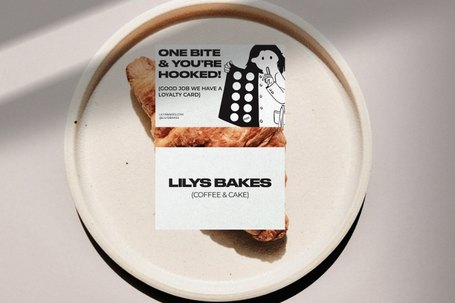
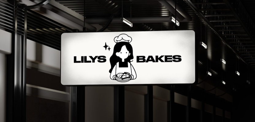
This boutique bakery’s branding earned Silver at the Creativepool Annual Awards 2025. Designer Phil Perkin crafted a charming, homespun visual identity for Lily’s Bakes, with a cozy logo and hand-drawn accents that evoke the warmth of homemade treats. The result is an award-winning design that feels both deliciously playful and professionally polished.
The Lottery Winners – Retro-Fresh Band Identity
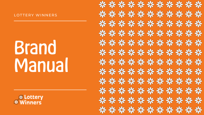
Indie pop band The Lottery Winners (from Manchester) received a vibrant rebrand concept that reached the Creativepool Annual shortlist. Nick Eagle’s design featured a “glasses-daisy” logo – a daisy flower doubling as eyeglasses – which was instantly recognizable and tied to lead singer Thom’s persona. With an orange palette and daisy motifs, the identity captured the band’s energetic, community-focused ethos and helped them stand out on the indie scene.
Bugg – Playful Premium Gardening Brand
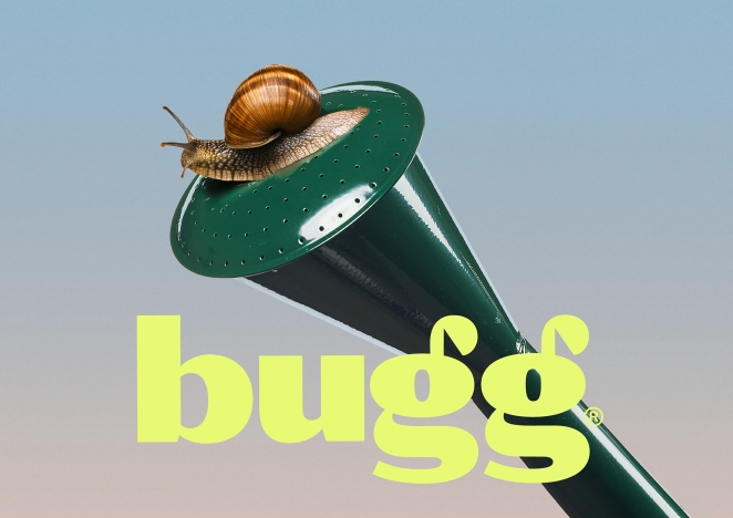
New Zealand gardening brand Bugg (by agency Seachange) proved that premium and “cute” need not be mutually exclusive. Bugg’s identity is bright-eyed and lightly eccentric: part high-design lifestyle brand, part whimsical ecosystem of garden characters. The Seachange team developed a joyful visual world – from a clever logotype where mirrored “g” letters sprout like beetle antennae, to earthy-meets-acid color pops – delighting design-conscious plant lovers.
Butter Baby – Whimsical Dessert Mascot
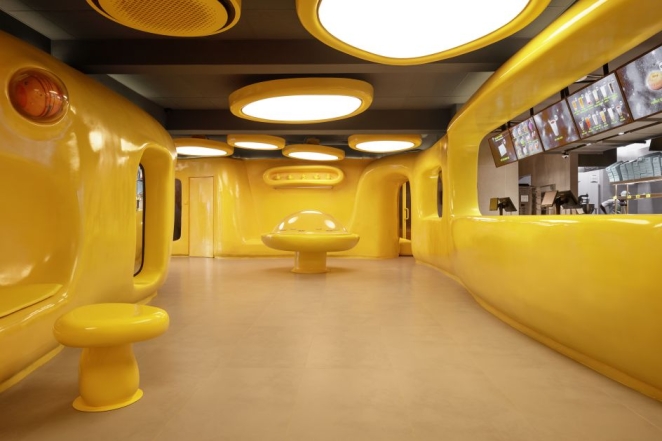
Jakarta’s Butter Baby dessert shop, branded by Universal Favourite, is built around an “adorable butter alien” mascot with an elaborate backstory. The entire brand identity was forged around this character, a bold approach that contrasts with typical mascot usage. The result is “a distinctive and out-of-this-world” visual identity, saturated in buttery yellow and vibrant blue, that feels weird yet works brilliantly. Butter Baby’s playful alien and maximalist packaging create an immersive brand universe that’s irresistibly charming.
Mutt – Pet Wellness with Personality
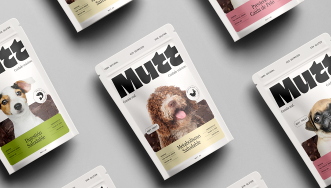
Mexican agency Brands & People reinvented petcare brand Mutt with a fun yet sophisticated identity. The new look is “fun but trustworthy; cute but not saccharine; bright but not lurid,” perfectly balancing emotional warmth with mass retail appeal. A standout feature is the chunky wordmark that, when animated, reveals wagging dog tails in its letterforms – a cheeky detail that keeps the design dog-centric. With its perky pastel palette and human wellness-inspired clarity, Mutt’s branding reflects the modern pet owner’s deep bond with their “fur companions.”
BubbleKush – An Effervescent Identity That Fizzes With Personality
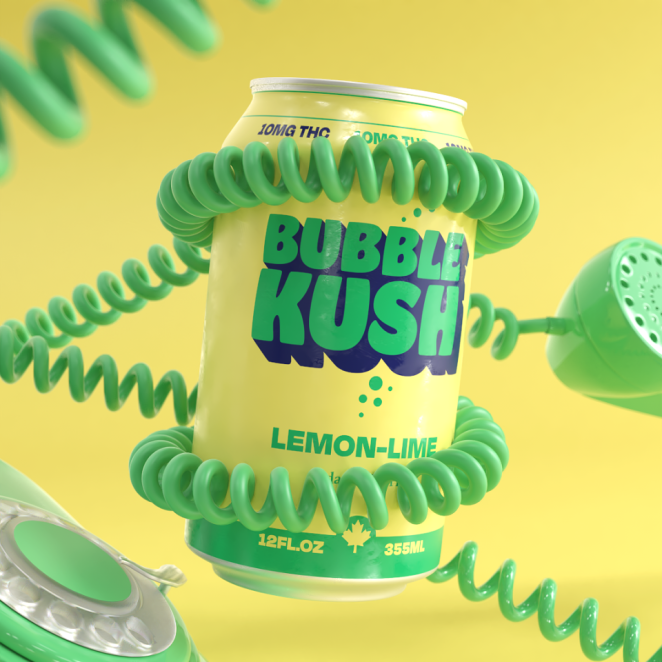
Elena Pavchuk’s BubbleKush for Greentone injects pure effervescence into brand identity with a bold, fizzy visual language that perfectly mirrors the playful personality of the Canadian THC-infused soda. The identity bursts to life through vibrant 3D elements and dynamic forms that feel as lively as the product itself, creating a sensory-rich experience that stands out in a crowded drinks category. Every aspect of the design — from its striking colour palette to its tactile, almost tangible visuals — communicates energy and innovation, proving that BubbleKush isn’t just a brand, but a mood. Celebrated with a Bronze nod at the Creativepool Annual 2025, this project exemplifies how imaginative brand design can elevate product storytelling.
INTL 2025 (International Assembly) – Festival Parade Aesthetic
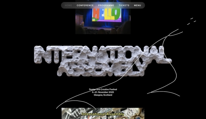
The graphic design festival INTL (formerly GDFS) launched a spectacular 2025 identity by Warriors Studio and NAM. The design is like an imagined parade of ideas – a dynamic, carnival-esque visual world complete with illustrated characters (Erica the caterpillar, Daisy the flower, etc.) that march across posters and screens. Most striking is the experimental typography: hulking 3D letterforms “sculpted” in VR, with wild stone-like textures that blur the line between typography and art. This identity’s celebratory chaos and sculptural type made it one of the year’s most talked-about event brandings.
MAG – Mayo with a Modern Retro Punch
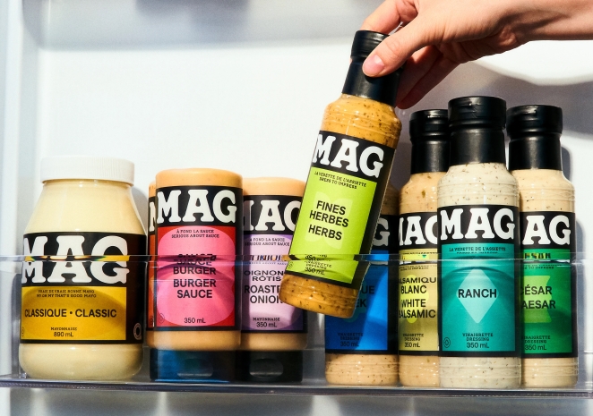
Quebec-based condiment brand MAG (rebranded by LG2) turned heads with its gloopy, bold wordmark that looks like splattered mayonnaise. The all-caps white logo, set against black, has a Cooper Black-esque confidence and perfectly reflects the product – comforting yet contemporary, slick but homely. LG2’s redesign is a “masterclass in simplicity that packs a punch,” stripping the packaging to essentials while using a unique color-and-shape system for each sauce. MAG’s identity feels retro and fun, but also fresh and innovative – an impressive balance that truly “stands out on shelves”.
Forest Carbon – An Identity That Listens to Nature and Lets It Speak
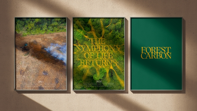
Design Bridge and Partners’ Forest Carbon – In Tune with Nature reframes environmental branding with a poetic mix of science and sensory storytelling, translating the very sounds of thriving ecosystems into a compelling visual identity. Anchored in the concept of bioacoustics, the identity system converts real forest soundscapes into dynamic Chladni-like patterns that pulse with organic rhythm and scientific precision. This sonic-driven approach gives voice to restored wetlands across Southeast Asia, transforming data and biodiversity into a visual language that feels alive, purposeful and deeply resonant. The result is a striking and intelligent brand world that elevates Forest Carbon’s mission beyond cliché green tropes to something as emotionally rich as it is technically grounded, making the invisible recovery of nature both seen and felt.
Olive + Gourmando – Lively Café Chaos, Refined
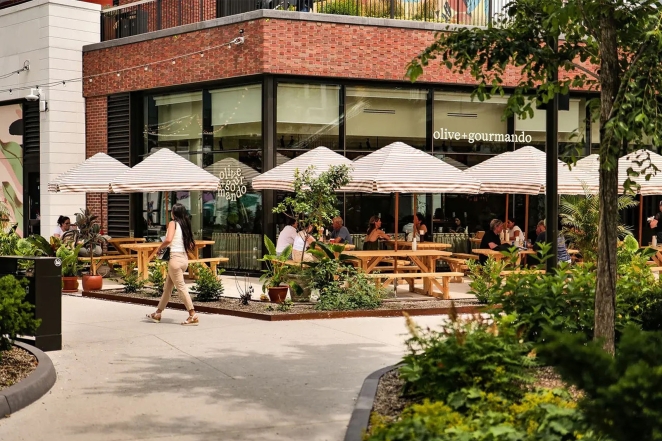
Montreal’s beloved bakery-café Olive + Gourmando worked with Caserne on a refresh that keeps its warm, artisanal charm even as it grows. The new identity centers on a flexible wordmark whose letters have “no fixed position” – sometimes tumbling playfully, other times lining up neatly. This elasticity gives a sense of spontaneity and “echoes the restaurant’s bustling, convivial atmosphere”. Caserne’s design maintains consistency without rigidity: “lively, organized chaos and inviting energy” are captured through scattered typography and earthy packaging, all while feeling timeless and genuine. It’s a perfect example of a heritage brand modernizing with subtle creativity.
Cob (Cob Foods) – Retro Kitchen Warmth
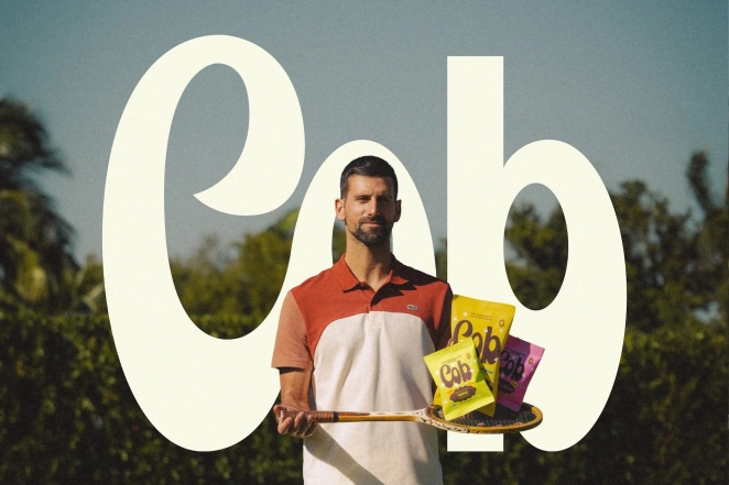
Cob Foods, a new snack brand co-founded by Novak Djokovic, got a delightfully nostalgic identity by Saint-Urbain. Inspired by 1970s kitchen culture, the branding features a friendly rounded wordmark and sunny retro color palette. It’s a “bright, confident identity” that reimagines healthy snack branding by making “corn-free” feel exciting, not restrictive. Warm yellows, chocolate browns, and playful layouts give Cob a welcoming, joyful-yet-iconic vibe. As Saint-Urbain describes, it’s proof that healthy food can still be joyful, iconic, and craveable – a refreshing take in the wellness space.
Tottenham Hotspur — Heritage Refined, Identity Reimagined
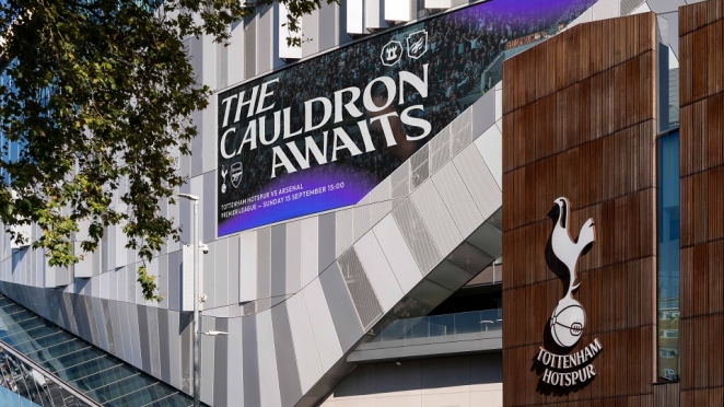
Tottenham Hotspur — Reimagined. Reborn. Remastered. sees Studio Nomad and Tottenham Hotspur collaborate on a thoughtful evolution of one of football’s most iconic identities, blending deep heritage with contemporary flexibility. The remastered brand honours the famous cockerel emblem — refined for clarity and impact across digital and physical platforms — while reintroducing the beloved THFC monogram and a suite of heritage-inspired hallmarks that nod to the club’s North London roots. Across a nine-month process informed by fans, players and club stakeholders, the identity system expands into a dynamic visual language of refreshed colours, patterns and a bespoke variable type family that feels as proud and spirited as the club itself. The result is a bold yet respectful evolution that embraces tradition while equipping Spurs to connect with a new generation of supporters around the world.
Current State – Boldly Colorful Skincare
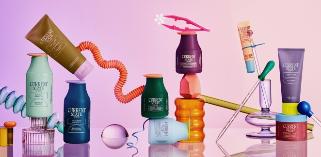
Skincare line Current State (by Werner Design Werks) broke away from the minimalist trope of beauty branding. Embracing an “explosion of 30+ colours” across its packaging, the brand visualizes its ethos of no fixed routine – your skin’s needs are ever-changing. This vibrant, multicolored identity is playful yet credible: it “eschews the overtly cutesy” while remaining slick and trustworthy. In a market of subdued apothecary-style labels, Current State’s approach is applauded for “very blatantly eschewing” the boring minimalism of competitors. The result is a skincare brand that is fun, flexible, and stands out on a Walmart shelf without sacrificing an ounce of professionalism.
Post Post Hotel – Heritage Typography with Wit
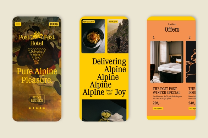
Studio Bruch’s rebrand of a 600-year-old Austrian hotel (formerly “Old Post”) is a typography lover’s dream. The highlight is a gorgeous bespoke serif font (BR-Post) whose letterforms hide an “Easter egg”: their counters and flourishes align perfectly with the circular perforations of postage stamps, nodding to the hotel’s postal history. This clever detail delights the “TypeNerds” while the overall design balances old-world charm and modern simplicity. A mustard yellow and powder blue palette, a playful monogram, and illustrated “postman” characters (contemporary yet woodcut-inspired) round out an identity that feels upscale, witty, and deeply rooted in place. It’s a masterclass in blending tradition with fresh creativity, proving that even a centuries-old brand can feel new again.
VerifyLabsAI — A Brand Identity Built on Trust in an AI Age
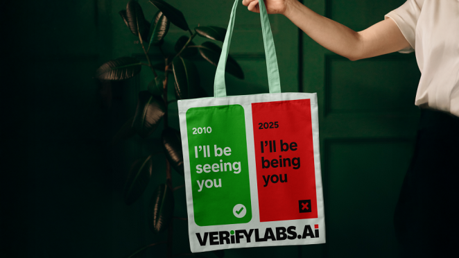
With VerifyLabsAI, Brand & Deliver has crafted a brand identity that feels both sharply intelligent and imminently relevant in a world navigating the challenges of synthetic media and digital trust. Built around the mission of helping people and organisations distinguish real from AI-generated content, the visual system distils confidence and clarity into every touchpoint — from mark to messaging — reinforcing the idea of reliability in a landscape rife with uncertainty. The identity balances a crisp, modern aesthetic with purposeful, human-centred cues that speak to accuracy and protection at scale, echoing the platform’s promise to make deepfake detection and verification accessible and trustworthy. In doing so, it elevates VerifyLabsAI from a technical solution to a stand-for-something brand in the emerging age of AI authenticity.
Project Send – Dynamic Climbing Gym Identity
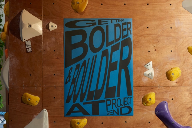
Singapore’s Project Send climbing gym, branded by Foreign Policy, exemplifies meaningful motion design. The studio used kinetic typography to mirror the flexibility and community spirit of climbing. The identity features a modular system where the wordmark and layouts literally stretch, shift, and rearrange – visually representing climbers contorting and routes changing. It’s a rare case where “kinetic typography…feels [truly] dynamic” in reflecting a brand’s core experience. A vibrant yet balanced palette (cobalt blue, coral red, electric green with neutrals) and strong fonts (a hefty grotesque paired with an open, legible sans) make the brand energetic but not chaotic. Project Send’s visual identity translates physical experience into design form, capturing the idea that climbing is as much about community and creativity as it is about strength.
Philadelphia Art Museum – Rule-Breaking Museum Rebrand
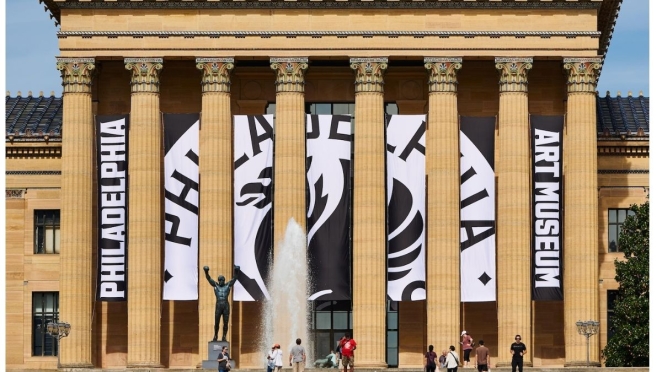
In a bold move, the Philadelphia Museum of Art reintroduced itself as the “Philadelphia Art Museum” (PhAM) with a vibrant identity by Gretel. This branding defies the usual “safe” museum formula of minimalist sans-serifs. Instead, Gretel took an expansive approach, curating a “tonne of different fonts” for various purposes – a strategy that feels original and smart. The design aims to “throw the doors open” to the community: it’s visionary, welcoming, provocative and playful, shedding any ivory-tower vibe. At its core is a custom serif typeface (Fairmount) inspired by the museum’s 1900s lettering and industrial Philadelphia heritage. The overall effect is a visual identity that is dynamic and inclusive, proving that a museum brand can be grounded in history yet boldly contemporary. Gretel’s work breaks the rules in the best way – and people are taking notice (for better or worse).
Fhirst – Maximalist Soda Joy
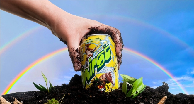
Mother Design’s rebrand of Fhirst probiotic soda is the antithesis of the “clean wellness” aesthetic. Fhirst’s new look is an “absolutely wild expression of joy”, fusing Big Soda energy with 90s health-food nostalgia. Think bright rainbow gradients, clashing nostalgic fonts, and a cast of quirky illustrated mascots (eagle, dolphin, butterfly, etc.) racing across cans. This maximalist, loud, unapologetic design rejects minimalist tropes to stand out in a crowded fridge. Mother Design strategically made Fhirst “scientifically grounded yet visually unforgettable,” balancing credibility with playful chaos. The result: a soda brand that is utterly unique – equal parts mischief and delight – bringing fun back into functional beverages.
Spudos – Simply Wholesome Crisps
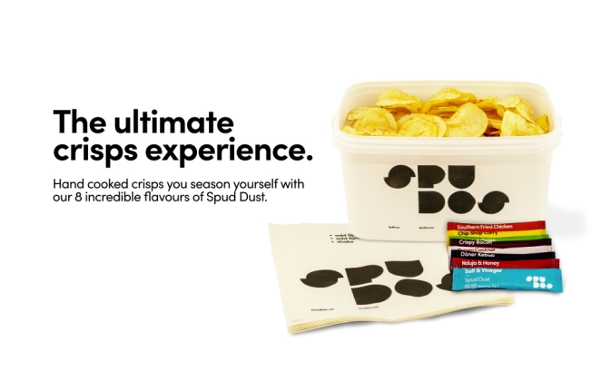
London agency Paul Belford Ltd. gave British potato chip startup Spudos a refreshingly playful yet earthy identity. Taking inspiration from childhood arts-and-crafts, the team created a geometric logotype using actual potato prints, complete with organic texture in the letters. The packaging is minimalist and honest – transparent compostable bags that let you see the chips (and avoid the dreaded half-filled bag). The branding “speaks to the child within,” invoking the simple joy of shaking on your own seasoning. Details like calling the flavor sachets “spud dust” add a dash of humor and magic. Overall, Spudos’ identity is humble and uncomplicated fun, proving that clarity and sustainability can be engaging. As BP&O noted, it’s a design that’s congruent with its product and looks right at home on the shelves of Whole Foods or Planet Organic.
Dark Arts Coffee – Joyful Nihilism in Coffee
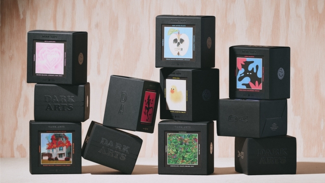
East London’s cult coffee roaster Dark Arts Coffee got an edgy makeover from NOT Wieden+Kennedy. The new concept, dubbed “Joyful Nihilism,” blends irreverent humor with occult-inspired cool. It retains Dark Arts’ goth/metal roots but with a wink – taking coffee seriously, if not itself. The design shifted away from heavy-handed satanic symbols to a mix of quirky, varied imagery: tarot-like linocut illustrations, surreal photo collages, naive doodles – all unified by bold black packaging. The result “looks superb” – still hinting at the occult vibe but tempered by dry wit. A stark colorblocked palette and trusty Cooper Black typography give it punch. Notably, the coffee comes in sleek black boxes with collectible art cards visible through a cutout – each card a unique artwork for a particular roast. This system adds a premium, fun twist (fans can collect all 50+ designs) while keeping the brand consistent. Dark Arts’ new identity successfully evolves its punk attitude into something modern, witty, and highly Instagrammable.
Sustana – Sustainable Simplicity
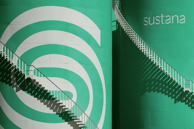
Sustainability was a key theme in 2025 branding, and Collins’ rebrand of paper company Sustana exemplifies this. The identity is “a study in calculated restraint”, featuring a swirling, clean logo and a soothing green palette that immediately signals eco-friendliness. By repositioning a 140-year-old paper mill as a modern sustainable leader, Collins proved that minimalist design can speak volumes. The pared-back look – refined wordmark, soft color gradients, and tactile natural textures – gives Sustana a contemporary credibility while emphasizing its environmental commitment. This branding quietly yet confidently “screams ‘sustainable’” through its calm, composed visuals, showing that sometimes less is more when conveying a green mission.
Yellowbird Hot Sauce – Mischief & Delight
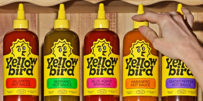
Austin-based hot sauce Yellowbird spread its wings with a rebrand by Gander that leans fully into its name. The new packaging places a friendly yellow bird mascot front and center, with bright yellow labels that dominate the shelf. The updated bird icon has tons of personality (less angry, more approachable) and the overall vibe is “equal parts mischief and delight, craft and casualness” – just like the sauce itself. By simplifying and amplifying what made Yellowbird special (simple ingredients and moderate heat), Gander created a modern yet playful identity. The design balances a handcrafted feel (quirky illustration and casual typography) with bold clarity, helping Yellowbird soar above both big-brand competitors and boutique hot sauces. It’s a perfect example of a brand refresh that stays true to its roots while injecting new energy.
Ding – Character-Driven Home Maintenance
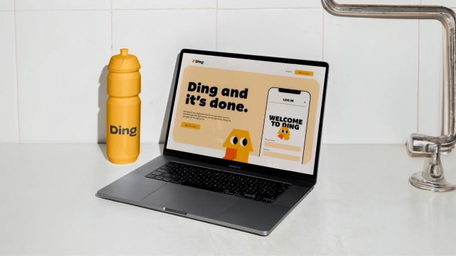
Who says home repair can’t be fun? London studio Wildish & Co. proved otherwise with Ding, a home maintenance app that introduced a lovable mascot into an otherwise utilitarian sector. This identity was even cited as a brave standout – “a brave use of character design in the overwhelmingly dull home maintenance category”. By personifying the brand (perhaps with a friendly tool or creature character) and using upbeat visuals, Ding’s branding turns fixing things into a more approachable, even enjoyable concept. The project shows how injecting a bit of whimsy (via illustration and a bright palette) can differentiate a service that’s typically all business. In 2025, Ding’s cheerful visual identity demonstrated the power of design to humanize tech and bring a smile to everyday tasks.
RW&CO – Inspiring Storytelling in Brand Communications
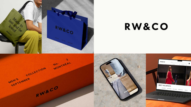
Global strategy and design studio Dalziel & Pow is behind Canadian retailer RW&CO’s recent rebrand, which introduced a refined visual brand identity and elevated positioning aimed at reinforcing RW&CO’s role as a Canadian fashion authority. The new positioning reflects RW&CO.’s core values of trust, quality and curated style, and was developed to give a single, cohesive identity across all its touchpoints and collections, whether they’re aimed at men or women. The new brand identity gives RW&CO. the ability to tell different stories with consistency yet allows for more dialled-up brand expression. A new black and white logo better reflects the brand’s personality - confident, considered, and precise – while bringing everything into a consistent typeface and removing the punctuation of the previous logo. Dalziel & Pow carefully adjusted the spacing and proportions to create a calm, balanced feel that is modern and inclusive, speaking confidently to all genders and all styles. The identity is designed to be adaptable across a wide range of touchpoints, from garment labels, to signage, to digital applications.
Double Diamond – Retro Revival Brew
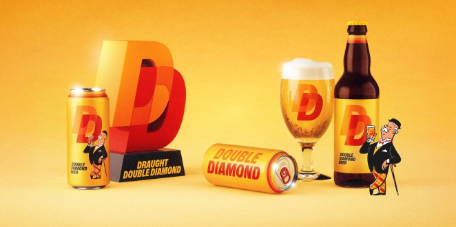
When a classic beer from the 1960s/70s is resurrected, branding has to walk the line between nostalgia and relevance. Designer Alec Tear’s identity for the relaunched Double Diamond beer nails it. Tasked with reviving this beloved UK ale, Tear “doubled back to its iconic design archive” – then restyled the best elements in a contemporary way. He smartly focused on a few key vintage assets: the slanted all-caps logo type, the linked “DD” diamond icon, the signature orange-and-yellow color scheme, and the little gentleman mascot known as the “Double Diamond man”. The new branding feels “totally contemporary, brilliantly bold, and thoroughly original,” yet it oozes heritage charm. A custom font “DD Boldd” (all-caps slanted sans) is used consistently, giving no-nonsense confidence to everything from cans to coasters. The palette is tightly limited to black, yellow, red, and that overlapping orange – “stripping everything back to its strongest elements”. The mascot is also reintroduced in a refined, animated form, adding character without kitsch. Double Diamond’s identity shows how looking backward can propel a brand forward when done with skill: it works wonders (pun intended) at tapping into collective nostalgia while appealing to new, younger drinkers.
Hank’s Bagelry – Mascot Charm for Foodie Folks
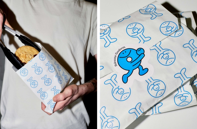
In a year rich with mascots, Hank’s Bagelry (by Studio Ongarato) is another delightful example. This Australian bagel shop’s branding centers on a quirky illustrated character (presumably “Hank” himself, perhaps a bagel-person or friendly baker) that gives the brand a face. While not as internationally known, Hank’s made waves in design circles for its bold use of a mascot in a hip café context. The visual identity combines nostalgic nods (maybe vintage cartoons or signage style) with contemporary cool, making the bagel shop feel like an instant neighborhood favorite. Alongside warm colors and inviting typography, the character injects personality into everything from the logo to the packaging. Hank’s Bagelry illustrates a 2025 trend: using playful illustration to craft an approachable, memorable food brand – one that looks as comforting as the carbs it sells.
You Own Co-op — A Democratic, Member-Led Identity for a Retail Icon
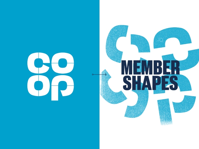
You Own Co-op sees London-based studio SomeOne reimagining one of the UK’s most historic retail brands with a bold visual idea that places membership at the heart of its identity. At the centre of the refresh is a deconstructed version of the iconic Co-op symbol fractured into distinct “Membershapes” that visually express the core cooperative principle that every member owns a piece of the business and has a real say in how it’s run. This flexible graphical system, paired with a bespoke type family and expressive iconography, brings a democratic and human-centric energy to the brand, enabling communication that feels simultaneously rooted in heritage and distinctly modern. The result is a refresh that doesn’t just update a logo, but reinforces the ethos of community ownership and collective purpose that defines Co-op across its retail, funeral, insurance and legal services.
What Are the Top Branding Trends of 2025?
The above best brand identity designs 2025 reflect several key branding trends that emerged this year:
The Return of Mascots & Characters
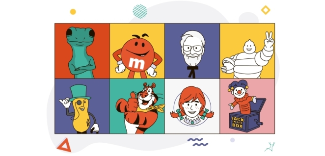
From Butter Baby’s butter alien to Ding’s handyman character, brands embraced mascots to forge emotional connections. This trend injected warmth and story into identities – a reaction to years of flat minimalism. Even serious categories (finance, B2B) saw a hint of this playfulness creeping in via illustrated brand characters or friendly icons.
Nostalgia and Retro Revival
Many top projects mined the past for inspiration. Double Diamond and MAG revived vintage typography and color palettes, while Fhirst and Dark Arts Coffee riffed on ’90s and ’70s aesthetics. These nostalgic touches weren’t used verbatim; instead, designers remixed them in modern ways. The “what’s old is new again” approach lent brands authenticity and comfort – a feeling consumers craved – without sacrificing relevance.
Maximalism vs. Minimalism (Strategic Extremes)
Brand identities largely went one of two directions in 2025 – all in on maximalist expression, or rigorously minimalist with a twist. On one hand, Fhirst’s riot of color and Project Send’s kinetic layouts exemplify the “more is more” attitude, aiming to captivate and energize audiences. On the other hand, brands like Sustana and Spudos achieved impact through restrained design and clarity, using simplicity to stand out in cluttered markets. Both strategies, when done thoughtfully, proved effective. Notably, purpose drove the choice: e.g., Fhirst needed to break the wellness mold with loud joy, while Sustana needed to convey trust and sustainability via clean design.
Bold Typography & Variable Logos
2025’s identities put typography front and center. We saw custom typefaces (e.g., Philadelphia Art Museum’s Fairmount Serif, Double Diamond’s DD Boldd) that carry brand storytelling in their very letterforms. Variable and animated logos were also common – INTL 2025’s sculptural type and Project Send’s flexible logo show how letters could morph and move yet remain recognizable. This trend toward typographic experimentation gave brands distinctive voices (literally, in their wordmarks) and allowed logos to be more adaptable across digital platforms.
Integrating Sustainability Visually
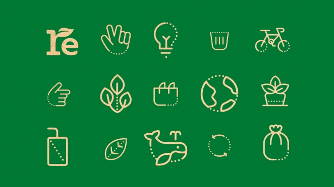
As eco-conscious values become mainstream, brands found creative ways to visualize sustainability. Spudos’ transparent compostable bags, Sustana’s green swirl logo, and Olive + Gourmando’s earthy tones all communicate environmental friendliness through design cues. In many cases, the materials and formats (e.g., using recycled paper textures, minimal ink, modular packaging for reusability) were part of the identity system. The trend is that sustainable design = good design, both aesthetically and ethically, rather than a separate niche.
Brand Identity Inspiration for 2026
2025’s most beautiful brand identities show that brand identity design is more creative and diverse than ever. Brands are telling richer stories visually – whether through nostalgic winks, bold mascots, or dynamic digital-friendly systems.
The year’s best brand design projects balanced art and strategy: each identity felt authentic to the brand’s soul and resonated with its audience, proving that great branding is as much about feeling as function. As we move beyond 2025, these exceptional examples will continue to inspire designers and companies alike – a reminder that investing in a distinctive, well-crafted visual identity is truly worth its weight in gold (or butter, or hot sauce, or even mayonnaise).
Each of these projects offers a brand identity inspiration 2025 for the creative community. Whether you’re drawn to the whimsical characters, the typographic bravado, or the heartfelt nods to heritage, one thing is clear: the most beautiful branding of 2025 set a high bar, showing that exceptional brand identities aren’t just seen – they’re felt, remembered, and loved.
Bringing Your Next Brand Identity to Life with Creativepool
If 2025 proved anything, it’s that when craft meets vision, brand identity design becomes culture. Whether it’s minimalist packaging, a kinetic logo system, or a brand book that rewrites the rules, great design starts with great collaboration.
That’s exactly where Creativepool comes in. Whether you’re a business looking for a branding studio that can deliver a world-class identity, or a creative agency seeking brilliant design talent to bolster your team, Creativepool connects the best in the business.
With thousands of creative directors, branding specialists, packaging designers, strategists, and design studios, Creativepool is where ideas become iconic identities.
Hiring a Branding Professional Through Creativepool
1. Search and Connect Directly
Need a brand designer fluent in luxury retail? A packaging pro with FMCG experience? A brand strategist who can turn positioning into visuals? Dive into Creativepool’s curated talent network. Browse portfolios, identity systems, and case studies — then message professionals directly to kick off a project. Use smart filters to target by industry, style, or skillset, and explore our Top 25 brand creatives to see who’s leading the field.
2. Post a Studiogig
Need someone fast? Whether you’re commissioning a new logo, a rebrand for a product launch, or a style guide to unify your comms, posting a Studiogig connects you to the most relevant creatives in the community — from emerging illustrators to seasoned identity designers. Receive replies directly to your inbox, ready to brief and begin.
3. Post a Job
Looking to scale your internal team or hire long-term creative talent? Post a job on Creativepool to reach the most engaged branding professionals in the industry. Whether it’s a mid-weight designer or a senior creative director, we’ll help you get in front of the right candidates — no recruiters or gatekeeping required.
Hiring a Branding Studio Through Creativepool
Find a Studio
Whether you’re launching a new brand or evolving an existing one, use the studio search tool to discover branding studios by style, industry focus, or location. Filter by awards, services, or visual approach, and browse portfolios from some of the most beautiful branding projects of 2025.
Post a Brief
Want proposals tailored to your needs? Post your brand brief — with timeline, deliverables and budget — and receive curated responses from Creativepool’s studio network. Compare portfolios and approaches before making your choice.
Need Help?
Not sure where to begin? Creativepool’s team of industry specialists can help you shape your brief, refine your direction, and connect with the talent or studio best suited to your vision. Whether it’s a brand refresh, packaging design, or complete identity overhaul, we’re here to help. Chat with us live or reach out directly via our contact page.
Because at Creativepool, we believe brand design doesn’t just define a company — it defines how the world remembers it. Let’s build something unforgettable together.