ABOUT
A tension runs through the £1.4 billion United Kingdom retail coffee market. Making a cup of coffee has become about ‘how’ and not ‘what’. Rituals and rigour have robbed the enjoyment of a simple cup of coffee. The joy draining from the category infects our kitchens at home. Instant brands with no distinction, swarm on grocery facings, sparking little happiness.
Coffee should be a quick and easy win, drunk to savour its flavours. The instant you commit to making a mug or a cup ought to be a pure pleasure. The instant coffee brand you select can make the difference. In tiny, fabulous ways, ‘a coffee’ deserves to be celebrated.
This is the thinking we shared with Little’s, a 30-year-old, 2nd generation family business, determined to regenerate excitement in the instant coffee world, to create real disruption within the category.
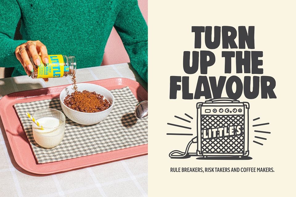
Mad River was tasked with auditing the brand, developing a motivating big idea and bringing a design reinvigoration to packaging with discipline and clear signposting. Following market analysis, the Mad River team identified Little’s values as Commitment, Care, Disruption and Enjoyment. These were used as steppingstones to re-introduce pleasure, personality and pep back into the brand. It was time to rock the coffee world, recapture the ‘what’ of coffee and give back the ‘how’ to consumers.
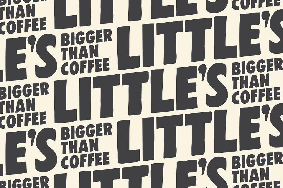
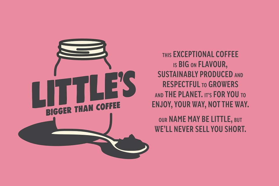
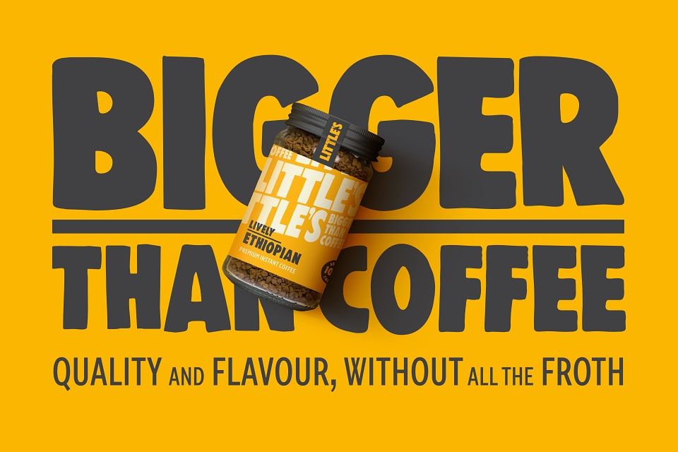
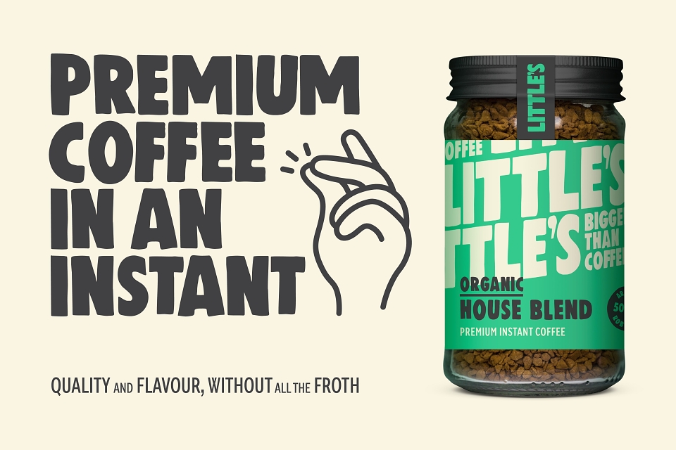
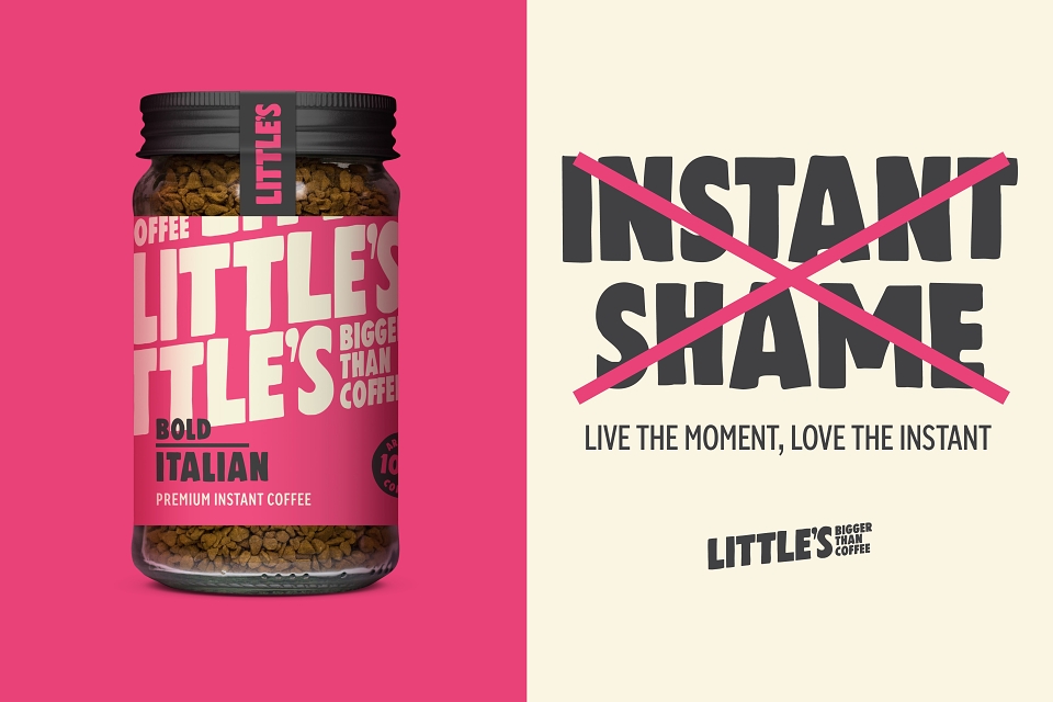
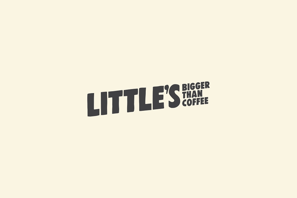
Little’s design ethos, whilst bright and sparky, had lost depth, meaning and clarity through years of exuberant improvisation. Mad River’s stringent process first focused on creating a brand summary, captured as ‘Little’s: Bigger than coffee.’ The justification and motor for driving that promise was expressed as ‘Changing the world Little by Little’. On quality, flavour and especially both sustainability and ethics, Little’s had to prove itself demonstrably ‘bigger’ than the category standards. In sourcing, production, distribution, business behaviour and product quality, it evidenced – and continues to evidence - the truth of this claim.
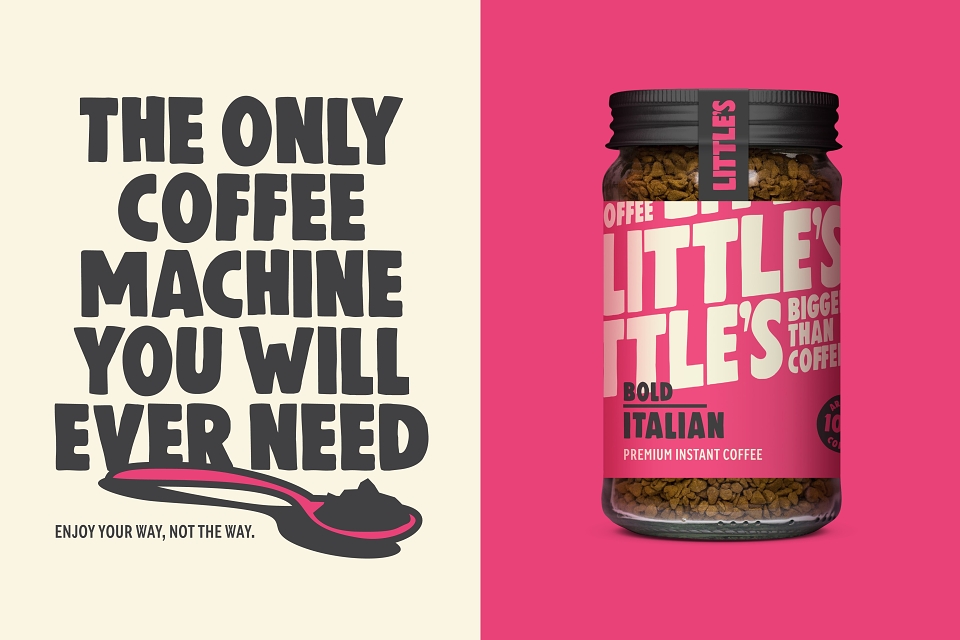
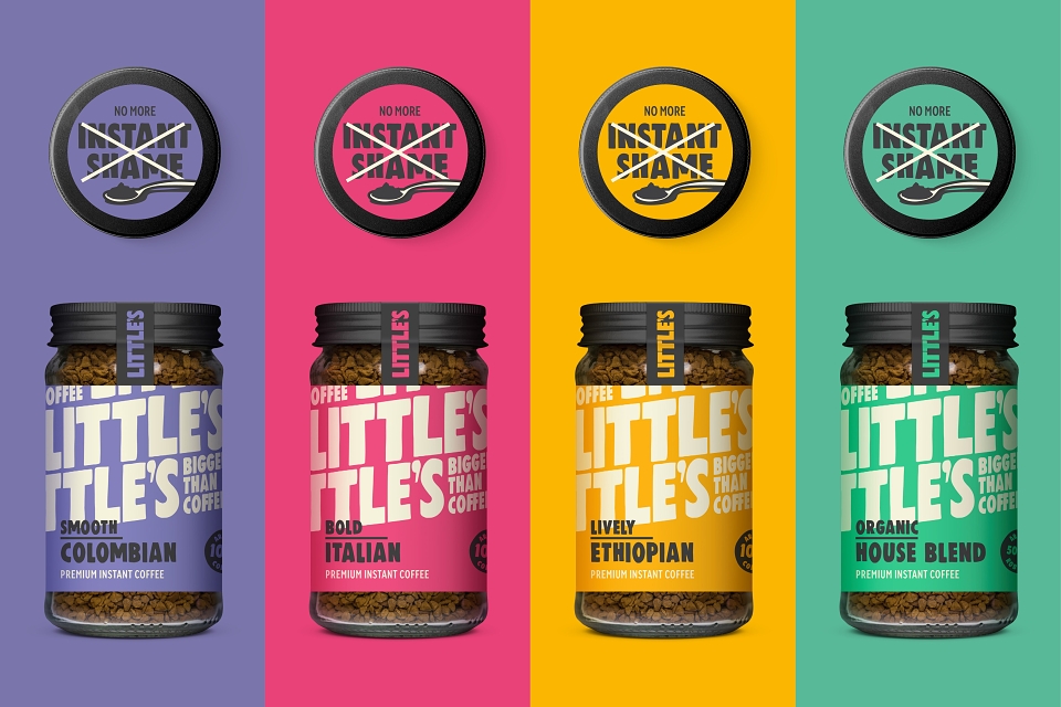
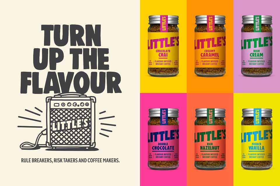
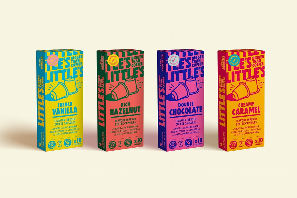
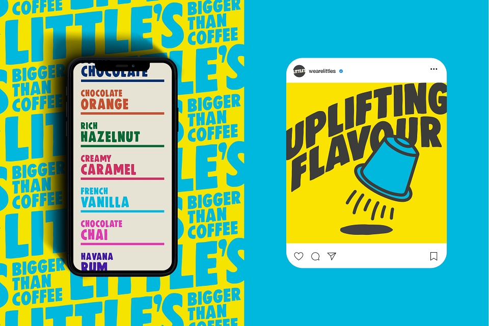
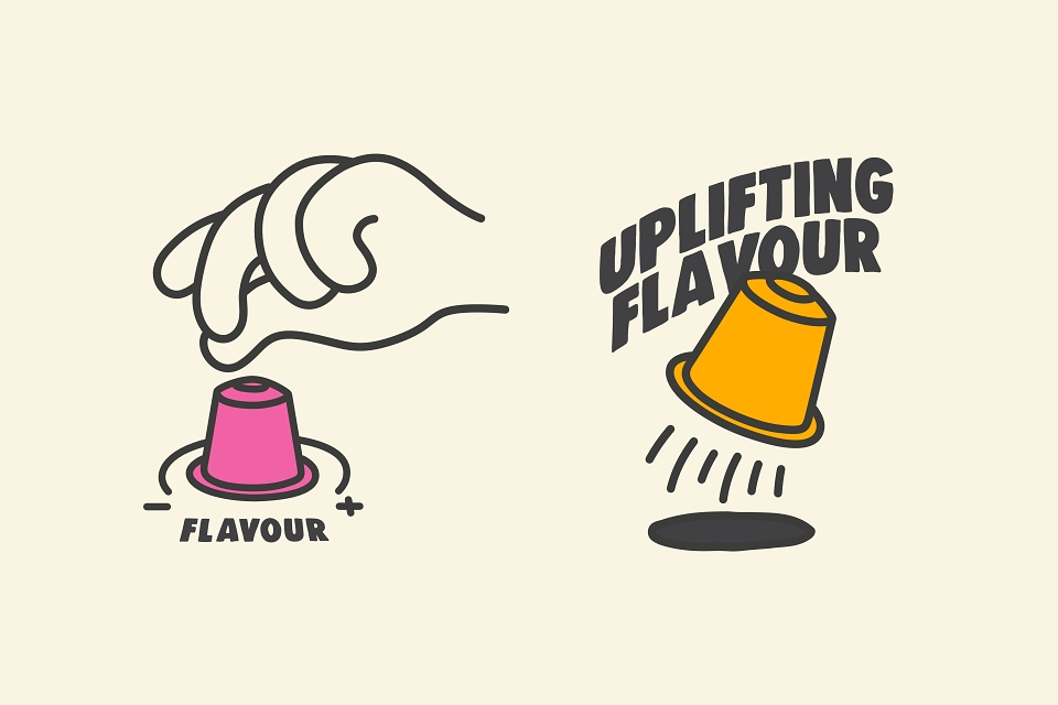
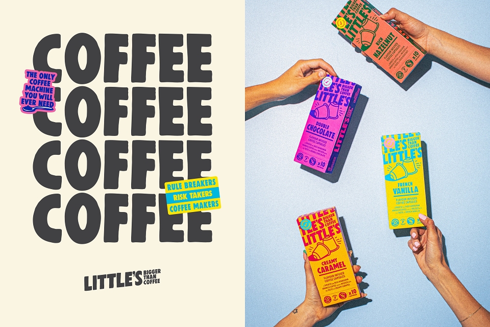
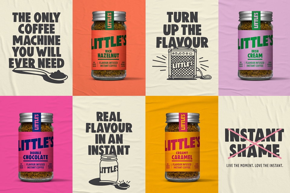
Mad River then translated this overall idea into a range rationalisation and a packaging design process that achieved significantly ‘louder’ on-shelf presence as a disruptor. New names were created for flavour variants. In design, a sensitivity and sequencing were introduced to make navigation for consumers, through colourways delineation, much easier and – simply put – to add more fun and energy to a category seriously in need of a smile.
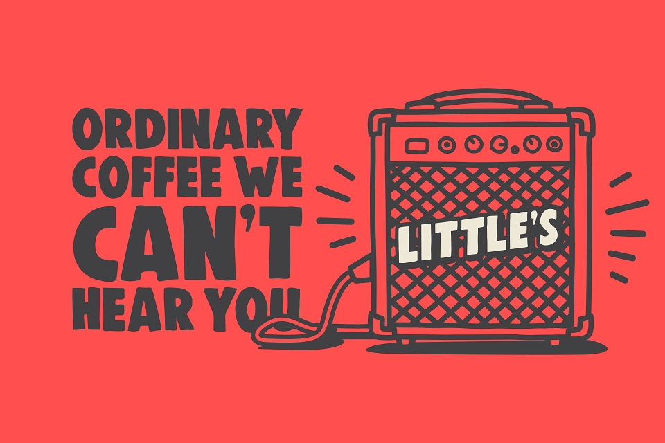
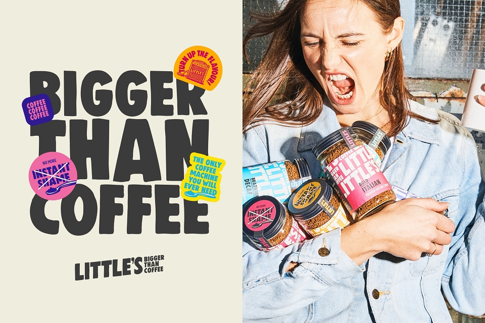
‘Bigger Than Coffee’ stands up to scrutiny. From its comms to facings in retail in Waitrose, Sainsbury, Tesco Ocado and Independents (including Harrods), Little’s is living its best life with a rallying cry of ‘Rule breakers, Risk takers, Coffee makers’. The new packaging is disruptive and clear. The exceptional flavoured variants add interest and news. Consumers immediately ‘get’ what the coffee represents, who makes it and why they should buy it.
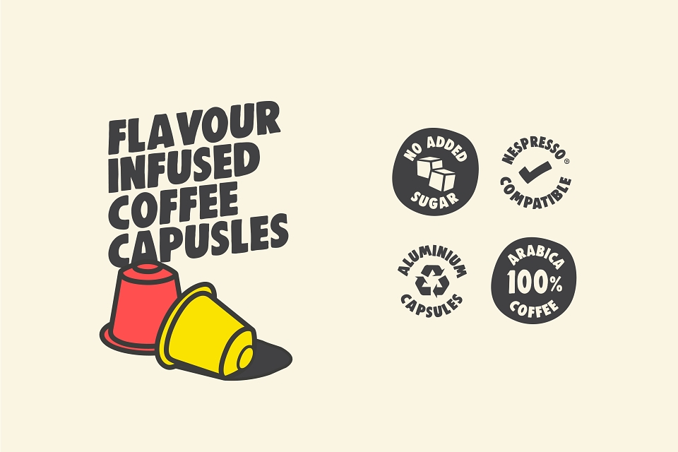
Rolled out across premium instant, flavoured instant, ground and capsule ranges, early results have been incredibly encouraging with an increase in reach of 488% between March 22 and March 23 and products only launching in stores in November 22.
Mad River’s designs reflect a far-greater-than-skin-deep reworking. With a great product, enticing flavours, fun, flair and fearlessness, Little’s isn’t just claiming that it’s bigger than coffee. It now has the design and communication to prove it.