
Gareth
Design Director
ABOUT
Terralyte is a hydration brand created for people who work in some of Australia’s harshest and most demanding environments. From construction and infrastructure to mining, oil and gas, forestry, transport, logistics, emergency services, and field-based industries, the product was developed for workers who face heat, sweat, fatigue, and long shifts as part of everyday working life.
The project began with an entrepreneur experienced in industrial products across the Australian market, who identified a clear opportunity within the hydration category. While the market is crowded with sports drinks, wellness products, and lifestyle-focused electrolyte brands, there was space for a product designed specifically for industrial workers and the conditions they operate in.
My role was to help build the brand from the ground up. This included shaping the brand strategy, positioning, visual identity, packaging system, digital presence, marketing collateral, and launch communications. The goal was to create a compelling brand that could speak directly to workers, while also appealing to businesses, procurement teams, safety managers, and organisations responsible for workforce wellbeing.
Concept
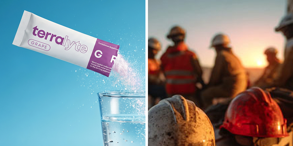
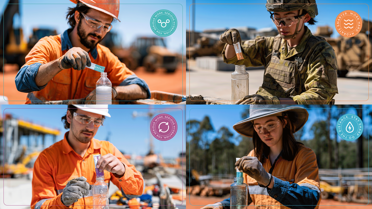
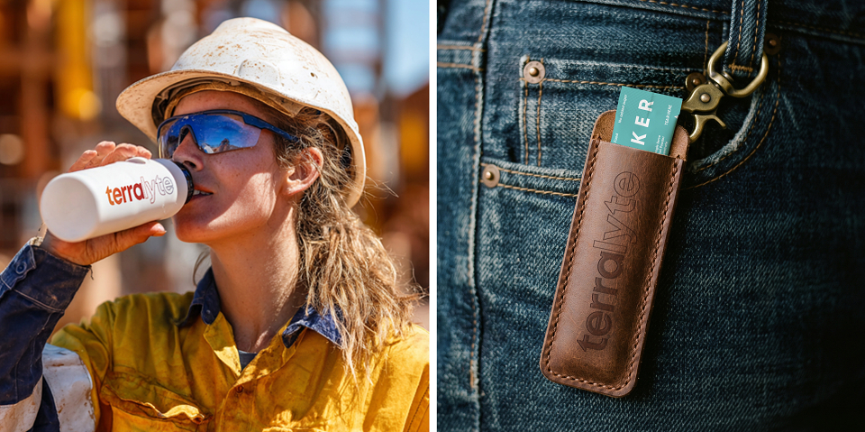
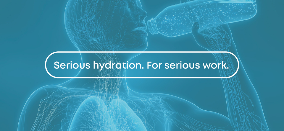
Terralyte was built around a simple idea: hydration should be seen as an essential tool for industrial workers, just like Personal Protective Equipment, machinery, or equipment. For people working in heat, dust, and physically demanding environments, hydration directly supports focus, stamina, safety, and performance.
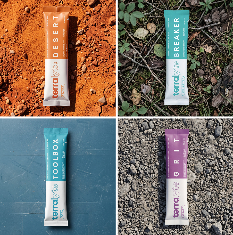
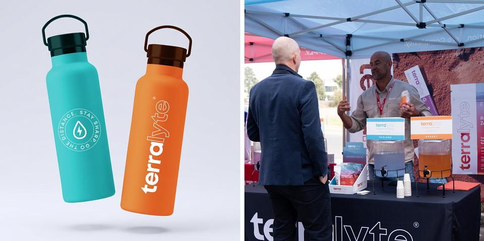
The concept was to create a brand that felt clean, direct, and practical, while still capturing the harsh beauty of the Australian terrain. Terralyte needed to feel like it belonged on site, in a work ute, in a toolbox, or at a hydration station.
Execution
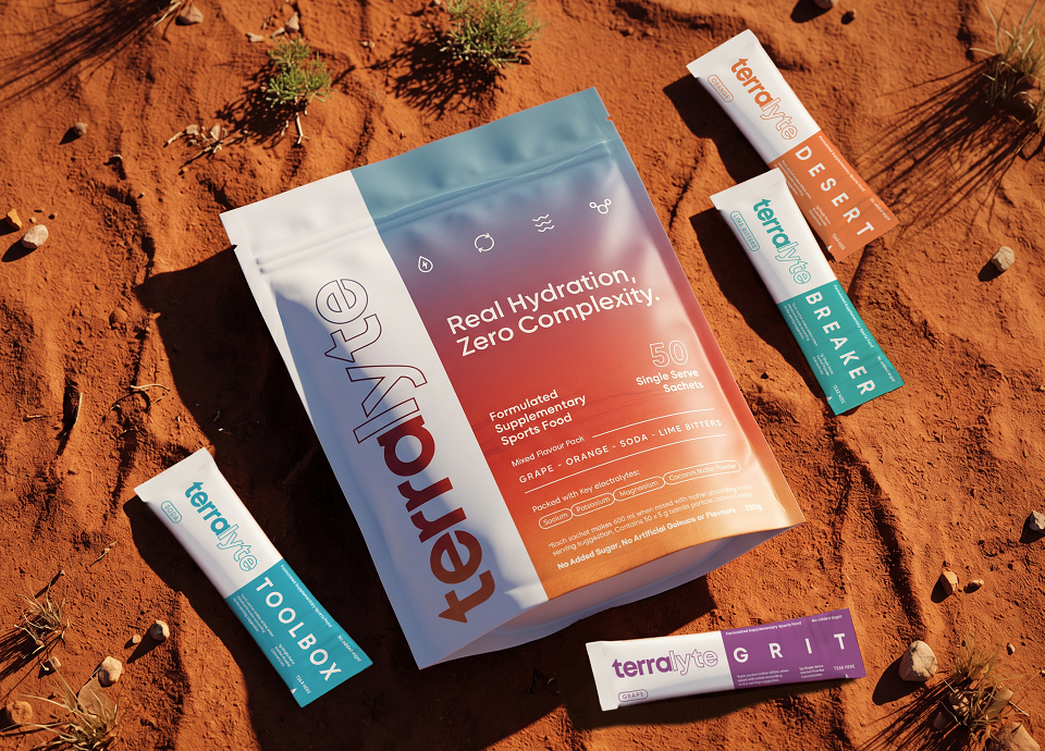
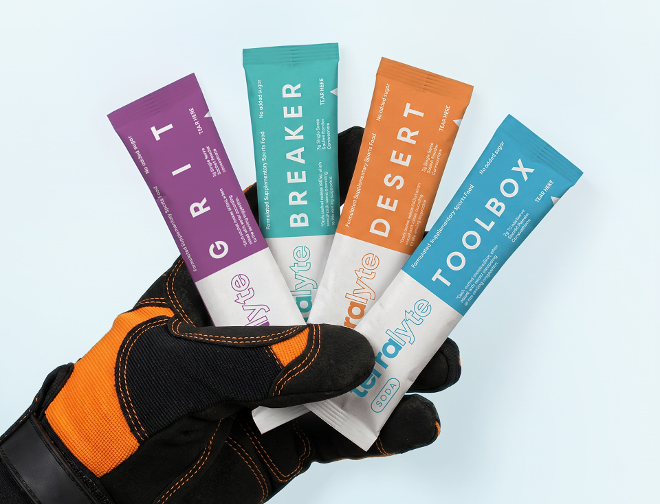
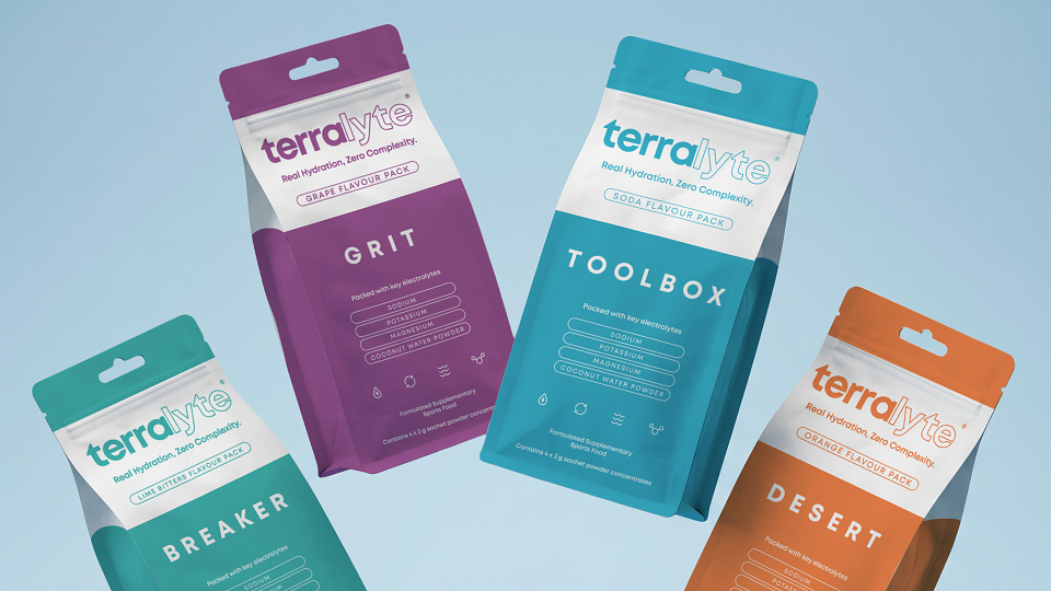
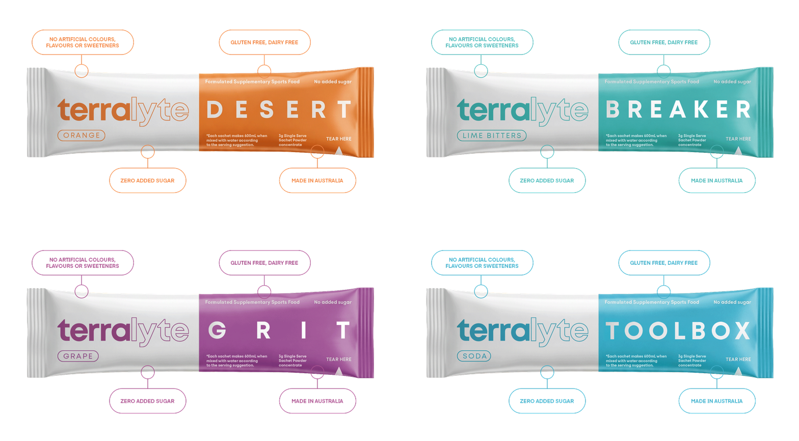
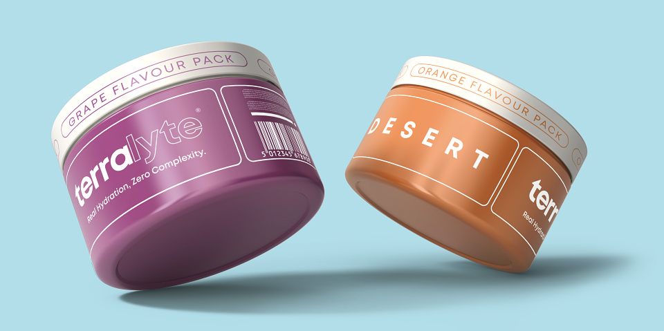
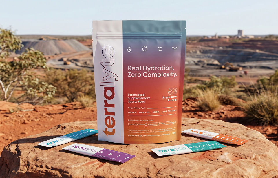
The identity was developed from the ground up across strategy, positioning, logo, packaging, digital, print, and campaign touchpoints. The visual system combines strong typography, clear messaging, terrain-inspired textures, bold product colours, and a practical packaging architecture designed to stand out in a saturated category.
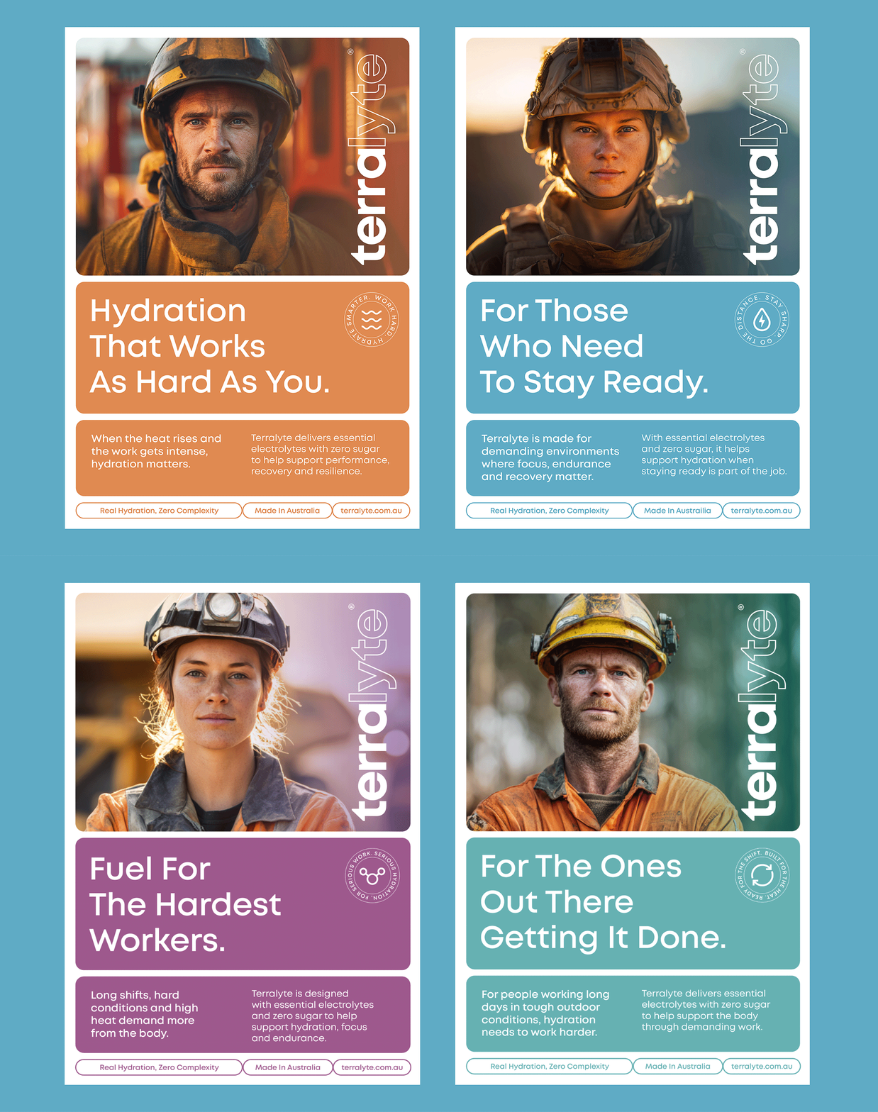
Because Terralyte needed to appeal to both individual workers and businesses, the brand had to balance character with credibility. It needed to feel rugged and memorable for workers, while still feeling professional and trustworthy for procurement teams, distributors, and workplace safety decision-makers.
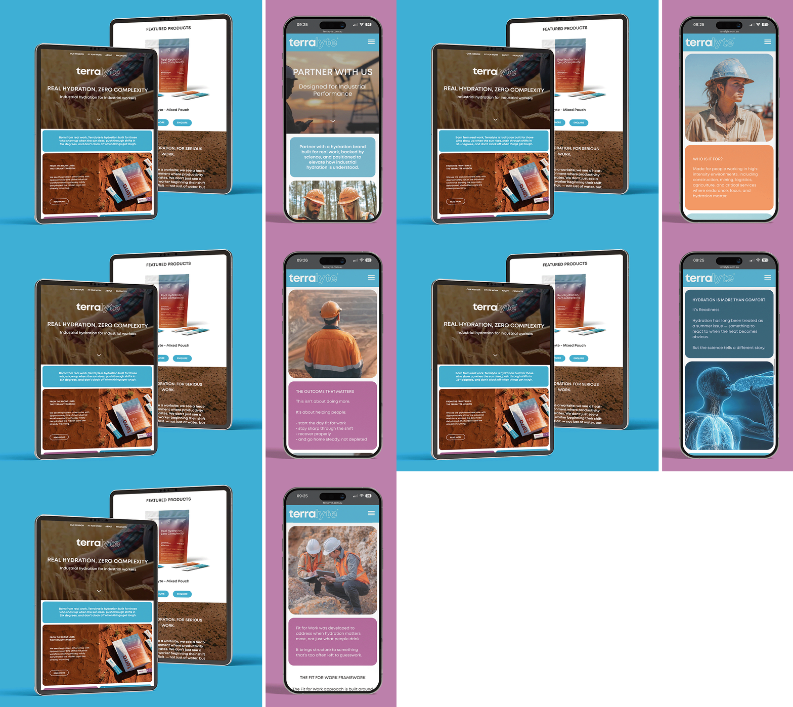
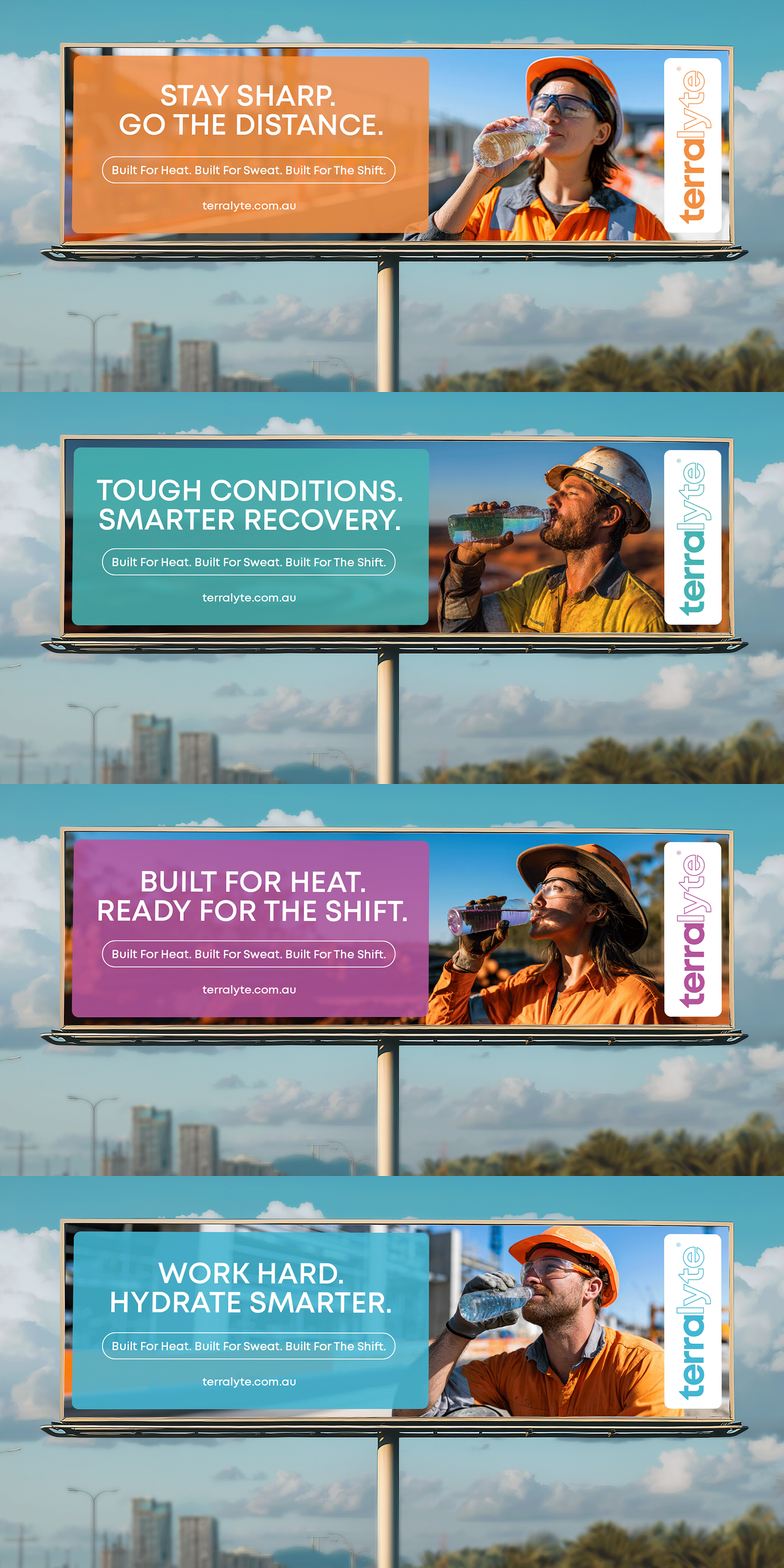
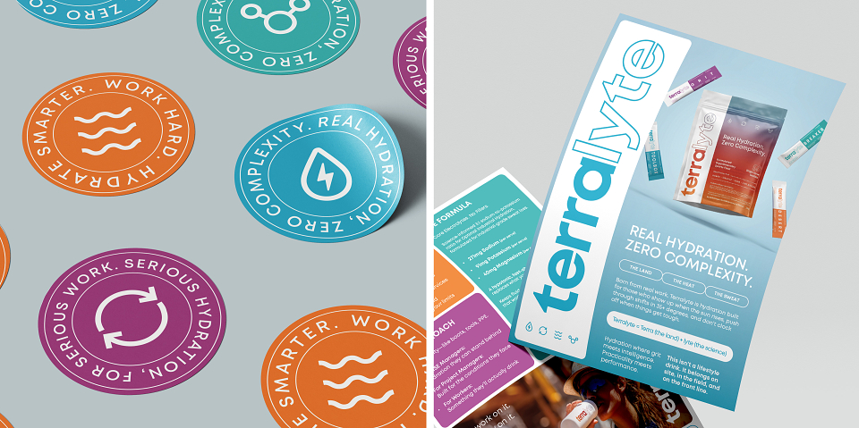
This system was applied across pouch and sachet packaging, website and mobile layouts, print marketing, digital advertising, social media, billboard concepts, and product launch collateral, creating one consistent brand experience.
Result
The result is a distinctive hydration brand with a clear market position: performance hydration for serious work. Terralyte stands apart from generic sports drinks and wellness-focused electrolyte brands by speaking directly to industrial workers and the demanding environments they operate in.
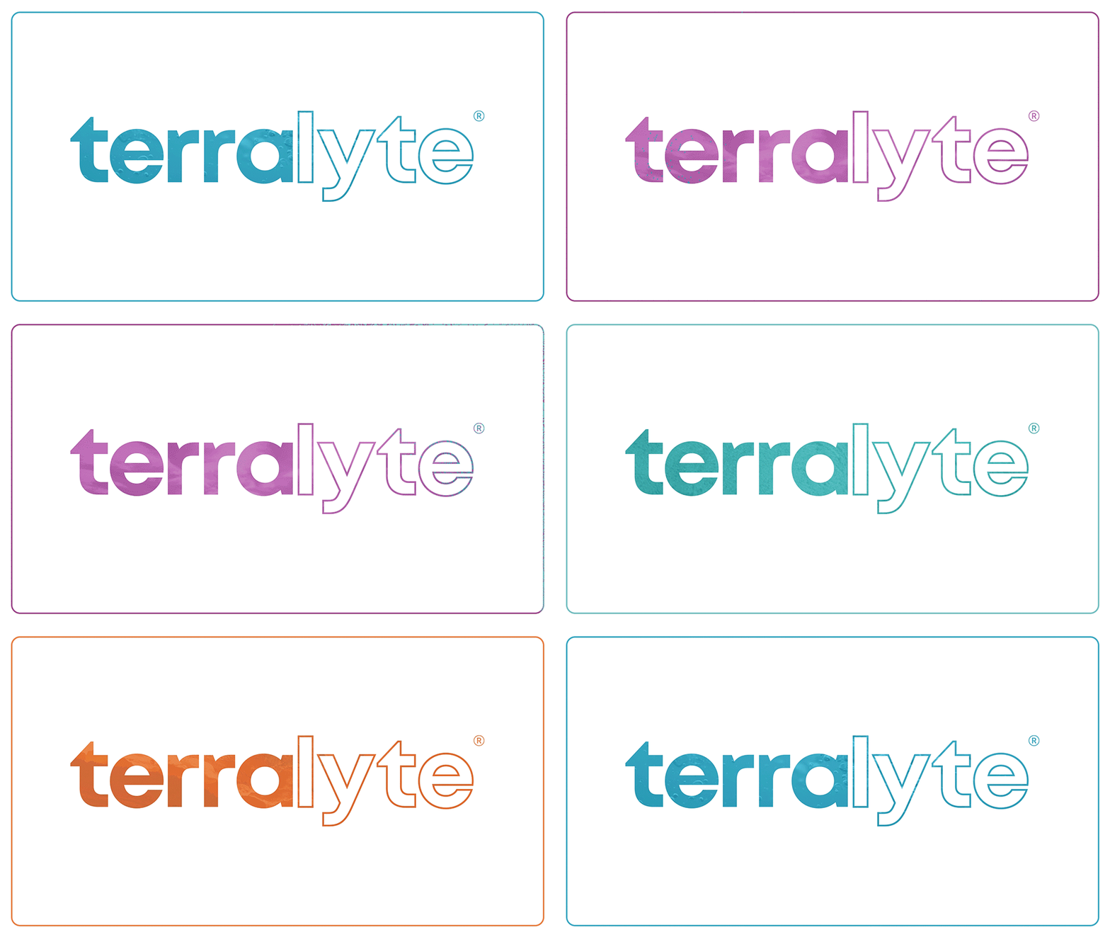
The finished brand connects product, audience, and place with clarity and purpose. Every detail was designed to reinforce the industrial context, from the naming of the colour palette to the way the logo system behaves across different media. The Terralyte wordmark became more than a static logo. It was designed around a clear sense of duality: “Terra” representing land, terrain, and the environments workers operate in, and “lyte” referencing hydration, electrolytes, and performance.
To emphasise this duality, a stroke effect was applied to the “lyte” section of the wordmark, giving the identity a more engineered and distinctive quality while still connecting back to the land. This treatment allows the logo to work as a flexible visual device, becoming a window into the world of industry.
When placed over terrain-inspired textures, the logo reveals the surfaces, colours, and environments associated with the workers the brand is made for. It can also be used as a clean white silhouette, sitting in direct synergy with the base media rather than simply being placed on top. This gives the identity versatility across packaging, digital, print, campaign material, and textured brand applications.
Together, these elements give Terralyte a strong foundation for launch across retail, digital, workplace, and B2B channels, while creating a visual and verbal identity that feels focused, practical, and ready for real-world conditions.
MADEIT CREDITS
-

GarethDesign Director
CLIENT REVIEW
Gareth’s been a big part of bringing Terralyte to life. From day one, he just got what we were trying to build. This wasn’t about making something that looked good on a shelf, it needed to feel real, grounded, and built for the environments it’s actually going into. He nailed that. He’s delivered across the full piece — brand, packaging, website, all the core assets and it’s consistent the whole way through. Clean, strong, no fluff. It looks like it belongs where it should… on site, not in a lifestyle campaign. What I’ve appreciated most is how he’s worked as part of the team. Good back and forth, open to feedback, no ego, just focused on getting it right and all done with fast turnaround times. He’s proven to be a really valuable part of what we’re building. He didn’t just design it, he’s bring it to life.
Founder / Entrepreneur at Terralyte
10 May 2026