CC Comms
London
ABOUT
Brief:
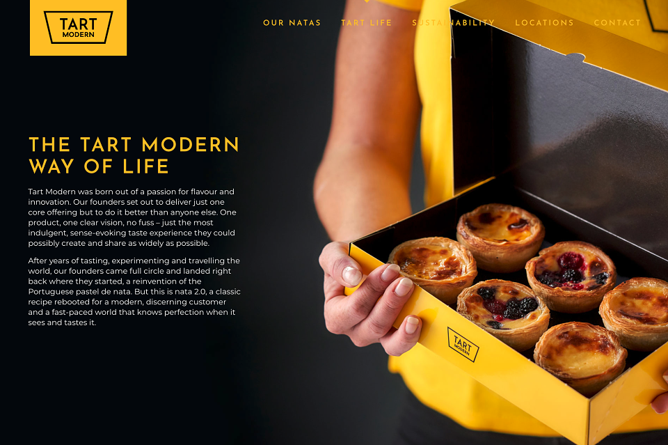
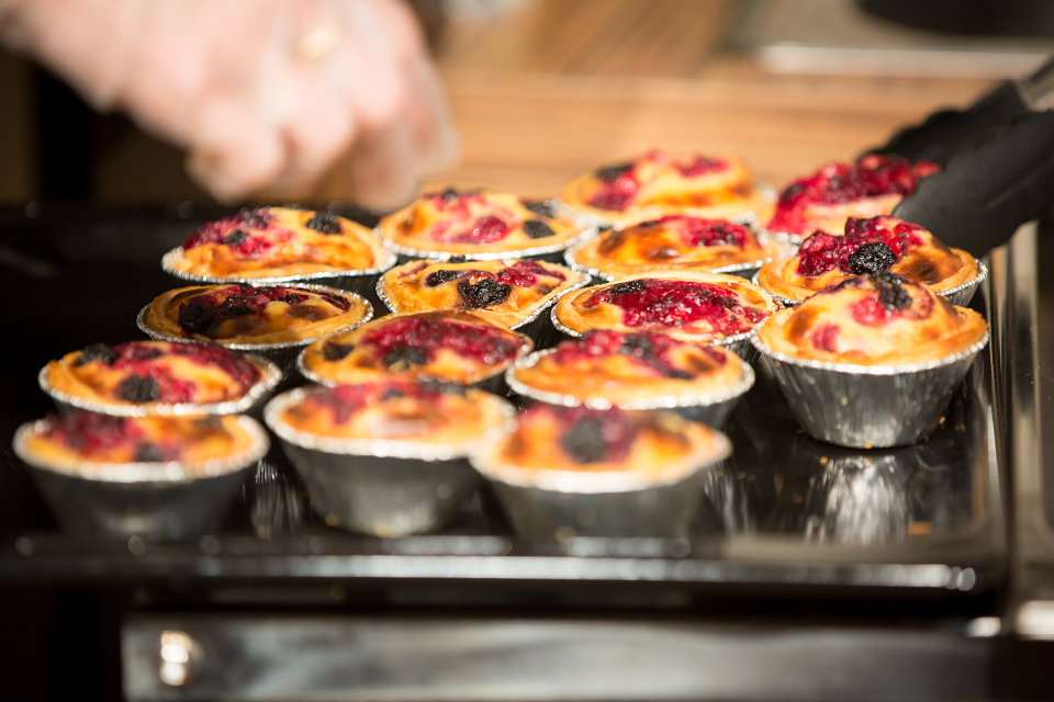
Tart Modern is a grab-and-go food offering serving a range of freshly-baked in-store natas – crisp flaky pastry tarts filled with indulgent oozy custard. Taking inspiration from both classic Portuguese pastel de natas and popular Asian Hokkaido cheese tarts, the brand founders were keen to establish a bold, distinctive take on their rebooted version of this tasty treat.
With its witty, irreverent name, Tart Modern required a characterful and eye-catching look and feel, in order to create standout and help build brand awareness. The key objective was to attract and tempt a range of audience personas (from shoppers to tourists to workers) who might be seeking an exciting and more interesting alternative to more conventional options such as doughnuts, croissants or pastries.
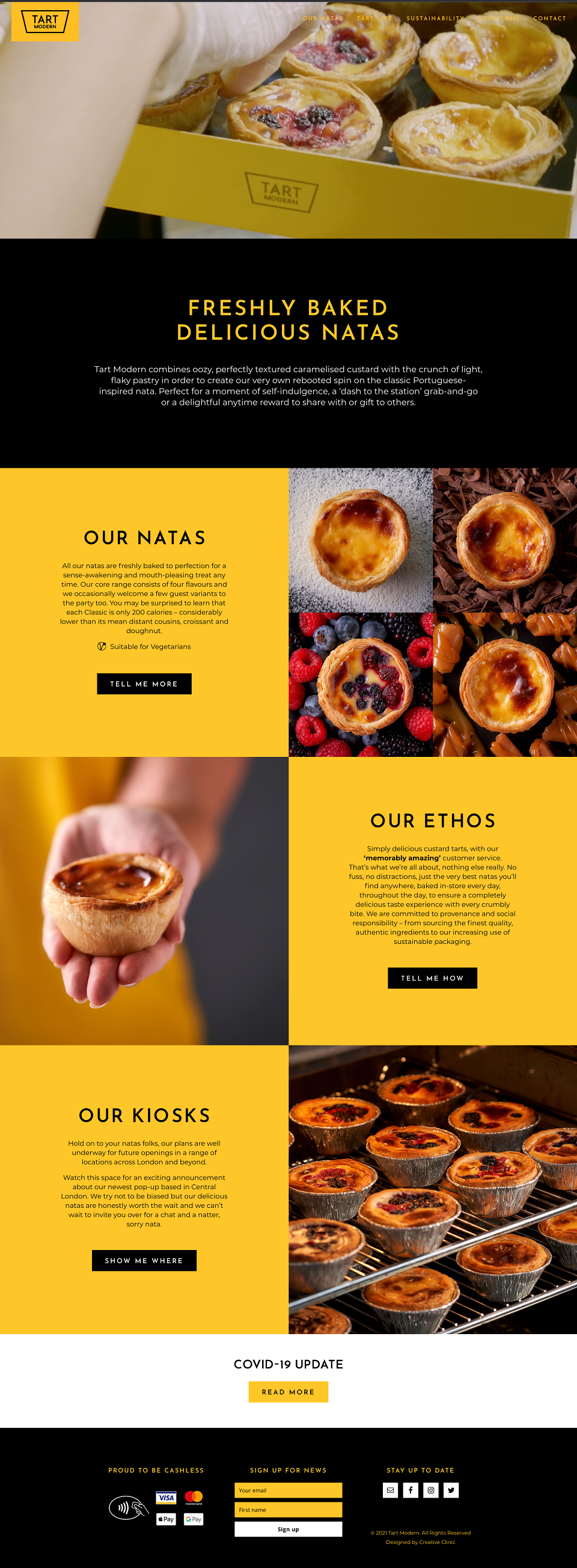
Our brief was to guide the founders in the shaping of their brand strategy, visual identity and language, brand book, website, brand store graphics, packaging, uniform, films, photography, motion graphics and marketing assets.
Concept:
With its singular focus on one product line and simplicity of offer, we developed a brand proposition of ‘Simply delicious natas’. This fuss-free positioning needed to be translated into the branding and brand assets: thus the minimal logo design features a graphical representation of a side-on view of a Tart Modern nata floating in an endless sea of oozy custard.
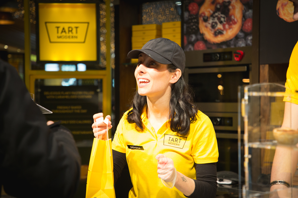
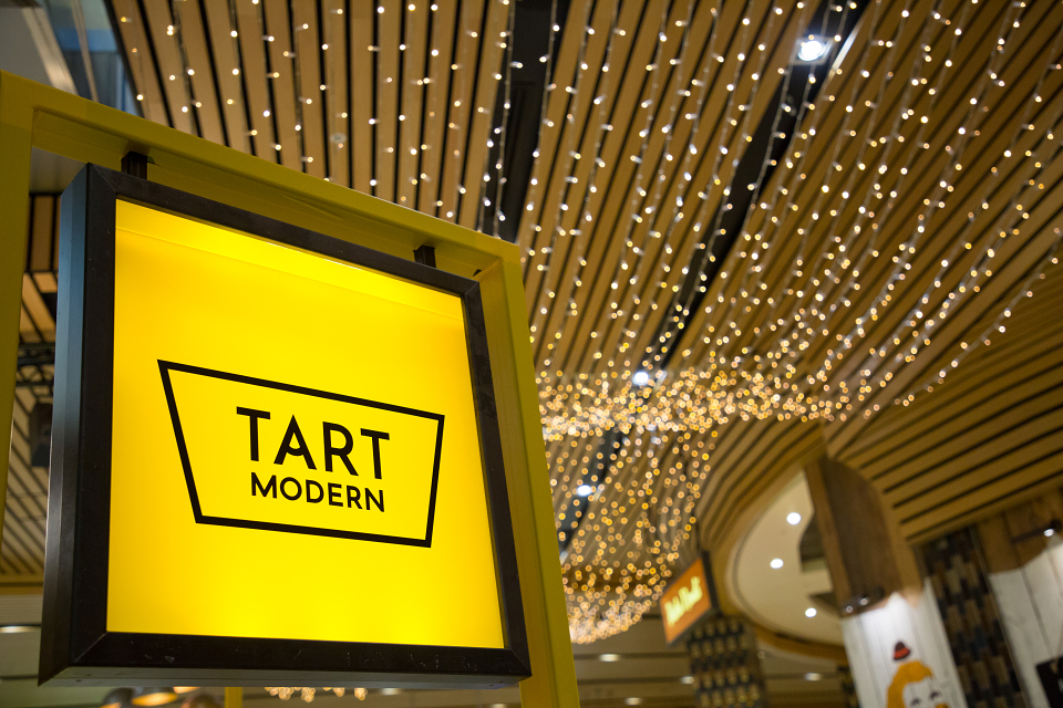
The bold, confident use of yellow and black is designed to achieve maximum impact and to attract as much footfall in busy retail locations as possible – whilst also emphasising the hero ingredient of custard.
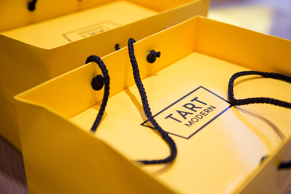
As part of the brand guidelines that we developed, the ratio of colours is defined in the percentages of 80% yellow, 15% black and 5% white when being applied to packaging, store graphics and other brand executions.
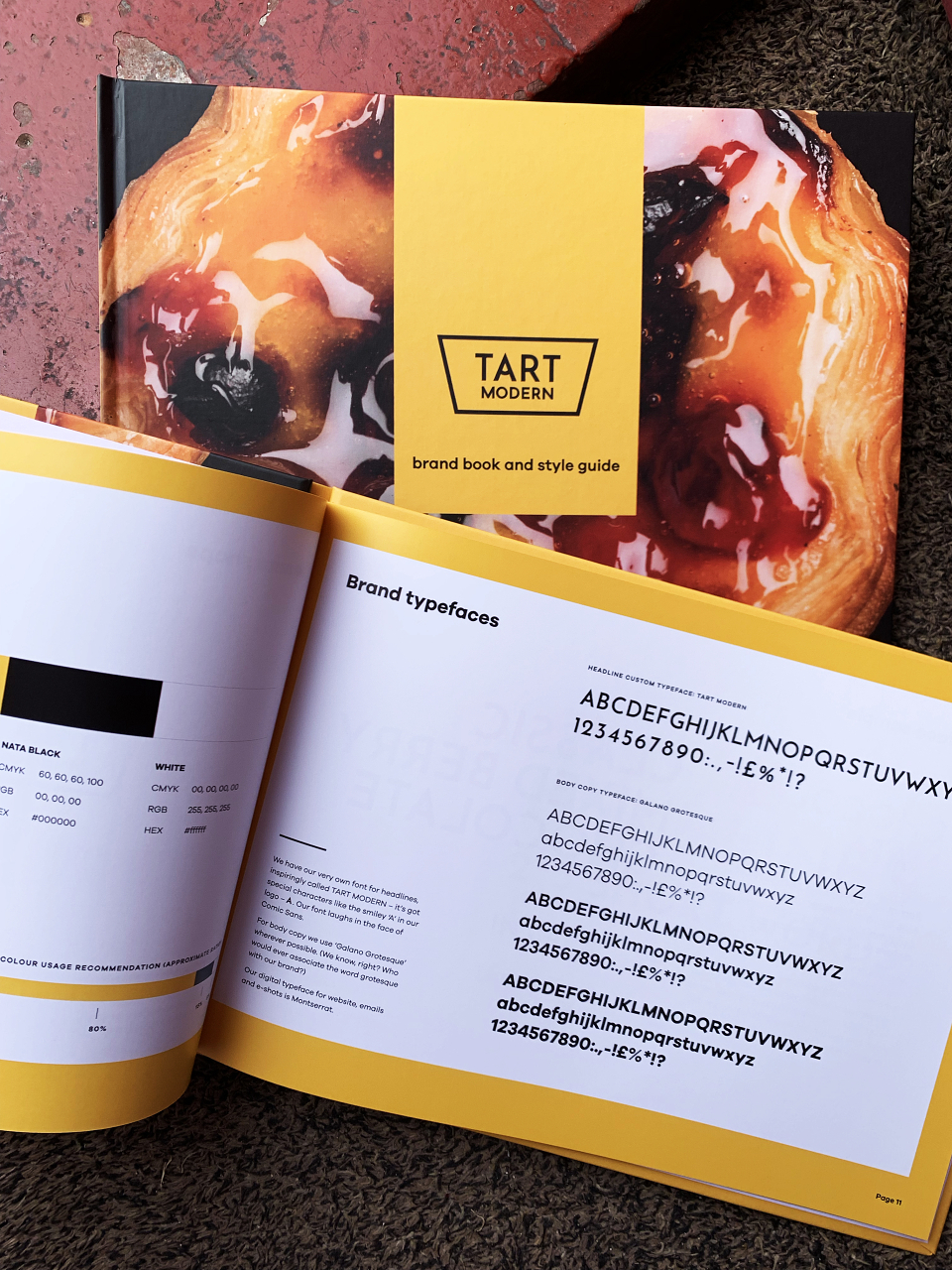
The brand also utilises a customised font that incorporates special characters such as a ‘smiley’ A, as a nod to the indulgent nature of the product and the cheekiness of the brand name.
Execution:
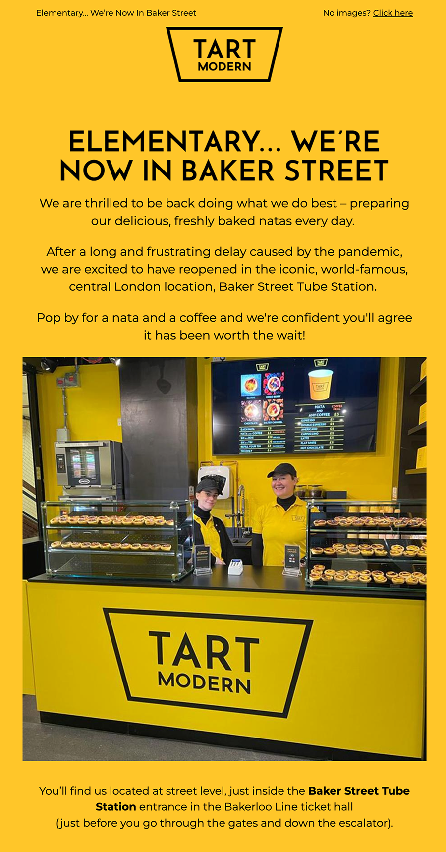
The first two brand stores were located in London shopping centres, Westfield Stratford and Brent Cross. Despite the brand’s initial popularity, the impact of debilitating factors caused by the pandemic, led to early closures of these stores. However in January 2022, Tart Modern was relaunched in its new flagship Central London location, in the iconic Baker Street London Underground Station.
The brand strategy and style was/is applied to signage, kiosk design, uniforms, menus and onscreen messaging and brand films. Distinctive and desirable cardboard outer packaging and limited edition multi-buy tins were designed to make ample use of the brand’s custard yellow colour.
In addition to rolling out the brand as above, Creative Clinic also wrote copy and art-directed product and video shoots for digital and printed executions such as menu boards, marketing collateral and the brand’s website.
Outputs:
Store graphics and signage
Digital menus
Packaging
Uniform
Website
Marketing collateral
Loyalty cards
Brand films and motion graphics
Photography
Brand book
Results:
Tart Modern experienced tough trading environments (with shopping centres hit hard) for an extended period of time, largely as a result of Covid-19. However the business has withstood these challenges and continues to trade positively at its latest location in Baker Street London Underground Station. The founders are presently looking at a rollout of the fledgling brand and concept across further UK locations.
MADEIT CREDITS
-

Tart ModernClient
-

CC Comms -

Marcel CowanBusiness & Digital -

Nicoleta CostinBrand and UX/UI Designer -

Adam SelwynCreative Director