Ugur Vidinligil
Photographer & visual content lead
ABOUT
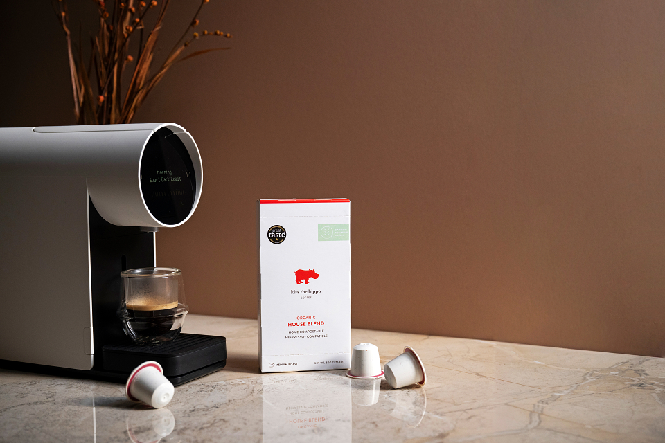
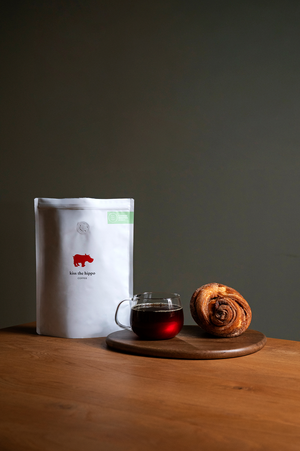
For years, Kiss the Hippo had built its visual language around bright, clean, high-key imagery, white backgrounds, minimal styling, and a very stripped-back aesthetic.
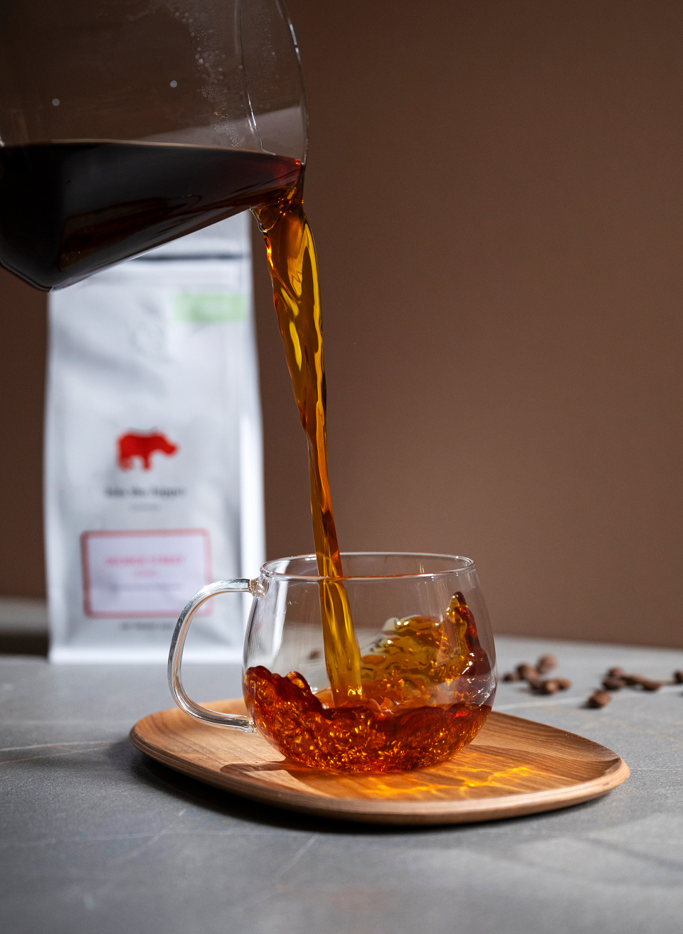
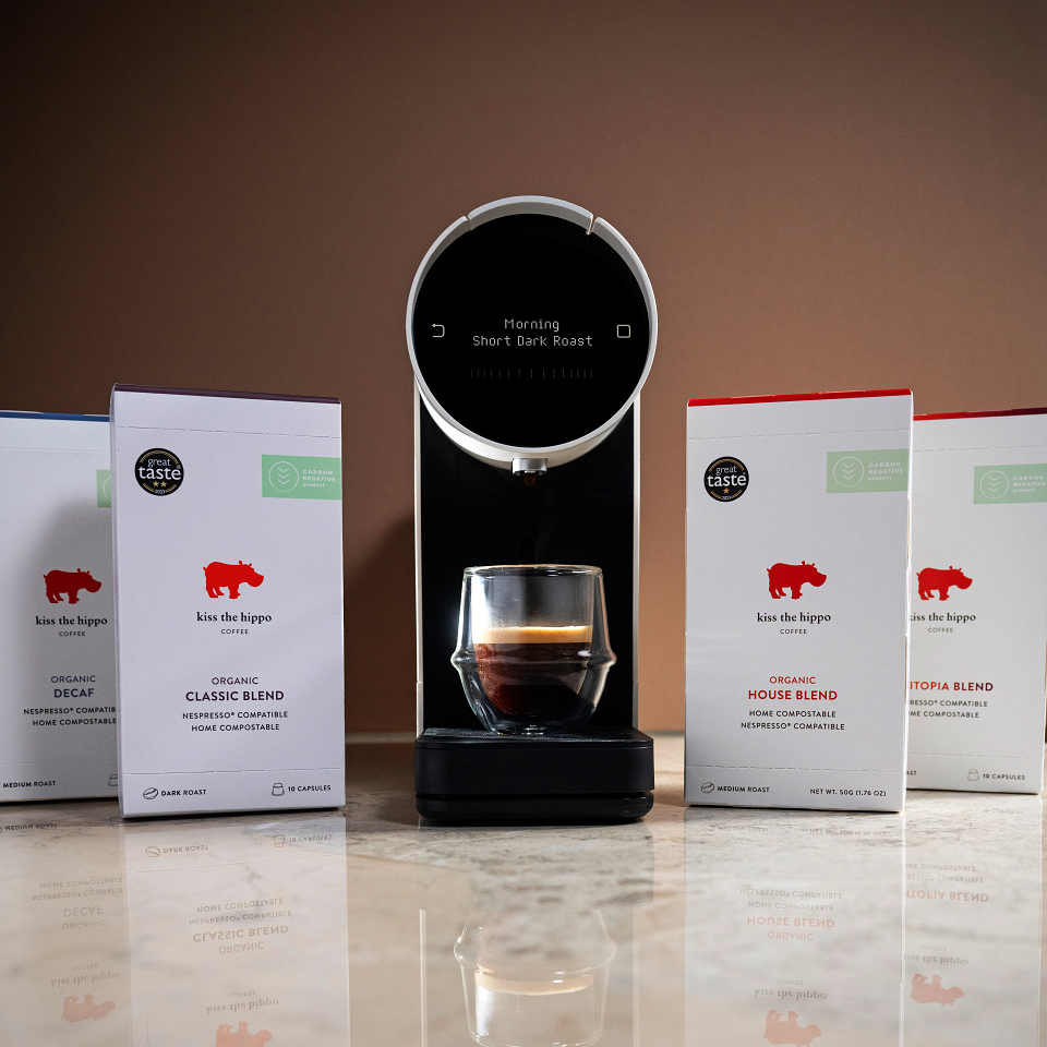
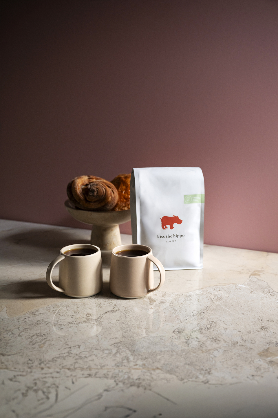
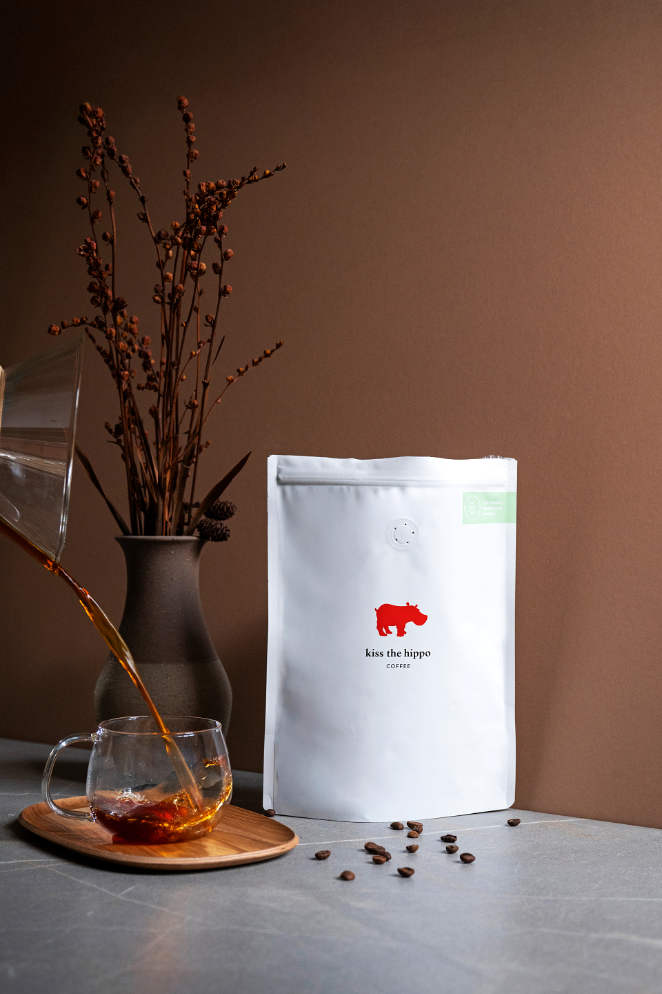
This project became part of a wider visual evolution for the brand. As many coffee and hot beverage brands began moving towards darker, moodier, black-dominated imagery, we wanted to explore a different direction, something warmer, softer, and more inviting, while still keeping the minimal approach that had always been central to the brand.
Rather than relying on cold blacks and stark whites, we introduced earthy coffee tones, muted pastel colours, and subtle filler lighting within the drinks themselves to create depth and atmosphere. The aim was to retain simplicity while adding a richer emotional tone, bringing warmth, texture, and colour into the frame without losing the clean visual structure.
MADEIT CREDITS


Annual 2026 ShortlistKiss the Hippo Ads CampaignPhotography
Project featured: on 28th May 2026