Eve Makarova
Packaging Designer, Brand Designer
ABOUT
BRIEF:
SKALVI is a self-initiated conceptual brand that redefines men’s skincare through the aesthetic and philosophy of the North.
The project set out to reframe how men’s skincare is communicated — stripping away clichés of wellness, vanity, and performance, and replacing them with a narrative of elemental strength, stillness, and intention.
The goal: to create a brand system that feels as confident and enduring as the landscapes that inspired it — grounded, minimal, and culturally distinct.
Mediums:
Complete brand creation — from naming and verbal strategy to full visual identity, packaging, and digital presentation.
CONCEPT:
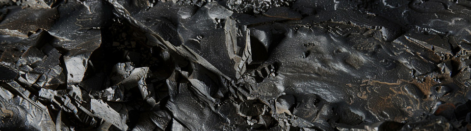
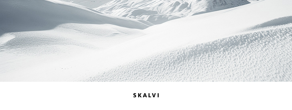
SKALVI is a skincare brand for men who reject noise, trend-chasing, and superficiality. Drawing from the stark beauty of Scandinavian wilderness — the granite fjords, glacial air, and still northern waters — SKALVI expresses a quiet power.
This is branding distilled to essence:
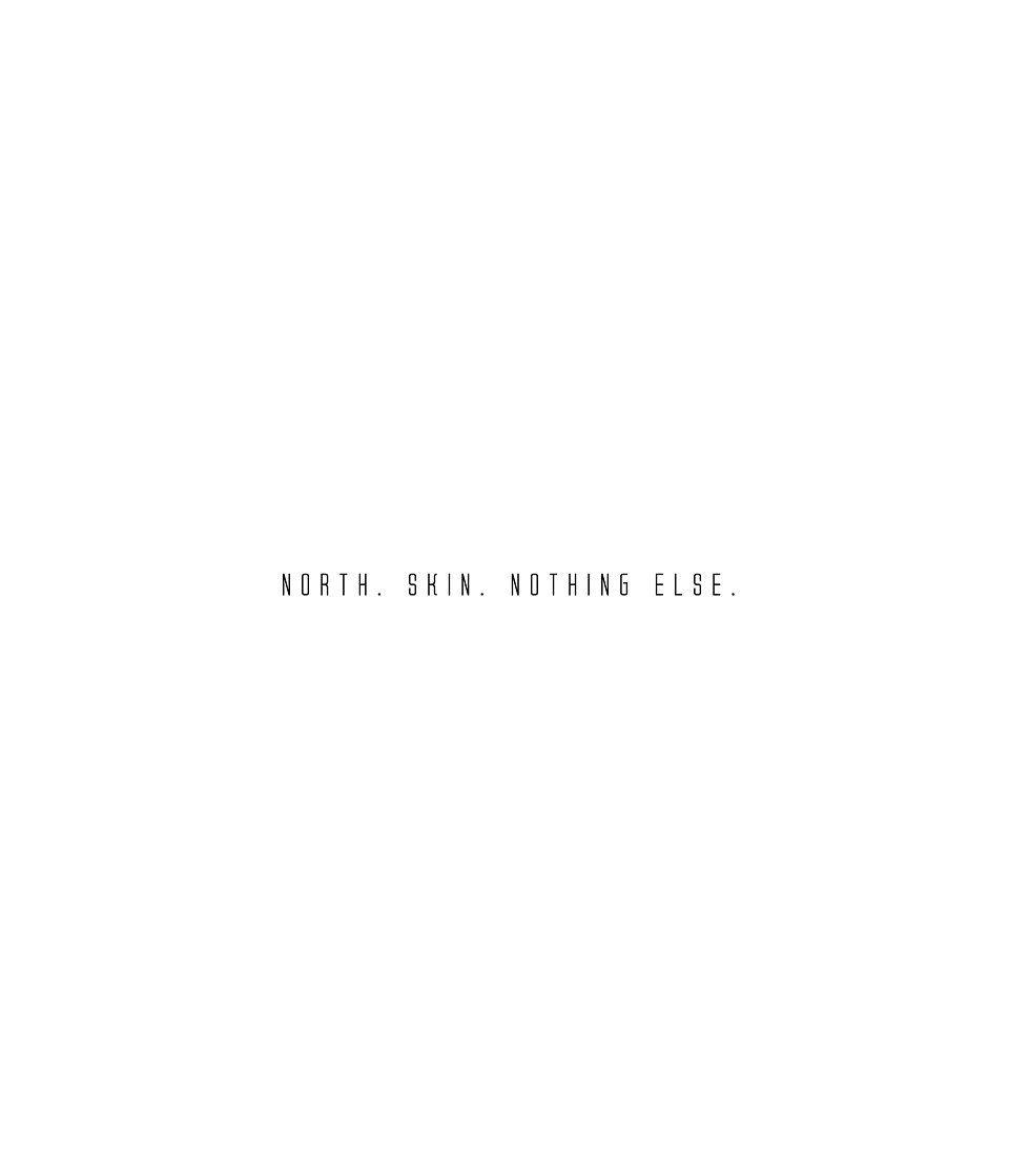
North. Skin. Nothing Else.
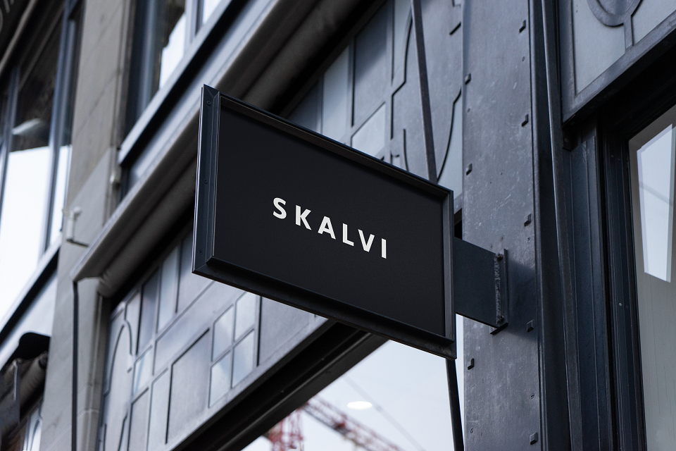
Even the brand name, SKALVI, subtly echoes “Scandi” — a familiar shorthand for Scandinavian identity — but reframes it through a colder, more stoic lens. It feels architectural, elemental, and deliberate, reinforcing the brand’s Northern DNA.
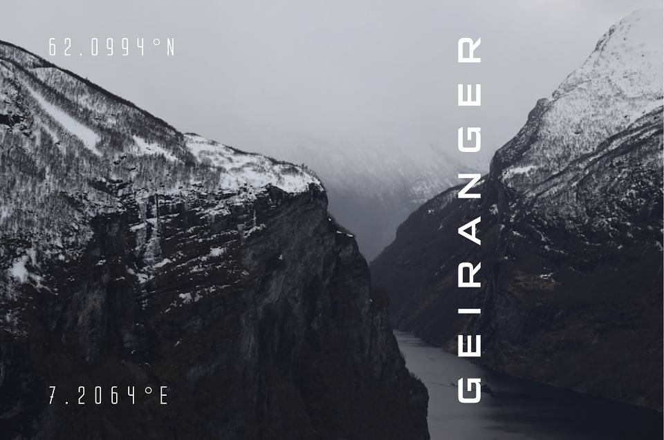
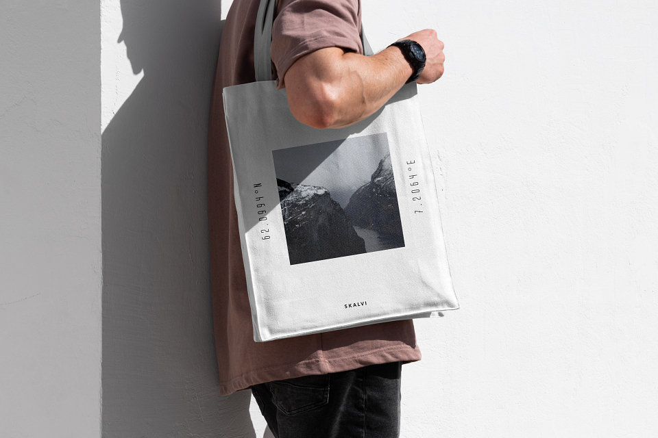
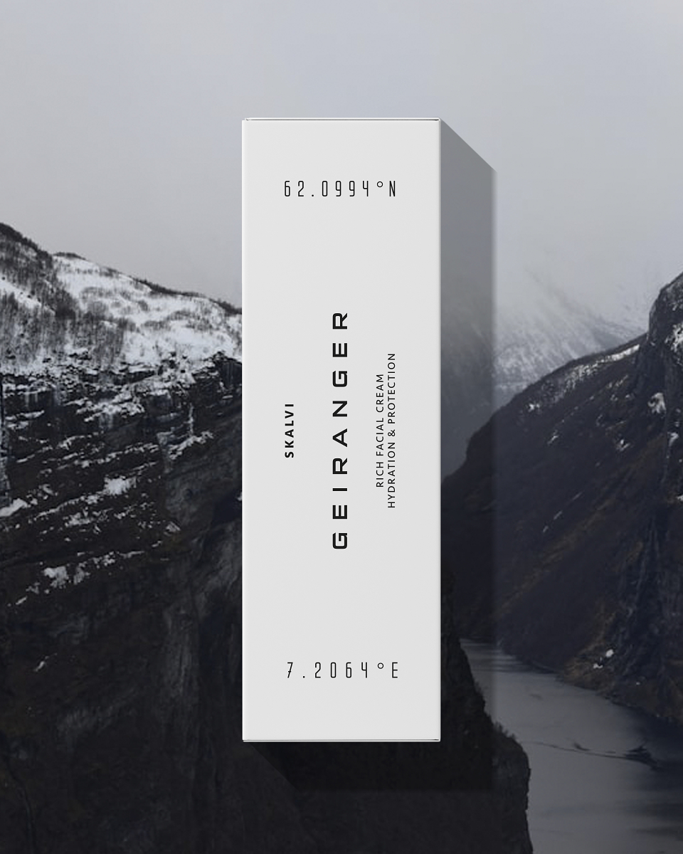
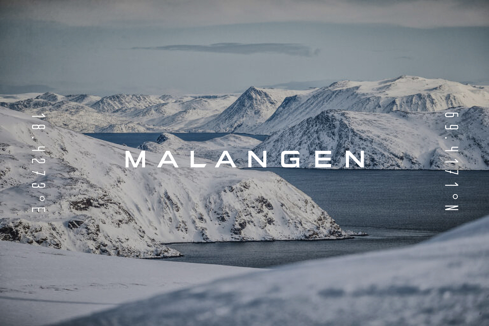
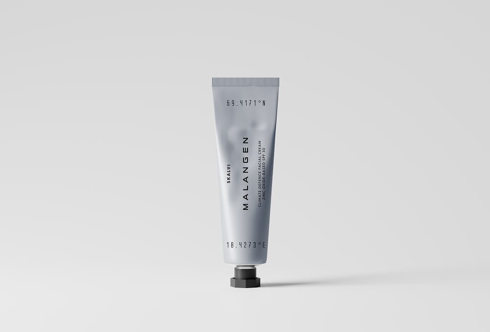
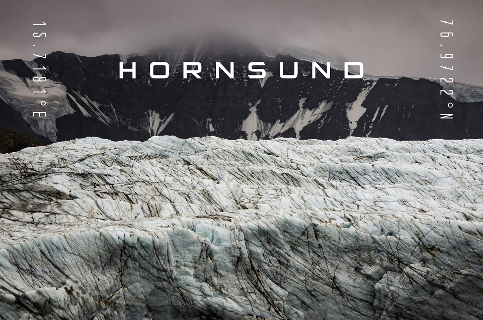
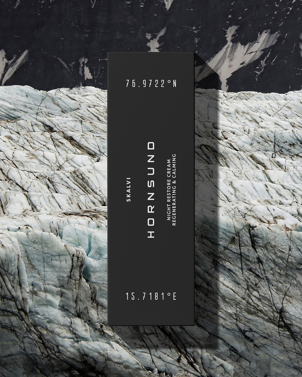
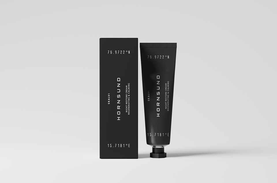
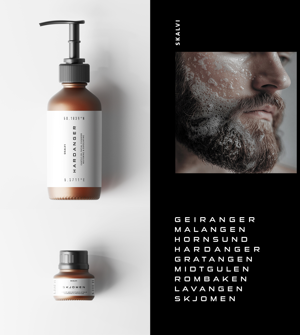
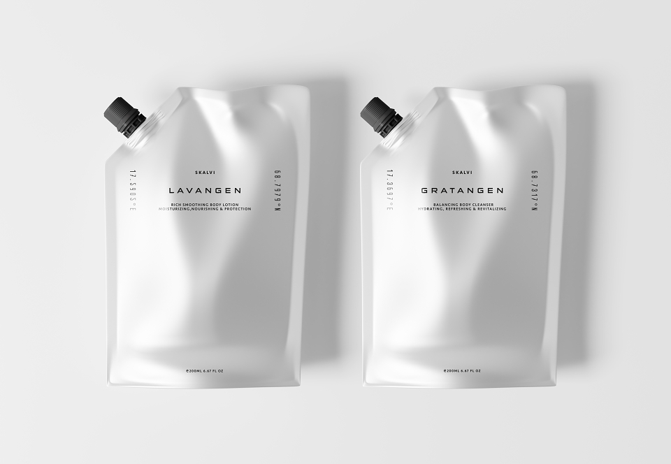
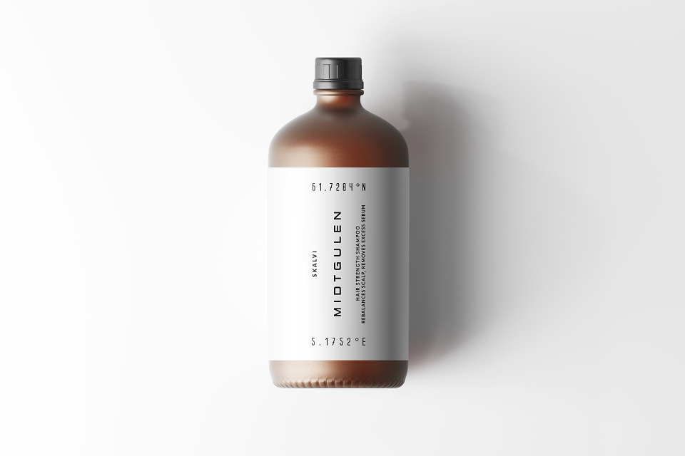
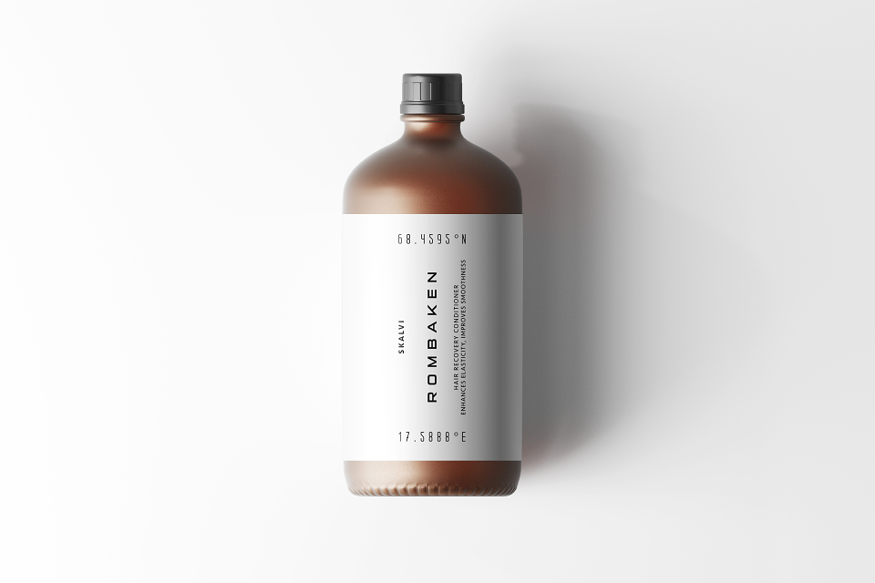
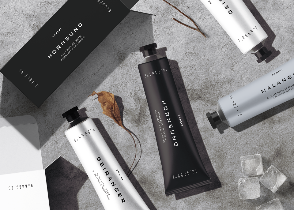
Every product is named after a specific fjord, its coordinates anchoring the brand in real, untouched nature. The identity is unapologetically minimal — with zero ornamentation, no performative masculinity — only raw geometry, disciplined layout, and tactile clarity.
The tone of voice is sparse, technical, and honest.
Freed from client expectations or commercial constraints, this project prioritised conceptual coherence, design integrity, and strategic differentiation.
Every detail — from type to tone — embodies the brand’s core values: purity, strength, and restraint.
Target audience:
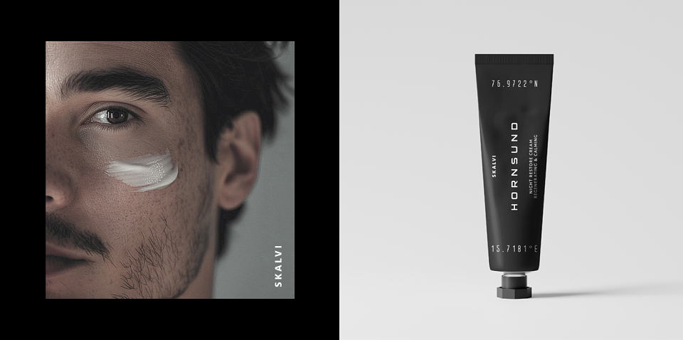
Discerning men aged 30–45 who value functional beauty, Nordic influence, and refined minimalism in both product and design.
EXECUTION:
Geographic Anchoring
Each product is named after a real Norwegian fjord, complete with geographic coordinates. This not only grounds the brand in a sense of place, but adds authenticity, story, and depth — a quiet nod to provenance in an age of surface.
Design Language
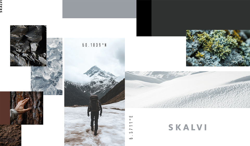
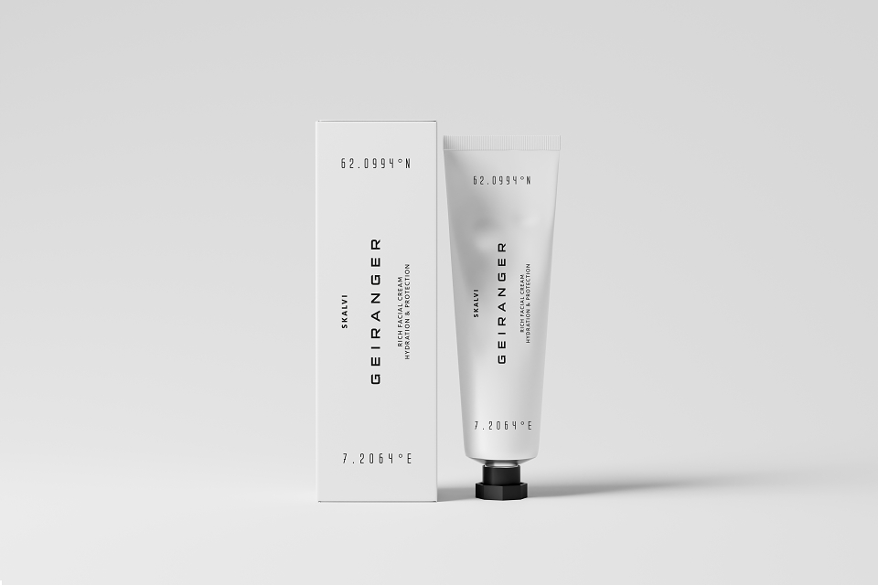
SKALVI’s visual system is defined by sharp vertical lines, bold contrasts, and expansive white space. The compositions evoke stillness with power — as if fjords themselves have been translated into layout. The rhythm of space and form suggests discipline, clarity, and reverence for the natural order.
Typography
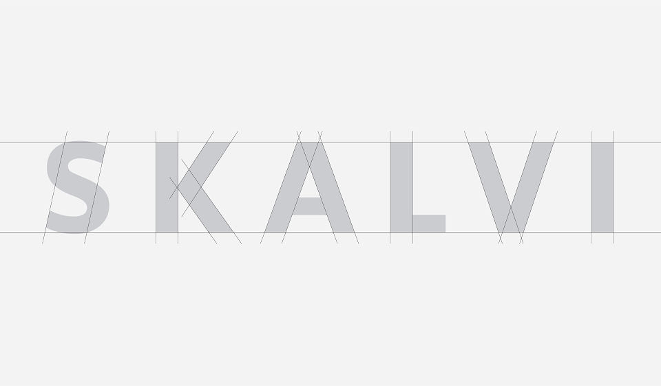
A precise sans-serif typeface in vertical orientation introduces controlled tension. The typography becomes structure — a visual metaphor for masculinity redefined through calm rather than aggression.
Color System
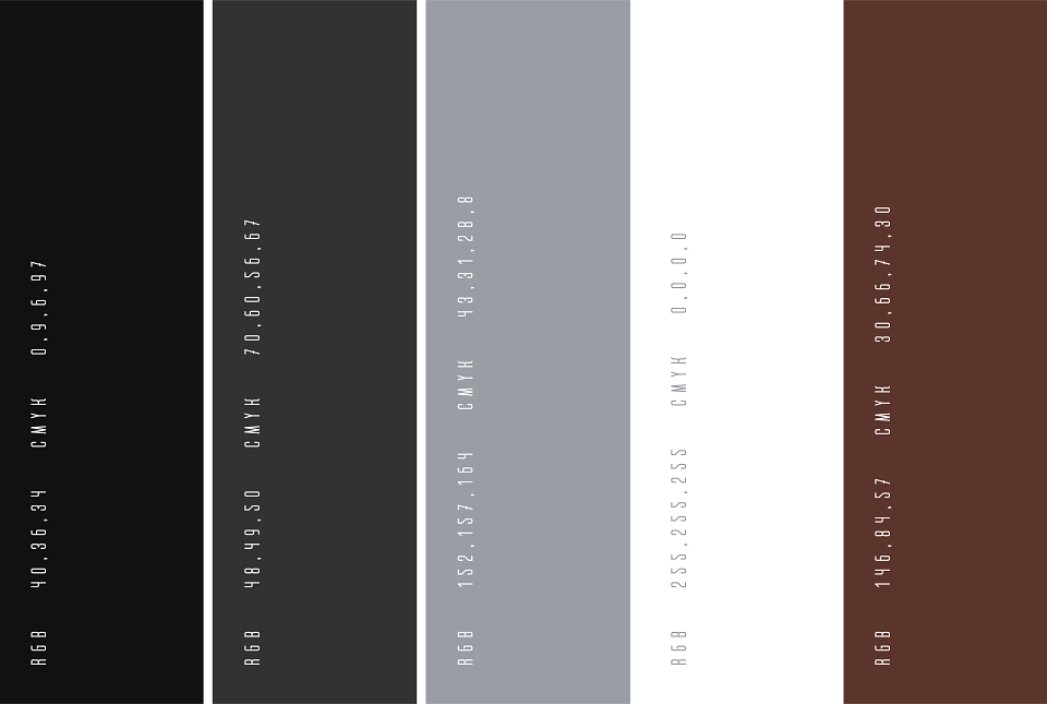
The palette is elemental: deep black, stark white, and tones like slate grey and soil brown. These colors mirror the brand’s philosophical restraint and its environmental references — understated yet commanding.
Materials and Finish
Matte finishes, minimalist labels, and recyclable substrates tie the brand to utilitarian design and apothecary roots. Sustainability is not a claim — it’s a built-in, silent principle.
Naming & Copywriting
The naming process began with the brand itself: SKALVI — a constructed name that feels rooted in the North. Its sound architecture evokes the sharpness and stillness of Scandinavian landscapes — clean, glacial, strong.
The name subtly echoes “Scandi” — a familiar shorthand for Scandinavian design and identity — but shifts it into something more elemental, architectural, and enduring.
It’s intentionally ambiguous — could be a place, a legacy name, or a system. That tension between recognition and invention is what gives SKALVI its presence: minimal, quiet, and full of intent.
Each product continues this logic by referencing real Norwegian fjords — named and positioned by exact geographic coordinates.
This creates not just a naming system, but a cartographic narrative, anchoring every product in actual, physical northern terrain.
Copy is deliberately sparse, technical, and emotionally neutral — free from the overused language of wellness.
The brand statement,
North. Skin. Nothing Else.
acts as a verbal distillation of the brand’s philosophy: restrained, elemental, and grounded in truth.
Mockups & Presentation
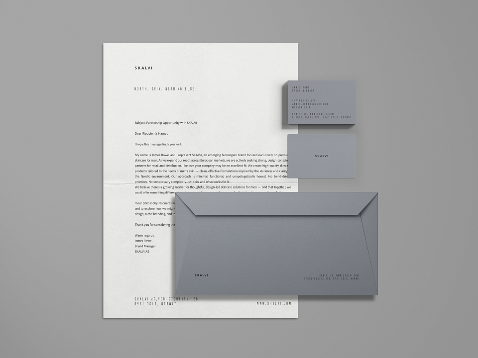
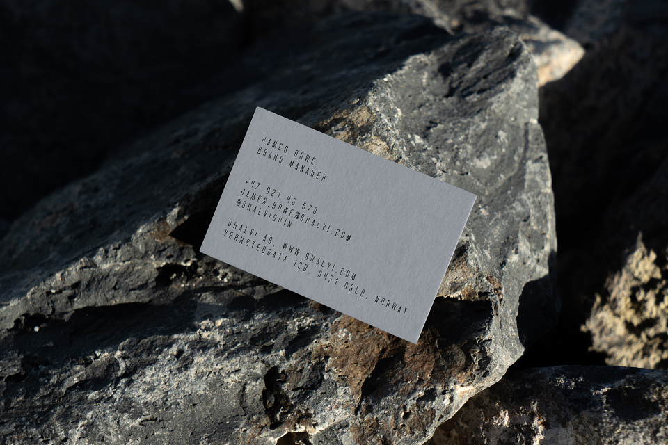
A full suite of digital and physical mockups demonstrates system cohesion and scalability — from primary packaging to product detail and tone of voice.
The mockups reflect real-world usability — how the product feels in the hand, the matte textures under light, the silence of space around typography.
Every visual decision contributes to a sense of control, calm, and deliberate experience.
RESULTS:
As an independent conceptual project, SKALVI was created to challenge conventions in men’s skincare branding. It received positive feedback across creative platforms and drew attention from boutique wellness startups and independent founders interested in brand systems with a strong conceptual foundation. The project was noted for its visual restraint, narrative clarity, and cohesive execution.
PROJECT CREDITS:
Creative Direction, Naming, Copywriting, Branding, Packaging, Typography, Color System — Eve Makarova.
ADDITIONAL NOTES:
This is a fully realised brand system — developed solo, from positioning and storytelling to execution and art direction.
SKALVI questions tired tropes of masculine branding, discarding performance and ego in favour of quiet confidence, raw clarity, and elemental design.
It’s branding not as decoration, but as a form of thinking — sharp, clean, and culturally attuned.
MADEIT CREDITS


Annual 2025 ShortlistSKALVI – Men’s Skincare Brand & Packaging DesignSelf Initiated
Project featured: on 16th January 2025