


ISTD 2025 Brief: Typographic Futures – From Patriarchy to Matriarchy
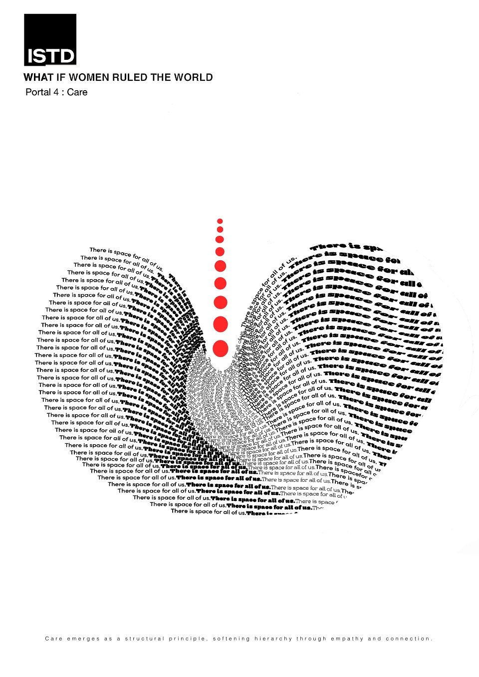
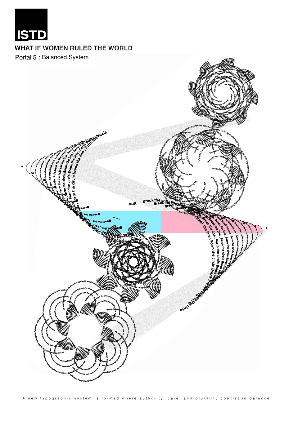
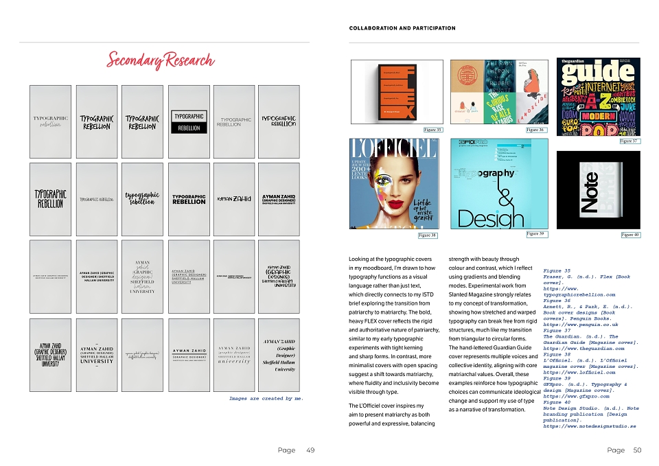
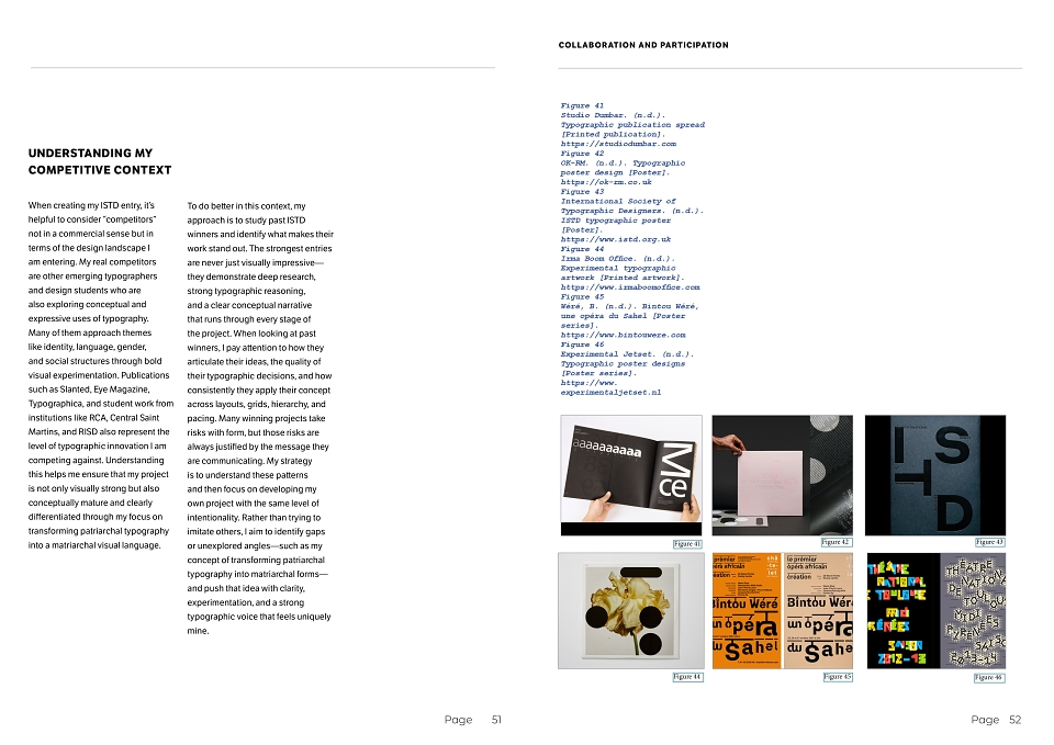
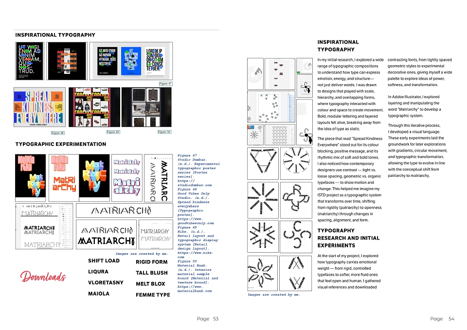
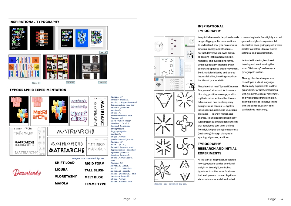
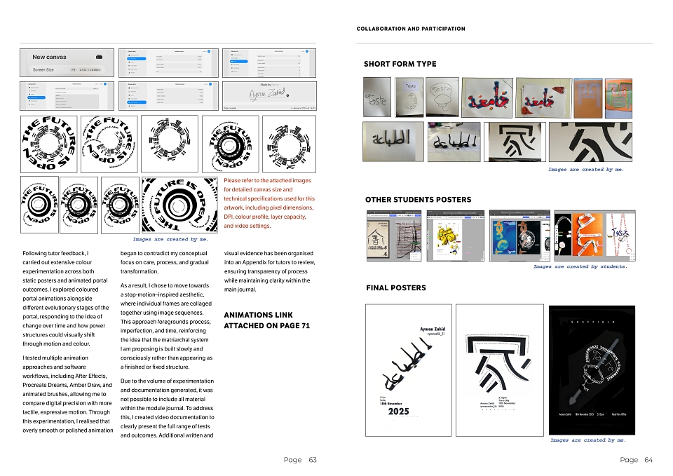
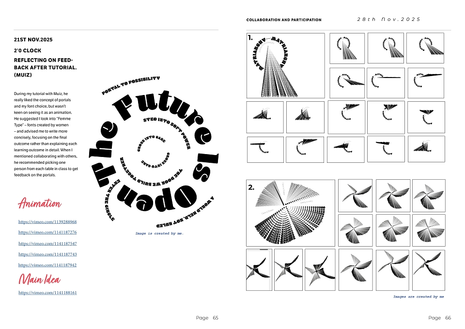
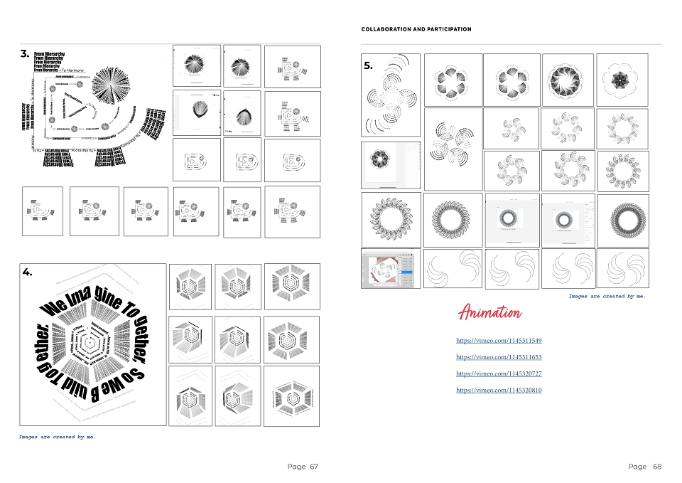
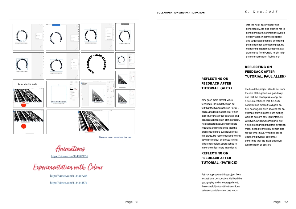
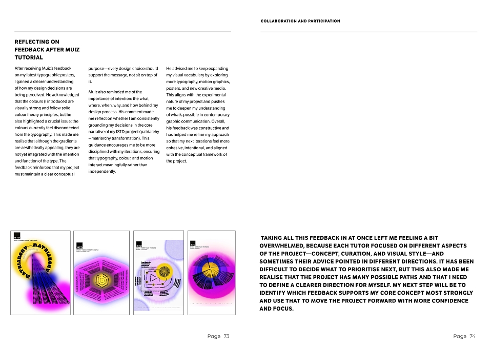
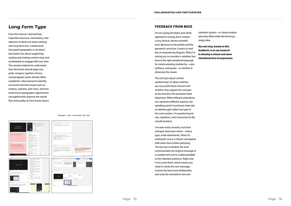
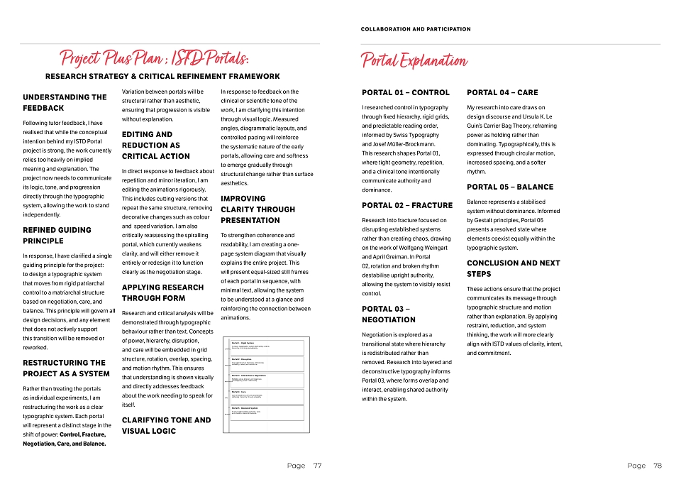
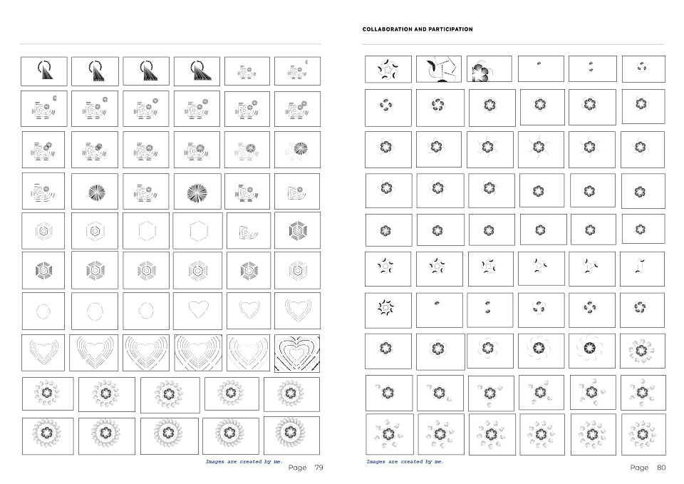
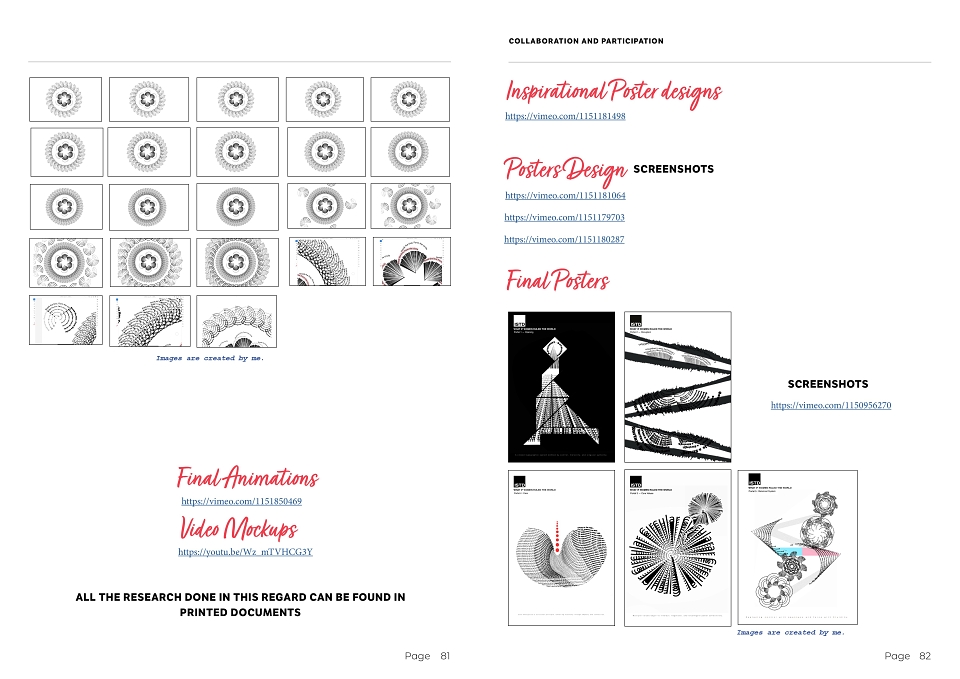
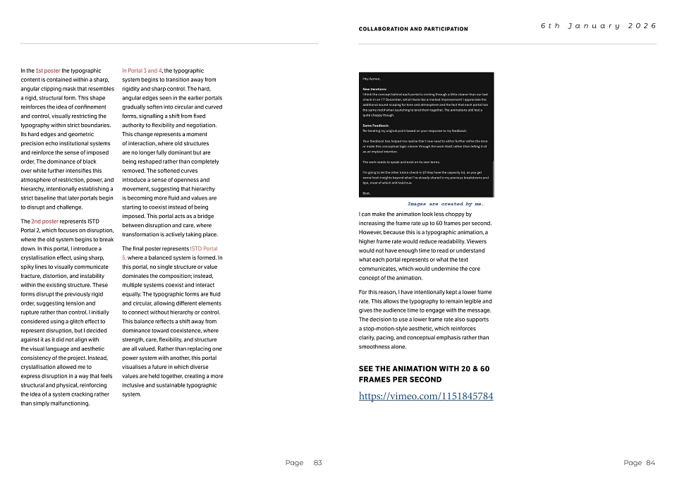
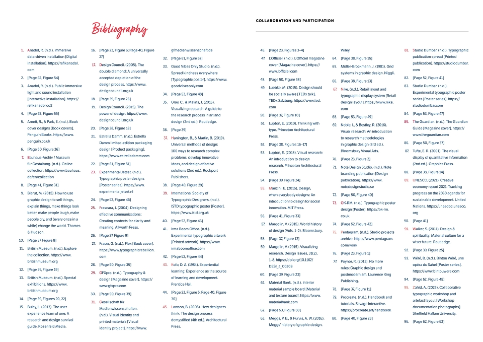
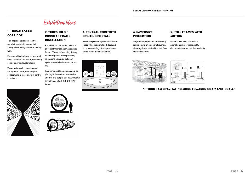
In my typographic portals, I’m exploring the transition from a patriarchal world to a matriarchal one by using typography, form, and motion to tell a visual story. Instead of explaining this only through text, I’m guiding the viewer through different stages, where the shapes, layouts, and movement gradually shift from rigid and hierarchical to fluid and shared. The circular structures, curved text, and gradients help the audience feel this change as they move through the sequence.
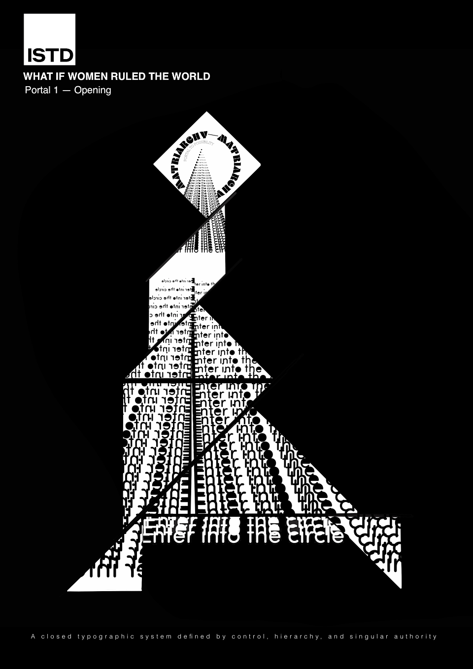
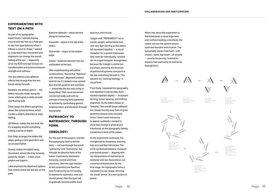
Portal 1 – Opening
This portal works as the entry point in my installation/animation. The open circular frame and expanding type create a “threshold,” inviting the viewer to step into a new perspective. By widening the letterforms and giving them more space, I’m already moving away from the closed, restrictive feel of patriarchal visuals.
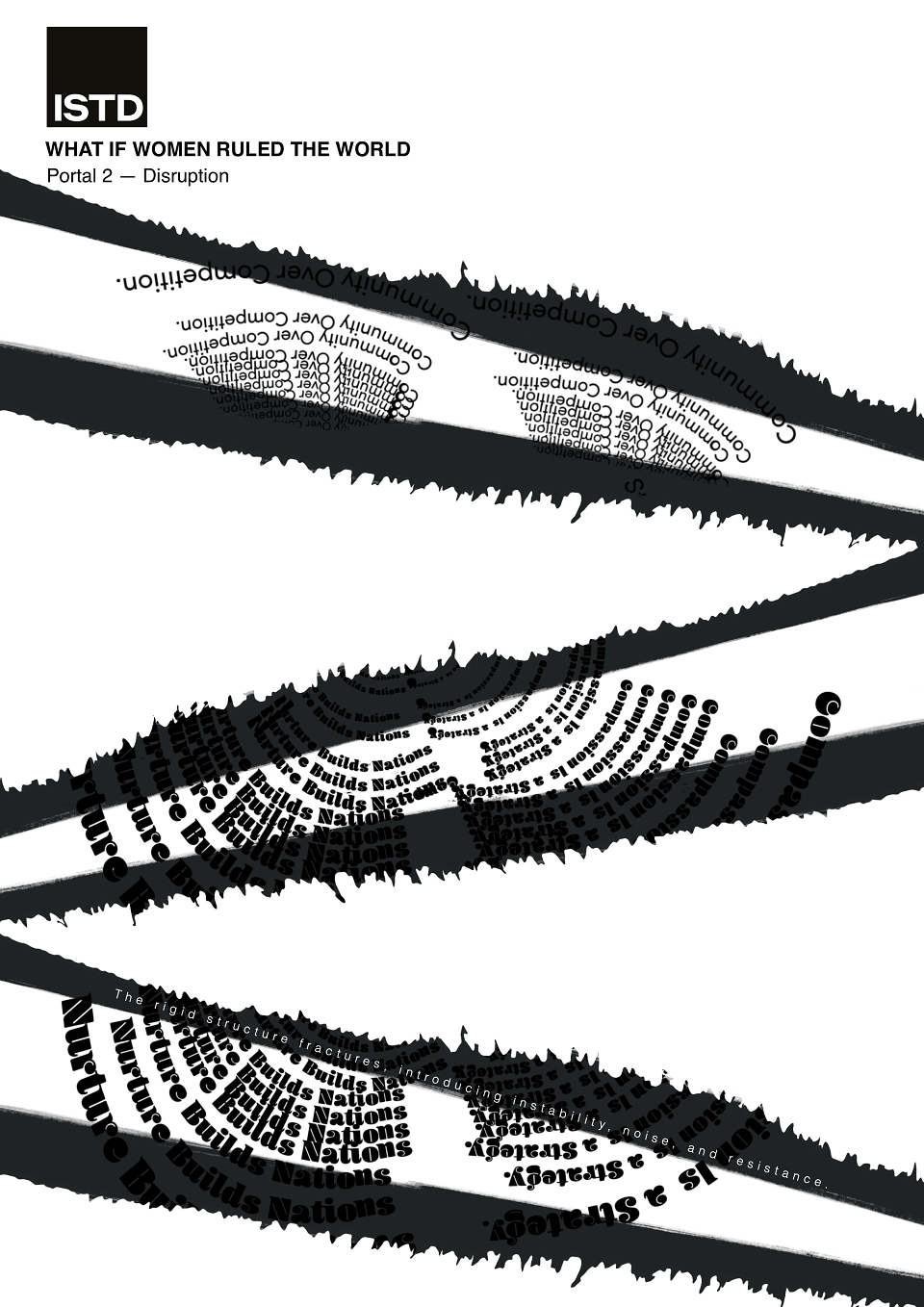
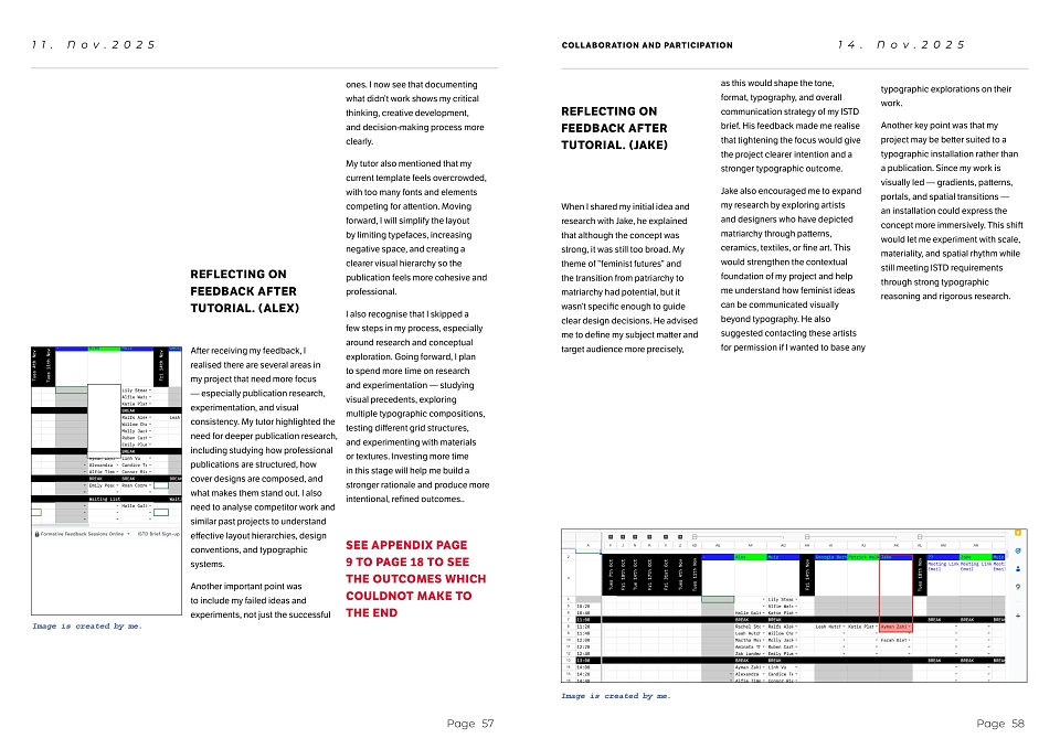
Portal 2 – Patriarchal Structures / Hierarchy
In this portal, I focused on visually representing the structured, rigid nature of patriarchal systems. The typography is tighter, more condensed, and aligned to straighter paths, reflecting control and hierarchy. I used more angular shapes and a stronger grid to show how power is often centralised and restricted. The viewer feels a sense of limitation through the narrow spacing and directional flow, which leads them toward a single reading route. This intentional restriction sets up a contrast for the later portals, making the shift toward openness and shared power more impactful.
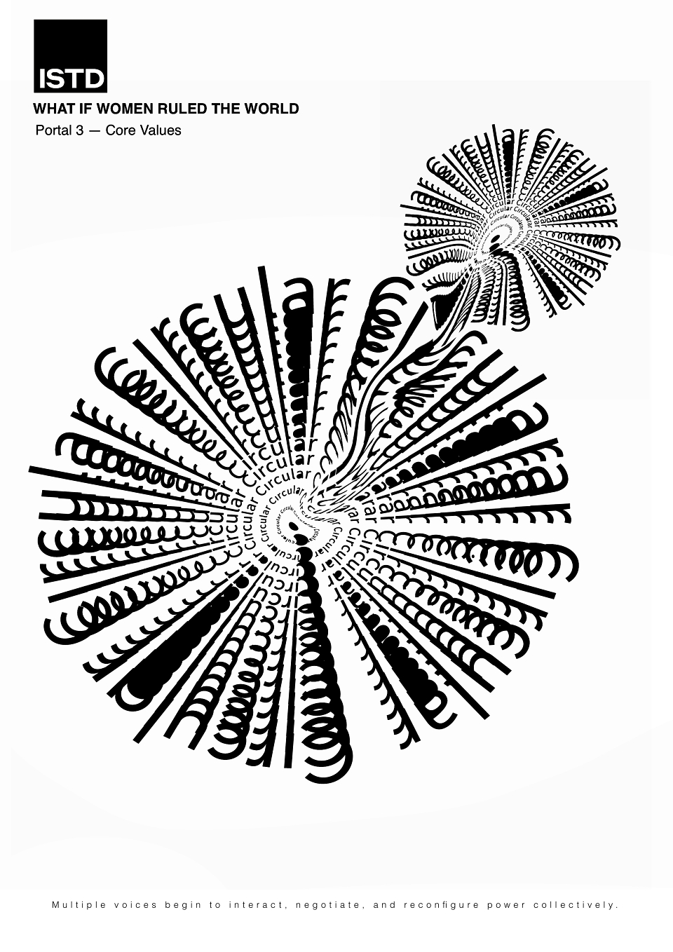
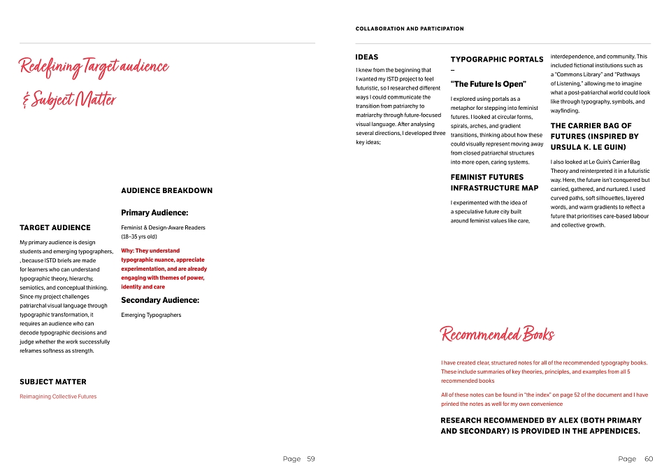
Portal 3 – Matriarchal Values / Core Principles
Here, I wanted the design to reflect care, connection, and community. I used curved layouts and shared spacing so the letters support each other rather than compete. The circular composition creates multiple reading paths, which encourages a more collective, inclusive experience instead of one dominant viewpoint.
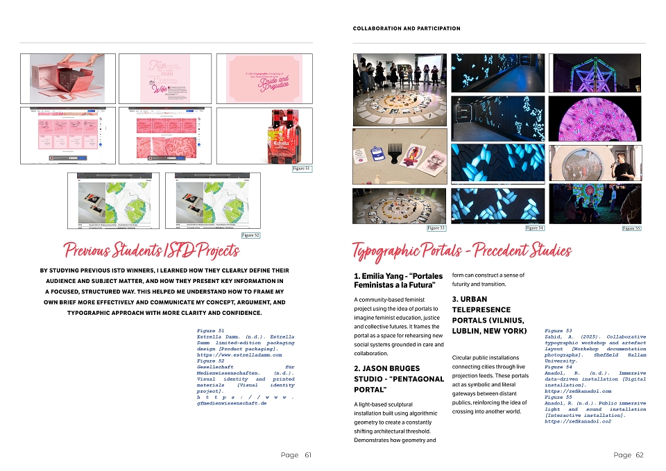
Portal 4 – Futurist Lines
This portal is inspired by Ursula Le Guin’s ideas about non-linear futures. The spirals and gradients show growth and fluidity. The gradient helps with this because it blends colours smoothly, showing transition and evolution rather than sharp boundaries. It visually suggests that identities and systems can shift and develop over time.
Portal 5 – Anti-Patriarchy
My approach to this portal is subtle and elegant. Instead of aggressively attacking patriarchal visuals, I removed bold, heavy, impact-style typography and replaced it with softer forms, circular layouts, and smooth transitions. By rejecting hard edges and rigid grids, I’m showing resistance through redefinition—proving that power can exist without dominance.
#ISTD2025 #TypographyDesign #MotionDesign #GraphicDesignPortfolio #FeministFutures #DesignForChange #SpeculativeDesign #FutureOfDesign #VisualCommunication #DesignResearch #CreativeProcess #EmergingDesigner #WomenInDesign #TypeMotion #DigitalInstallation #RefikAnadolInspired #DesignStudentLife #SheffieldHallamUniversity
 |
Ayman ZahidGraphic Designer |