Lala Pashayeva
Senior Graphic Designer
ABOUT
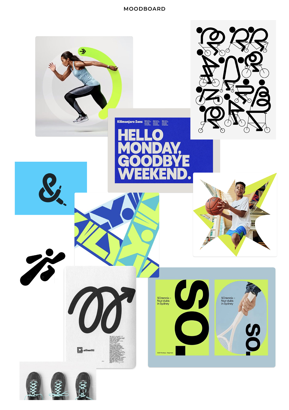
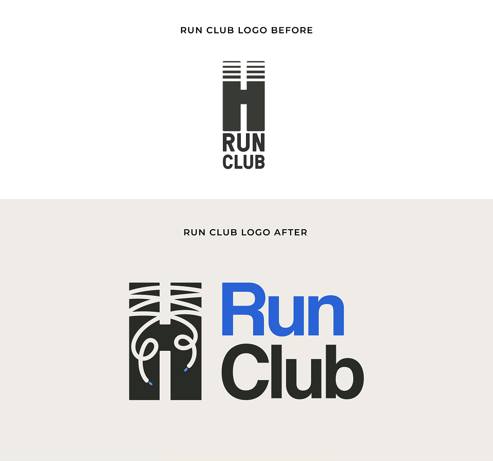
My goal was to maintain familiarity but add something more energetic and relevant to the running club.
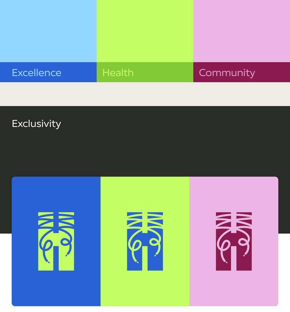
When I first worked with the existing Humantra logo, I wanted to add an icon or element to represent the running club. I explored several options but found that they didn’t match the vertical lines on the logo’s top. So, I brainstormed and thought—what’s central to running? Shoes, of course! That led me to incorporate shoelaces as part of the logo.
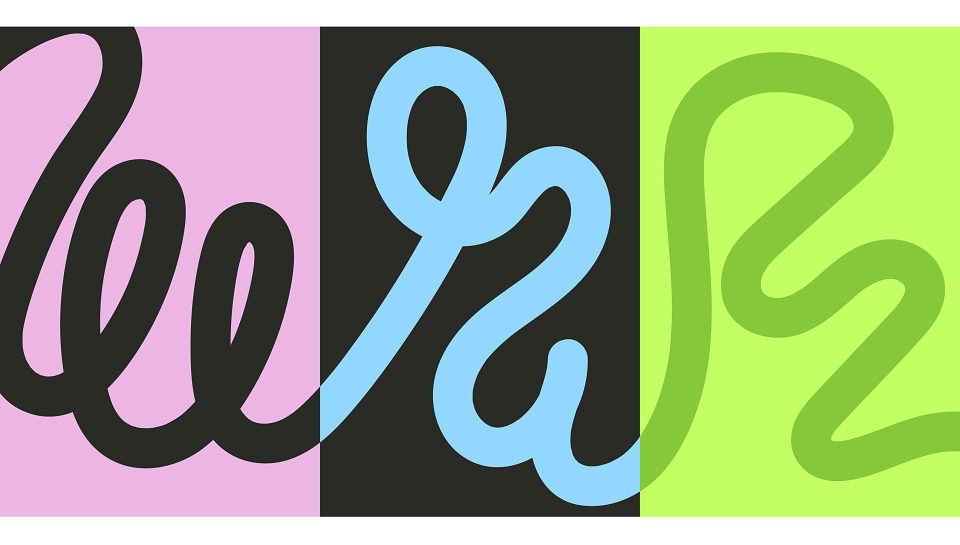
The vertical lines were transformed into laces, hand-drawn to bring a more organic and dynamic feel while staying true to the original structure of the logo.
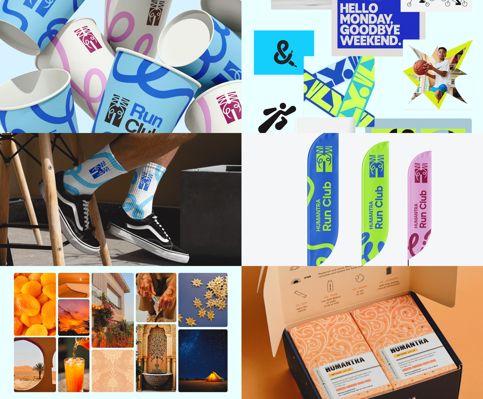
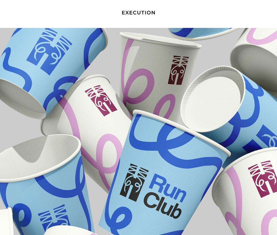
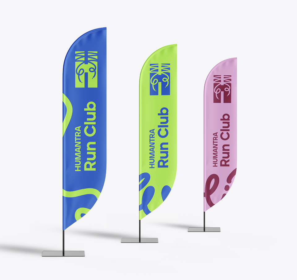
I used vibrant neon colors—blue, pink, and green—combined with neutral tones to represent excellence, health, and community. These colors are bright, eye-catching, and make the identity highly visible, which is important for events and outdoor activities like running. They create a sense of exclusivity and fun while still being very adaptable.
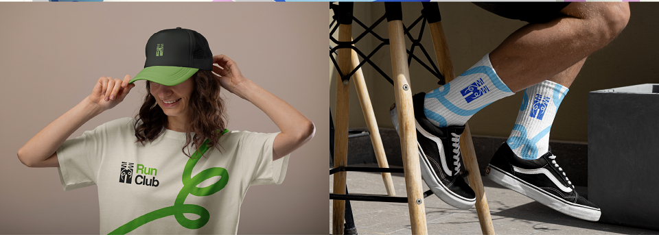
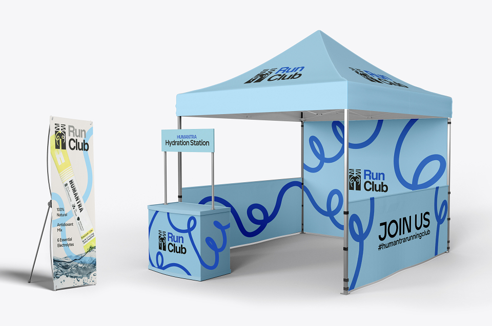
Regarding mockups, I thought carefully about the practical elements that would be visible at the events. So, I included meeting point flags, hydration tents, cups, and clothing items like caps and socks to extend the brand's presence in the real-world environment. These items create touchpoints where the brand feels dynamic and interactive with the community.
This concept delivers a bright, bold identity that’s very flexible and perfect for high-energy settings like running events.
MADEIT CREDITS


Annual 2025 ShortlistHumantra Run Club RebrandBranding
Annual 2025 ShortlistHumantra Run Club RebrandGraphic
Project featured: on 9th July 2025