Interbrand London
London
ABOUT
ENTRY DESCRIPTION
As the global leader in the oral care Sensitivity Category, Sensodyne had an ambition: to double their business by 2024. To do this, they needed to widen their focus from fixing the sensitivity problem to sensitivity plus all round cleaning performance. By turning episodic users to daily ones and showing pain avoiders they can use a sensitivity toothpaste without compromising on their other oral care benefits, it could open a huge opportunity for growth.
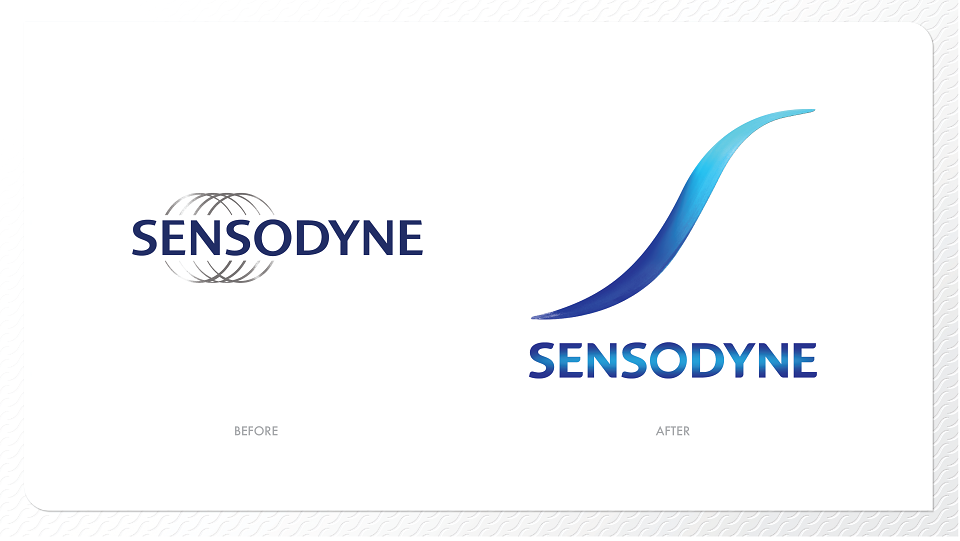
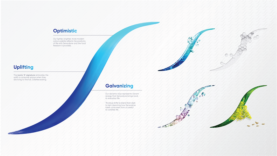
To capitalise on this opportunity, Sensodyne needed a big idea to visually represent this shift. A bold, crafted new signature and brand mark was required for the brand to move from clinical pain to all round cleaning, plus expert relief. The graphics evolved to be more daily, approachable, energetic and importantly, reassuring. Clear claims, a strong variant story and distinct tiering across the packaging help with navigation while reinforcing the expertise.
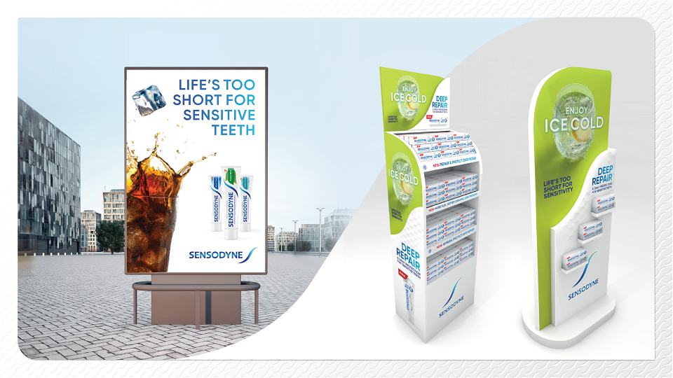
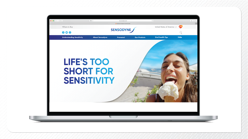
The packaging was launched alongside a new visual world – moving from a focus on the negativity of sensitivity to how carefree life can be with Sensodyne, highlighting the joy of everyday moments, pain free. The specialist ‘S’ used for our Advanced range expresses extra power indicating our heartland in science; it was key to repurpose the silver accents from the original logo and pack design in a modern yet familiar way to retain our authority.
The signature ‘S’ is a strong guiding design element unifying the packaging on shelf and online. As one consistent brand element it gave global markets the freedom to adapt supporting packaging visuals to be relevant for their region while still providing the expertise credentials the consumer expects of Sensodyne.
MADEIT CREDITS
-

James HoughtonClient
-

InterbrandStrategy Lead -
interbrandcreative director -

Rajen MistryBrand and Packaging Designer -

Sue Daunexecutive creative director -

Keelie TeasdaleCreative Director -

Rebecca WhyteClient Director -

Interbrand London
Annual 2022 ShortlistSensodyne Brand refreshBranding
Project featured: on 25th May 2022
Contributor:
Invite
x3
Interbrand London has been a Contributor since 25th November 2015.