Elmwood
London
ABOUT
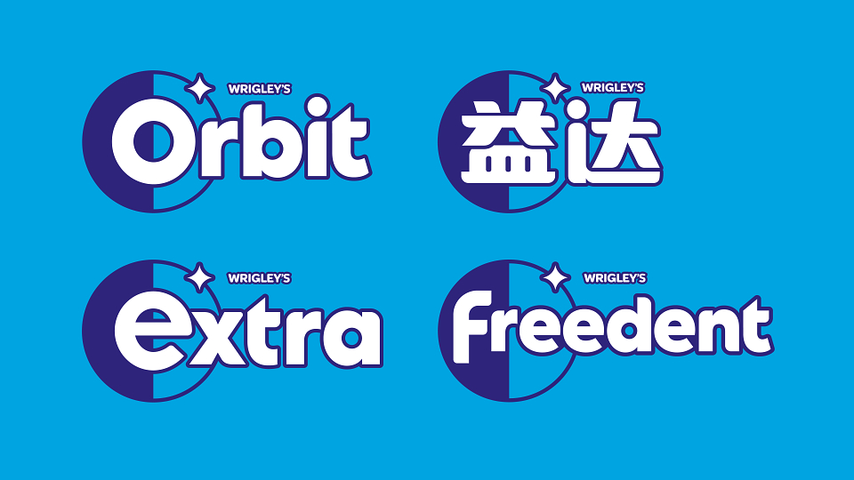
Mars Wrigley approached us to rebrand Extra, creating a new brand expression to unify global markets, appeal to younger consumers and transform the brand into an iconic lifestyle brand for a digital-first generation.
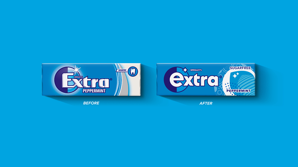
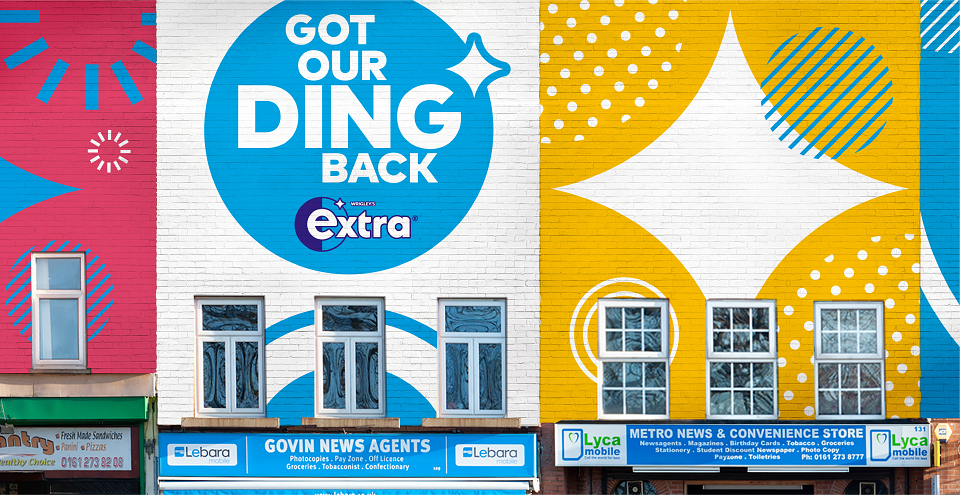
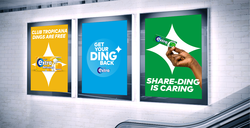
We began by looking at Extra's key asset: a "ding" symbol, traditionally a code for cleanliness and dental hygiene. The "ding" demanded a refresh - one reflective of the brand's target consumers and their lifestyle. We elevated the "ding" symbol, modernizing it as a bold, simplified, eye-catching key asset - reimagining it as a metaphor for celebrating moments of confidence.
Extra's new bold design and wider brand identity radiates confidence that goes beyond packaging to reflect a younger, global generation's lifestyle and desires and to unlock rich storytelling opportunities. Paired with a circular shield, the "ding" boasts softened curves and a clean eye-catching design. Versatile for use across touchpoints, the lock-up bridges the tension between iconicity and flexibility. Designed to meet market needs and drive future innovation, Extra's new distinctive visual identity is its first unified expression of the master brand at a global level - a move that is nothing short of "extra".
MADEIT CREDITS
-

Mars WrigleyClient
-
Beth StanfordAccount Director -
David WalshDesigner -
Emily MorrisDesigner -
Hanni EtheringtonAccount Manager -
Jack BannermanDesigner -
Mark LawsDesign Director -
Mike PrestonDesigner -
Sam PoveyDesigner -

Andrew LawrenceExecutive Creative Director -

Gtelmwood TaylorChief Provocation Officer -

Rob Clarke Design LtdTypography -

Doug BrownMotion Graphics and VFX Artist -

Nursel ArslanFreelance Creative & Packaging Artworker -

Rob DyerDesigner -

Elmwood -

Craig BarnesCreative Director
Annual 2022 ShortlistExtra RebrandBranding
Project featured: on 4th July 2022