PepsiCo Design & Innovation
New York
ABOUT
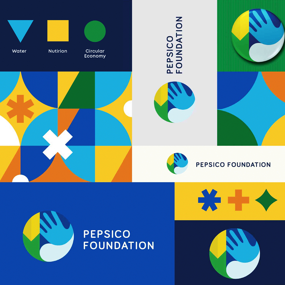
In Latin America, the PepsiCo Foundation is a nonprofit focused on investing in communities to help them thrive. Their mission is focused on empathy and equity. It’s human. However, the previous identity for the foundation was strongly influenced by the PepsiCo corporate visual language. We redesigned the identity from the ground up with human centered design principles as our guiding light. We developed a regional identity for the foundation that expresses the pillars of their work through universal icons infused with emotion, empathy and humanity.
We were originally tasked with a project to help identify volunteers doing field work. But after a bit of research, we identified a greater opportunity. Like many nonprofits that put most of their resources into program work, design tends to be done on a project-by-project basis. The organization didn't have a strong or consistent visual language that could identify volunteers. Nor did their identity or brand elements communicate their goals, process, mission or outcomes. We felt there was a need for empathy. To touch people emotionally. To powerfully communicate the issues the PepsiCo Foundation tackles. To get people involved in the difficult work of helping others.
Corporate foundations often follow their company's identity. And that makes it difficult for folks to differentiate the nonprofit and for-profit ventures. Yet, at the same time you can’t stray too far from the founding logo. So, one of our constraints was to find a unique yet similar solution. The visual identity also had to be relevant for the complex audience matrix of people interacting with the org. Our last consideration was that the system needed to be fluid and flexible so the Foundation can get deep in niche topics while also communicating on a broad integrated level.
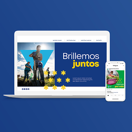
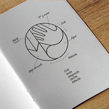
Our solution was simple. It’s all about action. Putting things into motion. Think of it in an elemental way. When simple things come together and activate, they are the building blocks of bigger, more powerful movements. Our concept was anchored in the idea of Simple Great Help. Then came the visual translation. Archetypal shapes were chosen to identify the three main pillars of the foundation. In this modular system these building blocks multiply and interact to form the greater whole. The shapes can be mixed and matched for different communication needs and audiences.
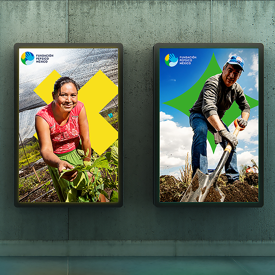
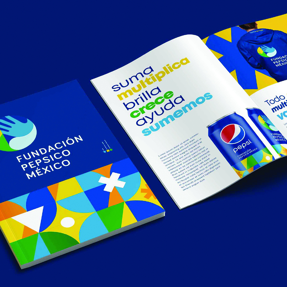
We developed a clear geometric typeface and a vibrant color palette. We chose a photography style that highlights both the power of individuals and communities. At the end of the day all these add up to a unique, consistent and coherent system.
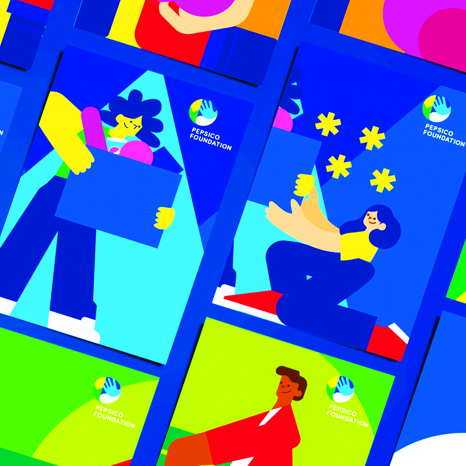
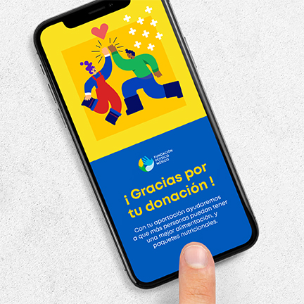
Still, something was missing, an element that could emphasize the strength of the simple principle of helping others. Inspired by the magnificent, empowered portraits from the muralist Diego Rivera, an illustration style was generated. Charismatic characters with oversized proportions now accompany the visual identity system giving it more humanity. More soul.
Internally, the new identity was so well received that its scope of implementation increased dramatically. This started out as a regional identity for Mexico. Then it expanded to LatAm. The PepsiCo Foundation saw an increase in volunteer donations which translated into programs that had a positive impact for half a million people throughout Latin America. And that’s just since the new identity launched in 2020. Fourteen Million food portions were distributed all over Mexico. Employee contribution was multiplied by 14% for water and food security to different communities. All this while fostering gender equity which became a core value running across all programs. Which just makes sense since two thirds of their programming benefits women.
MADEIT CREDITS

Annual 2021 ShortlistPepsiCo Foundation - MexicoBranded Content
Project featured: on 3rd September 2021