PepsiCo Design & Innovation
New York
ABOUT
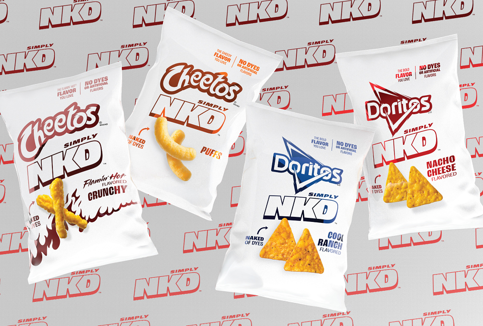
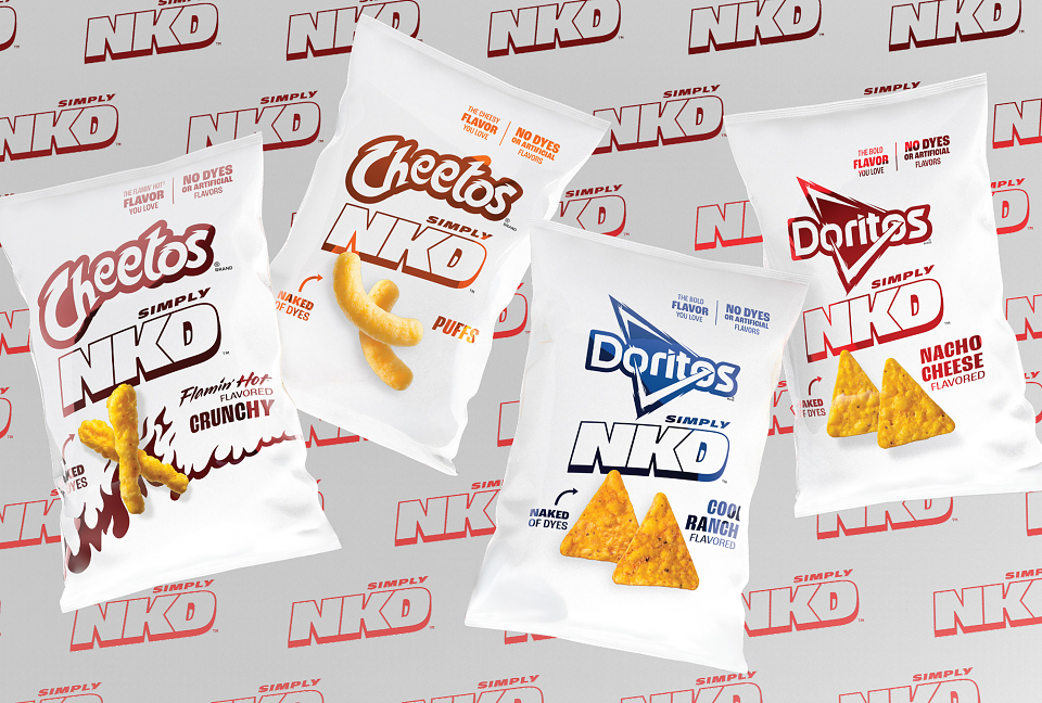
Doritos and Cheetos are indisputably iconic, right down to the orange dust left behind after a great snacking session. But today’s snackers are increasingly mindful of what they consume, especially when it comes to dyes, and our brands rose to the challenge. Introducing Simply NKD, a reimaging of classic Doritos and Cheetos made with no artificial flavors or dyes. Our team in the U.S. created a visual identity built on a stark white canvas and metallic brand cues, stripping back the look to its most honest form.
As U.S. food regulations evolve and people look for snack options without dyes, we introduced Simply NKD to offer new options and expand choice, not replace the originals. We had to present Doritos and Cheetos in a new way, naked of their distinctive orange and red seasonings. It wasn’t about changing who they are. It was about expressing them differently, ensuring the visual language reflected what’s inside the bag. In a category crowded with visual noise, sometimes the bravest move is restraint.
The Simply NKD identity embraces a blank canvas, honoring the core brand worlds through a contemporary lens. White takes center stage, acting as both a visual reset and a symbol of transparency. Doritos and Cheetos brand colors of orange, red and blue return as metallic accents, adding energy and recognition without excess. A modern sans-serif typeface prioritizes legibility and confidence, free from embellishment. On pack, matte finishes ground the bags in premium simplicity, allowing the metallic elements to shine with purpose. A playful and confident moment of honesty—a “naked” Chester—reinforces the idea that there’s nothing to hide. This is a visual language we’ve never used before, signaling a deliberate shift towards the future of snacking.
Early response to Simply NKD has been strong, with overwhelming demand at one of our retail partners exceeding SKU velocities in the first four weeks. Sentiment across conversations is 65% positive, with people highlighting appreciation for the product while maintaining flavor parity with the originals. Feedback like, “If I was blindfolded, I couldn’t tell the difference,” underscores the success of product and design working together, especially for Cheetos Simply NKD .
Pushing the boundaries of flavor and visual language, Simply NKD proves that transparency doesn’t require compromise, and we can still deliver the bold taste fans love.
MADEIT CREDITS

Annual 2026 ShortlistDoritos® + Cheetos® Simply NKD™ 2025Packaging
Project featured: on 9th July 2026