Vadym Aseiev
Creative Director
ABOUT
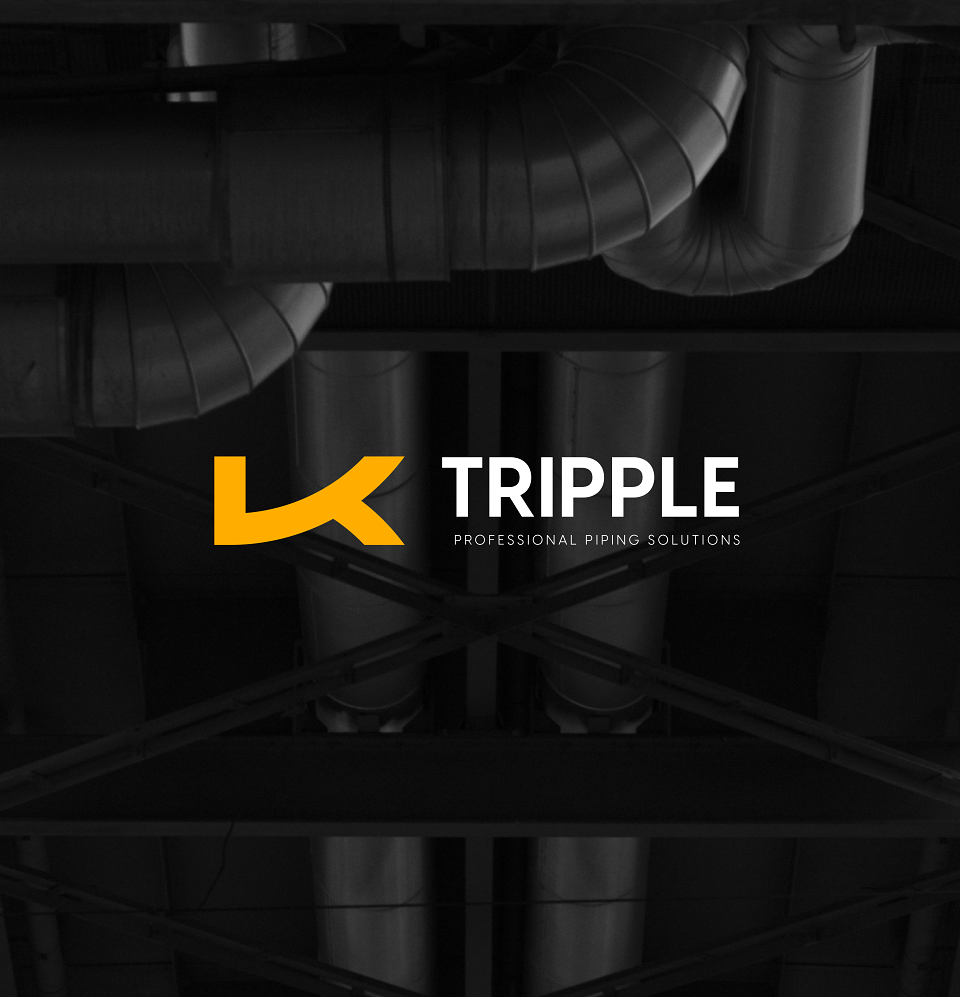
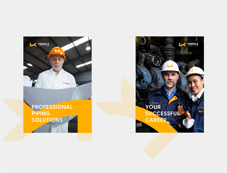
Tripple pride themselves on being at the forefront of the piping industry, dedicated to delivering professional piping solutions that drive excellence and innovation. As a premier manufacturer of pipes and piping systems, company offers a comprehensive range of high-quality products designed to meet the diverse needs of our clients across various sectors. Company expertise extends beyond manufacturing; providing exceptional service and engineering solutions tailored to your unique requirements.
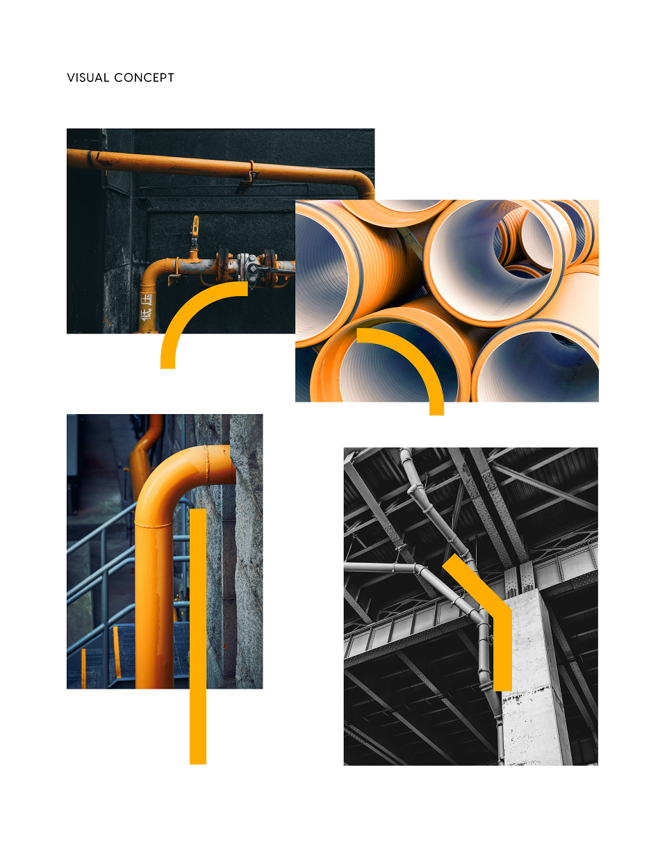
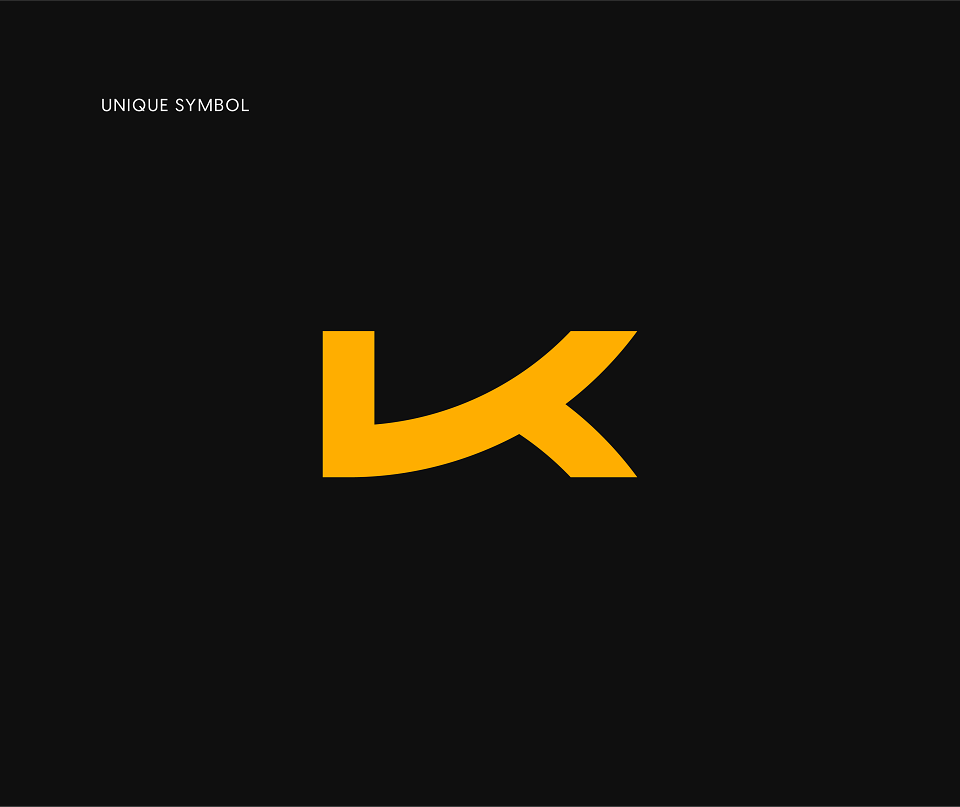
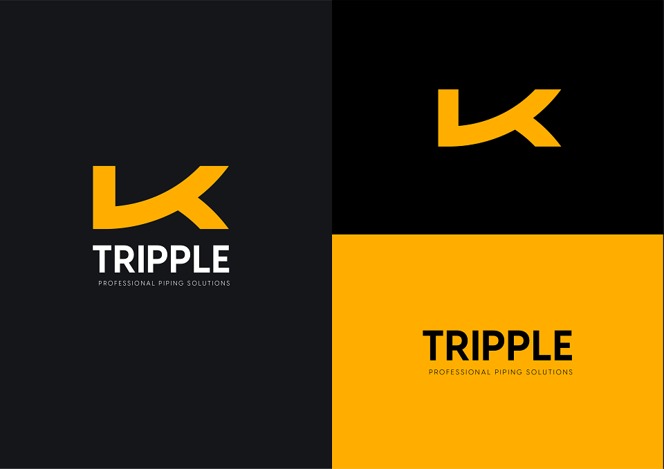
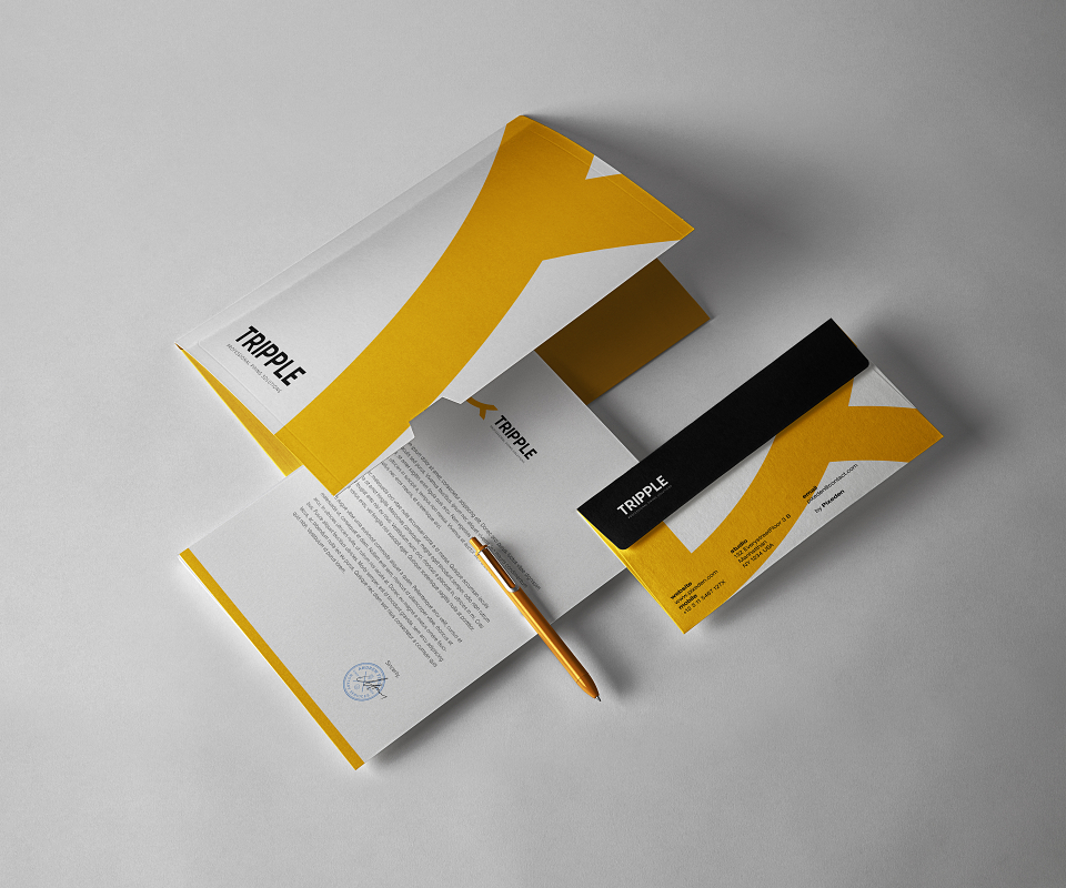
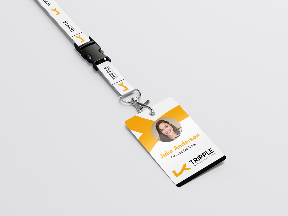
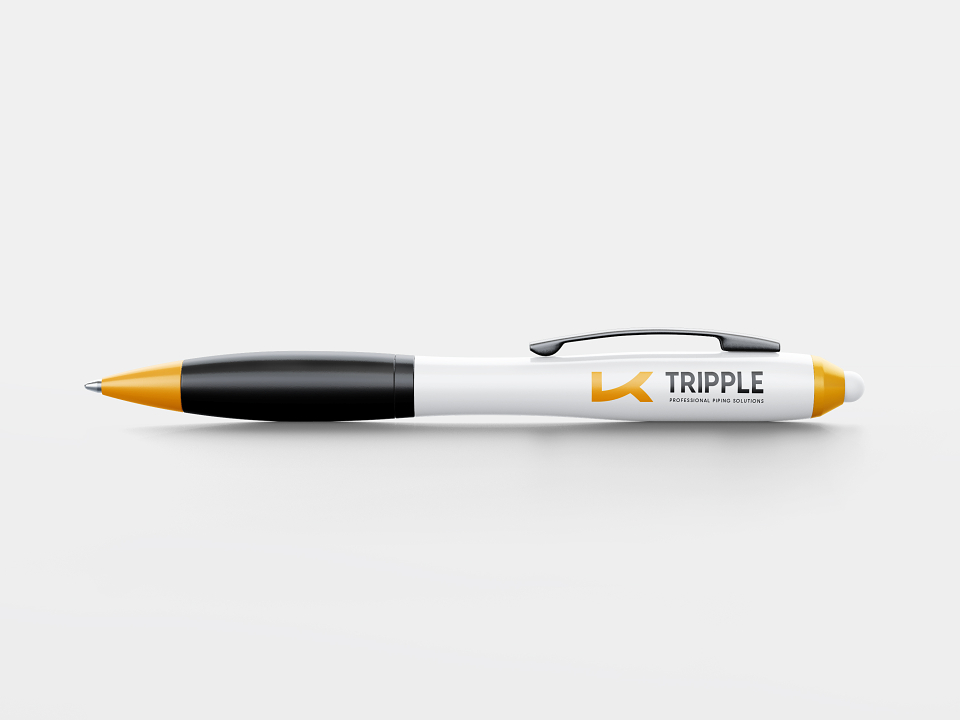
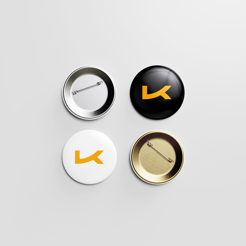
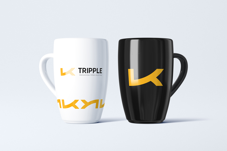
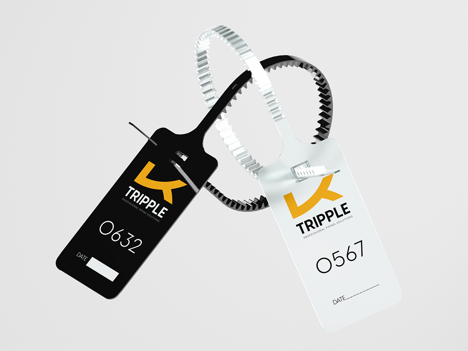
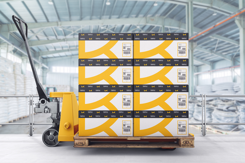
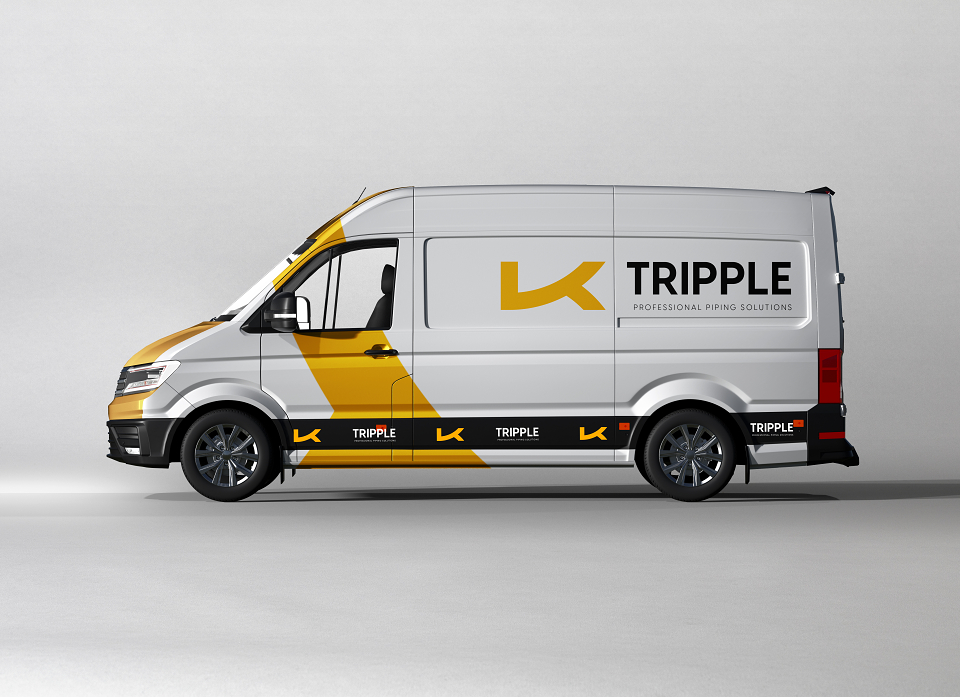
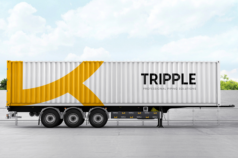
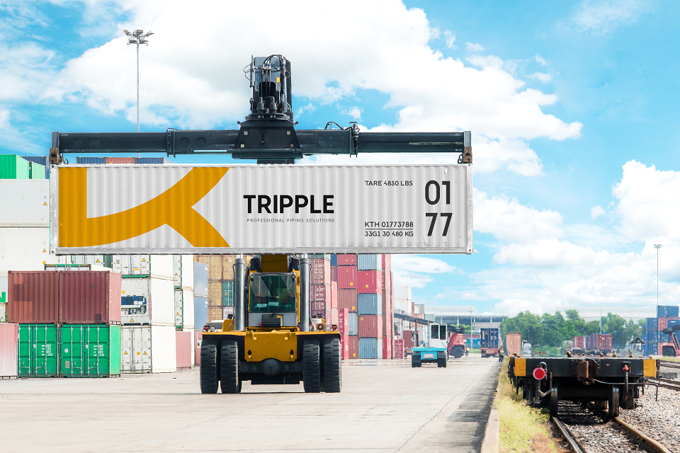
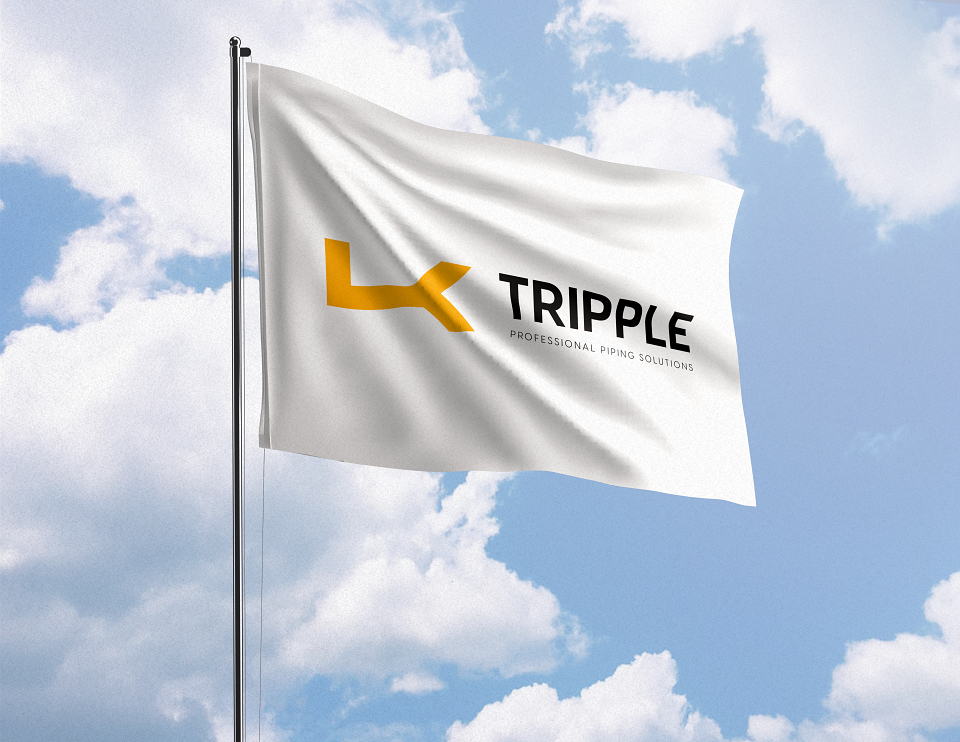
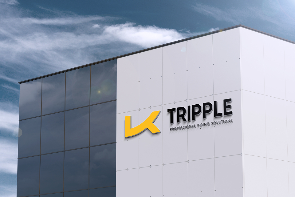
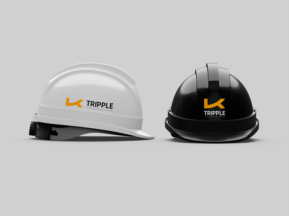
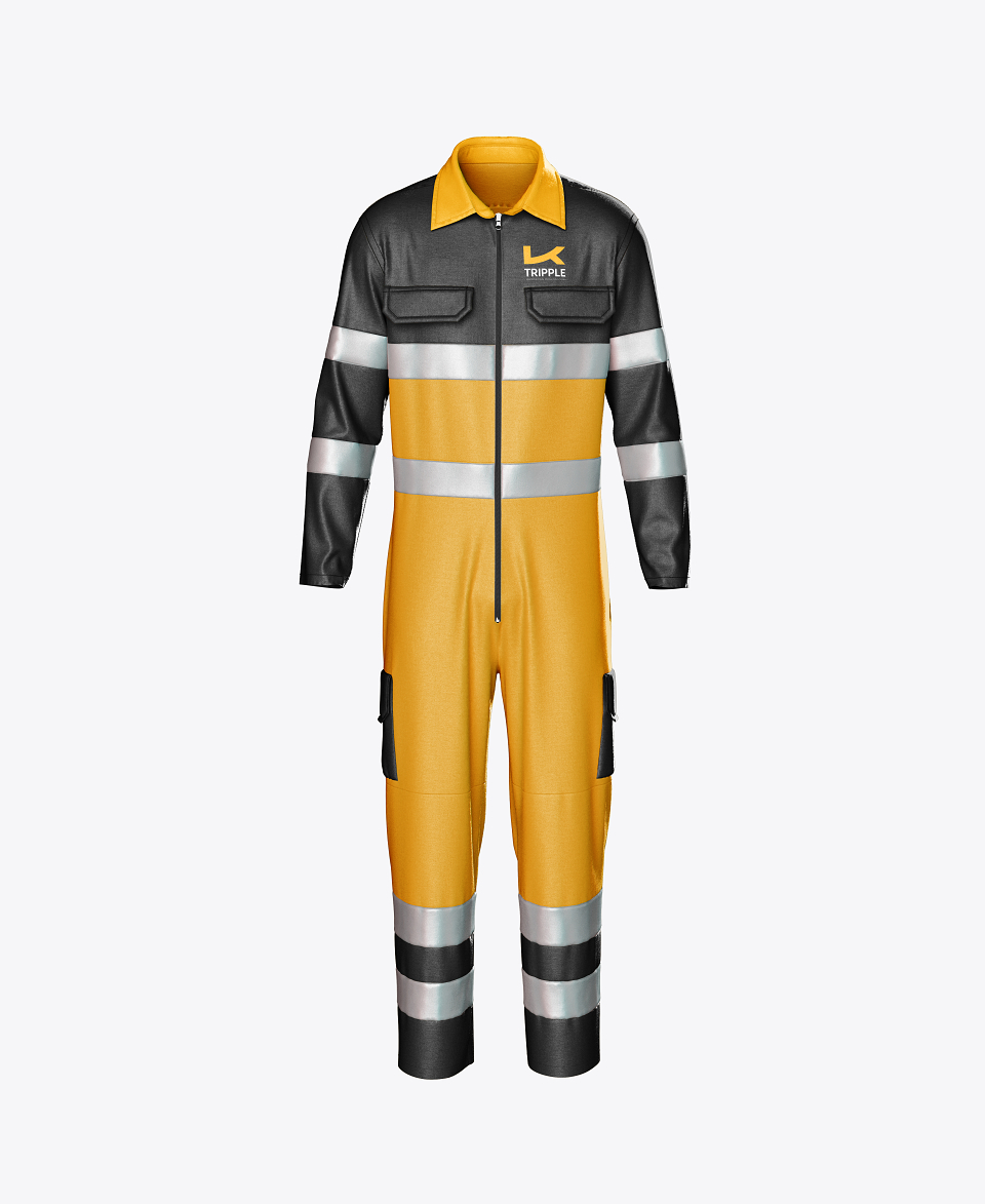
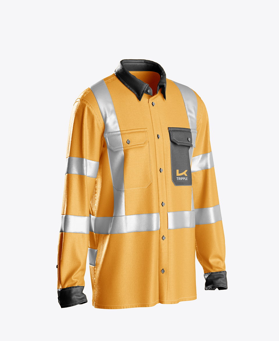
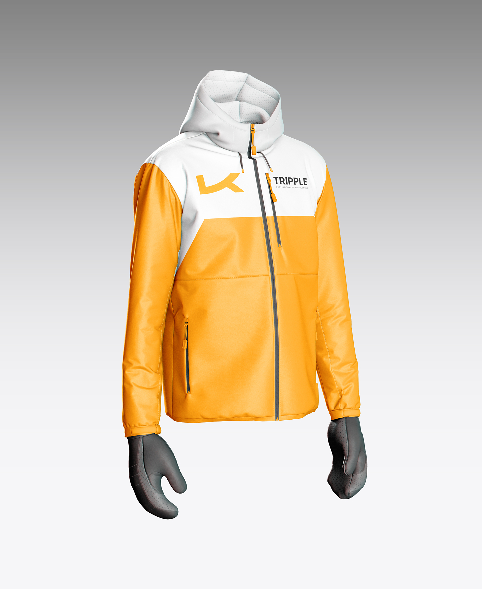
Tripple's brand identity and visual design are crafted to embody the essence of the company's core values and pillars: Production, Service, and Engineering. The logo itself, is a unique and innovative symbol, cleverly resembles the letter "K," symbolising the "Key of Success." This logo is designed to visually represent three interconnected pipes, signifying the seamless integration of our three foundational pillars.
The three pipes in the logo are not just a design element; they are a powerful representation of the synergy between Production, Service, and Engineering. Each pipe stands for one of these key aspects, showcasing how they collectively support and drive the business forward. This interconnectedness highlights the commitment to providing comprehensive and cohesive solutions to the clients.
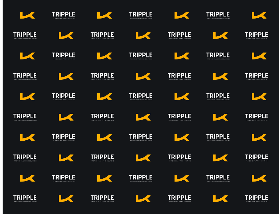
The color palette is meticulously chosen to reflect the brand’s identity:
1. Yellow: This vibrant and eye-catching color signifies energy, optimism, and innovation. It draws attention and reflects our forward-thinking approach and dynamic spirit.
2. Black: Representing strength, solidity, and reliability, black underscores the commitment to delivering robust and dependable piping solutions. It conveys a sense of professionalism and stability.
3. White: Symbolising purity, cleanliness, and simplicity, white adds a touch of elegance and clarity to the visual identity. It reflects the dedication to precision and high standards in every project company undertake.
Together, these elements create a strong and cohesive brand identity that is instantly recognisable and memorable. At Triple, visual design not only captures the essence of who they are but also communicates their unwavering dedication to quality, innovation, and customer satisfaction.
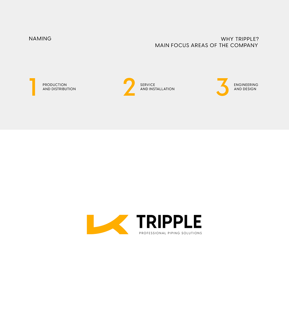
The brand name "Triple" is thoughtfully designed to encapsulate the essence of the company. The two "P"s in "Tripple" serve a dual purpose: they refer to the main product, pipes, and symbolise the three key pillars upon which the company stands — Production, Service, and Engineering.
The name itself, "Tripple," signifies the comprehensive and integrated approach company takes in all endeavours. It emphasises the synergy and harmony between their three core pillars, ensuring that every aspect of the business works seamlessly together to provide unparalleled piping solutions.
MADEIT CREDITS


studiopro:Vadym was verified as a studiopro on 12th April 2021
Annual 2024 ShortlistTripple - Professional piping solutions. Brand identity.Branding
Project featured: on 3rd July 2024
Pro member:
Contributor:
Pro accounts have added benefits for Creativepool members. To get your Pro account go here.
Vadym Aseiev has been a Contributor since 4th April 2021.