Range Left
London
ABOUT
Elara is a new beauty brand devised by an international client with an initial focus on a launch in Angola.
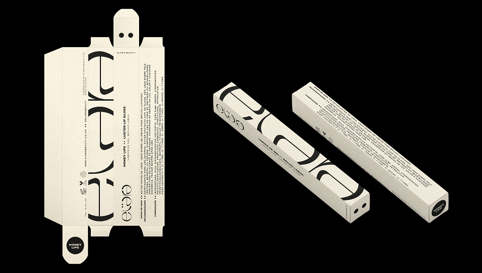
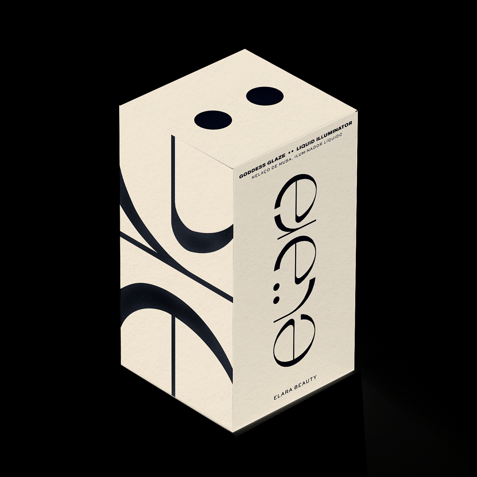
The media comprises all forms of brand roll-out with an initial focus on social media and packaging.
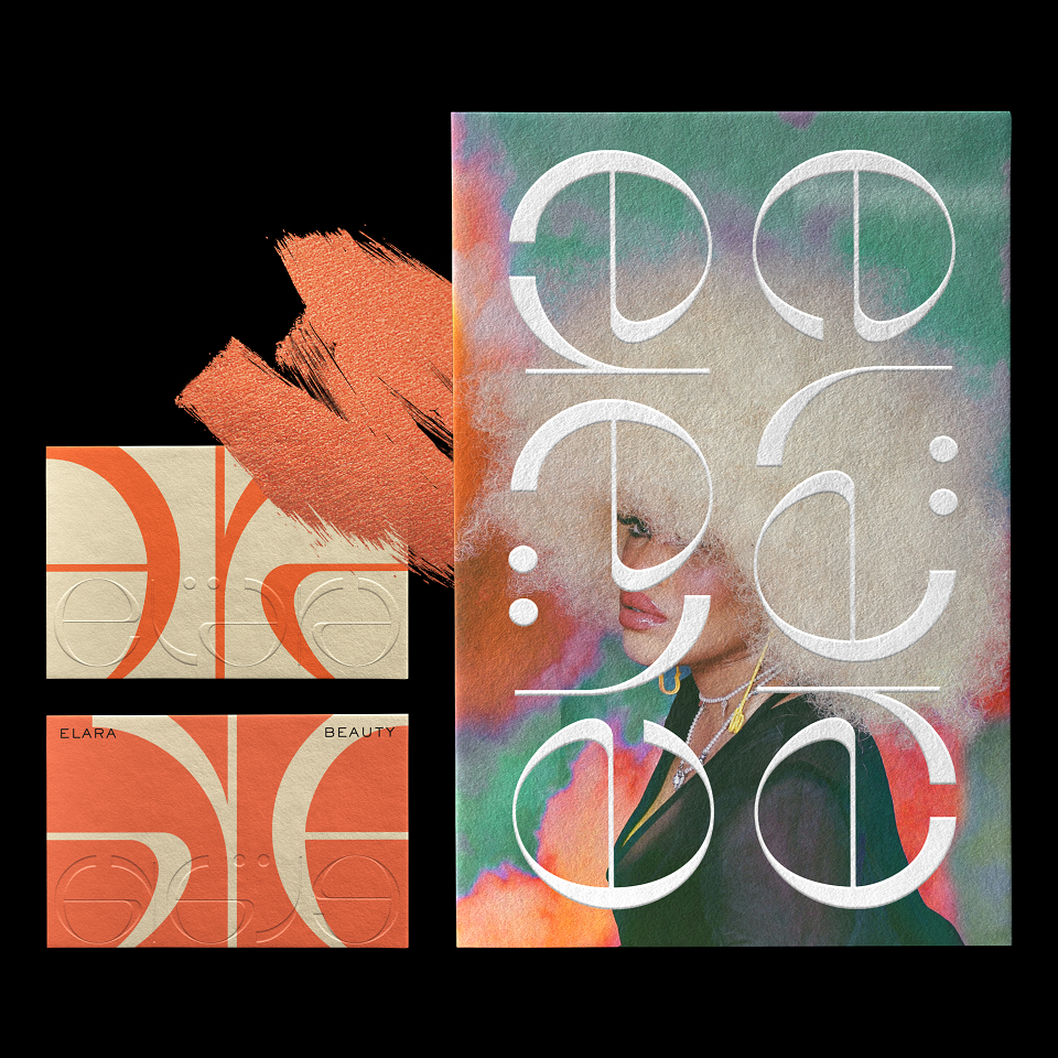
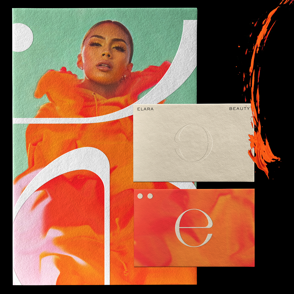
The brand is an ode to femininity. Its name is founded in astrology, as Elara is one of the smallest and most distant moons of Jupiter. With a first collection entitled ‘Muse,’ Elara represents femininity with strength and power, twinned with grace and delicacy. Its colours and products help empower and embolden beauty in all its forms, whilst retaining precision and refinement. The budget was geared around being cost effective for a fledgling brand, whilst conveying an aesthetic to appear well-established as a presence in its marketplace.
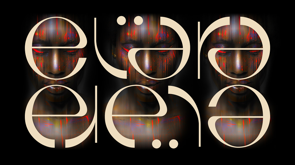
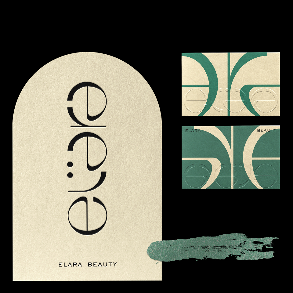
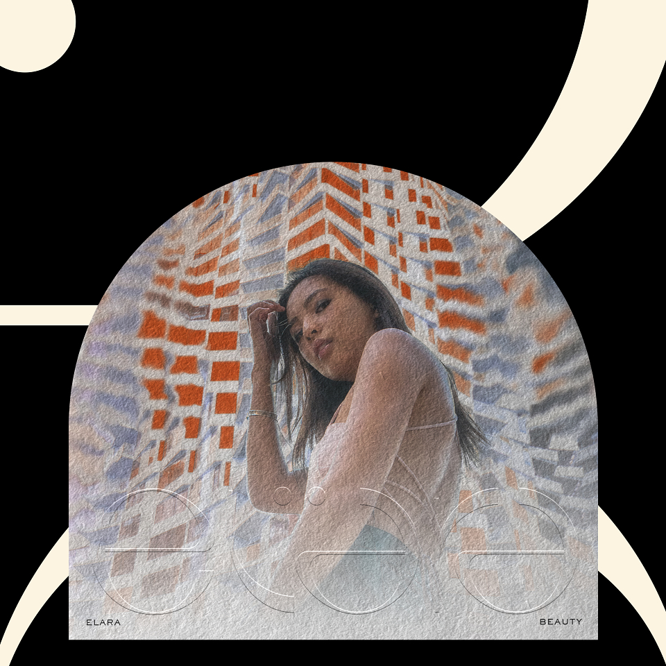
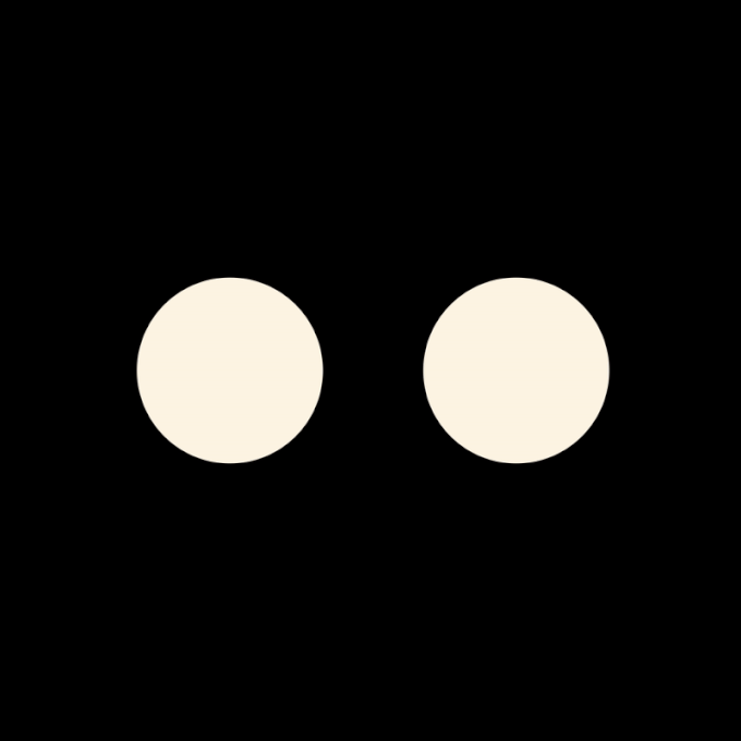
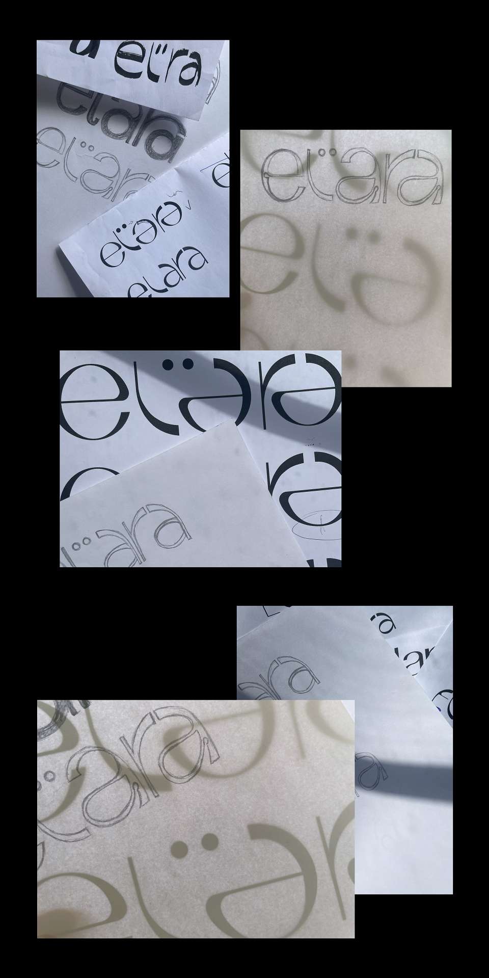
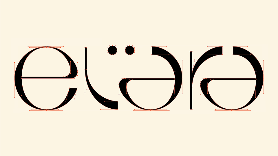
With a round and contrasted custom typography, the logo echoes its lunar origins, with the accent circles further representing the stellar bodies. The palpable sense of symmetry of the logo also conveys the idea of a mirror and its reflection, whilst being a reminder of the perfect imperfection in the symmetry of a face. Whilst the packaging is clean, striking and impactful in order to have clarity at position of sale, the marketing elements focus on Elara’s feminine and powerful essence, manifested through colourful, intriguing and impactful imagery which complement the logo, allowing the feminine attributes of the letters to reveal themselves subtly through this juxtaposition. This relationship also reveals how the logotype draws direct inspiration from feminine features, notably the curves and lines of cheeks, brows and eyes, which the product aims to accent. An important dynamic element for the client was to convey the idea of movement, the energy and the confidence that the product helps facilitate. The delivery of the brand typography via crops adapted to the various packaging shapes and styles required, serves to further focus on the delicacy of the curves and structures within the face. A distillation of the logotype is represented by its two dots, used as a strong key brand identifier, particularly useful at point of sale and as a social media visual reference point, through its distilled simplicity.
Although the products are yet to have their public release, preliminary social media posts have garnered some of our most fulfilled and broad reactions, both locally and globally, from peer group designers and target audiences alike.
MADEIT CREDITS


Annual 2022 ShortlistElara BeautyBranding
Project featured: on 4th July 2022
Contributor:
Invite
x3
Range Left has been a Contributor since 25th November 2015.