Taller Design
Guildford
ABOUT
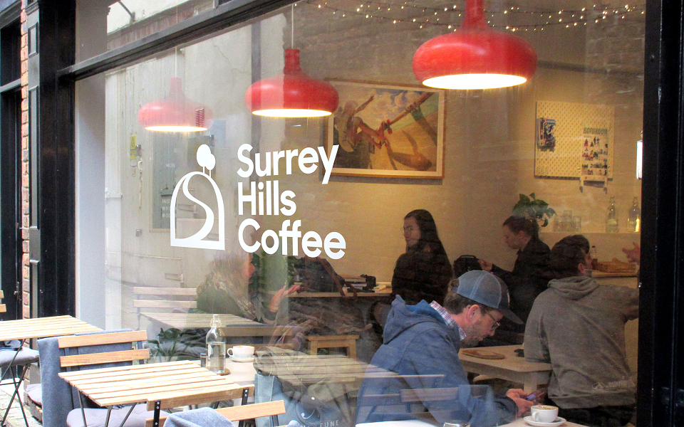
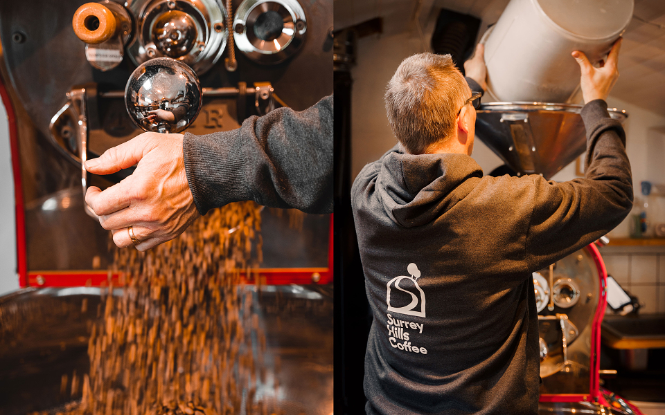
Surrey Hills Coffee is run by husband and wife Chris and Monica, from the roastery in their back garden, deep in the Surrey Hills. All very authentic and romantic, but not very ‘grown up’. As regular customers of their coffee shop in nearby Guildford, Taller Design were brought in to help elevate their brand and packaging, and help drive more custom. Strictly no coffee tropes, a dash of Swedish style (where the founders originate from) and with plenty of love. A new way for you to ‘find your peak’.
THE BRIEF
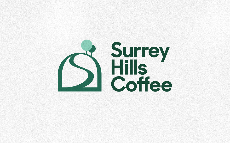
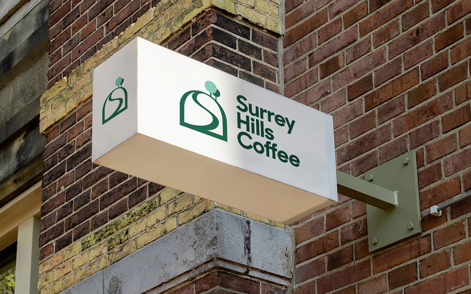
With a minimal budget the founders had an eye on the future, and wanted to evolve Surrey Hills Coffee into something that is seen as more professional, that can drive more custom, and would shift from the focus from being just on Chris and Monika as the faces of the brand. After 10 years it was time to make the brand more coherent and focussed, but as part of an evolution and not a revolution. The existing logo had a rudimentary reference to rolling hills but in a very functional style.
Aimed at the regular customers in local farm shops, food outlets and their coffee shop, as well as online orders from around the South East, the challenge was to capture the authenticity of each blend being created locally from scratch, by hand, with love.
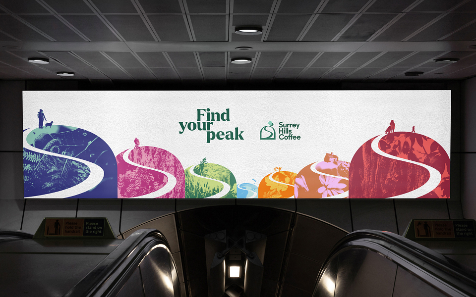
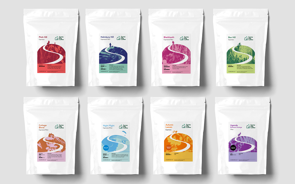
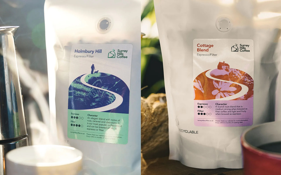
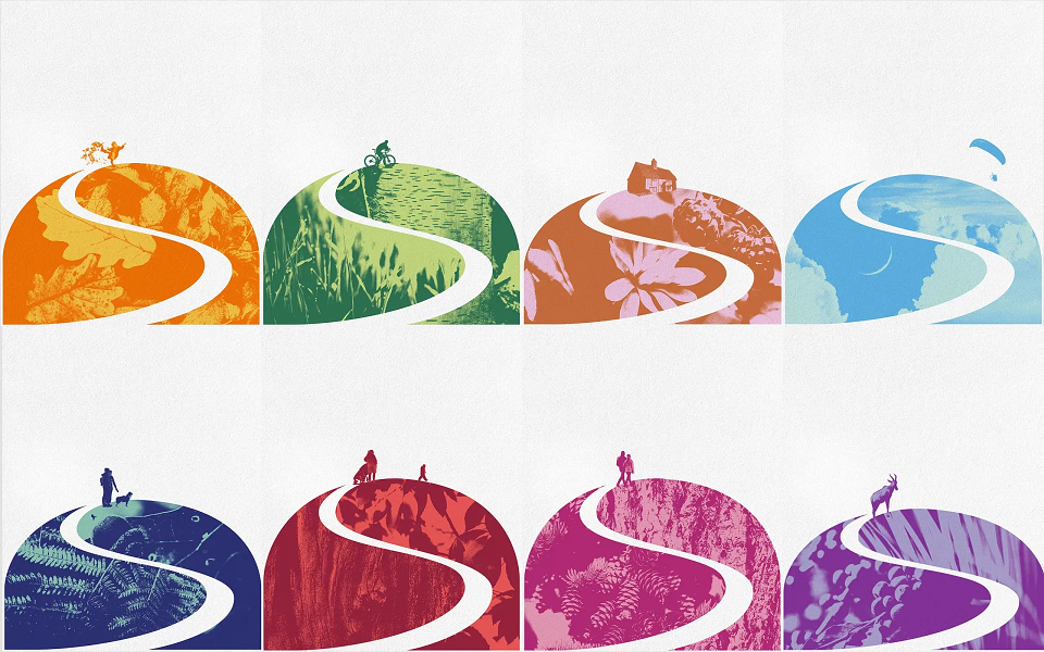
With many local hills, each gave inspiration to the naming of the blends but also the visual style and system for the brand. Each moment on your favourite hill, or with your favourite blend would help you to ‘find your peak’
THE IDEA
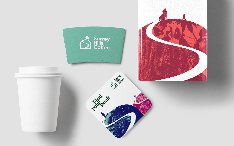
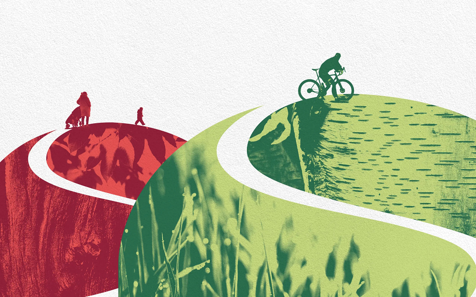
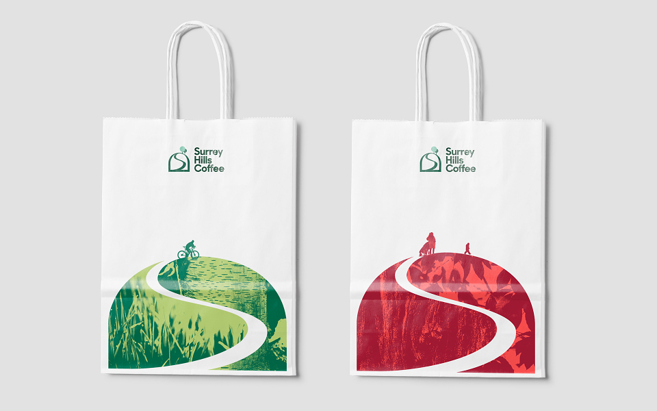
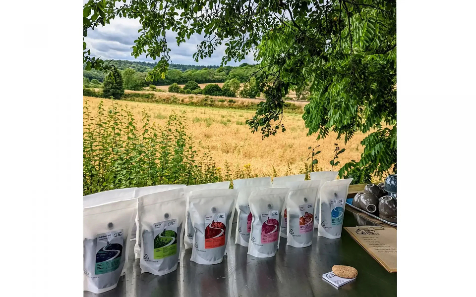
Taller Design developed the creative by giving each blend, and ‘hill’, it’s own character by using people, colour and nature as a visual property. The flora and fauna of each hill were referenced in the duotone illustrations in each hill, with the colours reflecting the type of blend. The strength of each blend was not only visualised in a chart on each label but also by the actual height of the hill. The stronger the blend the higher the hill.
The character of each hill was also expressed in the activity at the top of each hill, from kicking leaves for Autumn Blend, a microlight for Night Flight to a cyclist at the top of Box Hill.
The icon echoed the Surrey Hills, and there was a nod to the S which formed a path to the top of the hill, but also referenced steam rising.
Bearing in mind the cost constraints, the labels for each coffee bag were the main canvas and all efforts were made to keep the design simple and effective in a restrictive space.
MADEIT CREDITS


Annual 2023 ShortlistFind your peakBranding
Project featured: on 1st March 2023
Contributor:
Invite
x3
Taller Design has been a Contributor since 25th November 2015.