ABOUT
Our iconic typeface, remastered.
Tottenham Hotspur Football Club last developed their brand identity in 2006 – taking unprecedented steps to simplify their club crest and creating a custom display typeface... 18 years on, as other clubs start to follow in those footsteps, it was time to reimagine our brand once more. To challenge the perception of what a modern football club brand is, we embraced our rich history and unmistakable heritage, to create a richer, and wider, world of type that authentically connects with our brand, brings the heat and energy to support the many demands within the football space and beyond.
The Objectives:
• Build on the iconic nature of the existing Spurs display face to deliver something which is authentic and reflects the new brand philosophy - taking inspiration from our heritage to build something unique for our future.
• Modernise the forms, make it sit more coherently with the new suite of IP, and ensure it’s fit-for-purpose in today’s digital landscape.
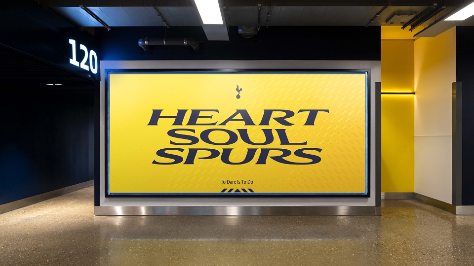
• Create an identity that places typography at the heart, developing a unique style and distinctive tone of voice to position language as a key component of the brand.
• Deliver a flexible, playful typeface which empowers fun, creativity, and dares, helping to engage with new audiences and younger fans across the globe.
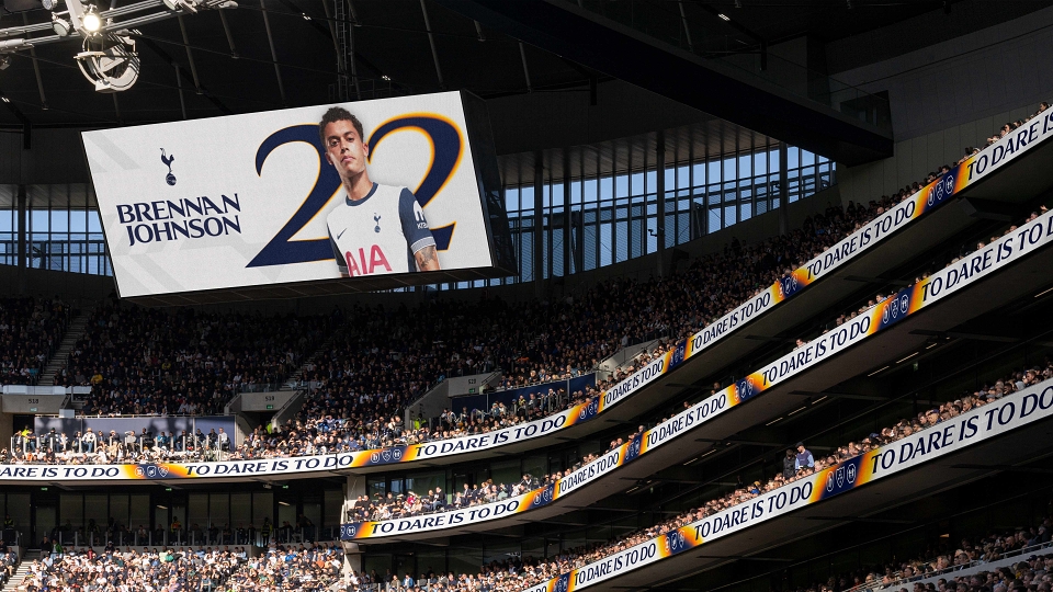
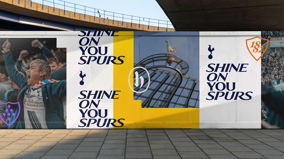
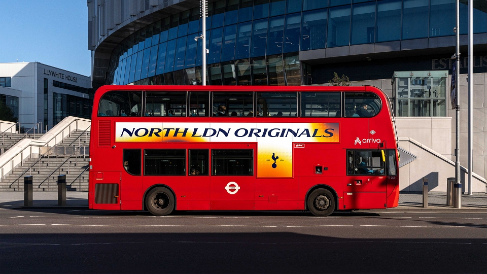
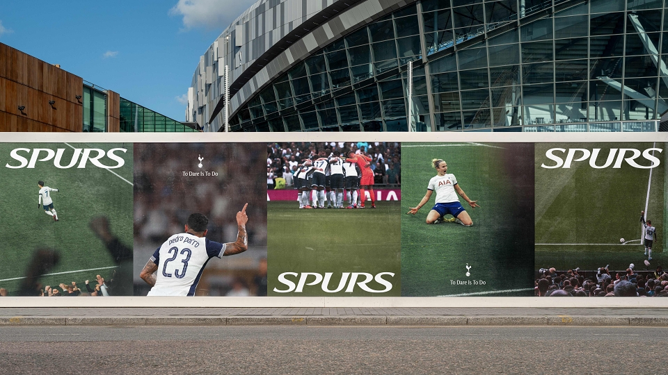
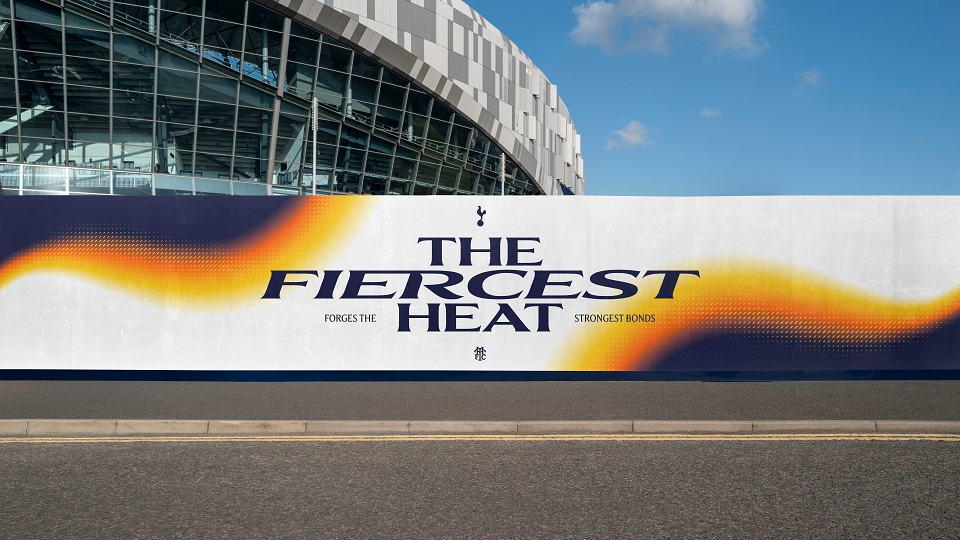
Heavily condensed sans serif type dominates football club communications, so we wanted to place the new supercharged Spurs font at the heart of the brand, and support this with a distinct tone of voice to ensure language and typography can become as uniquely Spurs as the Club’s cockerel and kit colours.
The Result:
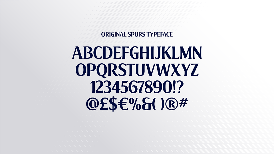
• A specially crafted typeface that retains its iconic and recognisable style with a modern twist which is adaptable, dynamic and has the tonnes of attitude.
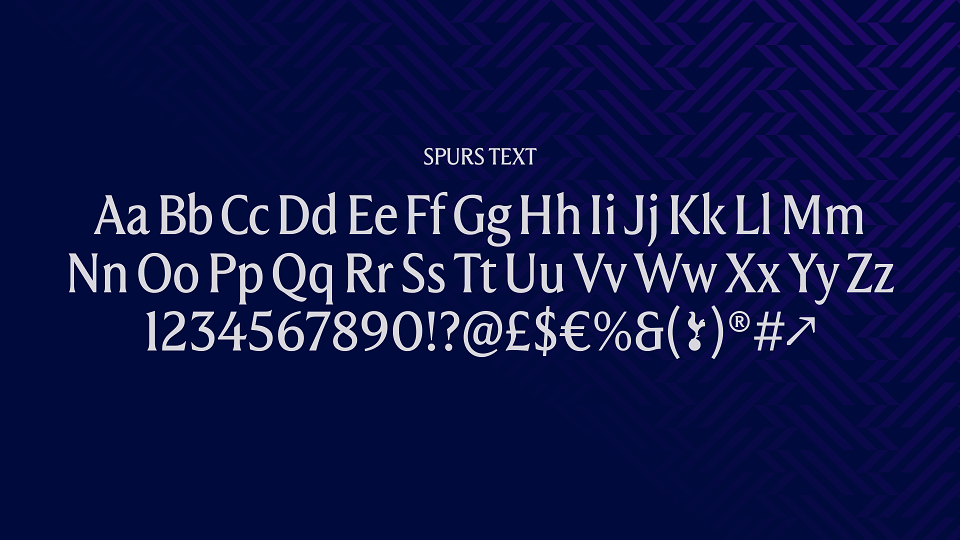
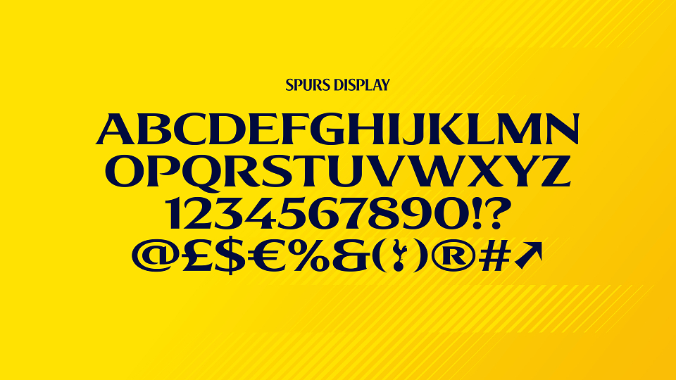
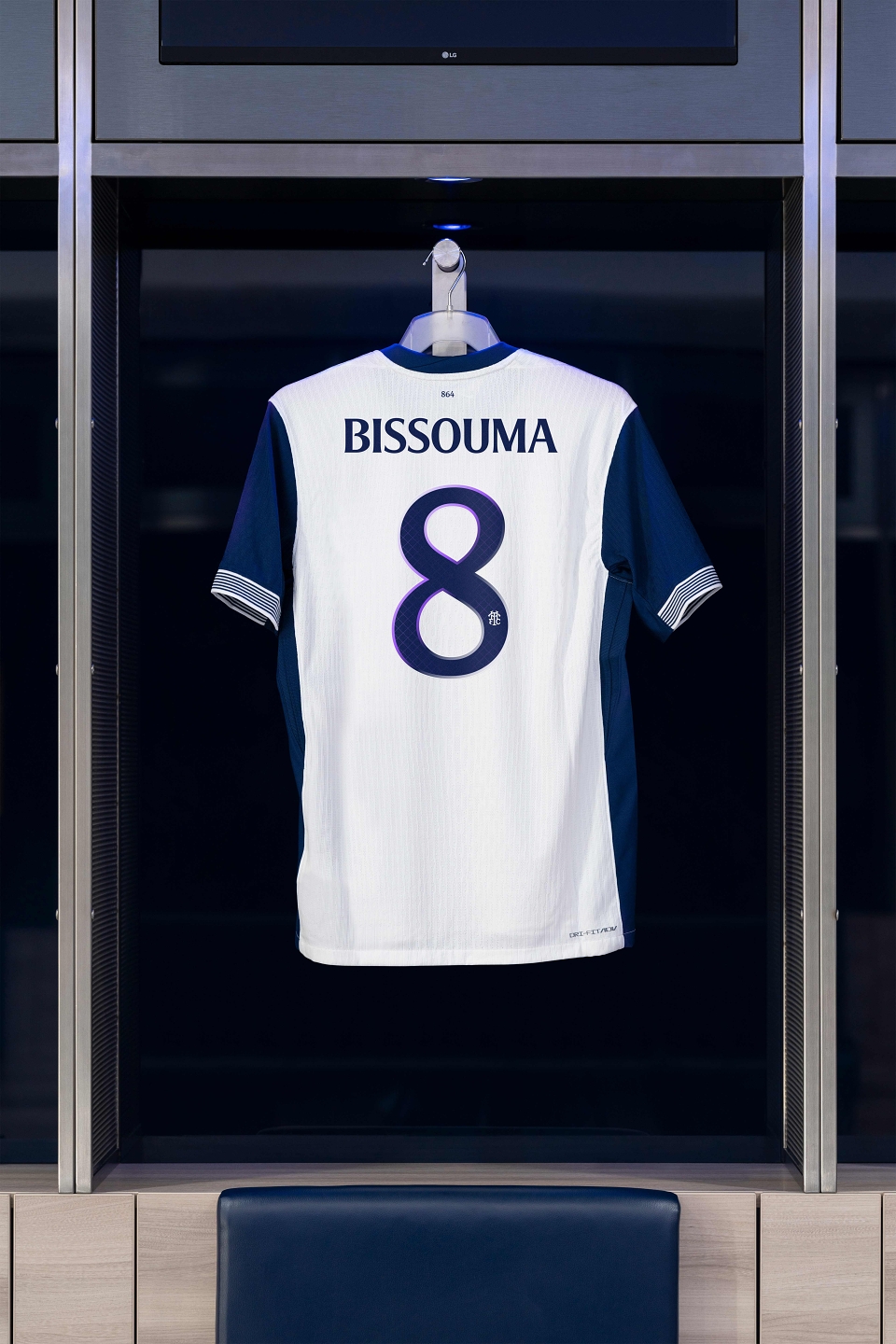
• A remastered custom typeface - it has expanded from 76 to nearly 7,000 characters.
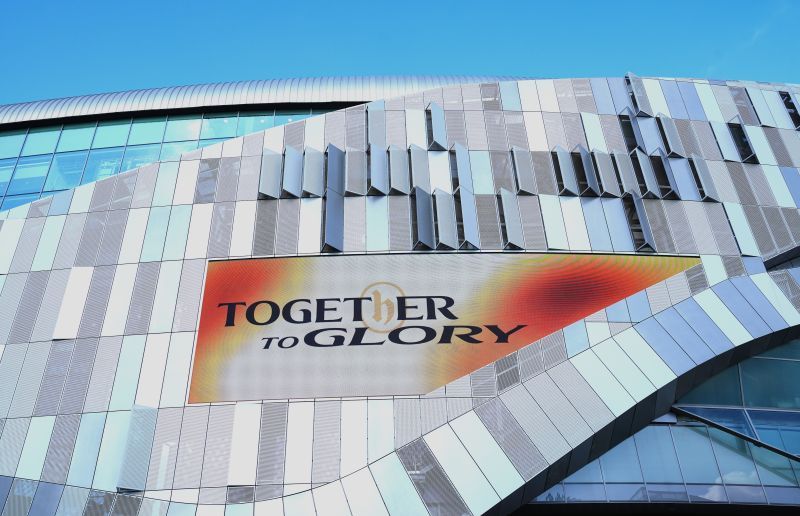
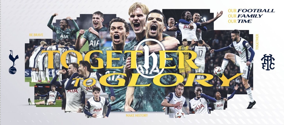
• We used the idea of heat from our wider brand philosophy to expand and contract the font, creating a variable headline and lowercase text variant, which is flexes to suit any platform.
• New features and curves within the typeface were inspired by our famous cockerel, expanding our font to include 12 different widths and styles, a completely new lowercase set, together with alternative characters, special glyphs and flowing ligatures.
Additional Type Assets:
We created a wider suite of assets that help tell our story of history and heritage.
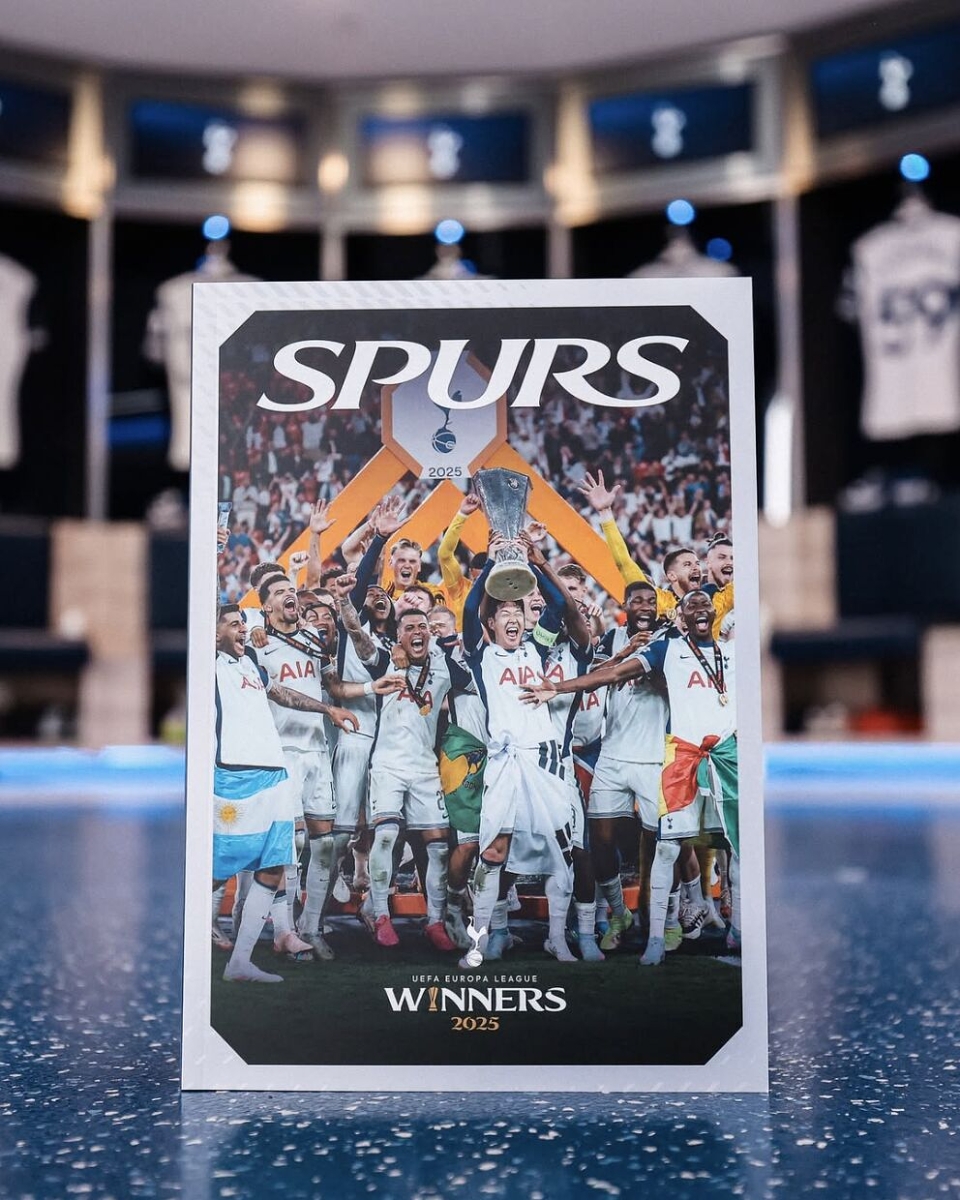
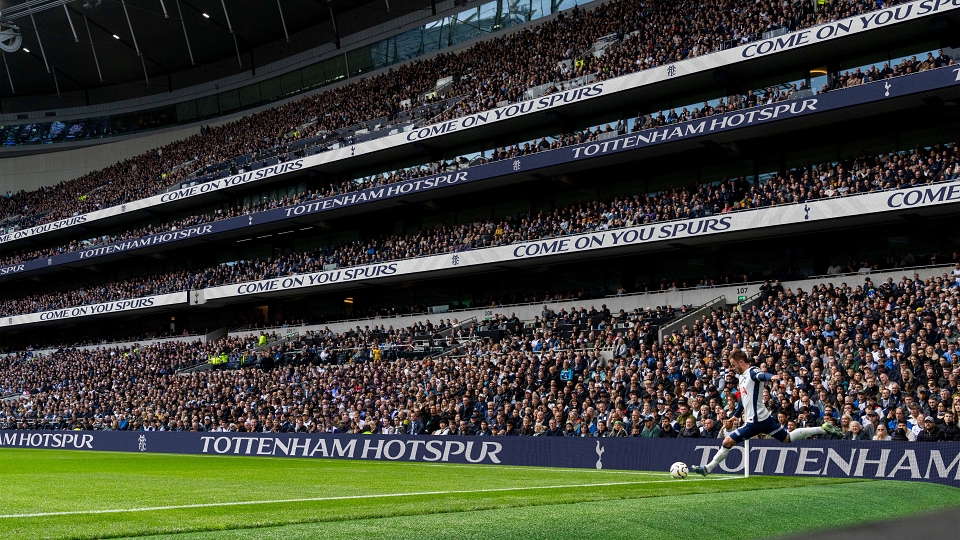
• A series of wordmarks were created to increase consistency in the way the Club’s name appears within comms, and give more flexibility in the weighting between crest and the Tottenham Hotspur name.
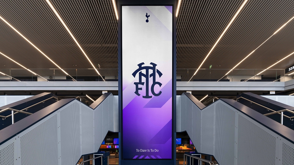
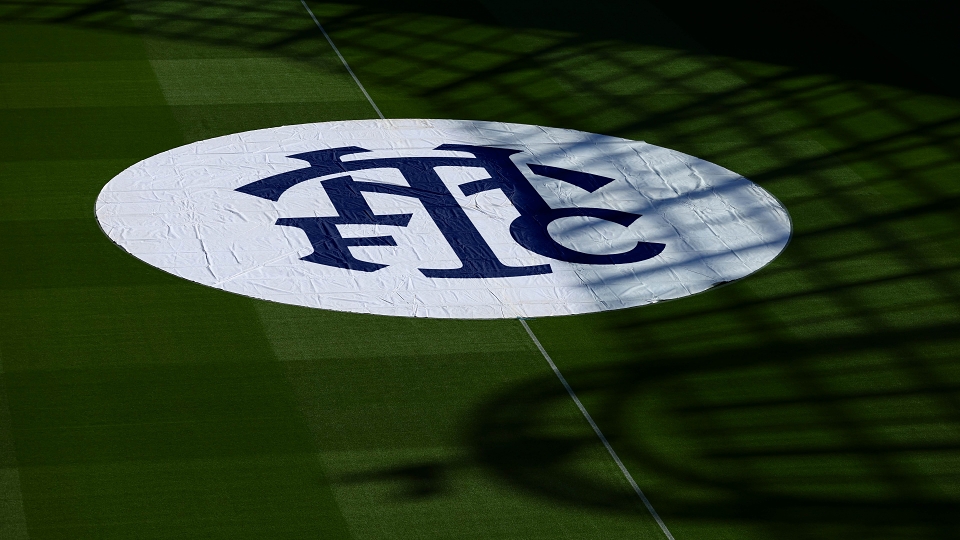
• A “new” secondary piece of IP was developed to support the Club logo – The THFC monogram was an iconic part of the Spurs brand for nearly 60 years – a fan favourite from the 1950s that went on to feature heavily in the Club’s badge. Our intention was to reintroduce a version that would be immediately identifiable by fans, to offer more variety in branded comms, and open up new merchandise opportunities. We modernised the forms and simplified the details in order to be legible when used at small sizes and on low resolution digital screens.
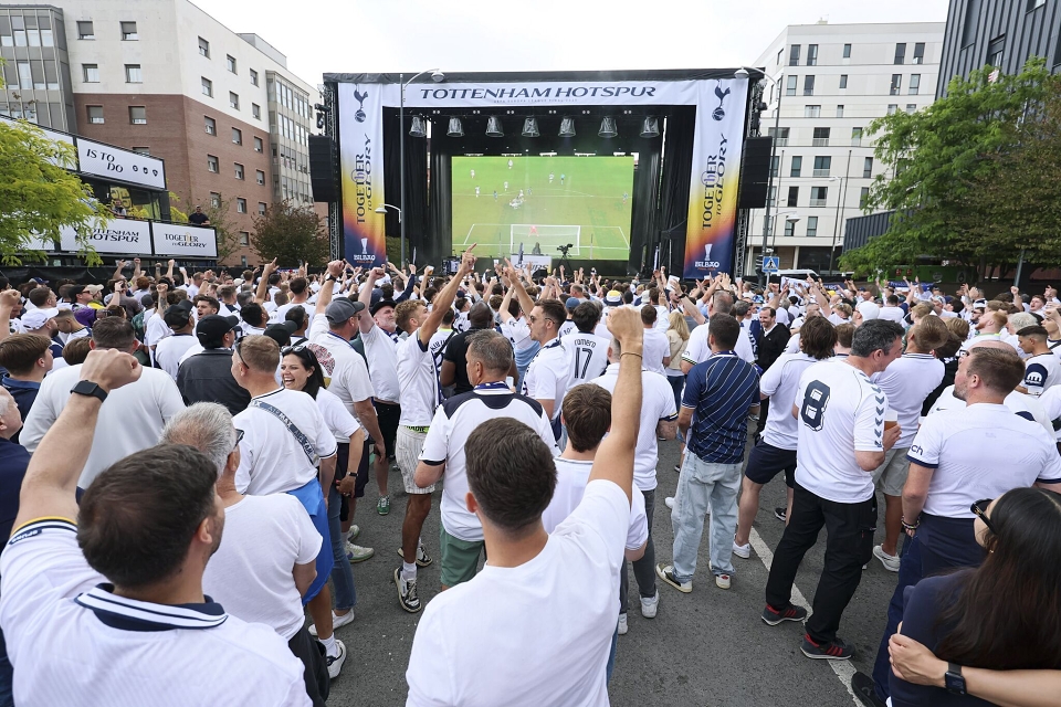
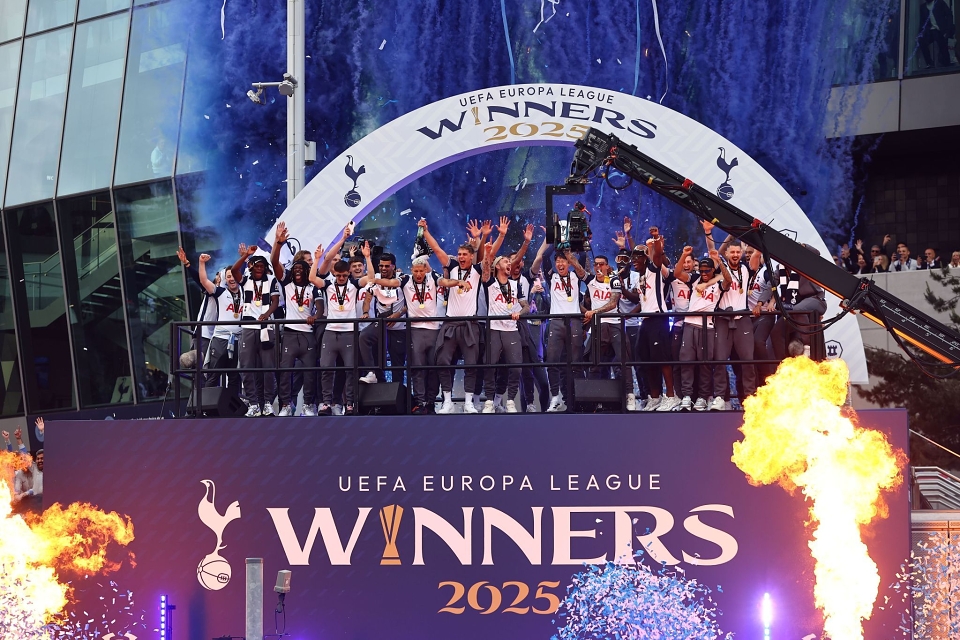
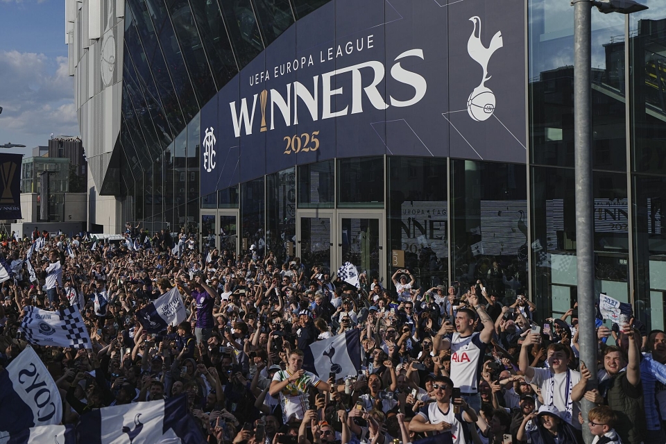
The work launched internally at a special event held at the Stadium in November 2024. Several weeks later the visual and verbal identity were introduced to the public. It immediately connected with fans old and new, and yet again set a benchmark for others to follow. In a world full of United's, City's and Rovers, there is only one Hotspur.
Key Highlights:
• Over 8m impressions and 50k+ articles views, across O&O channels on launch day.
• Brand launch film was aired across Sky Sports News – an unprecedented occurrence seen by over 13 million people.
• The Brand launch was the club’s 5th most engaged story ever! (eclipsing major transfer news and kit launches which are traditionally the most engaged content).
• Spurs have become the most followed football club on the planet on TikTok (over 8m more than second place Man City)
• 24m + supporters engaged with launch
• 400% increase in email engagement from fans - smashing a digital KPI for the season to reengaged with light and lapsed fans.
• Overwhelming positive reviews, engagement and impressions from the brand, creative and marketing industry voices.
Industry Voices:
“Probably one of the best type rebrands I have seen of late. Improve the old, give a twist of modern, make it iconic, and allow for flexibility and fun. Not a Spurs fan but I will need all the merch with that monogram, that is for sure.”
“Overall, this “remastering” brand projects cleverly side steps any drastic changes that would anger fans and adds plenty of relevant and crowd pleasing assets with the new typeface while being able to infuse the team with a new visual energy that has an electrifying and exciting aura to it.”